Project overview
Whoopea is a cross-border ecommerce brand focusing on doll products. It hopes to further enhance its brand image and online sales capabilities through its brand website. As the number of products and visiting users increases, the original website is gradually unable to meet the needs of business growth in terms of homepage information level, product category display, brand visual unification, and mobile shopping experience. Therefore, customers come to us and hope to systematically optimize the website. Project based on Shopify Platform To expand, we re-planned around the homepage structure, product pages, category navigation, brand visual system and mobile experience. Through a clearer information structure, more attractive product display and clearer purchase path, we help users quickly understand the brand and products, while enhancing trust and improving overall conversion efficiency, establishing a more stable and unified e-commerce visual system for subsequent product expansion and long-term brand development.
| Dịch vụ | Industry | Nền tảng |
| Website design and decoration | Home department store | shopify |
| Project requirements | target market | design style |
| Improve product display effect and sales conversion rate | Toàn cầu | Trendy and lively|Colorful|Young and interesting |
| project budget | Delivery content | Delivery time |
| ¥23100 | Website construction and full-site page design | 28 working days |
Project Challenges
The core challenge of the Whoopea project is how to enable users to quickly understand the product value after entering the website in the highly competitive doll e-commerce market, while at the same time establishing brand trust and smoothly completing browsing and purchasing. The original page had problems such as unclear expression of information on the home page, scattered visual focus, insufficient product discovery efficiency, lack of unified brand vision, and the need to enhance the mobile shopping experience. Before the formal design, we first sorted out Whoopea’s brand positioning, target users and business goals, and analyzed the complete path of users from entering the homepage, browsing products to checkout. At the same time, we clarified the optimization key points such as homepage structure, product classification, visual hierarchy, brand unity and mobile experience, and established a clear design direction and scalable visual system for subsequent Shopify page design.
Home Page Design: Core Conversion Engine
The homepage is the most critical traffic entry point for any Shopify store. For Whoopea, we redesigned the homepage structure so that it not only functions as a brand display, but also serves as a clear and logical sales conversion path to guide users from understanding the brand to product browsing and purchasing.
Hero first screen area optimization
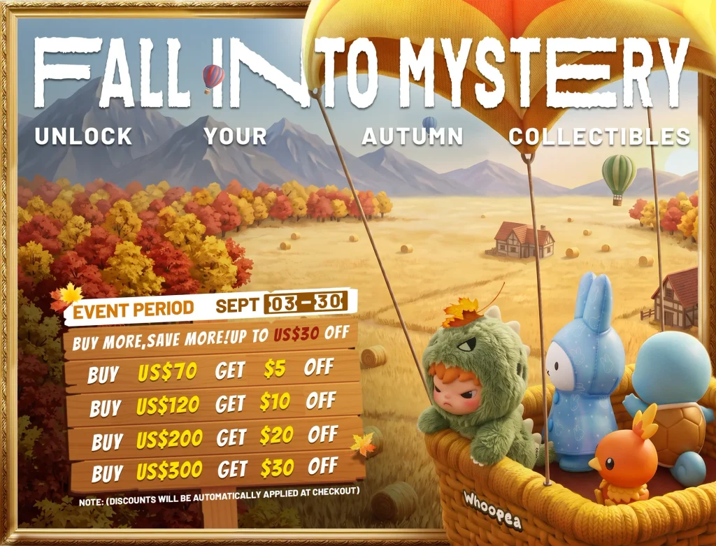
Project Challenges
- Lack of clear and unambiguous information expression
- The visual focus is not prominent enough
- Users cannot immediately understand the core value of the brand after entering the website
design solutions
- Introduce bold and visually impactful lifestyle images
- Add a concise and clear title to quickly convey the core value of the brand
- Set up clear and eye-catching CTA action buttons
- Improve content readability through contrast and reasonable white space
Optimize results
- Help users understand brand and product positioning faster
- Increase user attention and interaction with CTA buttons
Product discovery and browsing layout
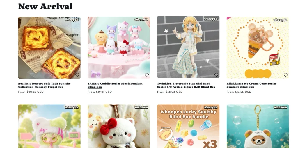
Project Challenges
- It is difficult for users to quickly find core products
- Lack of clear visual distinction between different product categories
design solutions
- Create visually differentiated product classification modules
- Use a unified card layout to maintain page consistency
- Add hover interaction effects to improve browsing experience
- Highlight hot-selling and trending products
Optimize results
- Improve the clarity of website navigation
- Increase users’ willingness to browse and explore products
trust building module
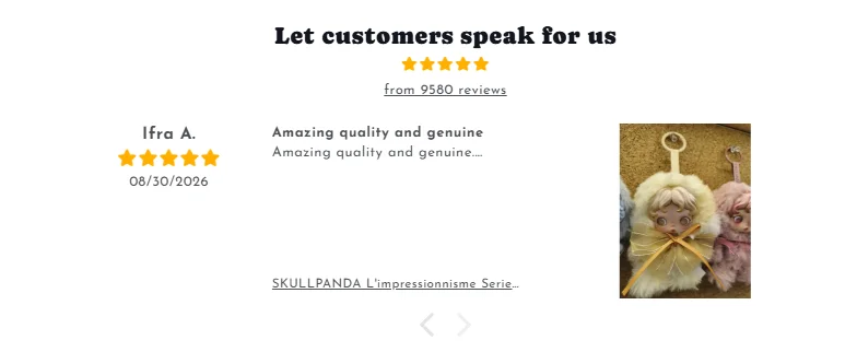
Project Challenges
- Website lacks sufficient brand credibility information
- Product quality and service advantages lack effective reinforcement
design solutions
- Increase customer reviews and product ratings
- Add trust mark and related guarantee information
- Highlight logistics, distribution and customer service advantages
Optimize results
- Enhance users’ trust in brands and products
- Reduce user hesitation in the purchasing decision-making process
Product page design: drive users’ purchasing decisions
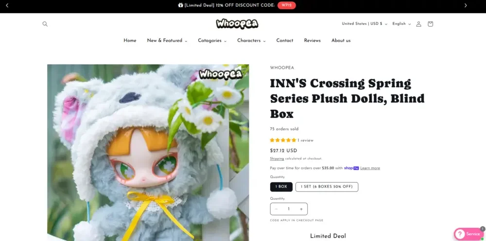
If the homepage is responsible for attracting and guiding users, then the product page is responsible for the important task of final conversion. By optimizing the information structure and visual expression of product pages, we reduce obstacles in the user purchasing process while enhancing product persuasiveness.
Product visual display
Design optimization
- Use large, high-resolution product images
- Show multiple product angles and real usage scenarios
- Use a simple and clean background to focus the user’s attention on the product itself
Information level optimization
Structural optimization
- Clearly display product name and price
- Use bullet points to highlight core product features
- Optimize product descriptions so users can quickly browse and understand key information
Conversion element optimization
Core new content
- Make the “Add to Cart” button more visible
- Add urgency prompts such as “stock is limited” when inventory is tight
- Incorporate social proof content such as user reviews
Optimize results
- Improve the conversion rate of adding products to the shopping cart
- Help users complete purchasing decisions more quickly
Mobile experience optimization
As mobile traffic gradually becomes an important part of modern e-commerce websites, experience optimization for small-screen devices has also become an important part of this Shopify website design.