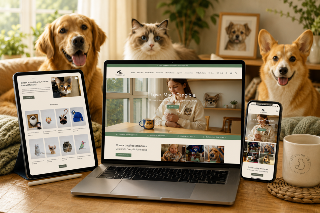
Project overview
Everful Wholesale is a jewelry wholesale brand targeting wholesale buyers, dealers and small and medium-sized enterprise customers. As the number of products and overseas business continue to grow, the original online display method can no longer meet the needs of bulk purchasing users for product search efficiency, price information, purchasing policies and brand trust. Therefore, customers come to us and hope to redesign a brand website that is more professional and suitable for B2B wholesale business. The final project selection is based on Shopify The platform designs and builds the overall website, focusing on optimizing the homepage visuals, product classification structure, product list and product detail page, while highlighting core advantages such as wholesale prices, no minimum order quantity, and global distribution, while taking into account the mobile browsing experience. Our goal is for the website to establish a clear, efficient, and trustworthy procurement path while maintaining the quality of the jewelry brand, and provide a more stable e-commerce foundation for subsequent product expansion and overseas business growth.
| Dịch vụ | Industry | Nền tảng |
| Website design and decoration | trang sức | shopify |
| Project requirements | target market | design style |
| Strengthen the expression of brand story and core advantages | Toàn cầu | Simple business, clear classification, wholesale display |
| project budget | Delivery content | Delivery time |
| ¥6700 | Website construction and full-site page design | 15 working days |
https://www.everfulwholesale.com
Project Challenges
The biggest challenge of this project is how to keep Everful Wholesale’s Shopify website clear, efficient, and professional in brand quality despite the large number of products and dense purchasing information. Wholesale customers pay more attention to prices, product classifications, minimum order requirements, delivery policies, and procurement efficiency. Therefore, we need to solve problems such as complex product search paths, unclear information levels, easy-to-crowd pages, and insufficient brand trust.
Before starting the project, we first analyzed the wholesale purchasing habits of target customers, researched similar excellent Shopify wholesale websites, and sorted out common page structures and user pain points in the industry. Then the website information structure, product classification, user browsing path and content priority of each page were re-planned, and the module relationship of the home page, collection page and product page was determined through wireframes to establish a unified design basis for subsequent visual design, mobile terminal adaptation and website expansion.
Home Page Design Strategy
Make a powerful first impression
The homepage is like a brand’s online store. For Everful Wholesale, we designed a first-screen area that can quickly convey the brand’s core information, allowing users to understand within a few seconds of entering the website:
What does the brand offer?
Clearly display core products and business types to allow visitors to quickly understand brand positioning.
Who does the brand serve?
Explicitly targeted at wholesale buyers, dealers and commercial purchasing customers.
Why brands are different
Quickly build brand awareness through core strengths and differentiated selling points.
We use visually impactful pictures of lifestyle scenes, paired with concise and powerful copywriting, to establish a sense of professionalism and credibility in a short time.
Establish a clear and smooth homepage structure
In order to avoid showing too much information to users at once, we planned the homepage into a clear and logical content flow based on users’ browsing and purchasing habits.
1. Hero area on the first screen

Use clear main titles, auxiliary descriptions, and eye-catching action buttons to guide users to the core product or category page quickly.
2. Product category navigation

We use product classification modules with obvious visual distinctions to allow users to quickly enter the product series they are interested in.
3. Core value advantages
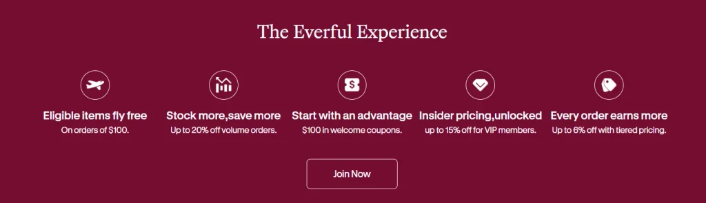
Highlight the advantages that wholesale customers care about most, including:
- Competitive wholesale prices
- No minimum order quantity required
- Fast global shipping
4. Selected product display
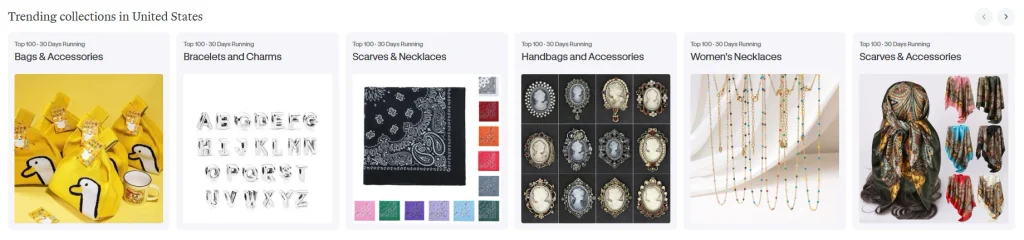
Select key products for display and maintain a neat and unified layout so that the page highlights the products while maintaining visual consistency.
5. Trust endorsement
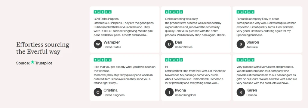
Enhance user trust through customer reviews, brand stories, corporate strength and other content, and build confidence for subsequent customer inquiries and orders.
visual design direction
In terms of visual expression, we intentionally reduce excessively decorative design elements and emphasize professionalism, clarity and legibility.
neutral color system
Use relatively restrained and natural color matching to create a professional and reliable brand temperament.
Uniform page white space
Improve the overall reading experience through consistent module spacing and content white space.
Clear font hierarchy
Use different font sizes and text weights to distinguish main titles, subtitles and main text to improve content browsing efficiency.
High quality product images
Through clear and unified product vision, users can quickly understand product details and quality.
This design direction results in an overall visual experience that is modern, reliable, clear, and easy to navigate.
Product category page and product detail page optimization
Improve product search efficiency
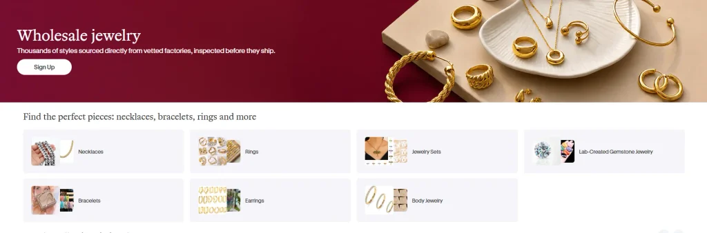
Wholesale users usually need to browse a large number of products at one time, so the design of the category page focuses on helping users quickly scan, filter and discover products.
We have focused on optimizing the following content on the category page:
Clear grid layout
Through regular product grid display, a large number of products can still be kept neat and orderly.
Highlight product thumbnails
Strengthen the visual weight of product images so that users can quickly judge product type and style.
Maintain uniform spacing and alignment
Reduce visual fatigue caused by long-term browsing through unified card size, spacing and alignment rules.
Product product detail page design principles
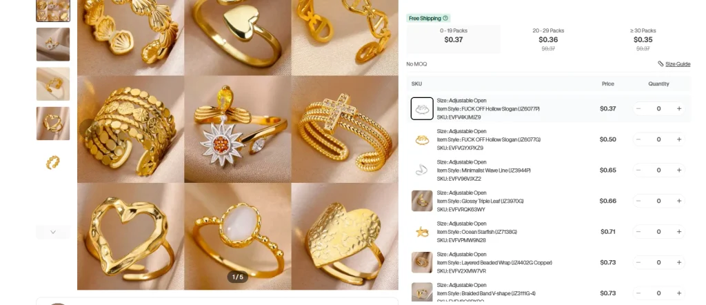
The product detail page is an important page for users to make final purchasing decisions, so we focus on information clarity and conversion efficiency.
clear information hierarchy
We focus on presenting the following in order of user decision-making:
- Product name
- price information
- Core product features
- Bulk purchase discounts
Enhance product visual presentation
Using larger-sized product images allows customers to view materials, structures and details more clearly, improving the efficiency of purchasing decisions.
Simplify purchasing decisions
Reduce irrelevant content and visual distractions while ensuring that the “add to cart” or customer inquiry button is always highly visible.
Design for wholesale purchasing behavior
Lower the threshold for using navigation
Wholesale customers are often more focused on efficiency, so we focus on optimizing the website navigation experience.
Keep your menu simple and structured
Help users quickly locate target products through clear classification logic.
Reduce unnecessary clicks
Shorten the path from the home page to the product category and then to the product detail page.
Keep page structure consistent
Allow users to quickly understand the page logic and operation methods when switching between different pages.
Enhance user trust through design
Brand credibility is very important in wholesale transactions, so we reinforce it through multiple pages and content modules.
Clear brand introduction and brand story
Help customers understand the corporate background, brand philosophy and business capabilities.
Clear shipping and policies page
Allow customers to quickly understand logistics, payment and related policies before purchasing.
Unified brand vision for the entire site
Establish a more professional brand image through consistent fonts, colors, typography, and image styles.
Mobile experience optimization
More and more users will browse and purchase through mobile phones, so the mobile terminal is also an important design focus of this project.
Responsive page layout
Ensure that mobile phones and tablet devices of different sizes can browse the page content normally.
Touch-friendly navigation
Optimize button size, menu structure and interactive area to make it easier for users to operate on mobile phones.
Image adaptive optimization
Adjust the image display ratio according to different screen sizes to improve the browsing experience while ensuring visual effects.
Our design process
Preliminary research and competitive product analysis
Before the formal design, we analyzed multiple excellent Shopify wholesale malls to understand common design methods and user needs in the industry.
Key research contents include:
Excellent page layout
Analyze how different wholesale malls organize homepages, category pages and product detail pages.
Effective visual hierarchy of information
Research how to let users quickly understand the most important information on the page.
Common user pain points
Identify problems that wholesale users may encounter during the browsing, product selection and purchasing process.
These findings ultimately helped us define the design direction for the entire project.
Wireframes and website structure planning
Before entering the formal visual design, we first sort out the page content and user path through wireframes.
Plan user browsing paths
Clarify the complete process for users to enter the category page, product page and final order from the home page.
Determine content location
Plan in advance the order in which content such as titles, products, benefits, reviews, and action buttons will be displayed.
Make sure the page is logically coherent
Maintain a unified structure and browsing logic between different pages.
Visual design execution
After determining the wireframe structure, we further transformed it into a complete visual design.
Unified font specification
Establish a consistent system of fonts, font sizes, and text hierarchy.
Develop a coordinated color scheme
Choose a page color that is consistent with your brand positioning.
Design reusable modules
Improve overall website consistency with unified product cards, header modules, buttons, and content components.
This design method not only ensures the visual unity of the current website, but also provides a better expansion foundation for subsequent new products, categories, and pages.