Giỏ hàng hiện không có sản phẩm nào.

Trong môi trường thương mại điện tử cạnh tranh khốc liệt, sự rõ ràng về mặt hình ảnh và sự kết nối cảm xúc thường quyết định liệu khách truy cập có trở thành khách hàng hay không. Điều này đặc biệt đúng trong các lĩnh vực ngách như game cổ điển, nơi người mua không chỉ bị thu hút bởi thông số kỹ thuật sản phẩm mà còn bởi sự hoài niệm, tính thẩm mỹ và bản sắc cộng đồng.
Nghiên cứu trường hợp này khám phá cách chúng tôi hợp tác với ToRetro để thiết kế một Shopify Cửa hàng trực tuyến mang lại trải nghiệm sống động, trực quan và tập trung vào chuyển đổi—mà không cần dựa vào các tùy chỉnh kỹ thuật phức tạp. Thay vào đó, chúng tôi tập trung vào chiến lược thiết kế, logic bố cục, kể chuyện bằng hình ảnh và cấu trúc lấy người dùng làm trung tâm để biến danh mục sản phẩm thành trải nghiệm thương hiệu hấp dẫn.
Thay vì tiếp cận dự án này như một "thiết lập cửa hàng" đơn giản, chúng tôi đã coi nó như một thiết kế hệ thống hình ảnh hoàn chỉnh: một hệ thống cân bằng giữa tính linh hoạt trong quảng bá, khả năng tìm kiếm sản phẩm và sức hấp dẫn về mặt cảm xúc, đồng thời vẫn có khả năng mở rộng cho các chiến dịch và ra mắt sản phẩm trong tương lai.
| Thời gian giao hàng | Loại | Nền tảng ứng dụng |
| 22 ngày | máy chơi game | Shopify |
| Các nhà thiết kế tham gia | Trị giá | Tác dụng |
| Lin Zhang | $2800 | Tỷ lệ mua hàng📈241% |
ToRetro phục vụ một lượng khách hàng toàn cầu gồm những người đam mê game retro, các nhà sưu tập và những người mua lần đầu tiên bị thu hút bởi các máy chơi game cầm tay lấy cảm hứng từ những kỷ nguyên game kinh điển. Thử thách đặt ra rất rõ ràng:
Làm thế nào để thiết kế mặt tiền cửa hàng mang lại cảm giác hoài cổ mà không bị lỗi thời?
Ngay từ đầu, định hướng thiết kế của chúng tôi tập trung vào ba nhận thức cốt lõi về thương hiệu:
Thông qua nghiên cứu ban đầu và các cuộc thảo luận với khách hàng, chúng tôi đã xác định được một số hành vi chính của đối tượng mục tiêu:
Những hiểu biết này đã định hình mọi quyết định thiết kế mà chúng tôi đưa ra—từ cấu trúc trang chủ đến bố cục thẻ sản phẩm.
Trước khi bắt tay vào thực hiện hình ảnh, chúng tôi đã xác định rõ ràng các mục tiêu thiết kế cho dự án.
Vai trò của chúng tôi không phải là sửa đổi chức năng cốt lõi của Shopify, mà là tối đa hóa những gì nền tảng này đã làm tốt thông qua các quyết định thiết kế chu đáo.
Chúng tôi bắt đầu bằng việc kiểm tra trực quan toàn diện trang web hiện có và xem xét các cửa hàng game cổ điển và điện tử cạnh tranh. Điều này giúp chúng tôi xác định được:
Từ đó, chúng tôi đã thiết lập một nguyên tắc thiết kế:
Mỗi phần phải chứng minh được vị trí của mình cả về mặt hình ảnh và chiến lược.
Trang chủ đã trở thành nền tảng của toàn bộ trải nghiệm.
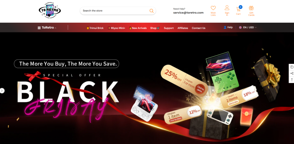
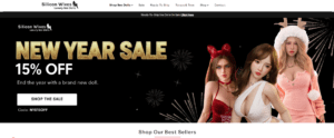
Banner quảng cáo chính được thiết kế không chỉ để thông báo các chương trình khuyến mãi mà còn để tạo nên sắc thái cảm xúc của thương hiệu.
Các lựa chọn thiết kế chính bao gồm:
Phần này ngay lập tức truyền tải sự hào hứng trong khi vẫn giữ cho thông điệp dễ đọc lướt.
Ngay bên dưới hình ảnh nhân vật chính, chúng tôi đã thêm một hàng các chỉ báo độ tin cậy dựa trên biểu tượng:
Những yếu tố này tuy nhỏ nhưng đóng vai trò quan trọng trong việc giảm bớt sự ngần ngại cho những du khách lần đầu đến thăm.
Thay vì làm người dùng choáng ngợp với vô số sản phẩm, chúng tôi đã thiết kế trang chủ theo các bộ sưu tập được tuyển chọn kỹ lưỡng, ví dụ như:
Mỗi khối bộ sưu tập đều sử dụng kiểu thẻ, khoảng cách và hiệu ứng khi rê chuột nhất quán để tạo nên nhịp điệu trực quan.
Mà không thay đổi hệ thống sản phẩm cốt lõi của Shopify, chúng tôi đã tinh chỉnh cách trình bày bằng cách tập trung vào:
Điều này cho phép người dùng so sánh các tùy chọn nhanh chóng mà không cần mở nhiều tab.
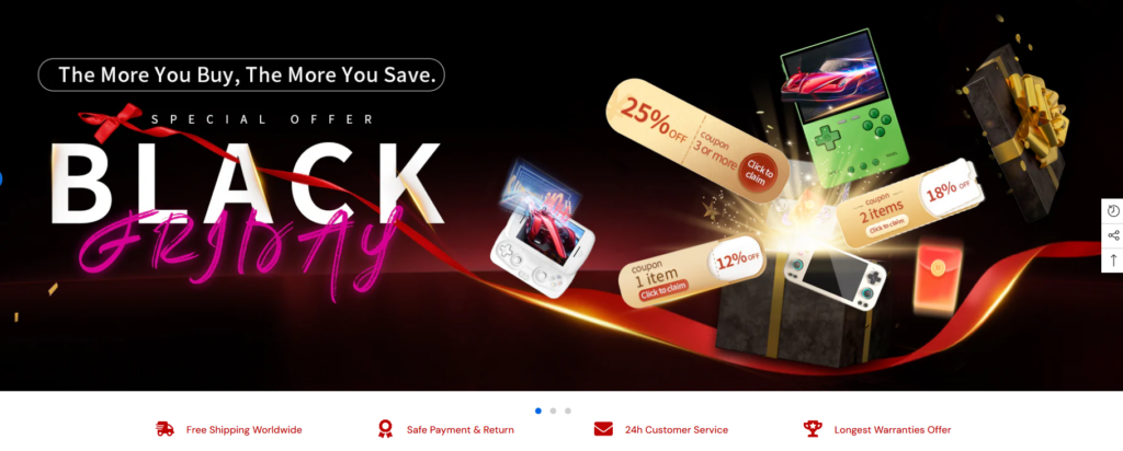
Một trong những nhu cầu chính của ToRetro là khả năng tổ chức các chương trình khuyến mãi thường xuyên — Black Friday, các ưu đãi số lượng có hạn và các đợt giảm giá theo chủ đề.
Giải pháp của chúng tôi là thiết kế các phần sẵn sàng cho chiến dịch, có thể được làm mới về mặt hình ảnh mà không cần cấu trúc lại trang.
Ví dụ bao gồm:
Bằng cách giữ bố cục theo dạng mô-đun, cửa hàng có thể duy trì vẻ ngoài tươi mới mà vẫn đảm bảo tính nhất quán.
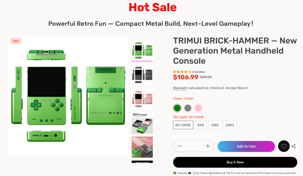
Với hàng tá mã sản phẩm (SKU), nguy cơ là gây ra tình trạng quá tải thông tin trực quan.
Giải pháp thiết kế của chúng tôi:
Cách tiếp cận này giúp trang chủ dễ dàng quét qua mà vẫn thể hiện được sự đa dạng.
Phong cách retro có thể nhanh chóng trở nên rối mắt hoặc khó nhìn.
Giải pháp thiết kế của chúng tôi:
Kết quả mang đậm dấu ấn của quá khứ, nhưng rõ ràng được xây dựng dành cho người dùng hiện đại.
Một phần đáng kể lưu lượng truy cập của ToRetro đến từ người dùng thiết bị di động.
Các yếu tố chúng tôi cân nhắc trong quá trình thiết kế bao gồm:
Mọi phần đều được xem xét từ góc độ trực quan ưu tiên thiết bị di động để đảm bảo sự rõ nét trên màn hình nhỏ.
Sau khi triển khai hệ thống thiết kế mới, cửa hàng trực tuyến ToRetro đã đạt được một số kết quả quan trọng:
Quan trọng nhất, trang web giờ đây mang lại cảm giác thống nhất — mỗi trang và mỗi phần đều sử dụng cùng một ngôn ngữ hình ảnh.
Chúng tôi tin rằng thiết kế Shopify tuyệt vời không nằm ở mã tùy chỉnh hay quá trình phát triển phức tạp. Mà nằm ở:
Dự án này chứng minh rằng chỉ riêng thiết kế chu đáo cũng có thể nâng tầm trải nghiệm thương mại điện tử và hỗ trợ các mục tiêu kinh doanh thực sự.
Cái ToRetro Shopify Trang web này là một ví dụ rõ ràng về cách thiết kế chiến lược có thể biến một cửa hàng tập trung vào sản phẩm thành một trải nghiệm thương hiệu đáng nhớ. Bằng cách tập trung vào logic bố cục, kể chuyện bằng hình ảnh và cấu trúc hướng đến người dùng, chúng tôi đã giúp tạo ra một cửa hàng trực tuyến thu hút, đáng tin cậy và sẵn sàng phát triển.
Cách tiếp cận này phản ánh cách chúng tôi giúp các thương hiệu biến Shopify không chỉ đơn thuần là một nền tảng bán hàng mà còn trở thành một phần mở rộng trực quan cho bản sắc của họ.
Cốt lõi của dự án này là triết lý tương tự mà chúng tôi áp dụng vào tất cả các công việc của mình tại [tên công ty]. AIRSANGThiết kế không chỉ cần đẹp mắt, mà còn phải đóng vai trò quan trọng trong việc quảng bá thương hiệu.