Giới thiệu
In today’s competitive eCommerce landscape, design is no longer just about aesthetics—it’s about creating a seamless, emotionally engaging shopping journey that builds trust and drives conversions. A well-designed Shopify website can transform a brand from a simple online store into a powerful storytelling platform.
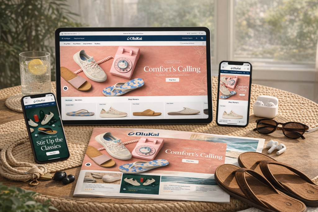
This case study explores how we approached the design of a Shopify website inspired by OluKai, focusing on crafting a premium, conversion-driven experience. While the homepage plays a central role, we also extended the design language across product pages, collection layouts, and supporting content sections to ensure consistency and brand cohesion.
| Thời gian giao hàng | Loại | Nền tảng ứng dụng |
| 21days | footwear | shopify |
| Các nhà thiết kế tham gia | Trị giá | Tác dụng |
| Lin Zhang | $2300 | Store traffic📈206% |
Understanding the Brand Vision
Building a Lifestyle-Driven Experience
OluKai is more than a footwear brand—it represents a lifestyle rooted in comfort, craftsmanship, and Hawaiian culture. Our design approach began with a simple question:
How do we translate a physical lifestyle into a digital experience?
To answer this, we focused on three key pillars:
- Emotional storytelling
- Clean, premium visual design
- Effortless user experience
Defining the Design Direction
We positioned the overall design direction around:
- Natural tones and textures to reflect island heritage
- Minimalist layouts to emphasize product quality
- Immersive imagery to create emotional resonance
This foundation guided every design decision across the site.
Quy trình thiết kế Shopify của chúng tôi
Research and Competitive Analysis
Before starting any visual work, we conducted research on:
- High-performing Shopify lifestyle brands
- Footwear and apparel UX trends
- Conversion-focused design patterns
This allowed us to identify what works—and more importantly, what feels authentic.
Wireframing and Structure Planning
We created a structured layout for:
- Luồng kể chuyện trên trang chủ
- Product discovery pathways
- Conversion touchpoints
Our goal was to ensure users could:
- Nhanh chóng hiểu rõ về thương hiệu
- Explore products effortlessly
- Make purchase decisions confidently
Visual Design Execution
Once the structure was finalized, we moved into visual design, focusing on:
- Thứ bậc kiểu chữ
- Image composition
- White space balance
- Section rhythm
Every section was designed to feel intentional, not crowded.
Chiến lược thiết kế trang chủ
Hero Section: First Impression Matters

The homepage begins with a full-width hero section designed to immediately communicate:
- Nhận diện thương hiệu
- Product category
- Lifestyle positioning
Key design elements include:
- High-resolution lifestyle imagery
- Minimal text overlays
- Clear call-to-action buttons
This creates a strong emotional hook within the first few seconds.
Storytelling Through Sections
Instead of overwhelming users with products, we structured the homepage as a narrative:
1. Brand Story Block

We introduced a short, visually rich section that communicates:
- Heritage
- Craftsmanship
- Brand philosophy
2. Featured Collections

We used grid-based layouts with consistent spacing to highlight:
- Best-selling categories
- Seasonal collections
3. Lifestyle Integration

Large visual sections show products in real-life scenarios, helping users imagine ownership.
Conversion-Focused Design
To improve conversion rates, we incorporated:
- Clear CTAs (“Shop Men,” “Shop Women”)
- Trust-building visuals
- Clean navigation
We avoided aggressive sales tactics and instead focused on subtle persuasion through design.
Phương pháp thiết kế trang sản phẩm
Clean and Focused Layout
Product pages are where conversions happen. Our design ensures:
- The product remains the focal point
- Information is easy to scan
- The purchase process feels intuitive
Các yếu tố chính bao gồm:
- Hình ảnh sản phẩm lớn
- Clear pricing and variant selection
- Minimal distractions
Visual Hierarchy for Decision-Making
We structured the page to guide users naturally:
- Product image
- Product name and price
- Key benefits
- Call-to-action
- Supporting details
This hierarchy reduces friction and improves clarity.
Trust and Credibility

We integrated trust elements such as:
- Customer reviews
- Lifestyle imagery
- Material and craftsmanship details
These elements help users feel confident in their purchase.
Thiết kế trang bộ sưu tập
Simplified Navigation
Collection pages were designed to:
- Display products clearly
- Allow easy filtering
- Duy trì tính nhất quán về mặt hình ảnh
Chúng tôi đã sử dụng:
- Uniform product cards
- Khoảng cách cân bằng
- Clean typography
Enhancing Product Discovery
To improve browsing experience, we included:
- Hover effects for product previews
- Quick visual comparisons
- Clear product categorization
This encourages users to explore more products without feeling overwhelmed.
Supporting Pages Design
About Page: Strengthening Brand Identity
The About page focuses on storytelling rather than selling. Design elements include:
- Timeline-style layouts
- Full-width imagery
- Short, impactful text blocks
Content Pages: Education and Engagement
We designed supporting pages to:
- Educate users about the brand
- Provide styling inspiration
- Reinforce brand values
Consistency across these pages ensures a cohesive experience.
Những thách thức chúng tôi đã gặp phải
Balancing Simplicity and Information
One of the biggest challenges was:
Providing enough information without cluttering the design
Maintaining Brand Authenticity
We needed to ensure:
- The design felt premium
- The brand story remained genuine
- The visuals aligned with lifestyle positioning
Giải pháp thiết kế của chúng tôi
Strategic Use of White Space
We used white space to:
- Improve readability
- Highlight key elements
- Create a premium feel
Modular Section Design
We built flexible design sections that:
- Adapt across pages
- Maintain consistency
- Support scalability
Visual Consistency
We ensured consistency in:
- Phông chữ
- Màu sắc
- Image styles
- Khoảng cách
This creates a unified brand experience across the entire site.
Advantages of Our Shopify Design Approach
Conversion-Driven Without Being Aggressive
Our design focuses on:
- Guiding users naturally
- Building trust
- Encouraging exploration
Scalable and Flexible Design System
The design can easily:
- Support new collections
- Adapt to seasonal campaigns
- Expand with the business
Strong Brand Alignment
Every design element reflects:
- Nhận diện thương hiệu
- Target audience preferences
- Market positioning
Kết quả cuối cùng
After implementing the design strategy, the website achieved:
- A more premium and cohesive visual identity
- Tăng cường sự tương tác của người dùng
- Câu chuyện thương hiệu mạnh mẽ hơn
- Enhanced shopping experience
Most importantly, the design created a connection between the brand and its audience, which is essential for long-term growth.
Phần kết luận
Design is the foundation of a successful Shopify website. It shapes how users perceive a brand, interact with products, and ultimately make purchasing decisions.
By focusing on storytelling, clarity, and user experience, we transformed a standard eCommerce structure into a refined, high-converting digital experience inspired by OluKai.
At the end of the day, great design is not just about how a website looks—it’s about how it works, how it feels, and how it converts.
If you’re looking to elevate your Shopify store with a design that truly reflects your brand and drives results, this is exactly where AIRSANG brings value—helping businesses turn ideas into visually compelling, conversion-focused online experiences.