


Giỏ hàng hiện không có sản phẩm nào.

Stone Harbor Hardware’s Shopify website is designed as a complete conversion ecosystem where visual storytelling, structured information, and trust-building elements work together seamlessly. As designers, we approached this project with one core goal: transform a traditionally technical product category—door hardware—into an emotionally engaging, highly intuitive, and conversion-driven digital experience.
Instead of presenting products in a purely functional catalog format, we restructured the entire journey into a layered narrative: inspiration → discovery → evaluation → trust → purchase. Every section is intentionally designed to reduce friction, increase clarity, and elevate perceived product value.
This article breaks down the full homepage and product experience in sequential order, explaining why each section is designed the way it is and how it contributes to user behavior, engagement, and conversion performance.
| Thời gian giao hàng | Loại | Loại trang web |
| 23 ngày | Hardware Accessories | shopify |
| Các nhà thiết kế tham gia | Trị giá | Tác dụng |
| Nancy | $2100 | Sales📈277% |

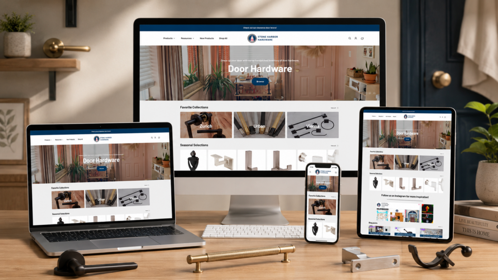
The homepage begins with a full-bleed hero section featuring a warm, residential environment. This is not accidental—it is a strategic decision to immediately reposition door hardware from an industrial product into a lifestyle upgrade.
We avoid technical imagery at this stage because users do not yet care about specifications. Instead, we prioritize emotional association: home comfort, design quality, and everyday usability.
We use centered headline placement (“Door Hardware”) to ensure immediate readability across devices. The hierarchy is deliberately minimal:
This reduces decision fatigue and ensures users take a single, clear action rather than being overwhelmed by multiple options.
By removing unnecessary UI distractions, we guide users into a controlled exploration path. The hero section acts as a “soft entry point” into the site, not a sales-heavy banner.
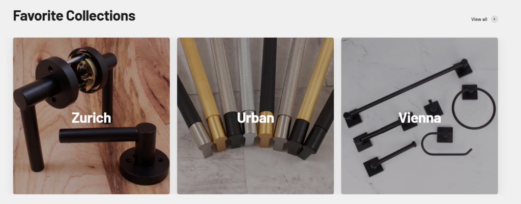
Instead of traditional product categories, we created curated design identities:
This transformation is intentional. Users do not emotionally connect with “hardware categories,” but they do connect with design styles and aesthetic narratives.
We use a three-column balanced layout to create visual equality between collections. This ensures that no single style dominates, encouraging users to choose based on preference rather than hierarchy.
Each card functions like a design magazine cover, where:
This section shifts user thinking from:
“What product do I need?”
ĐẾN:
“What style do I want my home to express?”
This is a critical conversion strategy in premium hardware positioning.
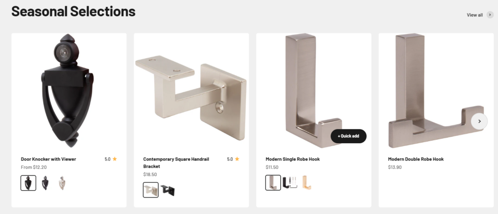
The Seasonal Selections section introduces temporal context into product browsing. Instead of static catalogs, we align products with seasonal use cases and lifestyle timing.
This increases urgency and relevance without aggressive marketing language.
Each product card is designed with:
This structure reduces friction between discovery and purchase.
We use generous spacing to prevent visual overload. This ensures users can compare multiple products quickly without fatigue, which is essential for technical product categories.
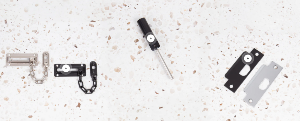
Instead of standard catalog layouts, we introduce a top-down editorial composition where products are arranged like a curated design board.
This approach transforms hardware from “commodity items” into “design objects.”
We intentionally use textured backgrounds such as terrazzo surfaces to:
Each product becomes visually distinct while still belonging to a unified system.
The “+” markers introduce subtle interactivity, suggesting expandable product detail layers. This increases engagement without disrupting visual simplicity.
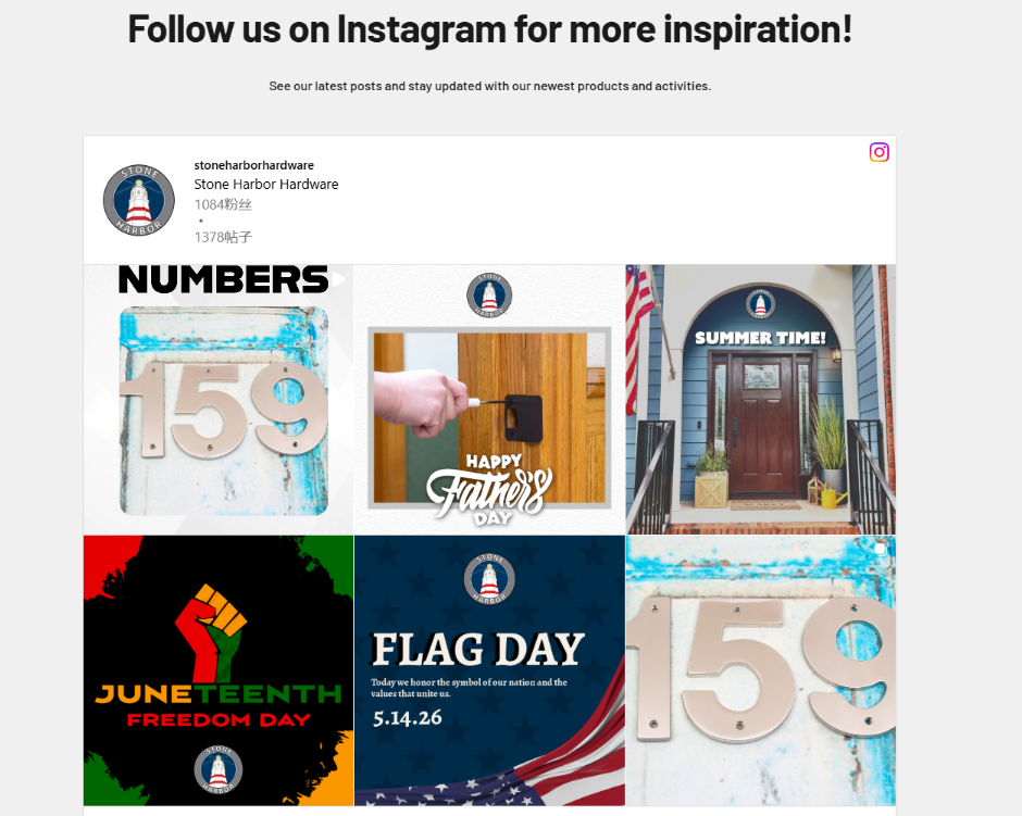
We embed Instagram content to extend brand presence beyond the website. This section demonstrates how products exist in real-world environments, not just studio photography.
Content includes:
This reinforces trust through lived experience rather than advertising claims.
We replicate Instagram’s grid behavior to reduce learning friction. Users instantly understand how to navigate this section because it mirrors an already familiar platform.
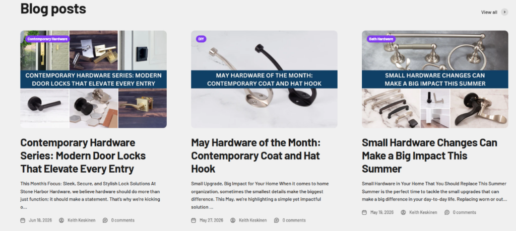
Instead of a hidden blog archive, we elevate content into a visually dominant grid system.
This positions the brand as an authority in design and hardware knowledge.
Each blog card includes:
This structure balances SEO needs with readability and engagement.
Educational content reduces purchase hesitation by:
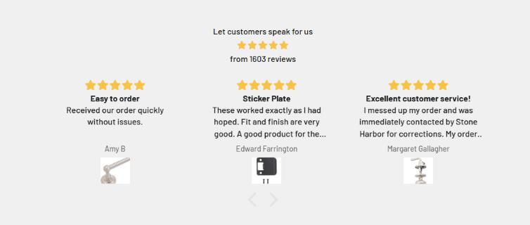
We place reviews prominently to serve as a psychological validation layer during decision-making.
The section includes:
This combination builds both emotional and statistical trust.
The review slider allows users to explore multiple experiences without overwhelming the page structure.
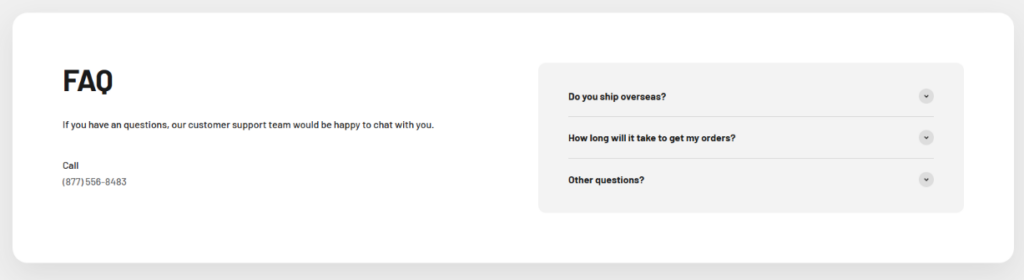
We split the section into:
This ensures both immediate and self-service support options are visible.
We use collapsible questions to keep the layout compact while still providing detailed answers on demand.
Questions are written based on real user concerns:
This reduces uncertainty at the final decision stage.
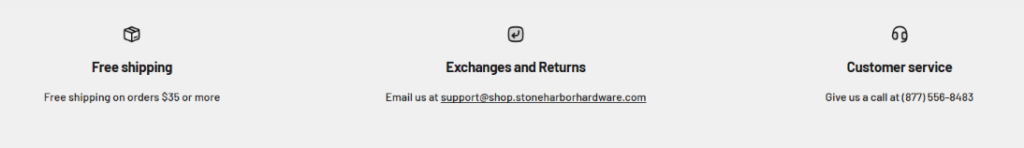
We surface key service guarantees before the footer to reinforce purchase confidence.
Each pillar is equally weighted to avoid perceived hierarchy.
We intentionally keep the design simple to emphasize clarity over decoration.
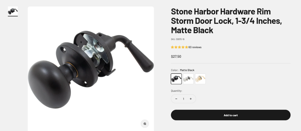
The product page uses a two-column structure:
This ensures immediate visual understanding and actionable clarity.
We structure content in layers:
This aligns with natural decision-making behavior.
Reviews are placed mid-page to influence decision-making before final purchase action.
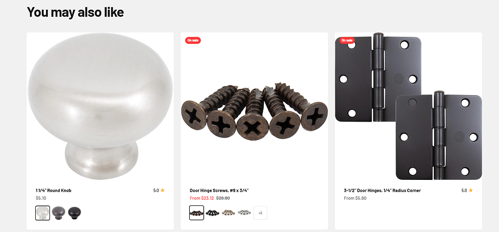
“You may also like” is not random—it is carefully curated based on:
Maintaining similar aesthetics ensures users stay within the same design ecosystem, increasing basket size probability.
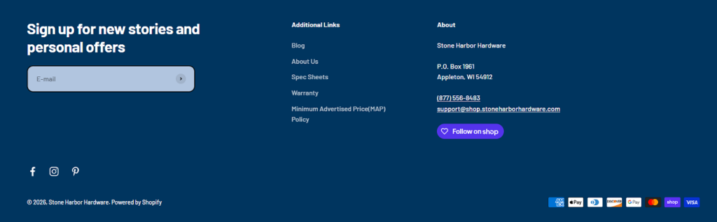
The footer provides:
We ensure users leave the site with full transparency and accessible support channels.
Cái Stone Harbor Hardware Shopify website is designed as a complete behavioral journey system rather than a simple product catalog. Every section is intentionally structured to guide users through emotional engagement, visual discovery, rational evaluation, and final conversion.
As designers, our focus is not only on aesthetics but on how each layout influences decision-making psychology. From lifestyle-driven hero imagery to structured product grids and trust-building modules, the entire experience is engineered to reduce friction and increase confidence at every stage.
This is not just a website—it is a conversion-focused design ecosystem where storytelling and commerce operate as one unified system.


