In the design of the Coupang product detail page of the hollow silicone teether ball, we organized the content around the structure, color matching and usage situation. Through mint green and cream yellow, light home colors, and thin theme words, product identification, local descriptions, and scene information are arranged at different levels, allowing readers to continue to understand the products in a clear order.
| Dịch vụ | Industry | Nền tảng |
|---|---|---|
| Coupang product detail page design | Maternity and baby products | Coupang |
| Project requirements | target market | design style |
| Structure, color matching and usage situations | Korean content display | Mint green and cream yellow, light home colors, thin theme text |
| Project quotation | Delivery content | Delivery time |
| ¥1,500 | Version 1 product product detail page design | not disclosed |
Design challenge: Separate different reading tasks
This set of product detail pages should not only retain the shape recognition of the hollow silicone teether ball, but also accommodate different themes such as structure, color matching and usage scenarios. Instead of letting each picture carry all the information repeatedly, we separated the whole, parts and scenes, and controlled the distance between titles, pictures and descriptions.
Our design strategy
We use mint green and cream yellow, light home colors, and thin theme characters to establish a continuous visual language so that the subject can be clearly identified from the background. The title uses an obvious font size and weight hierarchy, and the supplementary description is relegated to the next level to avoid decoration, photos and text competing for attention at the same time.
In terms of content organization, we divide chapters according to the themes of real works: use larger pictures to establish overall relationships, use parts and diagrams to explain details, and then use bounded text areas or lists to organize supplementary information. Long pages create pauses through color blocks, cards, and white space between groups, and chapter switches can also be identified during continuous reading.
Opening display: using natural light to connect products and packaging
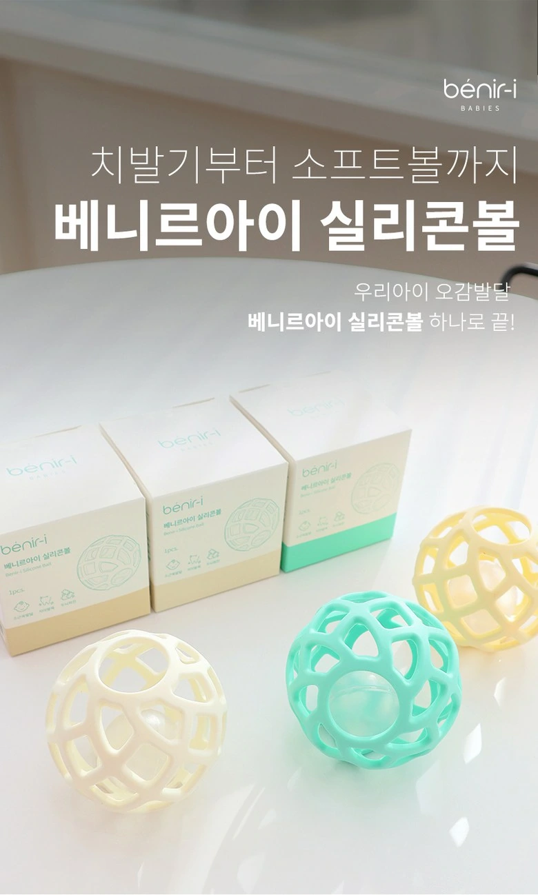
We put the spheres of three colors in the same frame as the packaging, and the sunlight and shadows form soft layers. The title is placed in the deeper upper area, leaving plenty of white space around the main body.
Question Index: Put text into separate cards
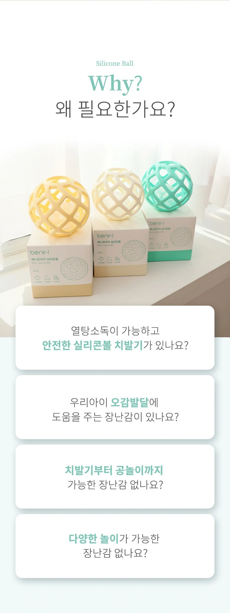
We put the product photo in the upper part, and the four light-colored cards below are arranged one by one. Uniform margins and rounded corners give long text a clear boundary, and mint green provides light emphasis.
Life theme: vertical connection between words and objects
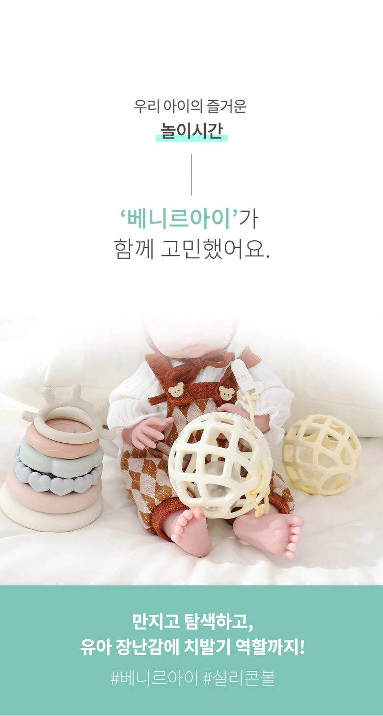
We left the theme text in the upper half of the space, concentrated the toy set at the bottom, and the green band at the bottom wrapped up the information. Images and text are in separate layers, so there is no need for dense leads.
Home screen: close-ups of products and the environment complement each other
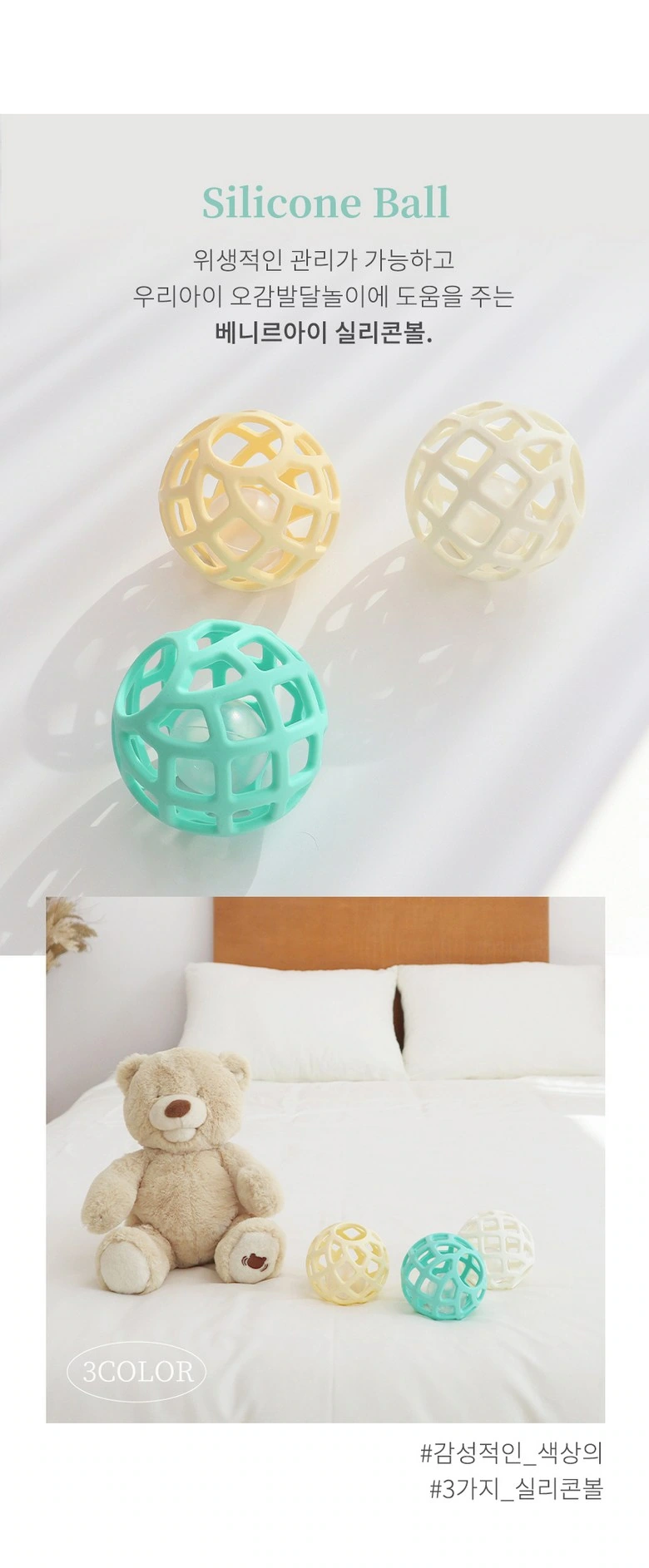
We use a close-up shot of a sphere to connect the bedroom scene, keeping the upper and lower photos at different scales. The thin theme text and the large shallow background maintain a soft and light reading feeling.
Icon Index: Arrange multiple topics around a center
We distribute five mint-colored round icons along the dotted structure, with the brand name in the middle. Keep icon sizes consistent to give multiple instructions a common visual hierarchy.
Combination situation: the ball and the connecting ring are in the frame together
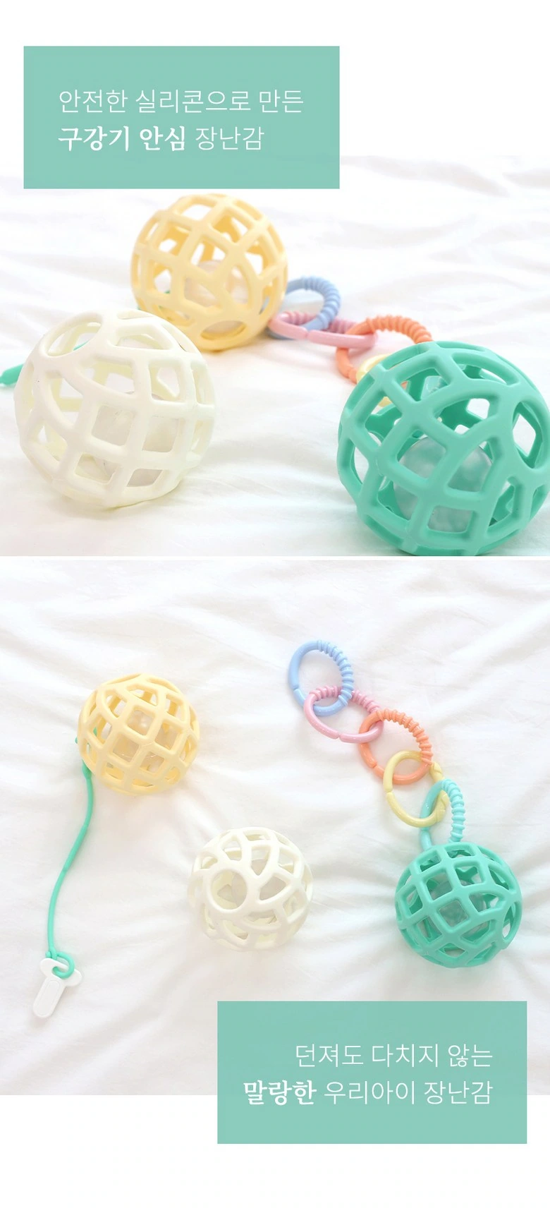
We use two photos to show the combination of spheres and accessories, with a short green title bar misaligned with the photos. White space separates adjacent situations so that connections can be clearly observed.
Material theme: graphics and still life occupy one layer each
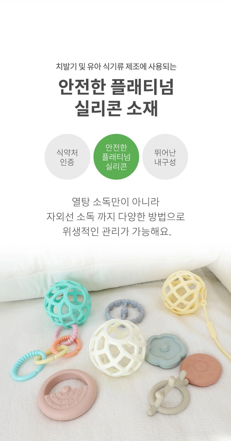
We organize the theme with a circular information area at the top, and display spheres and accessories below. The light-colored background, mint embellishments, and light-heavy text remain unified, and do not overlay instructions on complex objects.
Nursing Theme: Icon Grid Keeps Clear Boundaries
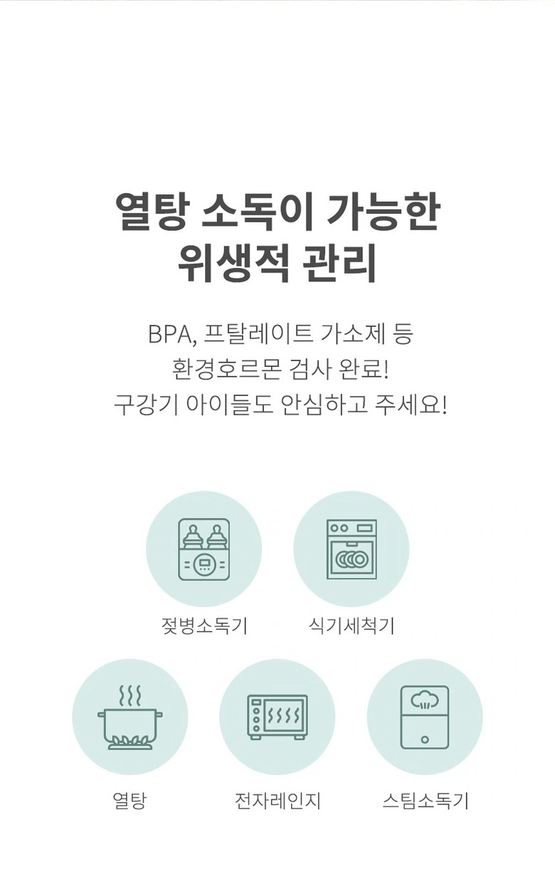
We arranged multiple care icons in a grid, with the text above divided into a title and a short description. The same icon size and white space allow this page to be scanned item by item.
Contrast information: organize content in a two-column framework
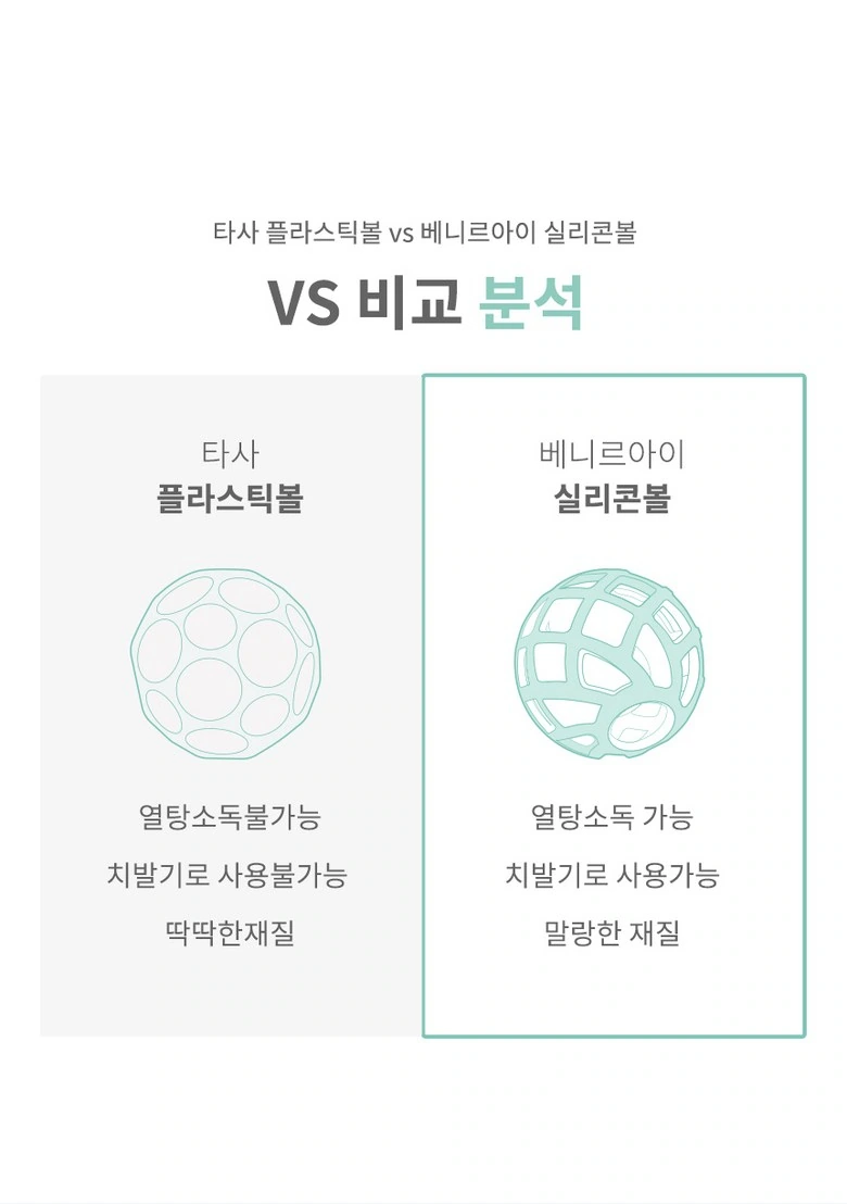
We used the left and right columns for line drawings and short text, and the right column was emphasized with a mint border. Alignment relationships and sibling font sizes provide a clear order for comparing topics.
Four situations: circular photos form a common rhythm
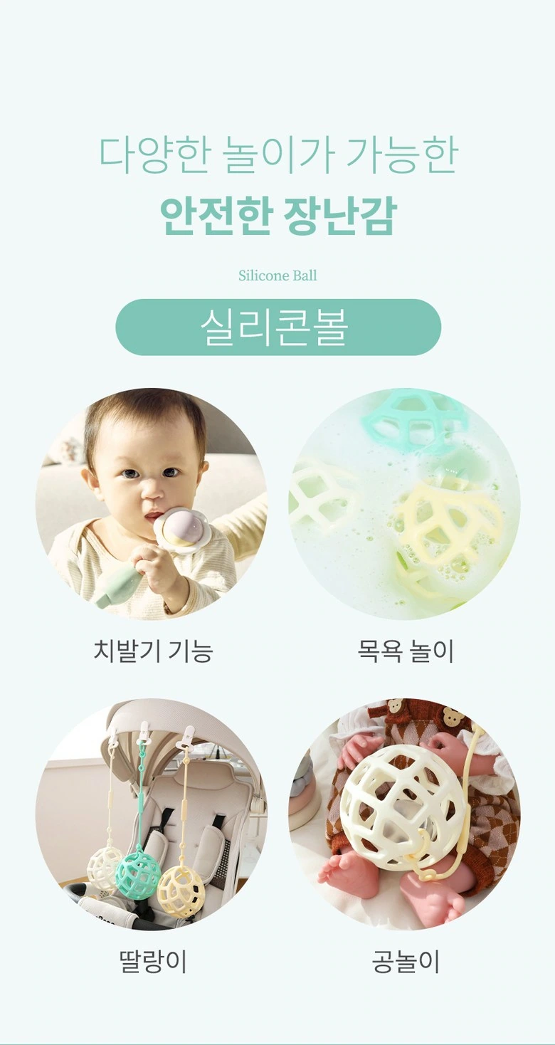
We put the different application themes into four circular windows with the titles at the top. The circular frame uniformly cuts the boundaries, which not only preserves the relationship between characters or objects, but also controls the density of the picture.
Hand details: character and scene connected circular zoom
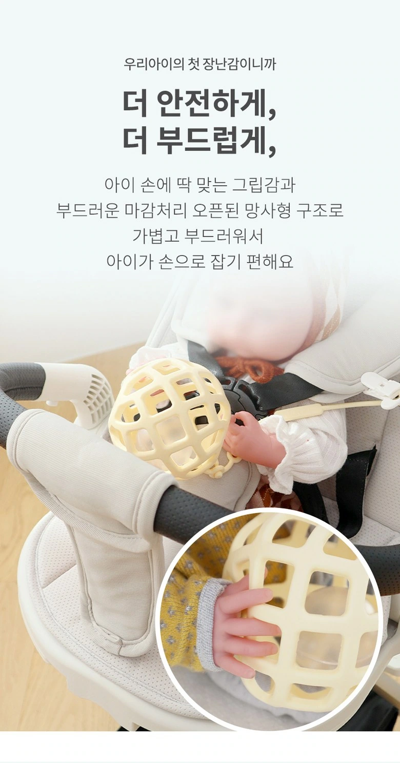
We put the baby and the sphere on the same screen, and the circular close-up view below supplements the grasping part. The text expands in the blank space above, while the outlines of the characters and products remain intact.
Gift display: display packaging and color matching
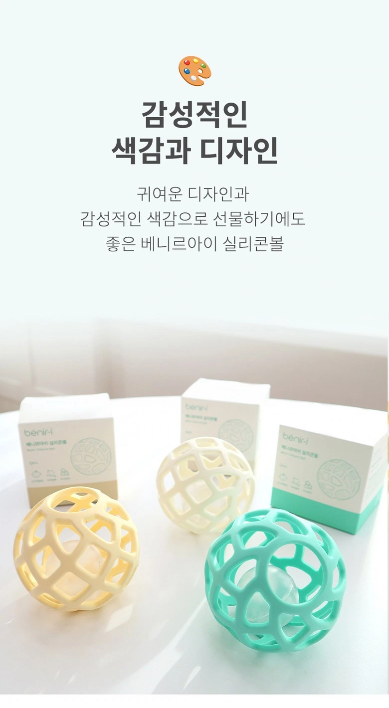
We placed the three-color products and cartons on a soft background, with titles and decorative graphics concentrated on the upper part. The packaging ribbon echoes the color of the sphere, making series identification more coherent.
Changes in color matching: two sets of photos form an upper and lower comparison
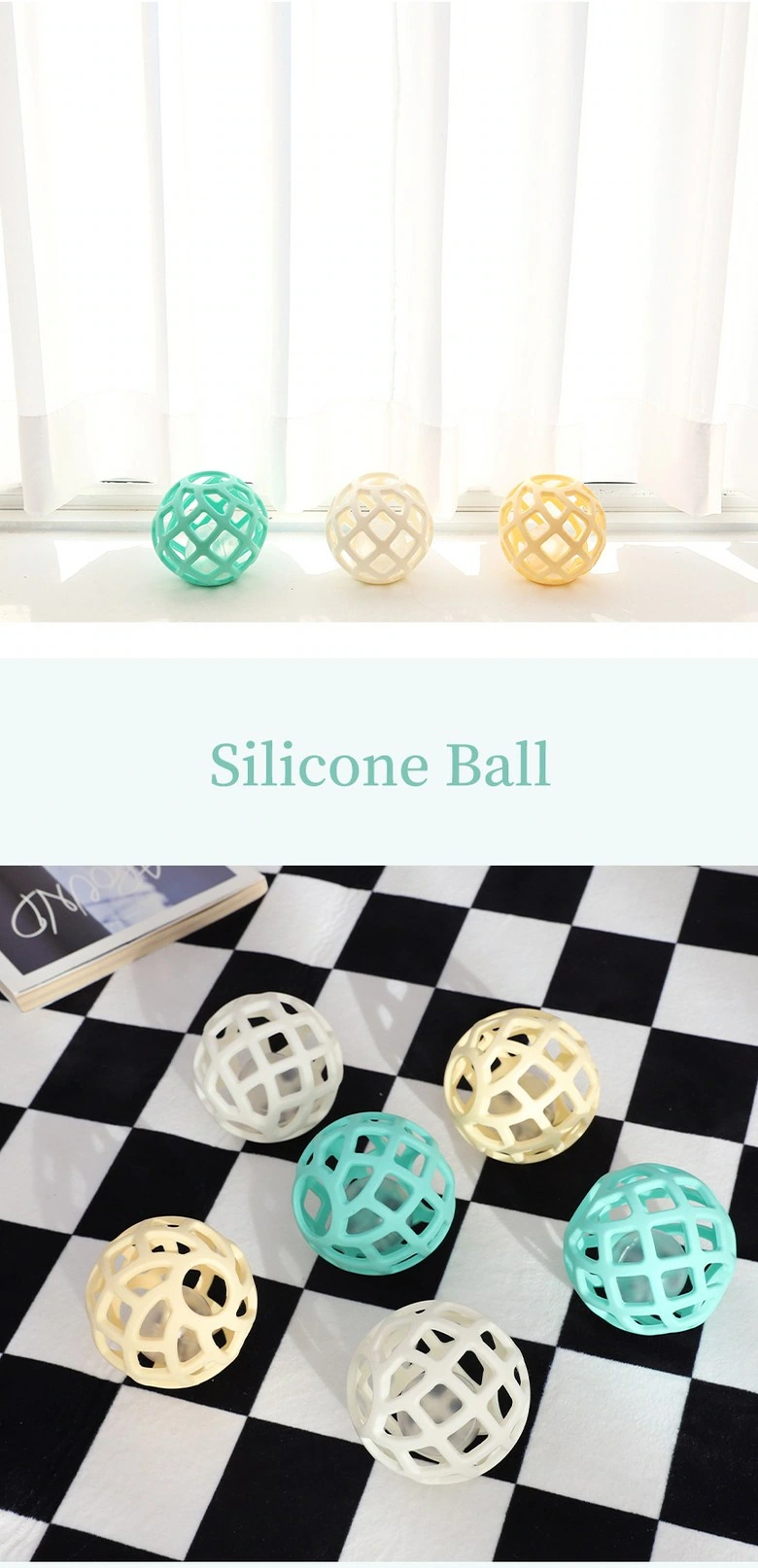
We use light-colored window edges and black and white checkered backgrounds to display the spheres, connected by short titles in the middle. The different environments remain unified through common product colors.
Series list: colors and packaging are divided into areas
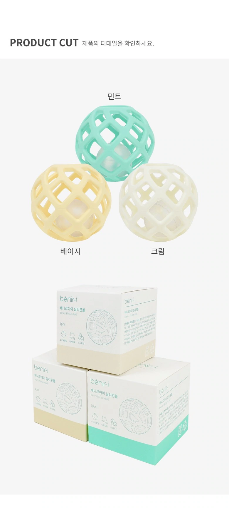
We arrange the three types of spheres above, with the corresponding packaging shown below, with the name next to the object. Regular spacing allows the series pages to bear clear selection responsibilities.
Dimensional information: label the sphere and carton in layers
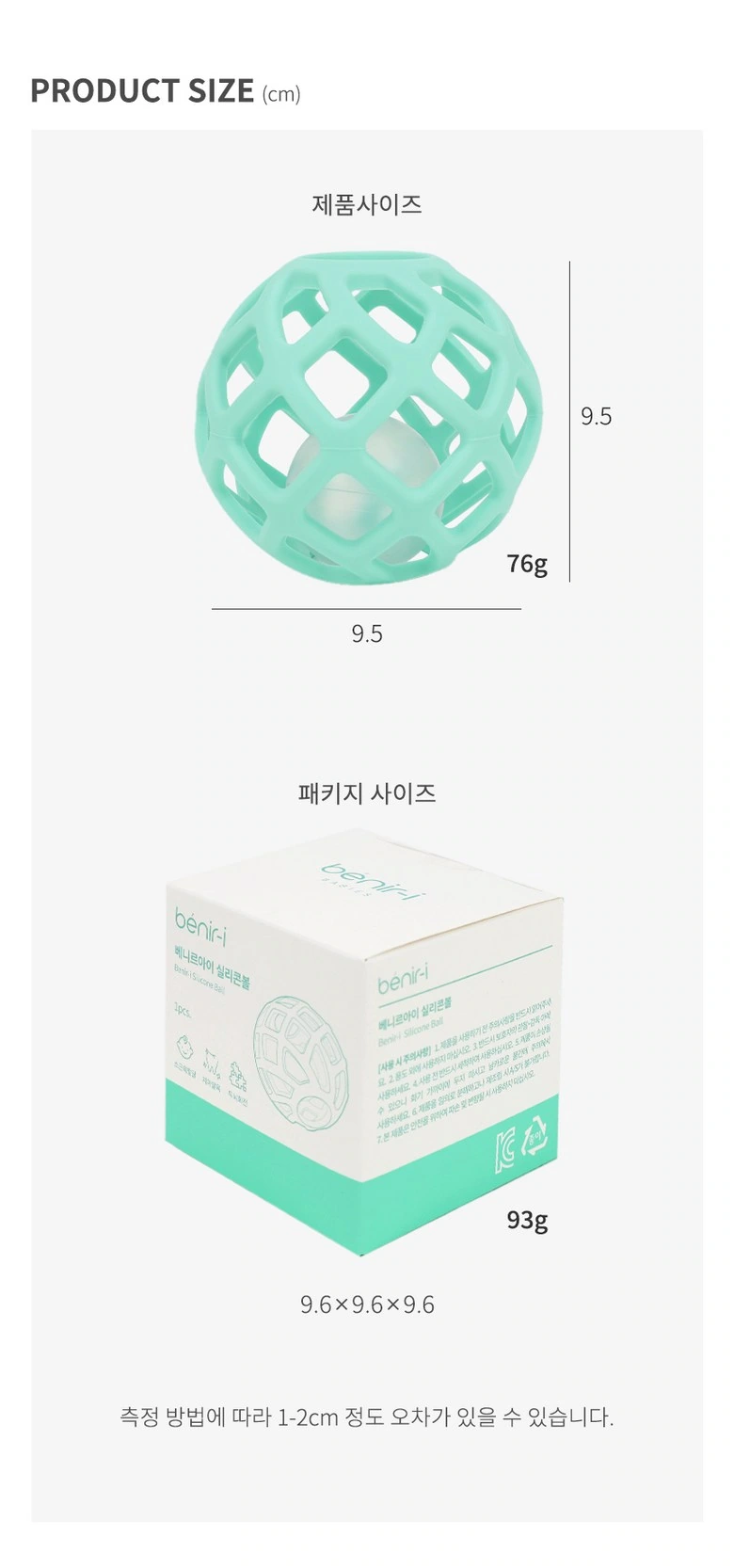
We mark the width and height of the sphere and the packaging respectively, and place the explanatory text in the light-colored area. Thin lines and white space work together to protect the outline and make size information easy to find.
Deliver and design value
Through this version of the product detail page, we establish a continuous reading path around structure, color matching, and usage scenarios. Mint green and cream yellow, light home colors, and thin theme words connect different chapters. The image scale, text level, and white space jointly distinguish the priorities, allowing the product overview and local descriptions to complement each other.
Develop a clear Coupang visual expression for your product
You can provide us with product links, existing materials, and key points that need clarification. We will combine the product structure, style and usage scenarios to plan the appropriate picture group or product detail page content and layout.