Around the square wireless lavalier microphone, we organized the plug-in scenarios and device details into a set of English product pictures. The entire set of works adopts the visual language of black and yellow body, blue and gray background, and partitioned step diagrams. Through the division of labor in different pictures, the product appearance, local information and usage scenarios are gradually presented.
| Dịch vụ | Industry | Nền tảng |
|---|---|---|
| Amazon primary and secondary product images design | Digital 3C | Amazon |
| Project requirements | target market | design style |
| Plug-in scenarios and device details | English content display | Black and yellow body, blue and gray background, partition step diagram |
| Project quotation | Delivery content | Delivery time |
| ¥600 | 8 product primary and secondary product images | 4 days |
Design Challenge: Let different information have its place
This one features a square transmitter that’s as much about showcasing equipment lists as it is about interviews, live broadcasts, and outdoor shooting situations. We kept the main visual and connecting steps separate from the technical topics, establishing a sequence from identifying the device to understanding the scene.
Our design strategy
Use black and yellow equipment with a blue and gray background to continue the clear temperament of digital products.
The operation page uses short steps, the scene page uses character relationships, and the detail page uses close shots and graphics.
Overview of the assembly: identify each component on a white background
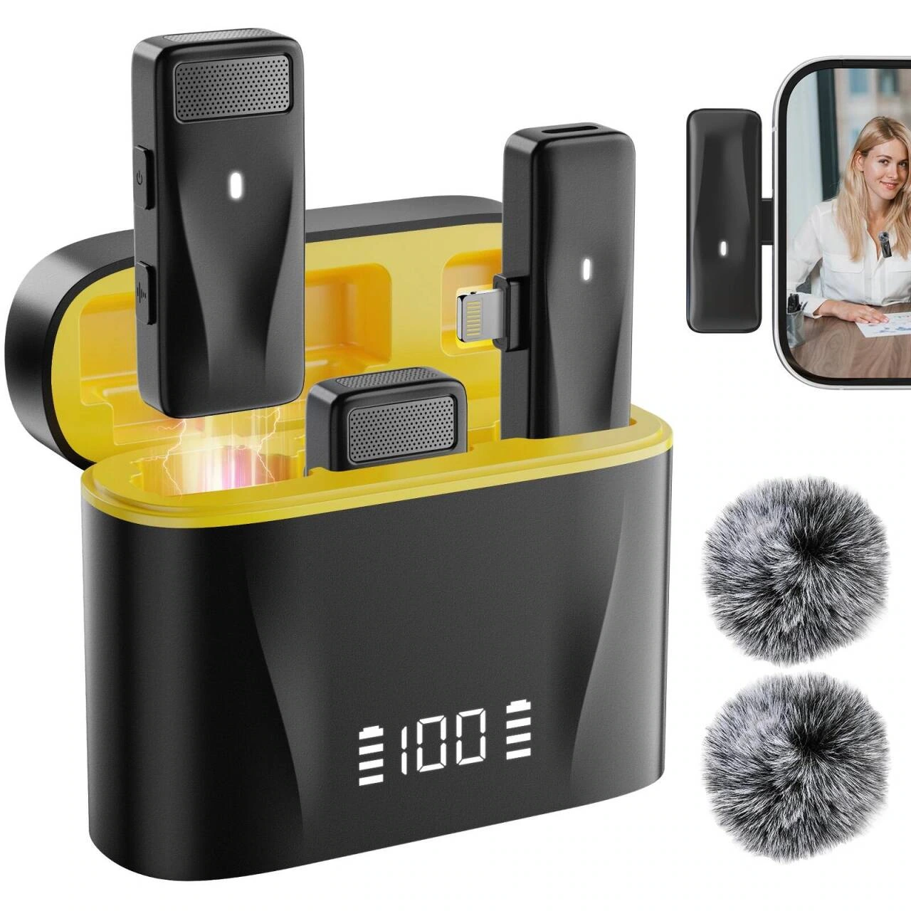
We arranged the charging box, square transmitter, receiver and windproof accessories on a white background, and the mobile phone screen was used as a reference for the application. Objects of different sizes are spaced independently to allow readers to understand the equipment combination first.
Show details: use close-up to highlight the box and interface
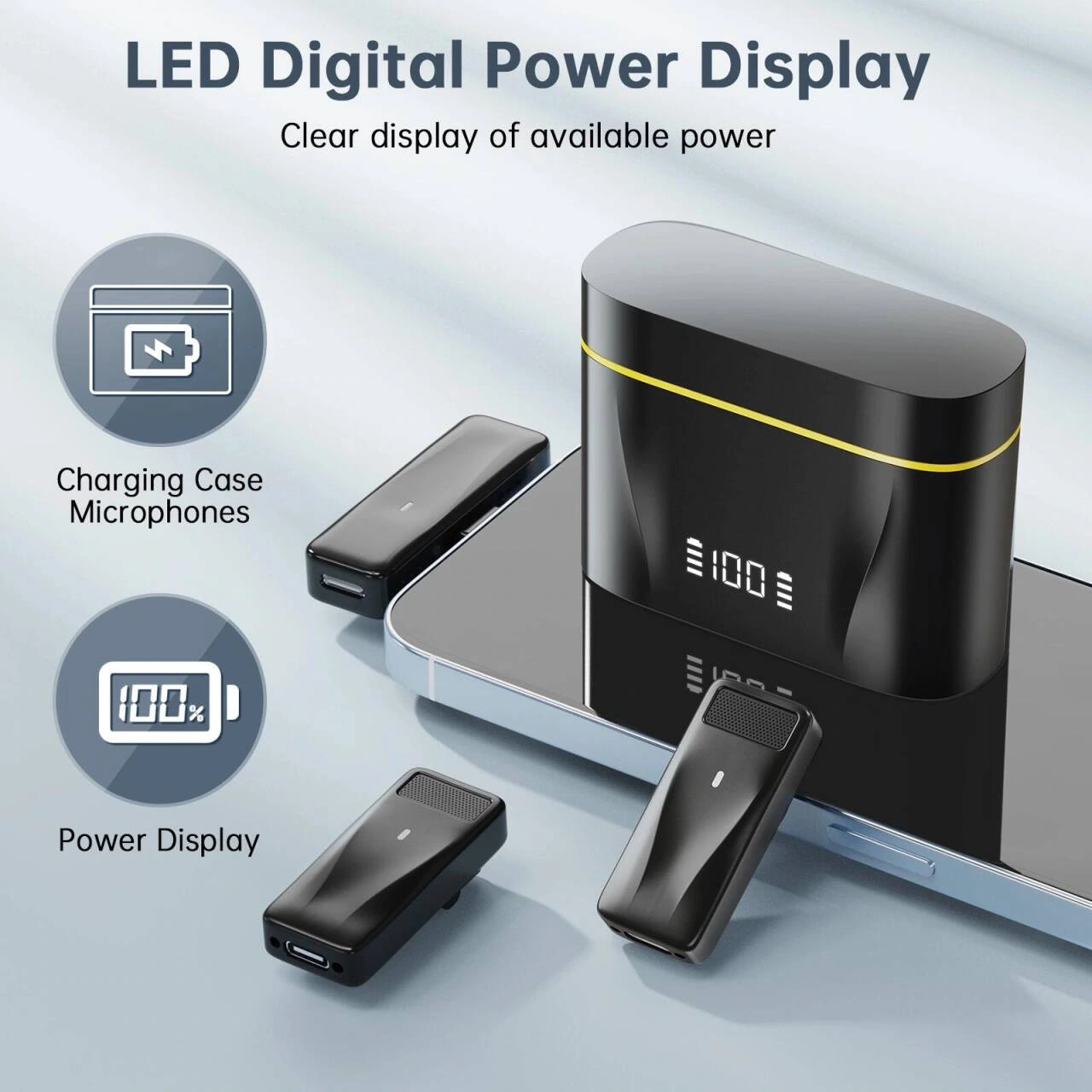
We zoom in on the box display area and microphone details, and the icon descriptions are arranged along the left side. The close-up view and text are separated, and the black body retains a clear outline on the light blue background.
Interview scene: two steps below the photo
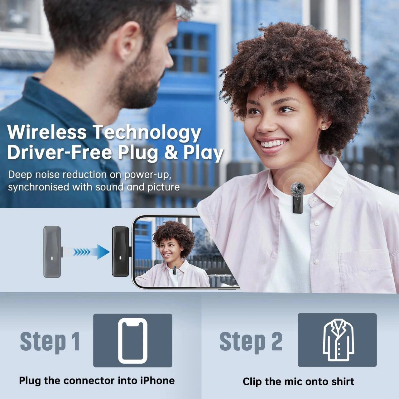
We use photos of two-person interviews to show the radio relationship, and below are the steps for inserting the receiver and wearing the device. The upper and lower layers have a clear division of labor, and the operation thumbnails and character scenes can directly correspond.
Live broadcast situation: Put the mobile phone and the character on the same path
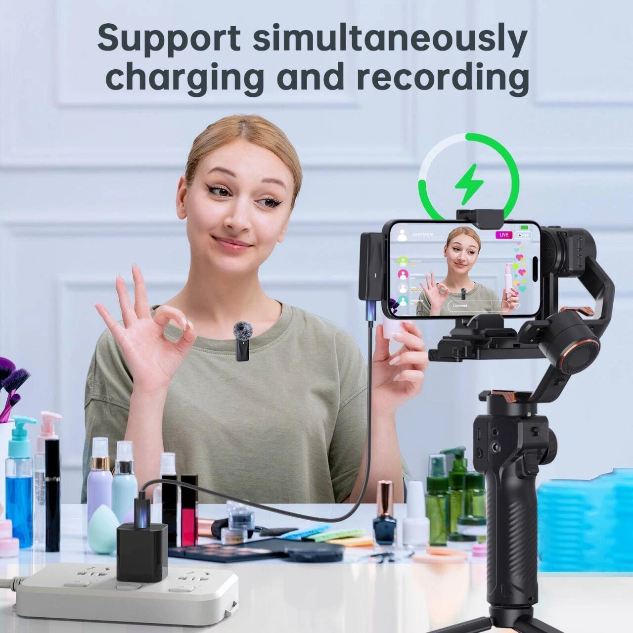
We put the beauty live broadcast character and the mobile phone holder into the same scene, and used arrows to supplement the connection theme. The text is left in a cleaner area of the background to avoid covering the collar equipment and hand movements.
Various shooting: four frames of content maintain a unified rhythm
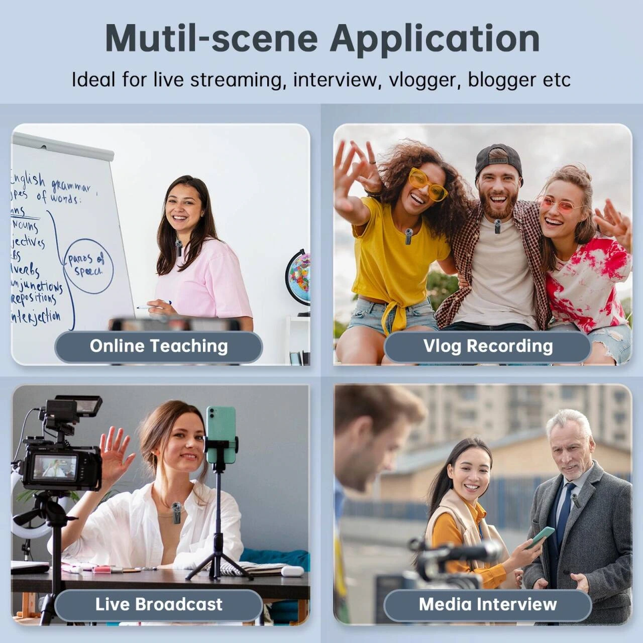
We organize situations such as online courses, short films, and interviews into four grids, and each grid maintains a similar title level. Common margins allow different photos to form a continuous group, and the information will not be scattered when the scene changes.
Audio topic: Chip diagram and waveform layering
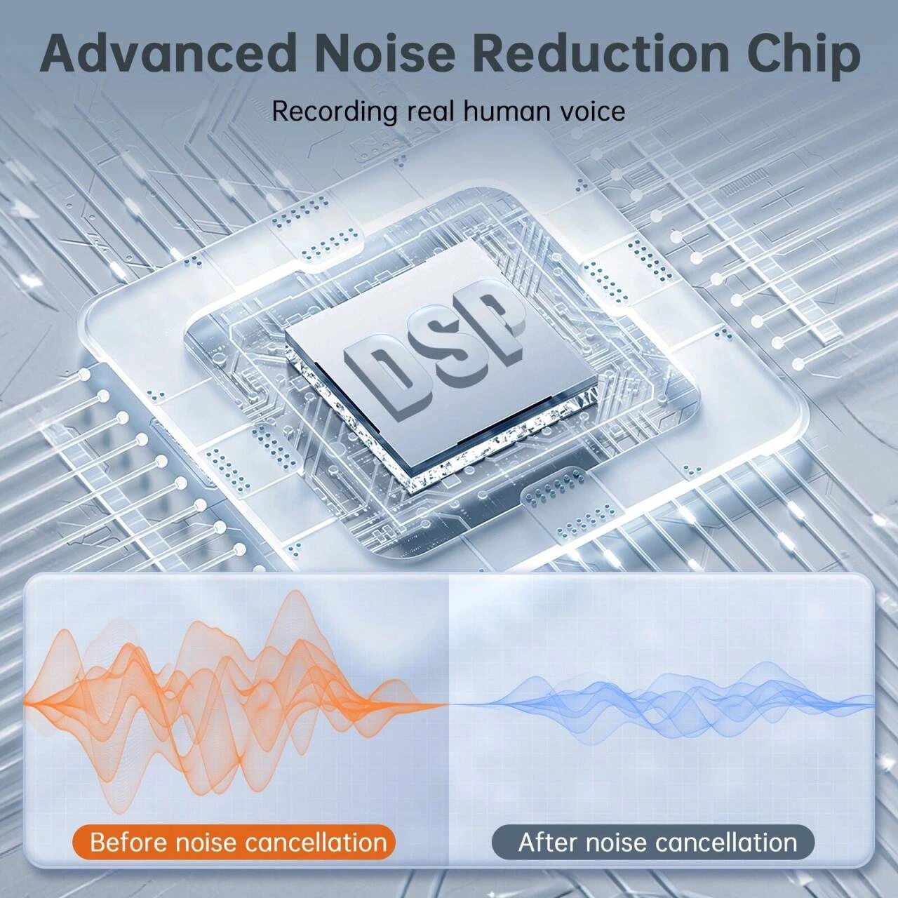
We use the chip graphics as the center of the technical theme, and then place the two sets of waveforms in separate areas. Keep graphics and text clearly spaced so that even abstract information has a traceable reading order.
Outdoor theme: distance graphic connects both ends of the screen
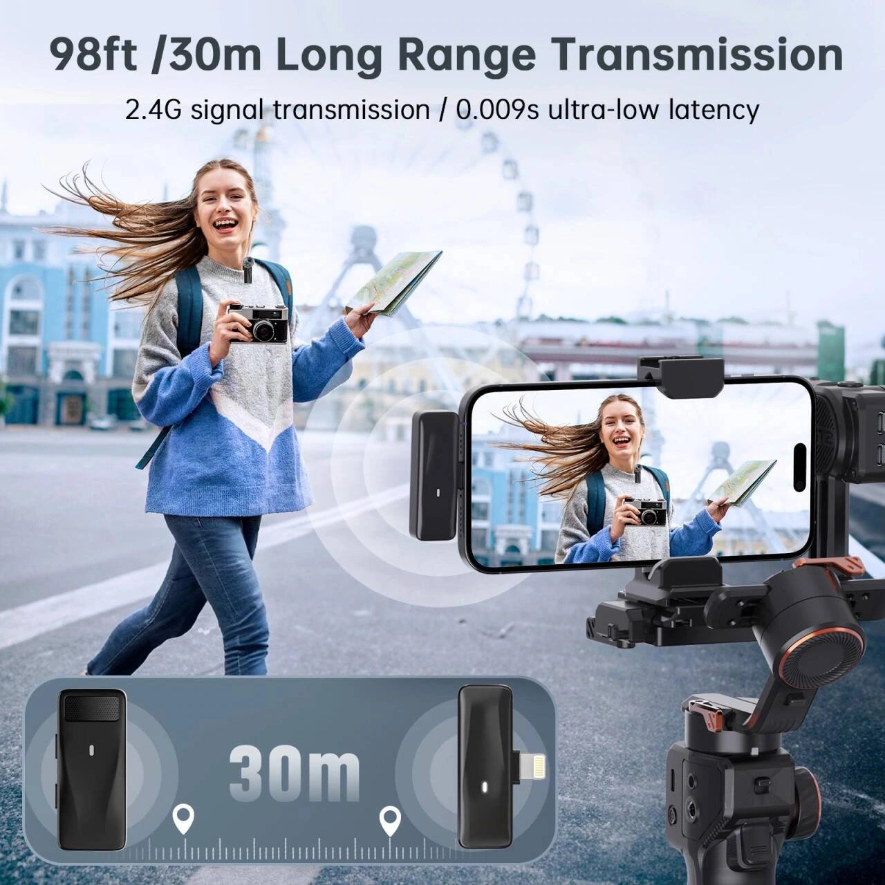
We preserve the relationship between the phone and the characters in outdoor shooting scenes, with distance lines extending along the background. Main titles, lines and photos are layered to avoid annotations covering the action of the shot.
Time information: summarized with three icon blocks
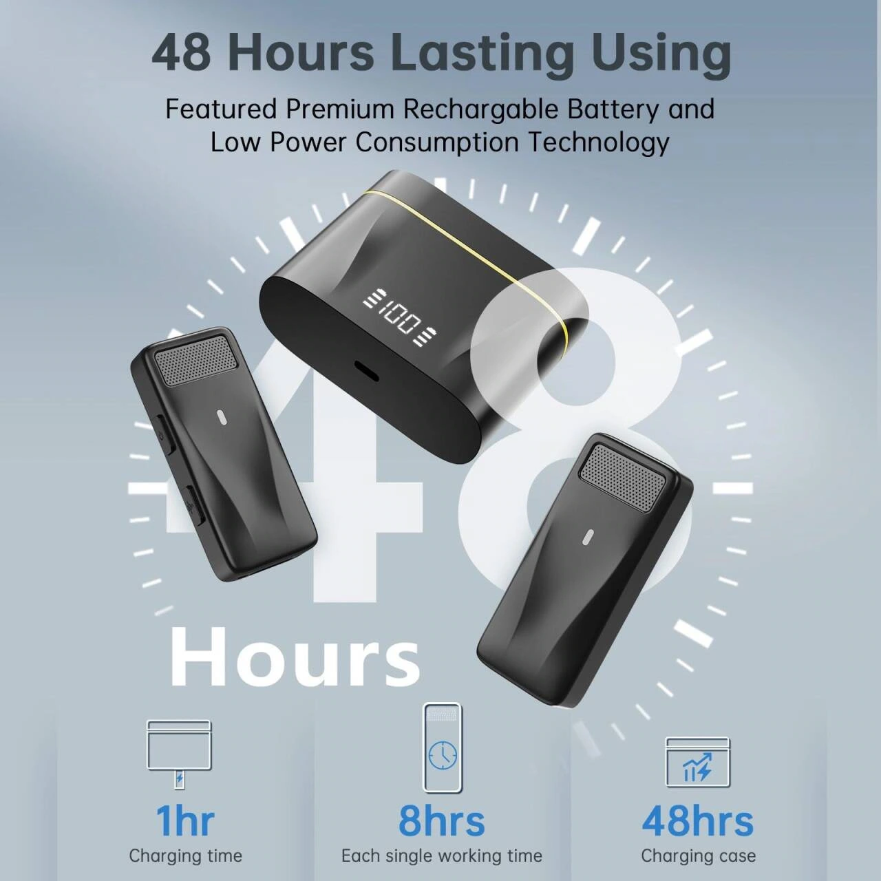
We put the time theme in a larger font size, and the three icon blocks below receive supplementary information. Numbers, icons and devices each have their own space, making this picture and the complex scene pages create a change in reading rhythm.
Deliver and design value
This set of works contains a total of 8 product pictures. We arranged the responsibilities of different pictures around the plug-in scenes and equipment details, and maintained the visual consistency of the entire set with black and yellow body, blue and gray background, and partitioned step pictures. From overall identification to partial explanation, the pictures complement each other, allowing readers to find information based on their own concerns.
Develop a clear visual expression for your products
You can provide us with existing product information, physical photos and key points to be displayed. We will combine the product structure, style differences and usage scenarios to plan image content and layout suitable for Amazon product display.