In the Coupang product detail page design of the cat tumbler interactive toy, we organized the content around the structural disassembly and multi-color series. Through orange and yellow embellishments on a white background, circular paths, and interactive photos of cats, product identification, partial descriptions, and scene information are arranged at different levels, allowing readers to continue to understand the products in a clear sequence.
| Dịch vụ | Industry | Nền tảng |
|---|---|---|
| Coupang product detail page design | pet supplies | Coupang |
| Project requirements | target market | design style |
| Structural dismantling and multi-color series | Korean content display | Orange and yellow embellishments on white background, circular path, interactive photos of cats |
| Project quotation | Delivery content | Delivery time |
| ¥1,300 | Version 1 product product detail page design | not disclosed |
Design challenge: Separate different reading tasks
This set of product detail pages should not only retain the appearance recognition of the cat tumbler interactive toy, but also accommodate different themes such as structural disassembly and multi-color series. Instead of letting each picture carry all the information repeatedly, we separated the whole, parts and scenes, and controlled the distance between titles, pictures and descriptions.
Our design strategy
We use orange and yellow embellishments on a white background, circular paths, and interactive photos of cats to establish a continuous visual language so that the subject can be clearly identified from the background. The title uses an obvious font size and weight hierarchy, and the supplementary description is relegated to the next level to avoid decoration, photos and text competing for attention at the same time.
In terms of content organization, we divide chapters according to the themes of real works: use larger pictures to establish overall relationships, use parts and diagrams to explain details, and then use bounded text areas or lists to organize supplementary information. Long pages create pauses through color blocks, cards, and white space between groups, and chapter switches can also be identified during continuous reading.
Situational introduction: arrange short themes around cats

We put the cat photo at the bottom and leave the text and bubble graphics at the top. The relaxed graphic tone establishes the atmosphere of the pet category, and the pictures still have clear priorities.
Product opening: main body and four color matching layers
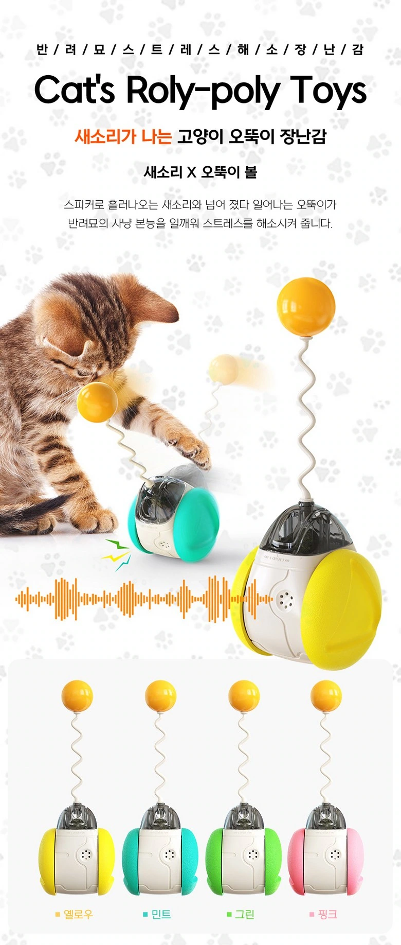
We use cats to establish an interactive relationship with toys, with four colors arranged below. The orange waveform and short title connect the theme, and the products and scenes have clear positions.
Cross-reference structure: Organizing descriptions with two columns and diagrams
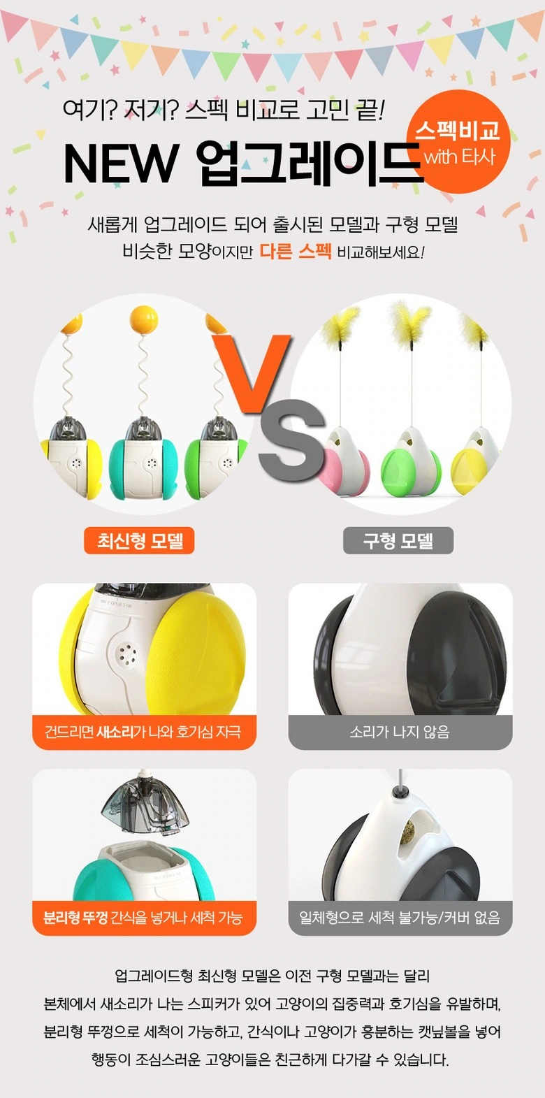
We display the two shapes side by side, with partial images and short logos arranged in rows. The same margins and title levels establish a comparison sequence without relying on complex backgrounds.
Functional Index: Let the six themes unfold along a circular path
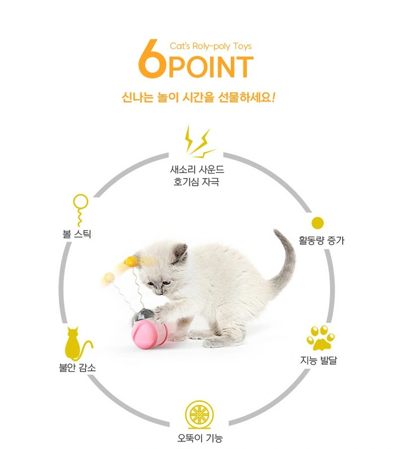
We arrange the icons in a circular path around the main body, with the cat and toys in the center. Keeping topics evenly spaced makes the index both dynamic and scannable.
Structural annotation: Leads close to corresponding components
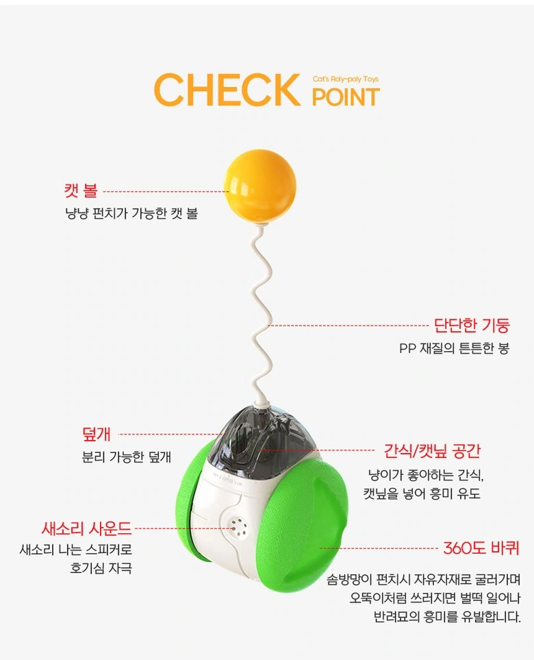
We enlarge the sphere, spring and shell and use wires to lead the short instructions to the outside. Titles and labels use different font sizes, and multiple components can also correspond one by one.
Operation steps: disassembly and assembly diagrams and local instructions are connected up and down.
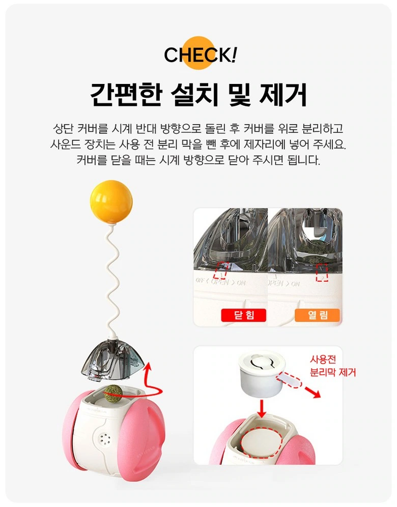
We use partial photos to show the cover body and installation position, and the arrows below supplement the directional relationship. White backgrounds and clear borders control information density and avoid description lines spanning multiple areas.
Interior spaces: showing structure in separate parts
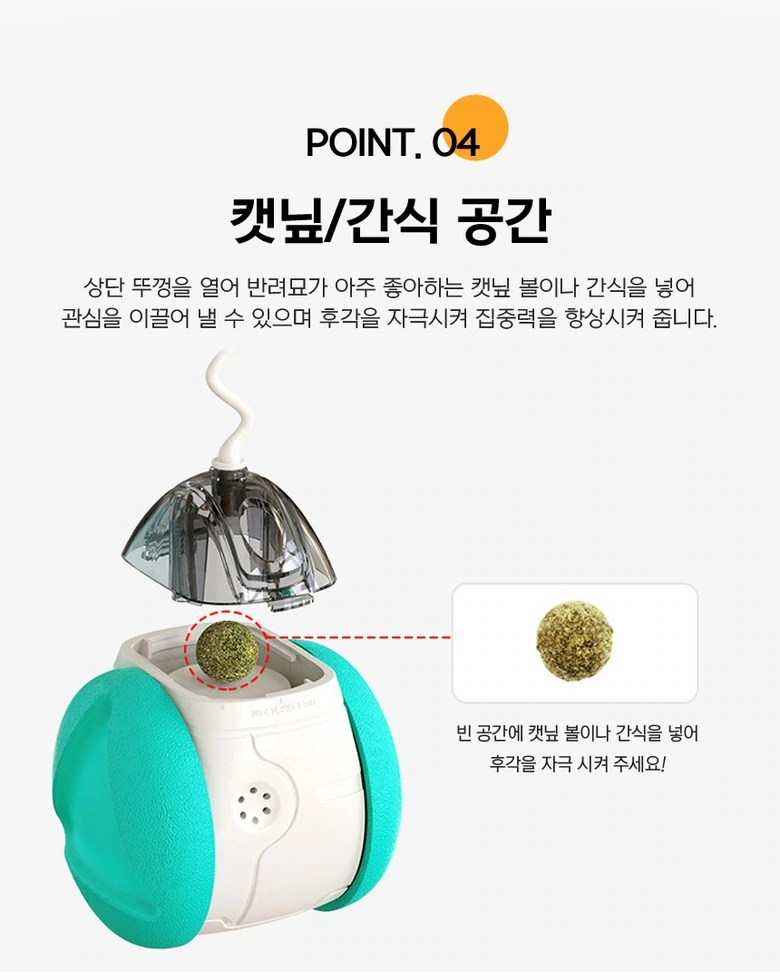
We separate the cover body from the sphere, connect the local circular frame to the internal position, and keep the complete outline of the shell. Products, details and short text occupy separate spaces, making the structure easier to observe.
Series wraps up: Color list continues with product information
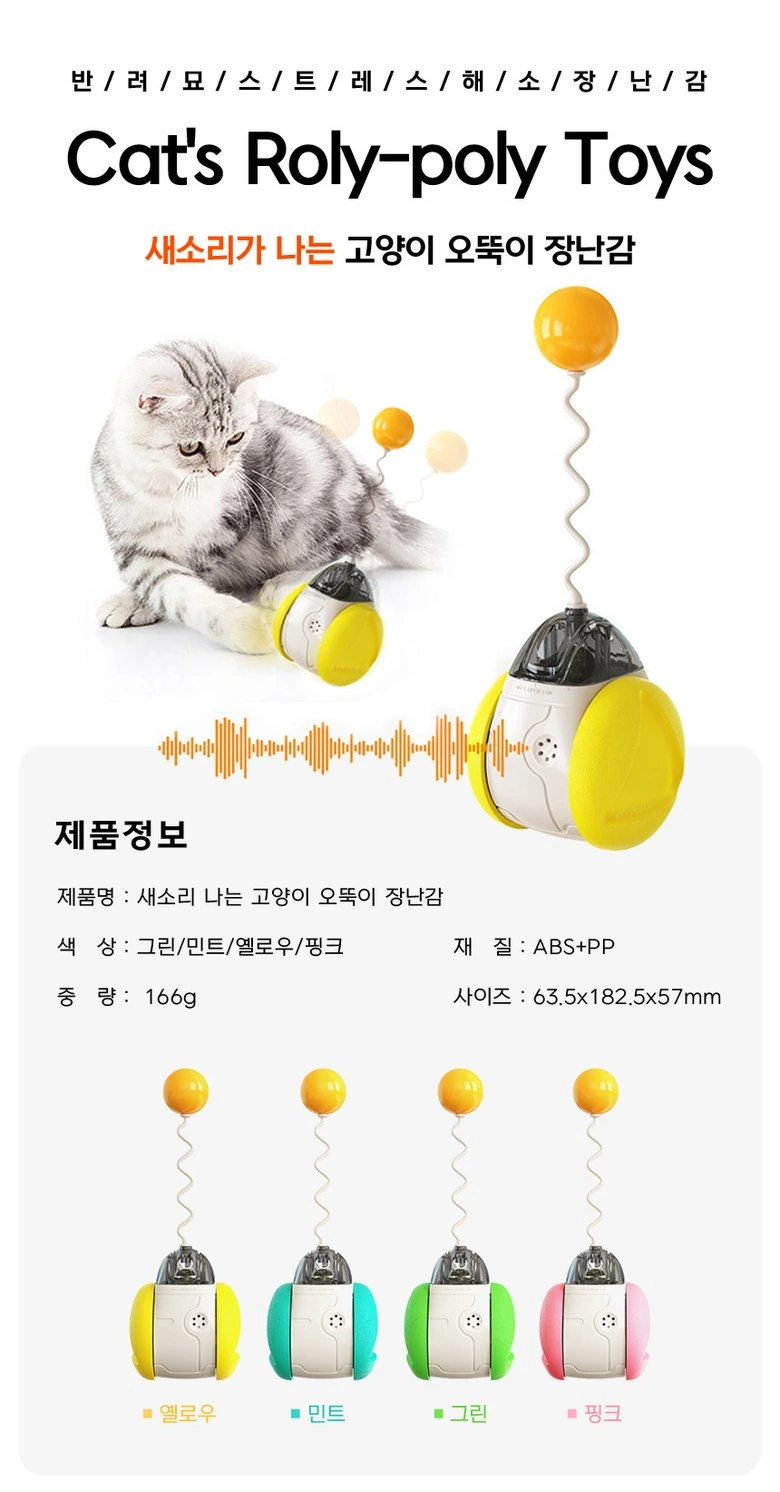
We keep the interactive photos above, and separate the information and four colors into zones below. The same font weight and alignment provide a unified order to the series of information.
Dimension topic: Front and side views provide proportional reference
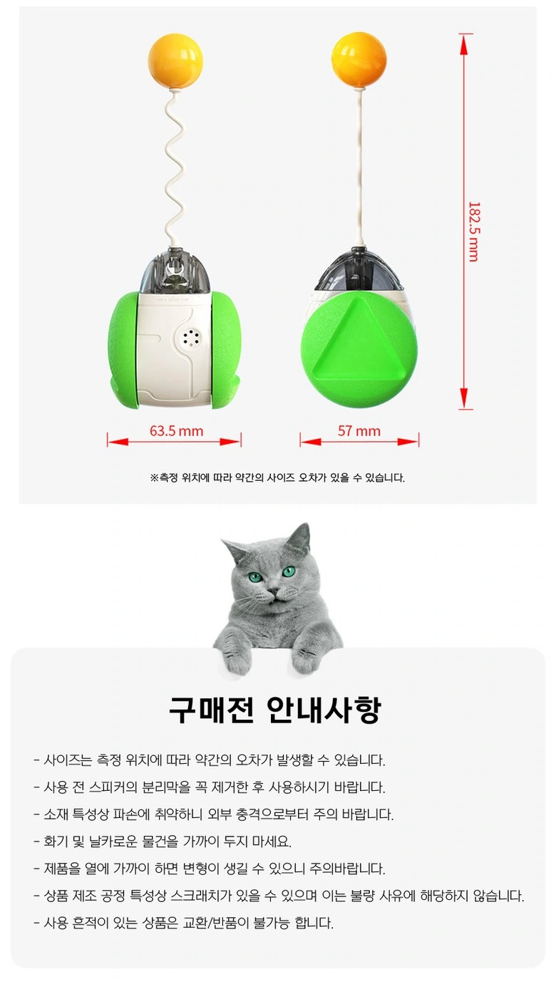
We display the toys side by side from two angles, with the red dimension line running along the outer edge. The description area below is arranged separately to keep the boundaries between specifications and reading tips.
Deliver and design value
Through this version of the product detail page, we establish a continuous reading path around the structural disassembly and multi-color series. Orange embellishments on a white background, circular paths, and interactive cat photos connect different chapters. Image scale, text levels, and white space all work together to distinguish priorities, allowing product overviews and local descriptions to complement each other.
Develop a clear Coupang visual expression for your product
You can provide us with product links, existing materials, and key points that need clarification. We will combine the product structure, style and usage scenarios to plan the appropriate picture group or product detail page content and layout.