Project overview
The client of this project is Ebikeling, a professional brand specializing in electric bicycle modification kits, motors, wheelsets, batteries and related accessories. It is mainly targeted at DIY modification users, electric bicycle enthusiasts and daily commuters. As the product line continues to be enriched, the original website gradually becomes complex in terms of product classification, technical information presentation, and user browsing paths. It is difficult for consumers to quickly judge the differences between different products and applicable scenarios. Therefore, customers come to us and hope to re-optimize the brand’s online shopping experience. The project is based on the Shopify platform. We are mainly responsible for the website visual and page experience design, including the homepage layout, product category entrance, product list and product detail page information level, brand trust and overall visual unity. The goal is to make complex electric bicycle products clearer and easier to understand without increasing the user’s understanding burden, while improving the website’s professionalism, purchase guidance ability and overall conversion performance.
| Dịch vụ | Industry | Nền tảng |
| Website design and decoration | Home department store | shopify |
| Project requirements | target market | design style |
| Improve product display effect and sales conversion rate | Toàn cầu | Professional and tough · Technical and practical · Clear and intuitive |
| project budget | Delivery content | Delivery time |
| ¥6800 | Website construction and full-site page design | 16 working days |
Project Challenges
The core challenge of this project is how to maintain a professional feel on the website while reducing consumers’ understanding and selection costs when electric bicycle product parameters are complex, there are many models, and users’ professionalism differs significantly. We need to focus on solving problems such as unintuitive product classification, difficulty in quickly comparing different configurations, complex page information levels, and lack of unified brand vision and purchase paths. Before the project started, we first sorted out the client’s existing Shopify website, product structure and main user groups, and analyzed the website layout, navigation logic and product display methods of similar electric bicycle and modified accessories brands. At the same time, combined with the user’s purchase decision-making process, the homepage content priority, category entry, product card and product detail page information structure are re-planned to establish a clear foundation for subsequent visual design and conversion optimization.
Home Page Design Strategy
Create a clear visual narrative
The homepage determines the first impression of the entire Shopify website. For Ebikeling, we hope to tell a simple and clear story through the homepage:
- What products does the brand offer?
- Who is the product suitable for?
- why trustworthy
- How should users start shopping?
Above-the-fold design: Emphasize confidence, not over-marketing
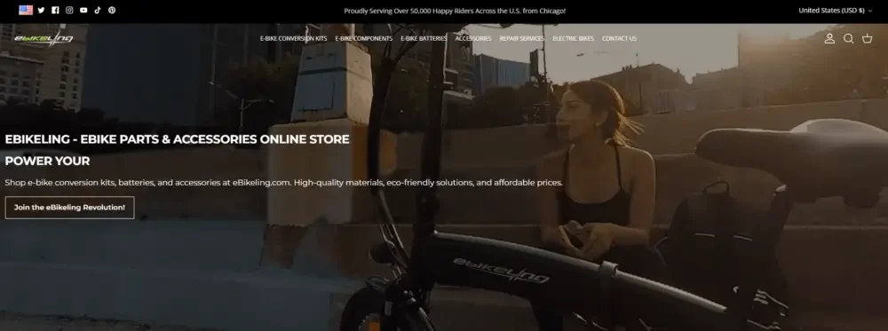
Rather than using too strong promotional language, we emphasize more in the first screen design:
- Real electric bicycle usage scenarios
- Clean, balanced page layout
- A clear core value proposition
We deliberately avoided stacking too many elements, allowing the main visual image and title level to quickly convey information on their own, so that users can immediately understand the brand positioning after entering the website.
Structured product category entry
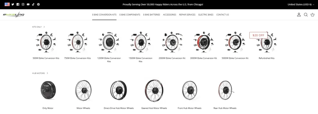
Since Ebikeling has a rich product line, we use clear visual classification modules to guide users to naturally enter different product categories, including:
- Electric bike conversion kit
- Motor and wheel set
- battery
- Phụ kiện
Each category module uses consistent spacing, visual cues, and font specifications to allow users to quickly browse, identify, and make selections.
Design for complex product collections
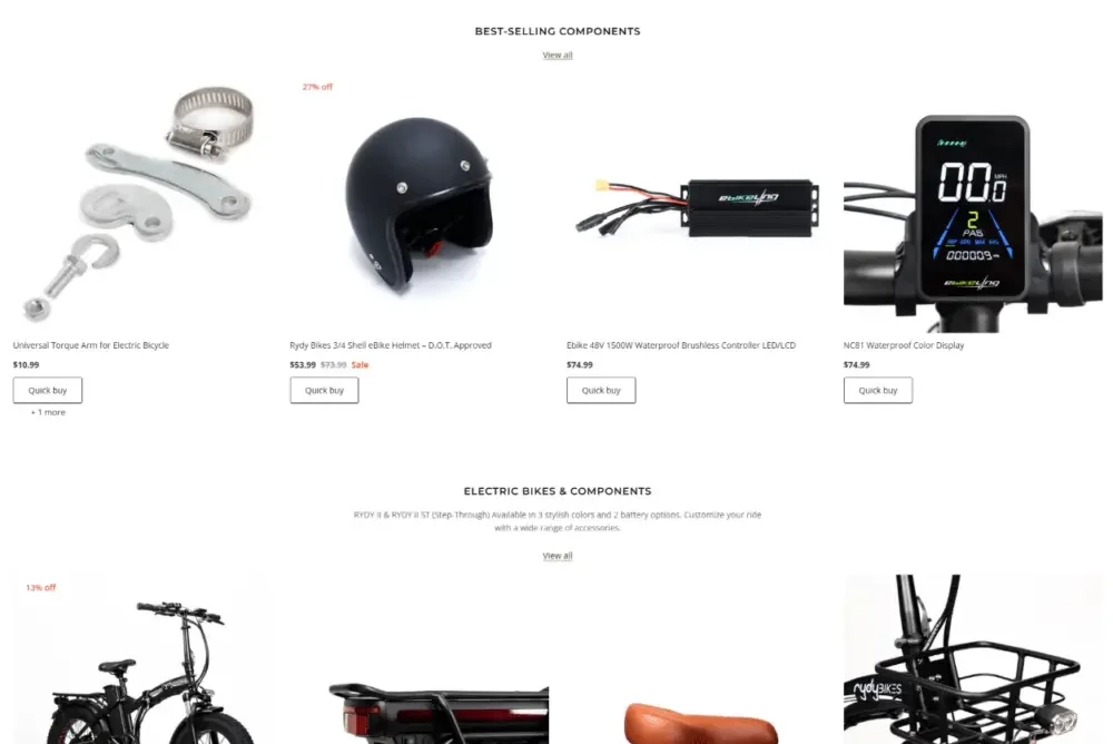
Make technical products easier to understand
One of the biggest challenges of this project was how to display products with complex technical specifications without overburdening users with information.
Our solution is not to add more technical explanations, but to reduce the difficulty of understanding through the page design structure itself.
Visual grouping and white space
We mainly use:
- clear grid system
- Unified product card layout
- Reasonable and rhythmic white space
These designs can help users visually distinguish different products and reduce the cognitive load during browsing.
Visually highlight core differences
Rather than using long paragraphs of text, we prefer:
- short auxiliary tag
- Iconic visual cues
- Clear font hierarchy
These elements help users identify important differences between products at a glance when browsing quickly.
Product product detail page design concept
Always put clarity first
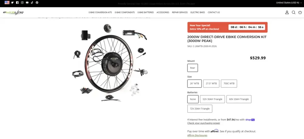
The product detail page as a whole pursues a calm, orderly and trustworthy visual experience.
We have focused on optimizing:
- Clear visual separation between different content modules
- Uniform and predictable page layout
- Good alignment between product images and text content
Assist users in making purchase decisions through layout
Without modifying the technical parameters and background function logic, we have re-optimized the visual presentation of information:
- Important information appears at the top of the page first
- Auxiliary content expands downwards in a logical order
- Guide users to browse downwards naturally through layout rhythm
This approach helps users stay on the page longer and reduces friction in the purchase decision-making process.
Build brand trust through design
Visual elements of trust
For brands selling e-bike parts, trust is important.
We strengthen brand credibility through the following design methods:
- Clean, professional font system
- A unified visual language for the entire site
- Properly arrange user reviews and customer feedback
- Use real product images strategically
Use “Move Green” as the visual anchor of the brand
Sustainability is an important part of Ebikeling’s brand image.
We did not regard “Move Green” just as a promotional slogan, but as a visual anchor in the overall design, strengthening its presence through white space, contrast and layout structure, while preventing this concept from overtaking the focus and ensuring that the website always maintains a smooth and natural shopping experience.