Project overview
Joy Love Dolls is a brand that focuses on high-fidelity adult lifestyle products. The products emphasize authentic texture, craftsmanship quality and private shopping experience. With the development of the brand, the original website gradually became difficult to meet business needs in terms of product classification, visual unity, user trust and purchase path. Therefore, the customer came to AIRSANG and hoped to redesign and design a more professional and conversion-capable WordPress e-commerce website. The focus of the project includes the visual upgrade of the homepage, optimization of product classification and screening, sorting out the information structure of the product detail page, and the reasonable presentation of trusted content such as privacy, delivery and quality assurance. Using WordPress as the platform, we help brands reduce browsing concerns in sensitive categories and enhance their professional image and overall shopping experience through more restrained, high-end visual language and clear user movement lines.
| บริการ | Industry | แพลตฟอร์ม |
| Website design and decoration | adult products | วordpress |
| Project requirements | target market | design style |
| Improve product display effect and sales conversion rate | ระดับโลก | Sexy and intuitive, realistic and immersive, high-end and private |
| project budget | Delivery content | Delivery time |
| ¥8500 | Website construction and full-site page design | 19 working days |
Project Challenges
The biggest challenge of this project was how to simultaneously take into account the sense of brand luxury, user privacy and website conversion efficiency in the sensitive category of adult lifestyle. The customer has a large number of products with complex categories and specifications. If the page information is too dense, it will easily increase user hesitation and bounce rate; if the visual expression is too direct, it will weaken the brand’s professionalism and trust. Before starting the project, we first analyzed the brand positioning, target users and the visual and interactive methods of similar websites, and reorganized the information architecture, product classification, user browsing path and trusted content display order of the WordPress website, and clarified the transformation logic from the homepage and category pages to product detail pages, and established a clear and unified design framework for subsequent visual design and page construction.
Our WordPress page design process
Step 1: Plan your information architecture
Before starting the visual design, we first sort out the user’s browsing path in the website.
เรามุ่งเน้นที่:
What is the first thing a first-time visitor to your website needs to see?
What information builds trust early on?
When should prices and product details appear?
How to reduce users’ choice pressure and decision fatigue?
Ultimately, we established a clear hierarchy of website information:
Home Page → Building Category Trust → Product Awareness and Education → Eliminating Purchase Concerns
By clarifying this structure upfront, every subsequent design decision can be centered around clear user goals.
Step Two: Home Page Design Strategy
First screen visual hierarchy
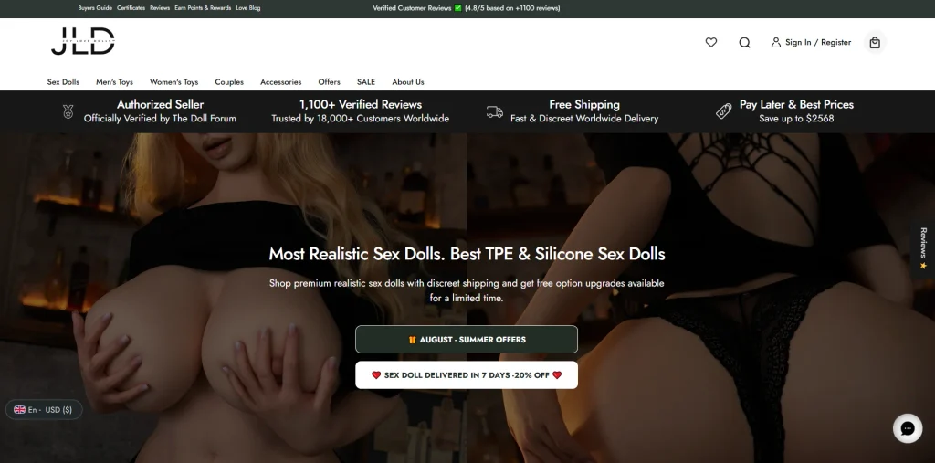
The homepage above the fold is crucial in shaping users’ first impression of your brand. We avoid complex and crowded visual expressions and focus on the following aspects:
Core titles that highlight product quality and authenticity
Simple and clean visual images with moderate contrast
Action buttons that are clear but not overly marketing
Our goal is not to let users buy immediately after entering the website, but to first attract users to continue exploring the brand and products through visuals and content.
Build trust without adding visual burden

Rather than heavily using certification badges, pop-ups, and promotional prompts, we integrate trust information into the page layout more naturally, including:
Safeguarding information presented in a low-key manner
Delivery and Logistics Instructions
Product quality related information
This approach can enhance user confidence without destroying the overall browsing immersion of the page.
Step Three: Category Page Design – Improve Clarity and Browsing Control
Product category pages often directly affect whether users are willing to continue browsing the website.
Unified product grid and visual specifications
We have unified planning for the product list, including:
Uniform product image proportions
Regular and consistent page spacing
Clear fonts and information hierarchy
Such a design can help users quickly browse products and compare and choose without increasing cognitive load.
Simplify filtering logic
Instead of stacking too many filters, we prioritize retaining the important attributes that users really care about.
By streamlining the filtering dimensions, selection difficulties can be reduced, allowing users to find products that meet their needs more quickly.
Step 4: Design product detail page that takes into account product education and purchase trust
For products that require a long decision-making cycle, the product detail page is usually the most obvious link for users to hesitate.
Structured information reading process
Each product product detail page follows a unified order of information display:
Core product pictures and product names
Main selling points and differentiating advantages
Detailed product introduction and specifications
Guarantee information such as delivery, privacy, and after-sales support
This content sequence is in line with the natural decision-making logic of users when learning about unfamiliar products, and can help users gradually complete the process from understanding the product to building purchase confidence.
Visual narrative with pictures as the core
Images play an important role in conveying the authenticity and quality of craftsmanship of a product. Therefore, we give pictures more sufficient display space in the page design so that they can:
Maintain sufficient visual white space
Presents more advanced visual effects without being overly stimulating
Help users understand the product rather than interfere with information acquisition
Textual content is primarily used to supplement image information rather than compete with visual elements for attention.
Visual language and brand tone
Color and font selection
We chose a more restrained overall color palette to meet the following needs:
Stay emotionally neutral and comfortable
Reflect brand maturity
Reduce visual fatigue caused by long browsing
Font design focuses on both readability and brand trust. The title needs to project professionalism and authority, while the body copy remains calm, clear, and easy to read.
Avoid excessive visual stimulation
Many similar websites make extensive use of strong contrast, highly saturated colors, and oppressive visual expressions.
In this project, we intentionally adopted the opposite design approach:
Reduce the number of accent colors
Add page space
Keep the composition of the picture balanced
This more restrained visual approach helps strengthen brand trust and keeps users’ attention focused on the product quality and core message itself.