


การแนะนำ
ในสภาพแวดล้อมอีคอมเมิร์ซที่มีการแข่งขันสูง ความชัดเจนทางด้านภาพและการเชื่อมโยงทางอารมณ์มักเป็นตัวกำหนดว่าผู้เยี่ยมชมจะกลายเป็นลูกค้าหรือไม่ โดยเฉพาะอย่างยิ่งในหมวดหมู่เฉพาะกลุ่ม เช่น เกมย้อนยุค ที่ผู้ซื้อไม่ได้พิจารณาเพียงแค่คุณสมบัติของผลิตภัณฑ์เท่านั้น แต่ยังรวมถึงความคิดถึง ความสวยงาม และอัตลักษณ์ของชุมชนด้วย.
กรณีศึกษาชิ้นนี้จะสำรวจว่าเราได้ร่วมมือกับอย่างไร ทูเรโทร เพื่อออกแบบ ช็อปฟี่ สร้างหน้าร้านค้าออนไลน์ที่ให้ความรู้สึกสมจริง ใช้งานง่าย และเน้นการเพิ่มยอดขาย โดยไม่ต้องพึ่งพาการปรับแต่งทางเทคนิคที่ซับซ้อน เราเน้นไปที่กลยุทธ์การออกแบบ ตรรกะของเค้าโครง การเล่าเรื่องด้วยภาพ และโครงสร้างที่คำนึงถึงผู้ใช้เป็นหลัก เพื่อเปลี่ยนแคตตาล็อกสินค้าให้กลายเป็นประสบการณ์แบรนด์ที่น่าดึงดูด.
แทนที่จะมองโครงการนี้เป็นเพียง "การจัดวางร้านค้า" เรามองว่ามันเป็นการออกแบบระบบภาพแบบครบวงจร: ระบบที่สร้างสมดุลระหว่างความยืดหยุ่นในการส่งเสริมการขาย การค้นหาสินค้าได้ง่าย และการดึงดูดอารมณ์ ในขณะเดียวกันก็สามารถปรับขนาดได้สำหรับแคมเปญและการเปิดตัวผลิตภัณฑ์ในอนาคต.
| ระยะเวลาจัดส่ง | หมวดหมู่ | แพลตฟอร์มแอปพลิเคชัน |
| 22 วัน | เครื่องเล่นเกมคอนโซล | ช็อปฟี่ |
| นักออกแบบที่เกี่ยวข้อง | ค่าใช้จ่าย | ผล |
| หลิน จาง | $2800 | อัตราการซื้อ📈241% |
ทำความเข้าใจแบรนด์และกลุ่มเป้าหมาย
ร้านเกมย้อนยุคที่ตอบสนองความคาดหวังสมัยใหม่
ToRetro ให้บริการกลุ่มผู้ชื่นชอบเกมย้อนยุค นักสะสม และผู้ซื้อครั้งแรกทั่วโลกที่หลงใหลในเครื่องเล่นเกมพกพาที่ได้รับแรงบันดาลใจจากยุคเกมคลาสสิก ความท้าทายนั้นชัดเจน:
คุณจะออกแบบหน้าร้านอย่างไรให้รู้สึกคิดถึงวันเก่าๆ โดยไม่ดูเชย?
ตั้งแต่เริ่มต้น ทิศทางการออกแบบของเรามุ่งเน้นไปที่ภาพลักษณ์หลักสามประการของแบรนด์:
- ขี้เล่นแต่ก็ไว้ใจได้
- ได้แรงบันดาลใจจากสไตล์เรโทรแต่ก็ทันสมัย
- มีสินค้าให้เลือกมากมาย แต่ไม่มากเกินไปจนทำให้สับสน
พฤติกรรมของผู้ชมและนัยยะของการออกแบบ
จากการวิจัยเบื้องต้นและการพูดคุยกับลูกค้า เราได้ระบุพฤติกรรมสำคัญของกลุ่มเป้าหมายไว้หลายประการ:
- ผู้เยี่ยมชมมักจะเลือกดูสินค้าในหลายหมวดหมู่ก่อนตัดสินใจซื้อ
- การเปรียบเทียบด้านรูปลักษณ์ (สี รูปทรง รุ่น) มีความสำคัญมากกว่าข้อมูลจำเพาะทางเทคนิค
- โปรโมชั่นและข้อเสนอพิเศษมีผลอย่างมากต่อระยะเวลาในการเปลี่ยนลูกค้าให้เป็นผู้ซื้อ
ข้อมูลเชิงลึกเหล่านี้เป็นพื้นฐานในการตัดสินใจด้านการออกแบบทุกอย่างที่เราทำ ตั้งแต่โครงสร้างหน้าแรกไปจนถึงการจัดวางการ์ดข้อมูลผลิตภัณฑ์.
เป้าหมายและวัตถุประสงค์ของการออกแบบ
ก่อนที่จะเริ่มลงมือสร้างสรรค์งานด้านภาพ เราได้กำหนดวัตถุประสงค์ที่ชัดเจนและเน้นการออกแบบสำหรับโครงการนี้.
เป้าหมายการออกแบบหลัก
- สร้างความประทับใจแรกที่ดีภายใน 3-5 วินาทีแรก
- ทำให้การท่องเว็บเป็นเรื่องสนุก ง่ายดาย และชวนให้สำรวจ
- เน้นโปรโมชั่นโดยไม่ลดทอนลำดับความสำคัญทางด้านภาพ
- สร้างหน้าแรกที่สามารถปรับเปลี่ยนให้เข้ากับแคมเปญตามฤดูกาลได้อย่างง่ายดาย
เป้าหมายทางธุรกิจรอง (ที่ได้รับการสนับสนุนผ่านการออกแบบ)
- ปรับปรุงการค้นหาสินค้าในคอลเลกชันต่างๆ ให้ดียิ่งขึ้น
- ลดความรบกวนทางสายตาบนอุปกรณ์เคลื่อนที่
- ส่งเสริมการเลื่อนดูเนื้อหาที่ลึกขึ้นและการสำรวจข้ามหมวดหมู่
บทบาทของเราไม่ใช่การแก้ไขฟังก์ชันการทำงานพื้นฐานของ Shopify แต่เป็นการเพิ่มประสิทธิภาพสิ่งที่แพลตฟอร์มทำได้ดีอยู่แล้วให้ดียิ่งขึ้นไปอีกผ่านการออกแบบที่รอบคอบ.
กระบวนการออกแบบ Shopify ของเรา
ขั้นตอนที่ 1 – การตรวจสอบด้วยภาพและการเปรียบเทียบกับคู่แข่ง
เราเริ่มต้นด้วยการตรวจสอบภาพรวมของเว็บไซต์ที่มีอยู่ทั้งหมด และทบทวนร้านค้าเกมย้อนยุคและอุปกรณ์อิเล็กทรอนิกส์คู่แข่ง ซึ่งช่วยให้เราสามารถระบุสิ่งต่อไปนี้ได้:
- การใช้เลย์เอาต์สีเข้มมากเกินไปทำให้ความสามารถในการอ่านลดลง
- ระยะห่างระหว่างการ์ดผลิตภัณฑ์ไม่สม่ำเสมอ
- แบนเนอร์โปรโมชั่นที่แย่งความสนใจจากเนื้อหาหลัก
จากสิ่งนี้ เราจึงได้กำหนดหลักการออกแบบขึ้นมา:
ทุกส่วนต้องมีความโดดเด่นทั้งในด้านภาพลักษณ์และกลยุทธ์.
ขั้นตอนที่ 2 – โครงสร้างหน้าแรกและลำดับชั้นทางภาพ
หน้าแรกกลายเป็นรากฐานของประสบการณ์ทั้งหมด.
การออกแบบส่วนฮีโร่
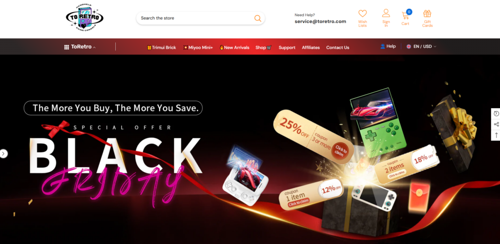
แบนเนอร์หลักถูกออกแบบมาเพื่อทำมากกว่าแค่ประกาศโปรโมชั่น—เพราะมันช่วยกำหนดอารมณ์ความรู้สึกของแบรนด์ด้วย.
ปัจจัยสำคัญในการออกแบบได้แก่:
- ภาพที่มีความคมชัดสูง พร้อมด้วยสีสันที่ได้รับแรงบันดาลใจจากแสงนีออน
- ข้อความส่งเสริมการขายที่ชัดเจน ("แบล็กฟรายเดย์" ข้อเสนอพิเศษจำนวนจำกัด)
- ภาพสินค้าถูกจัดวางเพื่อสร้างมิติและการเคลื่อนไหว
ส่วนนี้สื่อถึงความตื่นเต้นได้ทันที ในขณะเดียวกันก็ทำให้ข้อความอ่านง่ายและเข้าใจได้รวดเร็ว.
คุณสมบัติการบล็อกความไว้วางใจ
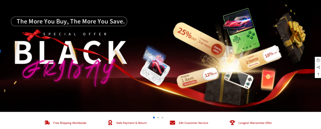
ด้านล่างของภาพฮีโร่ เราได้เพิ่มแถบแสดงระดับความน่าเชื่อถือโดยใช้ไอคอน:
- จัดส่งฟรี
- การชำระเงินที่ปลอดภัย
- ฝ่ายบริการลูกค้า
- ข้อความเกี่ยวกับการรับประกันหรือความพึงพอใจ
องค์ประกอบเหล่านี้อาจดูไม่เด่นชัด แต่มีบทบาทสำคัญในการลดความลังเลใจสำหรับผู้ที่มาเยือนครั้งแรก.
ขั้นตอนที่ 3 – การค้นหาผลิตภัณฑ์ผ่านการออกแบบ
การจัดวางแบบเน้นคอลเลกชันเป็นหลัก
แทนที่จะทำให้ผู้ใช้รู้สึกสับสนด้วยสินค้ามากมายนับไม่ถ้วน เราได้จัดโครงสร้างหน้าแรกโดยแบ่งเป็นหมวดหมู่ที่คัดสรรมาอย่างดี เช่น:
- เครื่องเล่นเกมพกพารุ่นเรโทรเด่นๆ
- สินค้าใหม่
- เครื่องเล่นเกมสำหรับมือใหม่ vs. สำหรับผู้ที่ชื่นชอบเกมอย่างจริงจัง
แต่ละบล็อกคอลเลกชันใช้รูปแบบการ์ด ระยะห่าง และลักษณะการแสดงผลเมื่อวางเมาส์เหนือการ์ดที่สอดคล้องกัน เพื่อสร้างจังหวะทางสายตา.
การเพิ่มประสิทธิภาพการ์ดผลิตภัณฑ์
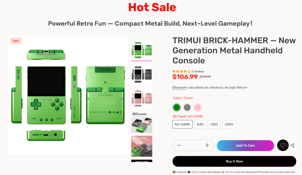
โดยไม่เปลี่ยนแปลงระบบผลิตภัณฑ์หลักของ Shopify เราได้ปรับปรุงการนำเสนอโดยเน้นที่:
- จัดวางภาพถ่ายผลิตภัณฑ์ให้สะอาดตา
- กำหนดลำดับชั้นราคาให้ชัดเจน (ราคาขายเทียบกับราคาปกติ)
- ตัวบ่งชี้สีต่างๆ ที่ใช้งานง่าย
วิธีนี้ช่วยให้ผู้ใช้สามารถเปรียบเทียบตัวเลือกต่างๆ ได้อย่างรวดเร็วโดยไม่ต้องเปิดหลายแท็บ.
การออกแบบสำหรับแคมเปญและโปรโมชั่น
ความยืดหยุ่นตามฤดูกาลที่ออกแบบมาโดยเฉพาะ
หนึ่งในความต้องการหลักของ ToRetro คือความสามารถในการจัดโปรโมชั่นบ่อยครั้ง เช่น Black Friday, ข้อเสนอสินค้าจำนวนจำกัด และโปรโมชั่นตามธีมต่างๆ.
วิธีแก้ปัญหาของเราคือการออกแบบส่วนต่างๆ ที่พร้อมใช้งานสำหรับแคมเปญ ซึ่งสามารถปรับเปลี่ยนรูปลักษณ์ได้โดยไม่ต้องปรับโครงสร้างหน้าเว็บใหม่.
ตัวอย่างเช่น:
- ป้ายโฆษณาแบบเต็มความกว้าง
- ส่วนสินค้าเด่น “ขายดี”
- ตัวคั่นแบบเคลื่อนไหวหรือภาพประกอบที่บ่งบอกถึงความเร่งด่วน
การออกแบบผังร้านแบบโมดูลาร์ช่วยให้ร้านดูสดใหม่และมีเอกลักษณ์เฉพาะตัวอยู่เสมอ.
การแก้ไขปัญหาด้านการออกแบบ
ความท้าทายที่ 1 – การจัดการหน้าแรกที่มีสินค้าจำนวนมาก
เนื่องจากมีสินค้าหลายสิบรายการ จึงมีความเสี่ยงที่จะเกิดภาวะสินค้าล้นมือ.
โซลูชันการออกแบบของเรา:
- แบ่งส่วนอย่างชัดเจนโดยใช้สีและระยะห่าง
- จำกัดจำนวนสินค้าที่แสดงในตัวอย่างคอลเลกชันให้เหลือเพียงจำนวนที่คัดสรรมาแล้ว
- กระตุ้นให้เกิดการสำรวจที่ลึกซึ้งยิ่งขึ้นผ่านคำแนะนำ "ดูทั้งหมด"
แนวทางนี้ช่วยให้หน้าแรกอ่านง่ายและรวดเร็ว ในขณะเดียวกันก็ยังแสดงให้เห็นถึงความหลากหลาย.
ความท้าทายที่ 2 – การสร้างสมดุลระหว่างความรู้สึกคิดถึงอดีตกับประสบการณ์ผู้ใช้สมัยใหม่
สไตล์ย้อนยุคอาจดูรกหรืออ่านยากได้ง่าย.
โซลูชันการออกแบบของเรา:
- ใช้สีสันชวนคิดถึงอดีตโดยไม่ลดทอนความคมชัด
- ผสมผสานกราฟิกที่สนุกสนานเข้ากับการออกแบบตัวอักษรที่ทันสมัย
- รักษาแนวการจัดวางและระบบตารางให้สม่ำเสมอ
ผลลัพธ์ที่ได้ให้ความรู้สึกเหมือนได้รับแรงบันดาลใจจากอดีต แต่ชัดเจนว่าสร้างขึ้นเพื่อผู้ใช้ในปัจจุบัน.
ความท้าทายที่ 3 – ประสบการณ์การใช้งานบนมือถือที่ไร้ข้อจำกัด
ผู้ใช้งานอุปกรณ์เคลื่อนที่เป็นส่วนสำคัญของปริมาณการเข้าชมเว็บไซต์ของ ToRetro.
สิ่งที่เราพิจารณาในการออกแบบประกอบด้วย:
- บัตรข้อมูลผลิตภัณฑ์ที่ใช้งานง่ายด้วยระบบสัมผัส
- ลำดับชั้นการนำทางที่เรียบง่าย
- ระยะห่างแนวตั้งได้รับการปรับให้เหมาะสมสำหรับการเลื่อนด้วยนิ้วหัวแม่มือ
ทุกส่วนได้รับการตรวจสอบจากมุมมองด้านการออกแบบสำหรับอุปกรณ์เคลื่อนที่โดยเฉพาะ เพื่อให้มั่นใจได้ถึงความชัดเจนบนหน้าจอขนาดเล็ก.
ผลลัพธ์และผลกระทบทางภาพ
สิ่งที่การออกแบบขั้นสุดท้ายบรรลุผลสำเร็จ
หลังจากนำระบบการออกแบบใหม่มาใช้ ร้านค้าออนไลน์ ToRetro ก็ประสบความสำเร็จในหลายด้านที่สำคัญ ดังนี้:
- สร้างเอกลักษณ์แบรนด์ที่แข็งแกร่งยิ่งขึ้น สอดคล้องกับวัฒนธรรมเกมย้อนยุค
- ปรับปรุงการจัดวางภาพให้สวยงามยิ่งขึ้น ตั้งแต่ส่วนหัวของภาพไปจนถึงการค้นหาผลิตภัณฑ์
- หน้าแรกที่สนับสนุนทั้งการเล่าเรื่องและการขาย
- เพิ่มความยืดหยุ่นสำหรับการจัดแคมเปญและการอัปเดตเนื้อหาในอนาคต
ที่สำคัญที่สุดคือ ตอนนี้เว็บไซต์ดูมีความสอดคล้องกันมากขึ้น ทุกหน้าและทุกส่วนใช้ภาษาภาพเดียวกัน.
เหตุใดโครงการนี้จึงสะท้อนถึงปรัชญาการออกแบบ Shopify ของเรา
เราเชื่อว่าการออกแบบ Shopify ที่ยอดเยี่ยมไม่ได้ขึ้นอยู่กับโค้ดที่เขียนขึ้นเองหรือการพัฒนาที่ซับซ้อน แต่ขึ้นอยู่กับสิ่งต่อไปนี้:
- การทำความเข้าใจเจตนาของผู้ใช้
- การจัดโครงสร้างเนื้อหาอย่างมีจุดประสงค์
- การใช้ภาพประกอบเพื่อชี้นำการตัดสินใจ
- ออกแบบระบบที่สามารถขยายขนาดได้ตามการเติบโตของแบรนด์
โครงการนี้แสดงให้เห็นว่าการออกแบบอย่างรอบคอบเพียงอย่างเดียวสามารถยกระดับประสบการณ์การซื้อขายออนไลน์และสนับสนุนเป้าหมายทางธุรกิจได้อย่างแท้จริง.
บทสรุป
เดอะ ทูเรโทร ช็อปฟี่ เว็บไซต์นี้เป็นตัวอย่างที่ชัดเจนว่าการออกแบบเชิงกลยุทธ์สามารถเปลี่ยนร้านค้าที่เน้นผลิตภัณฑ์ให้กลายเป็นประสบการณ์แบรนด์ที่น่าจดจำได้อย่างไร โดยการมุ่งเน้นไปที่ตรรกะของเค้าโครง การเล่าเรื่องด้วยภาพ และโครงสร้างที่เน้นผู้ใช้เป็นศูนย์กลาง เราได้ช่วยสร้างหน้าร้านที่ให้ความรู้สึกดึงดูดใจ น่าเชื่อถือ และพร้อมที่จะเติบโต.
แนวทางนี้สะท้อนให้เห็นว่าเราช่วยแบรนด์ต่างๆ เปลี่ยน Shopify ให้เป็นมากกว่าแค่แพลตฟอร์มการขาย แต่เป็นการผนวกรวมเอกลักษณ์ทางภาพลักษณ์ของแบรนด์นั้นๆ เข้าไว้ด้วยกัน.
หัวใจสำคัญของโครงการนี้คือปรัชญาเดียวกันกับที่เราใช้ในการทำงานทั้งหมดของเราที่ AIRSANGการออกแบบไม่ควรแค่ดูดี แต่ควรมีส่วนช่วยเสริมสร้างภาพลักษณ์ของแบรนด์ด้วย.


ออกแบบและสร้างเว็บไซต์ WordPress หรือเว็บไซต์องค์กรพร้อมระบบอีคอมเมิร์ซครบวงจรสำหรับคุณ.
ช่วงราคา: $200.00 ถึง $2,500.00ข้อกำหนดเฉพาะหรือใบเสนอราคาพิเศษ
ราคาเดิมคือ: $2.00.$1.00ราคาปัจจุบันคือ: $1.00. ภาพหลักสำหรับการออกแบบอุปกรณ์กายภาพบำบัดที่บ้านของ Amazon (อธิบายรายละเอียด)
บทนำ: การสร้างภาพลักษณ์ที่น่าเชื่อถือสำหรับอุปกรณ์บำบัดที่บ้านบน Amazon เมื่อออกแบบภาพหลักสำหรับอุปกรณ์บำบัดที่บ้านบน Amazon สิ่งสำคัญอันดับแรกของเราคือ...

ภาพหลักสำหรับการแปลงลิปสติกเป็นสินค้าสำหรับ Amazon
บทนำ: การออกแบบภาพหลักลิปสติกที่ขายได้บน Amazon เมื่อเราออกแบบภาพหลักสำหรับลิปสติกบน Amazon ความรับผิดชอบของเราไม่ได้จำกัดอยู่แค่...

อะไรทำให้รองพื้นชนิดเหลวของ Amazon (ภาพหลัก) ขายดี?
บทนำ การออกแบบภาพหลักสำหรับรองพื้นชนิดเหลวบน Amazon ไม่ใช่แค่การทำให้ผลิตภัณฑ์ดูสวยงามเท่านั้น บน Amazon ภาพหลักและ...

การออกแบบภาพหลัก Amazon ที่มีประสิทธิภาพสำหรับตลับกรอง
บทนำ การออกแบบภาพหลักสำหรับ Amazon ไม่ใช่แค่การทำให้สินค้าดูน่าดึงดูดเท่านั้น แต่ยังเกี่ยวกับความชัดเจน ความน่าเชื่อถือ และความเข้าใจได้ในทันที โดยเฉพาะอย่างยิ่งสำหรับ...

เปรียบเทียบธีม WordPress สำหรับสัตว์เลี้ยง 5 แบบ
บทนำ การเลือกธีม WordPress ที่เหมาะสมสำหรับธุรกิจเกี่ยวกับสัตว์เลี้ยงนั้นไม่ใช่แค่เรื่องของการออกแบบเท่านั้น แต่ยังส่งผลโดยตรงต่อการใช้งาน ความสามารถในการขยายขนาด และการเติบโตของธุรกิจในระยะยาว การดูแลสัตว์เลี้ยงและ...

การสร้างเว็บไซต์ WordPress ที่ปรับขนาดได้สำหรับแบรนด์ที่ขับเคลื่อนด้วยวิทยาศาสตร์: โครงการ AminoUSA
บทนำ ในยุคดิจิทัลปัจจุบัน เว็บไซต์เป็นมากกว่าแค่สถานที่สำหรับแสดงรายการสินค้า สำหรับแบรนด์ที่ขับเคลื่อนด้วยวิทยาศาสตร์ซึ่งดำเนินงานในอุตสาหกรรมที่มีการควบคุมหรือเน้นการวิจัย...

สร้างร้านค้า Shopify ที่ปรับขนาดได้สำหรับแบรนด์ใบมีดระดับโลก: โครงการ CoolKatana
บทนำ ในธุรกิจอีคอมเมิร์ซข้ามพรมแดน เว็บไซต์ Shopify เป็นมากกว่าแค่หน้าร้าน สำหรับแบรนด์ที่ดำเนินธุรกิจในกลุ่มเฉพาะหรือกลุ่มที่ขับเคลื่อนด้วยวัฒนธรรม เว็บไซต์ต้องทำมากกว่านั้น...

การออกแบบร้านค้า Shopify ที่มีอัตราการแปลงสูงสำหรับขายการ์ดโปเกมอน
บทนำ ในโลกของอีคอมเมิร์ซสินค้าสะสม โดยเฉพาะอย่างยิ่งในตลาดเกมการ์ดโปเกมอน (TCG) เว็บไซต์จะต้องทำมากกว่าแค่แสดงรายการสินค้า...

ดีไซน์ Shopify ที่เพิ่มยอดขายสำหรับแบรนด์อิฐสั่งทำพิเศษ
บทนำ ในสภาพแวดล้อมการแข่งขันอีคอมเมิร์ซในปัจจุบัน โดยเฉพาะอย่างยิ่งในตลาดของขวัญส่วนบุคคลและของสะสม เว็บไซต์ Shopify ต้องทำมากกว่าแค่แสดงสินค้า...

กรณีศึกษาการออกแบบเว็บไซต์ Shopify สำหรับแบรนด์ดอกไม้ระดับพรีเมียม
บทนำ ในสภาพแวดล้อมการแข่งขันอีคอมเมิร์ซในปัจจุบัน เว็บไซต์ Shopify ต้องทำมากกว่าแค่แสดงสินค้า มันต้องสื่อสารคุณค่าของแบรนด์ได้ทันที และแนะนำผู้ใช้...

กรณีศึกษาการออกแบบบน Shopify: แบรนด์ Tactical Rescue
บทนำ เว็บไซต์ Shopify ที่แข็งแกร่งนั้นทำมากกว่าแค่แสดงสินค้า—มันยังสื่อสารจุดประสงค์ สร้างความไว้วางใจ และชี้นำผู้ใช้ไปสู่การตัดสินใจซื้ออย่างมั่นใจ โดยเฉพาะอย่างยิ่ง...

กรณีศึกษาการออกแบบเว็บไซต์ Shopify สำหรับแบรนด์จักรยานไฟฟ้า
บทนำ ในตลาดจักรยานไฟฟ้าที่มีการแข่งขันสูงในปัจจุบัน เว็บไซต์ Shopify ต้องทำมากกว่าแค่แสดงสินค้า—ต้องเล่าเรื่องราว สร้างความน่าเชื่อถือ และให้คำแนะนำแก่ผู้ใช้งาน...

แพลตฟอร์มอีคอมเมิร์ซ Shopify ที่ปรับขนาดได้สำหรับแบรนด์สร้างสรรค์
บทนำ เมื่อแบรนด์สร้างสรรค์เติบโตขึ้น เว็บไซต์ของพวกเขามักประสบปัญหาในการปรับตัวให้ทัน เนื่องจากสายผลิตภัณฑ์ขยายตัว เนื้อหาเพิ่มขึ้น และปริมาณการเข้าชมสูงขึ้น แบรนด์ที่เน้นภาพเป็นหลักหลายแห่ง...

กรณีศึกษาการออกแบบเว็บไซต์ Shopify สำหรับแบรนด์สินค้าตกแต่งบ้าน
บทนำ ในตลาดสินค้าตกแต่งบ้านที่มีการแข่งขันสูง ภาพลักษณ์ของแบรนด์ไม่ได้เป็นเพียงแค่เรื่องของความสวยงามอีกต่อไป แต่ยังส่งผลโดยตรงต่อความไว้วางใจ พฤติกรรมการเลือกชมสินค้า และการตัดสินใจซื้อสินค้า สำหรับ...

กรณีศึกษาการสร้างเว็บไซต์สมัครสมาชิก WordPress ที่ปรับขนาดได้
บทนำ สำหรับแบรนด์อีคอมเมิร์ซสมัยใหม่ เว็บไซต์ไม่ได้เป็นเพียงแค่หน้าร้านดิจิทัลอีกต่อไปแล้ว มันคือกลไกสำคัญที่สนับสนุนการสมัครรับข้อมูล การเล่าเรื่องราวผ่านเนื้อหา การสร้างความไว้วางใจ...

ดีไซน์ WordPress ที่เพิ่มอัตราการแปลงสูงสำหรับแบรนด์สำหรับผู้ใหญ่
บทนำ ในตลาดอีคอมเมิร์ซที่มีการแข่งขันสูง ภาพลักษณ์ที่สวยงามเพียงอย่างเดียวไม่เพียงพอ เว็บไซต์ WordPress ที่ประสบความสำเร็จต้องนำทางผู้เข้าชมผ่านเส้นทางที่ชัดเจนและตั้งใจไว้ ซึ่ง...

เว็บไซต์อีคอมเมิร์ซตุ๊กตาเซ็กส์ WordPress ที่ปรับขนาดได้
บทนำ การเปิดตัวเว็บไซต์อีคอมเมิร์ซข้ามพรมแดนที่มีประสิทธิภาพสูงนั้นไม่ใช่แค่การนำสินค้าขึ้นออนไลน์เท่านั้น สำหรับแบรนด์ที่ดำเนินธุรกิจในตลาดที่มีการแข่งขันสูงและเน้นภาพลักษณ์เป็นหลัก เว็บไซต์...
ออกแบบเว็บไซต์ Shopify สำหรับแบรนด์ตุ๊กตาซิลิโคน
บทนำ ในตลาดอีคอมเมิร์ซที่มีการแข่งขันสูงและมีความละเอียดอ่อนทางด้านภาพ การออกแบบเว็บไซต์ไม่ได้เป็นเพียงแค่เรื่องของความสวยงามเท่านั้น แต่ยังเกี่ยวข้องกับความน่าเชื่อถือ ความชัดเจน การสร้างความประทับใจทางอารมณ์ และ...