Project overview
This project is designed around Temu stainless steel cutting board primary and secondary product images. Through scene-based display, size description, material comparison and functional disassembly, we systematically present the core advantages of the product in cutting, baking, cleaning and multi-purpose use, helping consumers quickly understand the selling points and improve clicks and conversions.
| Services | Industry | Platform |
| temumain product image design | Home department store | temu |
| Project requirements | target market | design style |
| Improve click-through rate | Global | Refreshing and practical |
| project budget | Delivery content | Delivery time |
| ¥500 | 7 shopeemain product images | 5 working days |
Project Challenges
This stainless steel cutting board has a simple appearance. If it only displays the product itself, it will easily appear monotonous and it will be difficult to establish differentiated recognition. Therefore, we need to take into account the realism of the scene, information clarity and e-commerce conversion logic under a unified visual style, so that each picture can accurately carry different selling points and avoid duplication of content.
1. Start with a real home kitchen and establish the use value of the product first
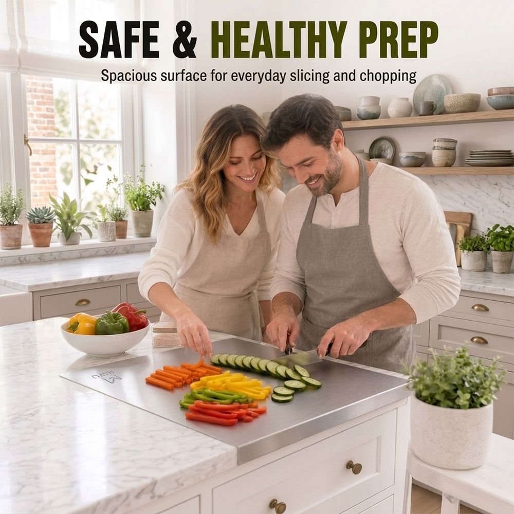
The first picture does not place the product alone on a pure white background, but is directly designed to look like a life scene of a couple preparing vegetables together in the kitchen.
A large stainless steel cutting board is placed in the center of the screen, and consumers can directly see the actual use status of ingredients such as carrots, cucumbers, and colored peppers on the cutting board. Rather than simply displaying a metal plate, this approach allows consumers to quickly understand the size of the product, how to use it, and its proportions in the kitchen countertop.
We design the title as:
SAFE & HEALTHY PREP
The subtitle emphasizes:
Spacious surface for everyday slicing and chopping
The focus of the design here is not to introduce complex parameters, but to first establish the first impression of “safe, healthy, spacious, and suitable for daily use”.
For a fast-browsing e-commerce platform like Temu, the first scene graph must reduce the cost of understanding as much as possible. Users do not need to read a lot of text. As long as they see that two people can handle ingredients around the cutting board at the same time, they can intuitively feel that it has a large operating space.
In terms of color, we chose a warm white kitchen, natural light and a small amount of green plants so that the cold-toned stainless steel products will not look too industrial. The characters wear off-white and gray aprons, which also form a soft and unified visual relationship with the silver-gray color of the product itself.
The task of the first picture is to answer the most basic questions of consumers:
“What does it feel like to actually use this cutting board at home?”
2. Use the size chart to resolve the most important specification questions before purchasing.
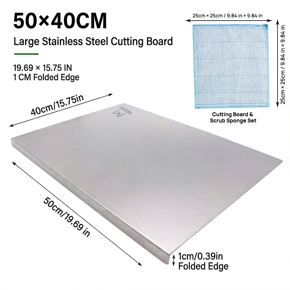
The second picture shifts from the scene to the parameter display, focusing on the product size.
The top uses a very eye-catching:
50×40CM
And added:
Large Stainless Steel Cutting Board
It is then clearly marked through three sets of size information:
- 50 cm / 19.69 in
- 40 cm / 15.75 in
- 1 cm / 0.39 in Folded Edge
This size chart is very important for Temu products because kitchen countertops come in different sizes and consumers often worry about products that are too big or too small when buying large cutting boards.
Instead of making the size information into a complex table, we set arrows directly along the edge of the product to establish a direct connection between the size and the corresponding position. In this way, users do not need to understand the parameter table, but only need to look at the picture to quickly know the length, width and hem height of the product.
In the upper right corner, additional cleaning cloth size information is added:
25 cm × 25 cm / 9.84 in × 9.84 in
And use “Cutting Board & Scrub Sponge Set” to explain the combination content.
This section not only supplements product packaging information, but also lets users know what they will receive after purchasing.
In terms of layout, we let the product occupy a large area in the lower half of the screen from a perspective angle, while the parameter information is concentrated at the top and around, which not only ensures the visual presence of the product, but also prevents text from covering the main body of the product.
The core goal of the size chart is not to pursue atmosphere, but to allow consumers to quickly confirm:
“Is this the right size for my kitchen?”
3. Expand product use value through baking scenarios
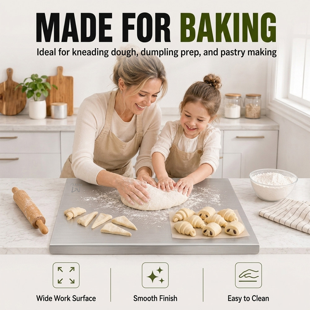
In the third picture, we do not continue to show ordinary chopping vegetables, but bring the product into the baking scene.
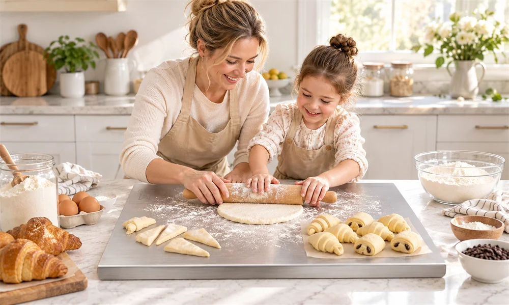
The picture shows a mother and child kneading dough together on a stainless steel cutting board, surrounded by dough, flour, croissants and rolling pins, making consumers immediately think of home baking.
Title use:
MADE FOR BAKING
Subtitle:
Ideal for kneading dough, dumpling prep, and pastry making
This picture is responsible for the task of “expanding uses”.
If only cutting vegetables is shown on the front, consumers may interpret the product as an ordinary metal cutting board. Through the kneading and baking scenes, we further emphasize that this large-sized stainless steel plate can also be used as a pastry work surface.
Especially for families who like to make bread, dumplings, pizza or desserts, the large flat working area is a strong selling point in itself.
We add three visual selling points at the bottom of the screen:
- Wide Work Surface
- Smooth Finish
- Easy to Clean
These three pieces of information do not reiterate the emphasis on materials, but directly describe the experience that users can get.
This design method has more conversion value than simply writing “304 Stainless Steel”, because consumers ultimately care not just about the name of the material, but what changes the material will bring to actual use.
Character interaction also makes the whole picture more life-like. The scene of mother and daughter kneading dough together can weaken the coldness of stainless steel products and allow them to blend into the home kitchen more naturally.
4. Strengthen safety and process details through edge close-ups
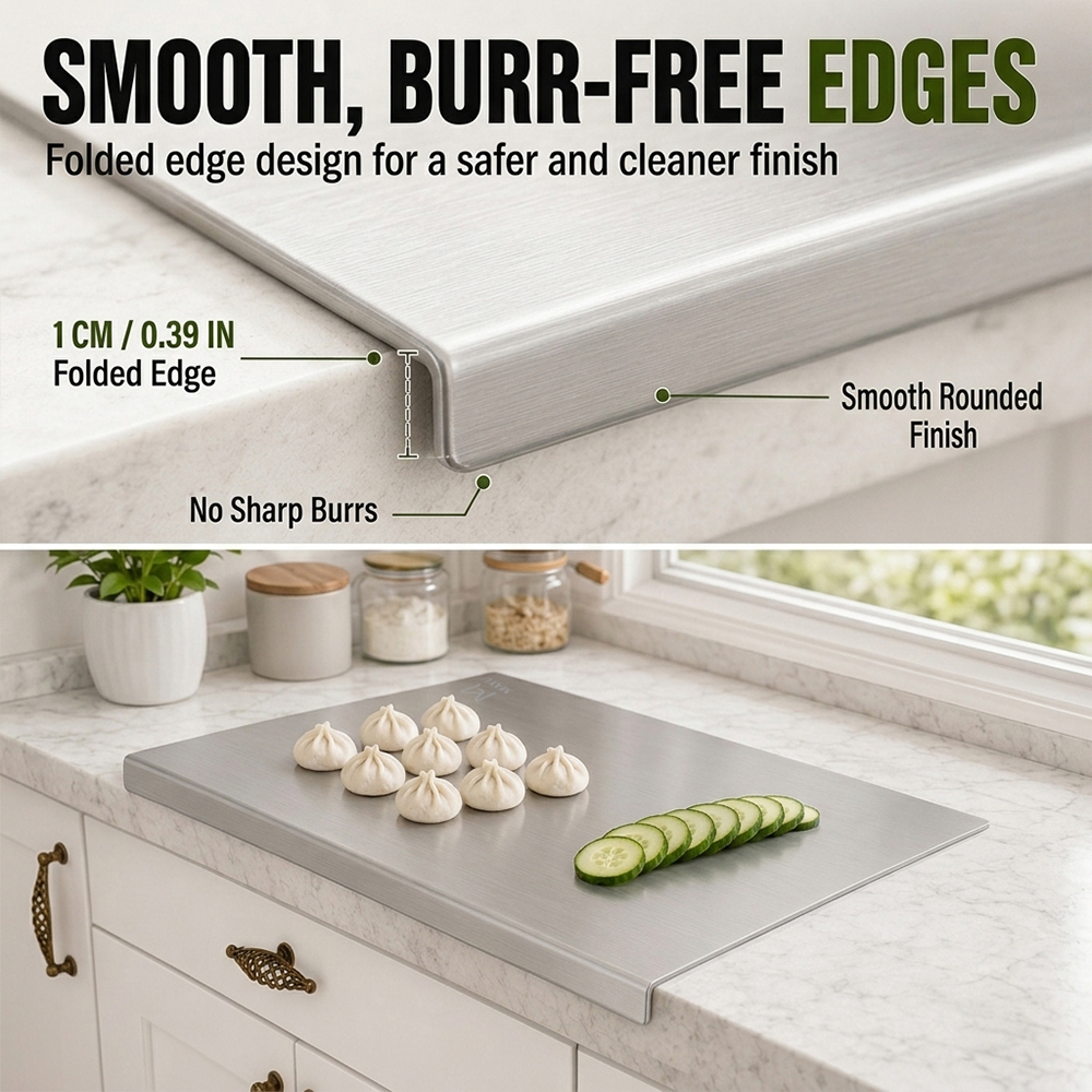
The fourth picture focuses on the hemming of the product.
Title use:
SMOOTH, BURR-FREE EDGES
Subtitle:
Folded edge design for a safer and cleaner finish
This picture adopts an upper and lower partition structure.
The upper part directly enlarges the edge of the stainless steel cutting board, highlights the folding structure through macro vision, and adds three instructions at the same time:
1CM / 0.39 IN Folded Edge
No Sharp Burrs
Smooth Rounded Finish
This is a very important detail in the entire set of images.
Because metal kitchen products can easily cause consumers to have a potential concern: Will the edges be sharp?
If you only write “safety rounded corners” in the copy, it will not be convincing enough. Therefore, we directly use the close-up of the product to enlarge the folding structure and display it.
Consumers can clearly see that the edges are not exposed thin metal sections, but are folded downwards.
This visual expression can effectively reduce users’ concerns about security.
The lower part returns to the kitchen usage scene, with steamed buns and sliced cucumbers placed on the cutting board, so that the close-up of the craftsmanship does not appear too technical.
We hope that users will form a clear understanding after reading this picture:
This product is not only large in size, but also considers the daily use experience in edge processing.
5. Comparison before and after use to show the easy cleaning characteristics
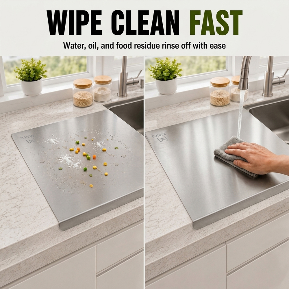
The fifth picture mainly highlights cleaning.
Title use:
WIPE CLEAN FAST
Subtitle:
Water, oil, and food residue rinse off with ease
We use left and right comparison.
The left side shows the cutting board after use, with a small amount of water droplets and food residue on the surface; the right side shows the state after cleaning. The user wipes the surface with a cleaning cloth while the faucet is rinsing.
This “before and after” structure is perfect for expressing the selling point of cleaning.
If you only take a picture of a clean stainless steel surface, consumers will not be able to feel “easy to clean”. But when the dirty state and cleaning action appear at the same time, users can quickly understand the entire use process.
The picture is also deliberately chosen to be close to the sink, so that the cleaning action conforms to the logic of a real kitchen.
When designing this picture, we did not add too many icons or parameters because the core action itself is clear enough.
For Temuprimary and secondary product images, when the picture can directly explain the problem, the less text, the better.
This picture actually answers a question that users encounter every day:
“Is it okay to clean up after cutting the vegetables and kneading the dough?”
6. Explain why you choose stainless steel through material comparison
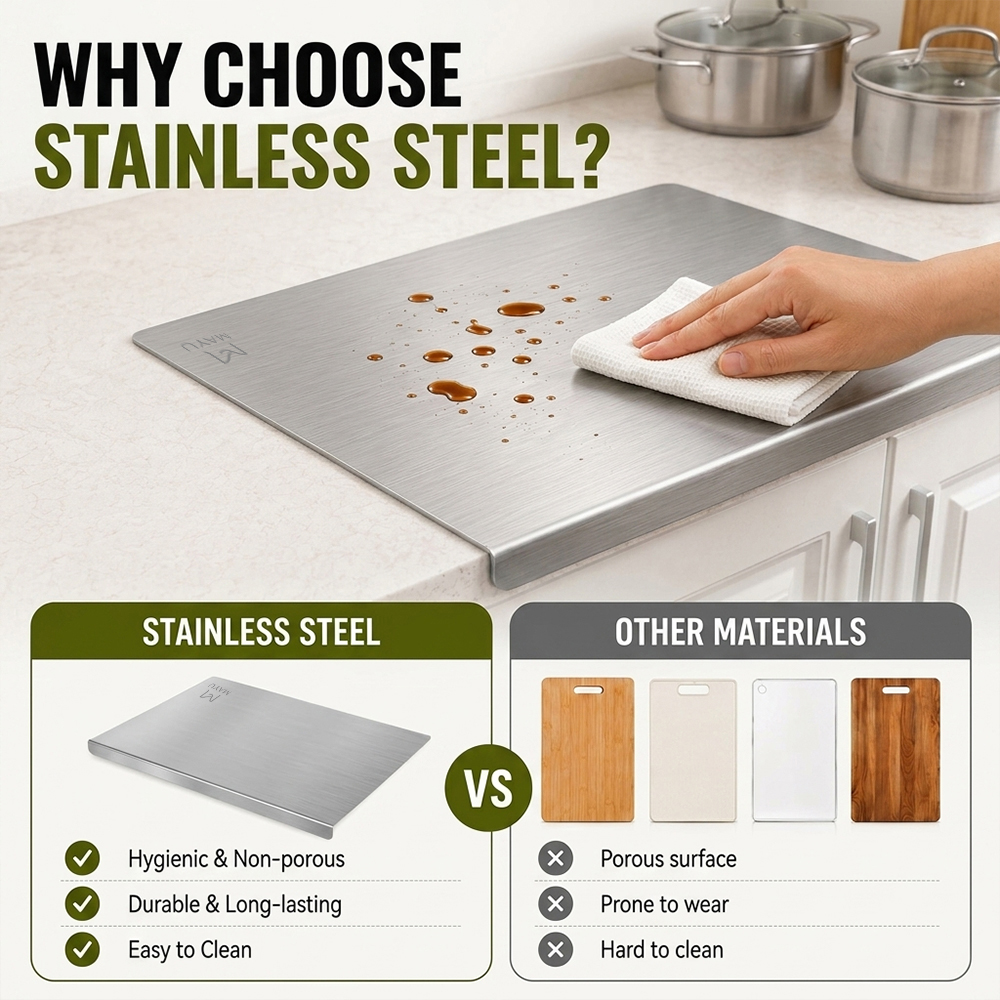
The sixth picture further explains the material value of the product.
Title use:
WHY CHOOSE STAINLESS STEEL?
The upper part still uses a real kitchen countertop scene to show the user’s actions of wiping the stainless steel cutting board.
The lower part is designed with a clear contrast between left and right.
On the left is:
STAINLESS STEEL
And list three characteristics:
- Hygienic & Non-porous
- Durable & Long-lasting
- Easy to Clean
On the right is:
OTHER MATERIALS
Match the visuals of common cutting boards such as wood and plastic, and list:
- Porous surface
- Prone to wear
- Hard to clean
Here we did not turn the entire picture into a rigid parameter comparison table, but retained the actual product shooting area and added graphical comparison at the bottom.
This can not only maintain the visual appeal of e-commerce, but also allow consumers to understand product positioning.
In terms of color matching, the stainless steel area continues to use olive green titles, while other materials use gray, allowing users to distinguish “recommended items” and “comparison items” at first glance.
The function of this picture is to further summarize the experience of “easy to clean, large size, suitable for kitchen use” that has been shown before, to the material level.
From the perspective of user decision-making path, this step is very important.
The previous picture tells consumers “what functions the product has”, while this one tells consumers “why this material is worth choosing.”
7. Use the four-square grid scene to enhance one board with multiple uses
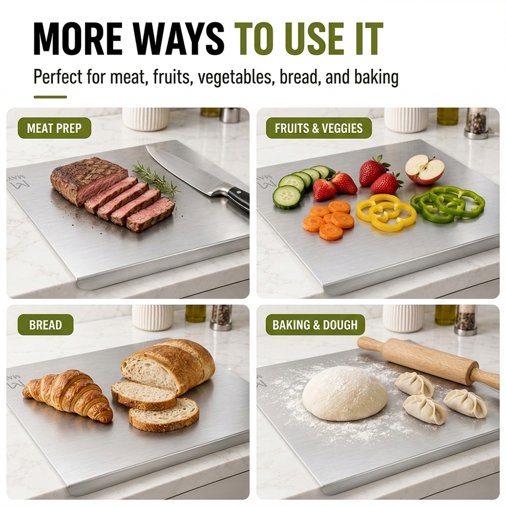
In the last picture, we chose to use a four-square grid to summarize the product usage range.
Title:
MORE WAYS TO USE IT
Subtitle:
Perfect for meat, fruits, vegetables, bread, and baking
The four scenes are:
MEAT PREP
The first frame displays steak slices and a kitchen knife.
This scenario can help consumers understand that the product is capable of handling meat. The metal surface paired with steak also further enhances the visual sense of a professional kitchen worktop.
FRUITS & VEGGIES
Use strawberries, apples, cucumbers, carrots and bell peppers in the second grid.
The rich and bright colors of the ingredients contrast sharply with the silver-gray cutting board, making the picture look more refreshing.
This scene emphasizes the most frequently used vegetable and fruit cuttings in daily households.
BREAD
The third panel displays croissants and sliced bread.
This scene extends the offerings further from the “cutting board” into breakfast and bread preparation areas.
Consumers can feel that it is not limited to traditional cutting board uses.
BAKING & DOUGH
The fourth compartment displays the dough, buns and rolling pin.
This part echoes the third baking scene, but here it prefers to use a range summary rather than a display of character emotions.
The four scenarios combined together can quickly tell consumers:
This is not a cutting board only suitable for cutting vegetables, but a multi-purpose kitchen workboard that can cover meat, fruits and vegetables, bread and pastry making.
This summary design is very suitable for the last picture on the e-commerce page.
It can help users reconfirm the value of the product at the end of their browsing experience and reinforce their reasons for purchasing.