Conversion-Focused Travel Website Design for Global Booking Growth

Введение

In the travel industry, a website is more than just a digital storefront—it is the first destination a customer experiences. A well-designed travel website must inspire, build trust, and guide users seamlessly from exploration to booking. For this Ueeshop project (https://t181.shop5.ueeshop.com/), our goal was to design a visually immersive and conversion-driven travel website that captures the excitement of discovery while delivering a smooth and intuitive user experience.

Rather than focusing on technical complexity, we approached the project from a design-first perspective. Every layout, visual, and interaction was crafted to reflect the emotional nature of travel—curiosity, inspiration, and confidence—while also driving measurable business outcomes.

This case study explores how we designed a travel-focused Ueeshop website, how each design decision supports user behavior, and how a strategic design approach can turn browsing into bookings.

Срок доставкиКатегорияПлатформа приложений
24 дняtravelUeeshop
Участники проекта (дизайнеры)РасходыЭффект
Линь Чжан$2600Pageviews📈277%

Understanding the Project Goals

Before any design work began, we defined clear objectives to align the website with the client’s business vision.

Основные цели

  • Build a clean, modern, and globally appealing visual identity
  • Improve user trust through structured and transparent design
  • Highlight product value through visual storytelling
  • Create a seamless browsing and purchasing experience
  • Ensure strong conversion performance across desktop and mobile

Target Audience

The website targets international customers, primarily from Western markets. This meant the design needed to reflect:

  • Minimalism and clarity
  • High visual consistency
  • Strong brand storytelling
  • Easy navigation and fast decision-making

Стратегия дизайна главной страницы

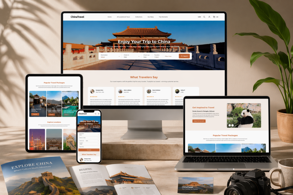
The homepage acts as a gateway to exploration. It must immediately capture attention and encourage users to dive deeper.

Hero Section: Inspire at First Glance

Conversion-Focused Travel Website Design for Global Booking Growth-Homepage Design Strategy-Hero Section: Inspire at First Glance

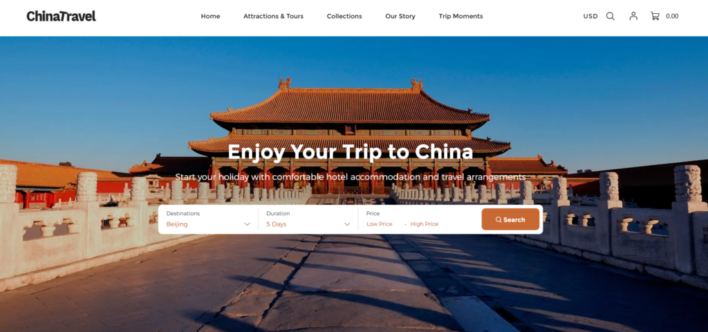
We designed a full-width hero banner featuring immersive travel imagery—landscapes, destinations, and cultural moments. The goal is to create an emotional connection within seconds.

Key elements include:

  • High-impact destination visuals
  • Short, inspiring headlines
  • Clear call-to-action (e.g., “Explore Destinations” or “Plan Your Trip”)

This approach invites users to start their journey instantly.rload.ad.

Destination Highlight Sections

Conversion-Focused Travel Website Design for Global Booking Growth-Homepage Design Strategy-Destination Highlight Sections

Instead of generic product listings, we structured sections around travel experiences and destinations.

Design Approach

  • Grid layouts showcasing different destinations
  • Balanced use of imagery and minimal text
  • Clear categorization (e.g., cities, nature, cultural tours)
  • Consistent spacing for a clean look

Each section answers key user questions:

  • Where can I go?
  • What can I experience?
  • Why should I choose this option?

Trust and Credibility Elements

Travel decisions involve higher commitment, so trust is critical.

We integrated:

  • Traveler reviews and testimonials
  • Service guarantees and support highlights
  • Clear booking and cancellation policies
  • Visual trust indicators (icons and badges)

These elements reduce uncertainty and increase booking confidence.n easier.

Beyond the Homepage: Supporting Travel Pages

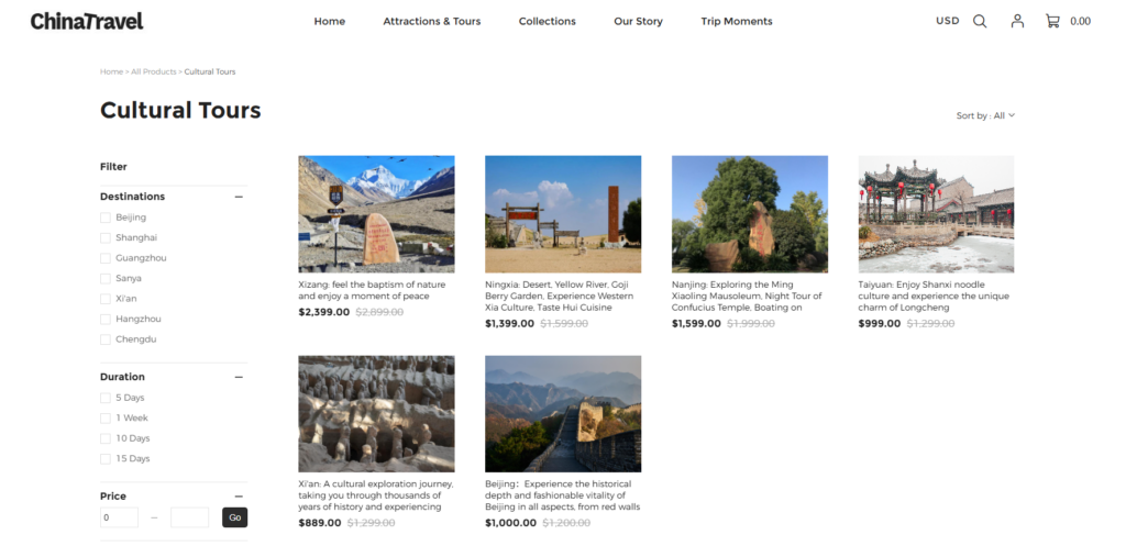
While the homepage inspires, internal pages convert interest into action.

Travel Package / Service Pages

We designed these pages to present travel offerings clearly and persuasively.

Structure Includes:

  • High-quality destination galleries
  • Key highlights and itineraries above the fold
  • Transparent pricing and inclusions
  • Prominent booking or inquiry buttons
  • Supporting visuals (maps, icons, feature highlights)

Instead of long descriptions, we used visual storytelling to communicate the experience. communicate value.echnical descriptions, we used visual storytelling to communicate value.

Destination Category Pages

These pages help users explore travel options efficiently.

We optimized them by:

  • Keeping layouts clean and easy to scan
  • Grouping destinations logically
  • Using consistent visual cards
  • Avoiding clutter to maintain focus

This allows users to quickly compare and choose destinations.find what they are looking for.

About and Brand Story Pages

In travel, emotional connection is essential.

We designed these pages to:

  • Share the brand’s travel philosophy
  • Highlight expertise and reliability
  • Maintain visual consistency
  • Build a sense of trust and inspiration

Наш процесс проектирования

A structured approach ensures both creativity and effectiveness.

Step 1: Research and Travel Market Insights

We analyzed:

  • Travel industry trends
  • Competitor travel websites
  • User behavior in trip planning

This helped define the visual and structural direction.

Step 2: Wireframing the User Journey

We mapped the full user journey:

  • Discovery → Exploration → Decision → Booking

This ensured every page supports a logical flow.

Step 3: Visual Design for Inspiration

Мы сосредоточились на:

  • Large, immersive imagery
  • Clean layouts with ample whitespace
  • Consistent typography
  • Harmonized color schemes

The goal was to balance inspiration with clarity.

Step 4: Conversion Optimization

We refined the design to:

  • Reduce friction in navigation
  • Highlight key actions
  • Simplify decision-making

Our focus: guide users naturally toward booking.ve friction and guide action.

Key Advantages of Our Approach

1. Experience-Driven Design

We design for emotion and experience, not just structure. This is especially important in travel, where inspiration drives action.

2. Global User Alignment

We follow Western design standards:

  • Minimalist layouts
  • Четкая визуальная иерархия
  • Clear communication

3. Consistency Across Pages

Consistency ensures users feel confident throughout their journey.

4. Mobile-First Travel Experience

Travel users often browse on mobile devices. We optimized for:

  • Easy scrolling
  • Touch-friendly interactions
  • Fast content consumption

Трудности, с которыми мы столкнулись

Challenge 1: Balancing Inspiration and Information

Travel websites must inspire without overwhelming users with details.

Challenge 2: Building Trust Quickly

Users need to feel confident in booking decisions within seconds.

Challenge 3: Structuring Complex Travel Content

Travel offerings can be complex, requiring clear organization.

Наши решения

Solution 1: Clear Content Hierarchy

We prioritized essential information and structured it logically.

Solution 2: Visual Storytelling

We used imagery and layout to communicate experiences instead of relying on text-heavy content.

Solution 3: Simplified Design Language

We removed unnecessary elements to keep focus on destinations and actions.

Final Results

The final travel website achieved:

  • A visually engaging and immersive experience
  • Improved navigation and user flow
  • Stronger presentation of travel offerings
  • Increased trust and credibility
  • Enhanced booking potential

Users can now easily explore destinations, understand offerings, and take action.

Заключение

This Ueeshop travel website project demonstrates how design can transform a browsing experience into a booking journey. By combining inspiration, clarity, and strategic layout, we created a platform that not only attracts users but also converts them effectively.

In the travel industry, great design is not optional—it is essential.

На сайте АИРСАНГ, we specialize in creating high-converting, design-driven websites tailored for global markets. Whether for travel brands or other industries, our focus remains the same: turning user interest into real business growth through thoughtful design.

Доставка по всему миру

АИРСАНГ Предоставляет экономически эффективные решения в области веб-дизайна, фирменного стиля и электронной коммерции. От Shopify и WordPress до изображений товаров для Amazon., Мы помогаем мировым брендам создавать, развивать и расширять свой онлайн-бизнес.

Спроектируем и создадим для вас WordPress-сайт или корпоративный сайт с полной системой электронной коммерции.
Нестандартные требования или специальные предложения

Нестандартные требования или специальные предложения

Первоначальная цена составляла: $2.00.Текущая цена: $1.00.
Дизайн главного изображения для домашнего физиотерапевтического устройства Amazon: пояснения.
Введение: Создание достоверного изображения для домашних терапевтических приборов на Amazon При разработке главного изображения для домашнего терапевтического прибора на Amazon мы в первую очередь...
Разработка эффективного основного изображения Amazon для фильтрующих картриджей
Введение. Разработка основного изображения для Amazon — это не просто создание привлекательного внешнего вида товара. Речь идёт о ясности, доверии и мгновенном понимании, особенно для...
Повторные атаки на WordPress: реальная угроза или преувеличенный миф?
Давайте сначала кое-что проясним. Атаки повторного воспроизведения не выглядят страшно. Они не взламывают пароли. Они не внедряют вредоносный код с зелёным хакерским текстом, разлетающимся повсюду. Они действуют коварно...
Сравнение пяти тем WordPress для сайтов о домашних животных
Введение. Выбор подходящей темы WordPress для сайтов, посвященных домашним животным, — это не просто решение, связанное с дизайном; оно напрямую влияет на удобство использования, масштабируемость и долгосрочный рост бизнеса. Уход за домашними животными и...
Сравнение пяти тем оформления для интернет-магазинов купальников
Введение. Выбор правильной тематики для независимого магазина купальников или нижнего белья — это не просто визуальное решение, оно напрямую влияет на коэффициент конверсии, масштабируемость и долгосрочную перспективу...
Создание масштабируемого веб-сайта на WordPress для научно-ориентированного бренда: проект AminoUSA
Введение. В современном цифровом пространстве веб-сайт — это больше, чем просто место для размещения информации о товарах. Для научно-ориентированных брендов, работающих в регулируемых или научно-исследовательских отраслях, это….
Создание масштабируемого магазина Shopify для глобального бренда ножей: проект CoolKatana
Введение. В трансграничной электронной коммерции веб-сайт Shopify — это больше, чем просто витрина магазина. Для брендов, работающих в нишевых, ориентированных на культуру категориях, веб-сайт должен делать гораздо больше, чем...
Высокоэффективный дизайн Shopify для индивидуального бренда стационарной торговой точки.
Введение. В условиях современной конкурентной среды электронной коммерции, особенно в сегменте персонализированных подарков и коллекционных товаров, веб-сайт на платформе Shopify должен делать гораздо больше, чем просто отображать товары. Он...
Как связаться со службой поддержки Shopify: простое и понятное руководство
Управление магазином Shopify должно приносить удовольствие, а не путаницу. Когда возникают вопросы или проблемы замедляют вашу работу, Shopify предлагает несколько вариантов поддержки в зависимости от ситуации...
Пример разработки веб-сайта на платформе Shopify для премиального цветочного бренда.
Введение. В условиях современной конкурентной среды электронной коммерции веб-сайт на платформе Shopify должен делать гораздо больше, чем просто отображать товары. Он должен мгновенно передавать ценность бренда, направлять пользователей...

Готовы преобразовать свой бизнес?

Закажите звонок, чтобы узнать больше о том, как наше агентство цифрового маркетинга может вывести ваш бизнес на новый уровень.