


Введение
A fashion website should do more than display products. It should create desire, communicate brand values, guide shoppers with confidence, and make every click feel effortless. For a colorful Parisian fashion brand, this goal becomes even more important because the website must translate personality, craftsmanship, sustainability, and style into a clear digital shopping journey.
Для этого Shopify design project, our focus was not simply to make the store look beautiful. We wanted to build a visual experience that felt joyful, refined, easy to browse, and aligned with the expectations of modern online shoppers. The homepage became the heart of the experience, while collection pages, product pages, brand storytelling sections, lookbooks, and customer service areas worked together to support a complete fashion eCommerce journey.
The brand already had a strong identity: colorful collections, expressive prints, feminine silhouettes, and a responsible fashion message. The website needed to reflect that personality while keeping the shopping path simple. From the first homepage impression to the final product discovery moment, every page had to balance emotion and usability.
| Срок доставки | Категория | Платформа приложений |
| 19 дней | Women’s Clothing | shopify |
| Участники проекта (дизайнеры) | Расходы | Эффект |
| Нэнси | $2000 | Sales📈271% |
Обзор проекта
Soi Paris is a fashion brand with a joyful and engaged identity. Its Shopify website presents categories such as new arrivals, dresses, blouses, tops, pants, accessories, second-hand pieces, permanent collections, maternity, lookbooks, boutiques, brand story, material guides, and journal content. This gives the site a broad content structure that supports both shopping and storytelling.
Our design direction centered on three priorities: creating a strong first impression, improving product discovery, and building a brand experience that felt consistent across pages. Fashion customers often browse with emotion first, then compare details later. Because of that, the homepage needed to invite users in visually, while the navigation and product sections needed to help them move quickly toward the right category.
The Objective
The main objective was to design a Shopify fashion website that could support both brand storytelling and high-intent shopping. The homepage had to introduce the brand mood immediately, highlight key product categories, promote seasonal collections, and guide users toward best-selling or newly launched items.
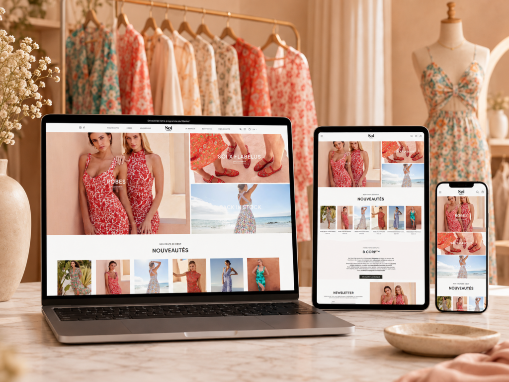
Creating a Strong Homepage Experience
The homepage needed to feel like a digital storefront. It had to showcase the brand’s most important visual assets, seasonal edits, and product categories without overwhelming visitors. We designed the page around clear visual hierarchy, giving each section a specific role.
The hero area introduced the seasonal message and led users toward the most important collection. Category blocks then helped shoppers choose where to go next, such as dresses, collaboration pieces, or back-in-stock items. Product highlight areas created a stronger commercial path by showing selected favorites and new arrivals.
Supporting Brand Trust
The site also needed to communicate trust. Soi Paris highlights its B Corp certification and responsible fashion values, including social and environmental standards, certified workshops, and a commitment to better fashion practices. This content gives the brand more depth than a standard fashion store and helps shoppers connect with its values.
Improving the Shopping Journey
The goal was to make the store easy to browse on both desktop and mobile. Fashion shoppers often move between inspiration and decision-making, so we focused on simple navigation, clean product grids, strong imagery, and direct calls to action.
The Design Challenge
A fashion Shopify website can easily become visually attractive but hard to use. The challenge was to protect the brand’s artistic personality while still creating a clean, conversion-focused structure.
Challenge One: Balancing Color and Clarity
The brand uses expressive prints, bright visuals, and seasonal storytelling. These assets create personality, but they can also make a page feel busy if the layout does not control spacing, rhythm, and contrast. Our design approach gave the visuals room to breathe. Instead of crowding the homepage with too many messages, we created a sequence that moves naturally from inspiration to product discovery.
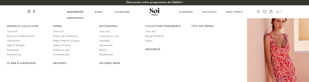
Challenge Two: Organizing a Large Product Structure
The store includes many categories and subcategories, including new collections, dresses, blouses, tops, pants, accessories, scarves, fans, jewelry, headbands, maternity, second-hand, and permanent collections. It also includes lookbooks and brand content.
This structure required careful navigation design. Customers should not feel lost, even when the catalog is broad. We treated the menu as a guided shopping tool rather than a basic list of links.
Challenge Three: Making Storytelling Commercial
The brand has a strong story, but the website still needs to sell. We needed to connect emotional storytelling with product movement. This meant placing brand values, lookbook content, product edits, and trust messages in positions that support shopping instead of distracting from it.
Challenge Four: Designing for Mobile-First Browsing
Fashion shoppers often discover brands through social media and browse from mobile devices. The design had to work beautifully on smaller screens. We simplified section layouts, prioritized tappable content blocks, and kept the mobile path focused on categories, product imagery, and clear calls to action.
Наш подход к дизайну Shopify
Our approach followed a clear process: brand analysis, page structure planning, visual direction, UX refinement, and conversion-focused layout design. We did not position the project as a technical development exercise. Instead, we focused on what matters most for a design-led Shopify store: presentation, user flow, product clarity, and brand consistency.
Step One: Understanding the Brand Mood
Before designing page sections, we studied the brand’s visual world. Soi Paris feels colorful, feminine, playful, artistic, and responsible. The design needed to avoid generic fashion templates. It needed to feel boutique, expressive, and editorial, while still being easy to shop.
We translated that mood into a layout system built around large lifestyle imagery, clean spacing, soft editorial rhythm, and simple commercial blocks. The goal was to let the products carry emotion while the interface stayed clean.
Step Two: Planning the Homepage Flow
The homepage needed a strong order. We structured it like a fashion retail journey.
First, the hero section creates the emotional entry point. Next, category tiles guide shoppers into key collections. Then, featured product areas help users discover popular or new pieces. After that, trust and brand value sections provide deeper meaning. Finally, newsletter, service benefits, Instagram content, and footer links complete the experience.
This structure allows the homepage to serve different user types. New visitors can understand the brand. Returning customers can jump to new arrivals. Gift shoppers can find seasonal edits. Brand-conscious visitors can learn about responsible fashion.
Step Three: Designing Clear Category Pathways
A strong Shopify fashion website depends on category clarity. We focused on making category blocks feel visual and direct. Instead of relying only on menu navigation, we used homepage sections to guide visitors into major shopping paths.
For example, dresses can become a key visual category because they are central to the brand’s product offering. Collaboration areas can highlight urgency and novelty. Back-in-stock sections can create demand because they signal popularity and limited availability.
Step Four: Building a Product-Focused Visual System
Product cards needed to feel elegant but practical. We emphasized strong product photography, clear names, visible pricing, and simple interactions. The product grid should help shoppers compare quickly without feeling like a discount marketplace.
For fashion brands, the product image is the strongest selling tool. We kept the surrounding interface minimal so that colors, prints, silhouettes, and fabric movement could stand out.
Стратегия дизайна главной страницы
The homepage is the most important page in this Shopify design case because it defines the brand experience within seconds.
Раздел «Герои»
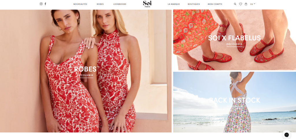
The hero section needed to communicate the season, collection mood, and brand personality. We designed it to feel more like a fashion campaign than a standard eCommerce banner. The visual direction should be bright, confident, and emotionally clear.
A strong hero area needs one primary message, one strong image direction, and one clear action. This keeps the first screen focused. Visitors should immediately understand where to click next.
Featured Category Blocks
The homepage uses collection-driven sections such as dresses, collaboration highlights, and back-in-stock areas. These blocks help turn visual interest into shopping action.
We treated each block like a mini campaign. The image creates emotion. The title explains the category. The call to action gives the shopper a clear next step.
Product Highlights
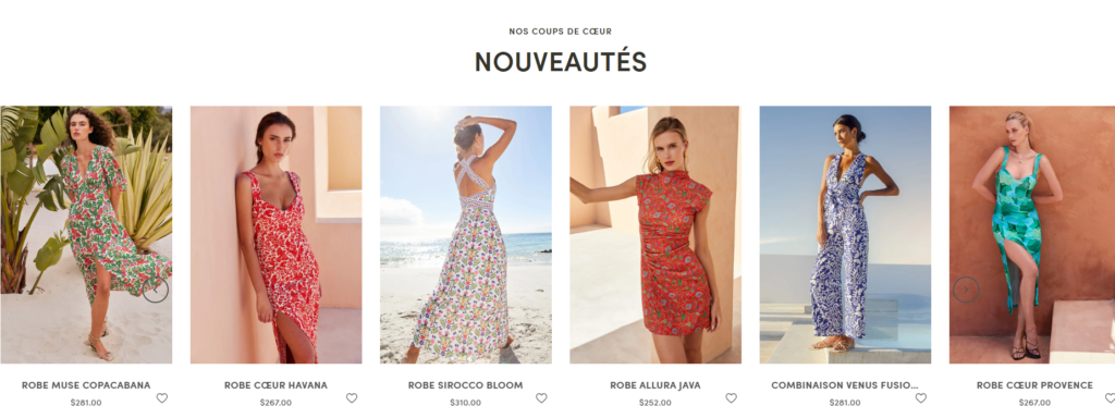
Featured product sections support conversion by showing shoppers what is new, loved, or seasonally relevant. On a Shopify fashion store, these sections work best when they feel curated. A shopper should feel like the brand selected these items intentionally, not that the site is simply showing random products.
Brand Value Section
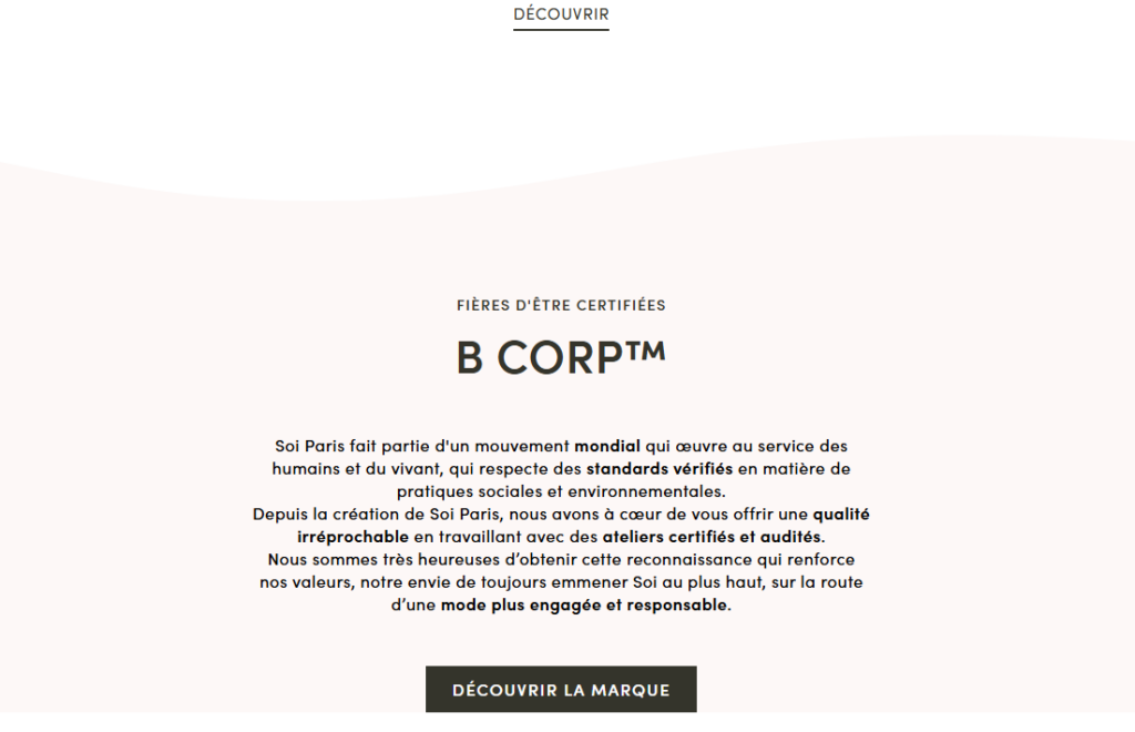
The B Corp certification section plays an important role. It helps customers understand that the brand stands for more than clothing. The section gives the homepage a responsible fashion message and reinforces trust.
We placed this type of content after product discovery rather than before it. This keeps the shopping journey active while still giving values-based shoppers a reason to believe in the brand.
Newsletter and Community
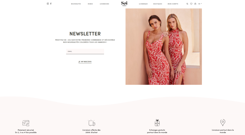
The newsletter area offers a first-order incentive and invites visitors to receive colorful new arrivals. The site also includes Instagram content, contact details, boutique links, and service benefits such as secure payment and delivery information.
These elements complete the homepage by supporting retention, social proof, and customer confidence.
Дизайн страницы коллекции
Collection pages are where inspiration turns into comparison. For Soi Paris, collection design needed to support browsing across dresses, tops, accessories, maternity pieces, permanent collections, second-hand selections, and seasonal edits.
Clean Product Grids
We designed the collection experience around clean grids and strong image consistency. The customer should be able to compare silhouettes, colors, patterns, and prices quickly. Product names and prices should be easy to read, but they should not overpower the imagery.
Filter and Sorting Experience
The site includes filtering actions such as filter, reset, and validate. For a fashion store, filters should feel simple and helpful. Shoppers may want to narrow by size, category, material, or style. The interface should reduce friction, especially on mobile.
Editorial Collection Structure
Fashion collection pages should not feel purely mechanical. We recommend treating top collection pages as editorial landing pages when possible. A short visual introduction, a strong title, and a curated product grid can make the collection feel more premium.
Дизайн страницы товара
The product page must help shoppers make a confident decision. For fashion, confidence comes from visuals, sizing information, material details, styling context, and trust signals.
Product Imagery
The image area should be the focus. Large product photos, detail shots, and lifestyle images help shoppers understand fit, color, and texture. Since Soi Paris emphasizes colorful materials and distinctive prints, product photography should remain central to the page.
Product Information Hierarchy
The product title, price, size options, material, description, shipping information, and return policy should follow a clear order. We recommend keeping the main purchase area clean and using expandable sections for deeper details.
Styling and Cross-Selling
A fashion product page can also suggest matching items, accessories, or related pieces. This supports a better styling experience and can improve average order value without aggressive selling.
Brand Story and Content Pages
A strong Shopify website should not rely only on products. Soi Paris includes pages for brand story, sustainable manufacturing, material guides, attention to detail, journal content, and lookbooks.
These pages help the brand educate customers and build emotional loyalty.
Brand Story Page
The brand story page should explain why the brand exists, what makes its design language different, and how it approaches fashion responsibly. The layout should feel editorial, with a balance of imagery, short text sections, and meaningful visual breaks.
Material Guide
The material guide supports product confidence. Shoppers who understand fabrics, care instructions, and material quality are more likely to trust the purchase. This page also helps position the brand as thoughtful and transparent.
Lookbook Pages
Lookbooks are especially valuable for fashion Shopify design. They show products in context and help customers imagine complete outfits. Soi Paris includes multiple lookbook areas, giving the brand room to present seasonal moods and campaign stories.
Our Visual Design Direction
The visual direction focused on joy, elegance, and clarity. We wanted the interface to support the product personality rather than compete with it.
Color
The website needed a clean base so that product colors and prints could stand out. Neutral backgrounds, controlled typography, and spacious section design allow the collection imagery to remain the strongest visual element.
Типография
Typography should feel refined but readable. Fashion websites often use elegant type treatments, but readability must come first. We used clear hierarchy for headings, product names, navigation, and calls to action.
Spacing
Spacing plays a major role in premium design. Generous spacing makes the site feel calmer and more editorial. It also helps customers focus on each section without feeling overloaded.
Calls to Action
Calls to action should be direct and consistent. Buttons such as “Discover,” “Shop New Arrivals,” or “Explore Dresses” work best when they appear at key decision points. The goal is to guide, not pressure.
The Benefits of This Shopify Design Strategy
A strong Shopify design strategy creates both emotional and commercial benefits.
Stronger Brand Recognition
The design helps the brand feel memorable. Customers can recognize the brand through color, imagery, layout rhythm, and tone.
Easier Product Discovery
Clear navigation and homepage category sections help users find relevant products faster. This is especially important for fashion stores with multiple categories.
Better Mobile Experience
A mobile-first structure makes browsing smoother for social traffic and returning customers.
Повышение доверия клиентов
Trust sections, material guides, responsible fashion messaging, service information, and clear product layouts help customers feel safer before purchase.
More Complete Brand Experience
By connecting homepage design, collections, product pages, lookbooks, and brand story pages, the website becomes more than a store. It becomes a complete digital brand environment.
The Result
The final Shopify design direction gives the brand a colorful, polished, and conversion-conscious online presence. The homepage introduces the mood quickly. The navigation organizes a broad catalog clearly. The collection pages support browsing. The product pages help customers evaluate details. The story-driven pages reinforce trust and brand meaning.
This type of Shopify website design works because it does not separate beauty from function. Every visual choice supports the shopping journey. Every section has a role. Every page helps the customer move from discovery to confidence.
Заключение
Разработка Shopify fashion website requires more than arranging images and products. It requires a clear understanding of brand identity, customer behavior, product discovery, mobile browsing, and visual storytelling. For a brand like Soi Paris, the website needed to feel joyful, refined, responsible, and easy to shop.
Through a design-led approach, the project connected homepage storytelling, collection clarity, product presentation, brand values, and customer trust into one cohesive Shopify experience. This is where thoughtful eCommerce design creates real business value.
На сайте АИРСАНГ, we help fashion and lifestyle brands shape Shopify experiences that feel premium, user-friendly, and conversion-focused while staying true to each brand’s visual identity.


Спроектируем и создадим для вас WordPress-сайт или корпоративный сайт с полной системой электронной коммерции.
Ценовой диапазон: от $200.00 до $2,500.00Нестандартные требования или специальные предложения
Первоначальная цена составляла: $2.00.$1.00Текущая цена: $1.00. Дизайн главного изображения для домашнего физиотерапевтического устройства Amazon: пояснения.
Введение: Создание достоверного изображения для домашних терапевтических приборов на Amazon При разработке главного изображения для домашнего терапевтического прибора на Amazon мы в первую очередь...

Дизайн основного изображения для конвертации помады на Amazon.
Введение: Разработка главного образа помады, которая продается на Amazon Когда мы разрабатываем главный образ для помады Amazon, наша ответственность выходит далеко за рамки...

Как хакеры крадут электронные письма администраторов WordPress (и как им это предотвратить)
Начнем с неприятной истины: ваша электронная почта администратора WordPress, вероятно, гораздо более публична, чем вы думаете. А хакеры? Им это нравится. Для них ваш...

Что делает основное изображение жидкой тональной основы Amazon конвертируемым?
Введение. Разработка дизайна основного изображения для жидкой тональной основы на Amazon — это не просто создание красивого внешнего вида продукта. На Amazon основное изображение и...

Разработка эффективного основного изображения Amazon для фильтрующих картриджей
Введение. Разработка основного изображения для Amazon — это не просто создание привлекательного внешнего вида товара. Речь идёт о ясности, доверии и мгновенном понимании, особенно для...

Повторные атаки на WordPress: реальная угроза или преувеличенный миф?
Давайте сначала кое-что проясним. Атаки повторного воспроизведения не выглядят страшно. Они не взламывают пароли. Они не внедряют вредоносный код с зелёным хакерским текстом, разлетающимся повсюду. Они действуют коварно...

Как скопировать страницы WordPress, ничего не сломав
Давайте посмотрим правде в глаза. Иногда вам не хочется создавать новую страницу. Вам нужна та же самая страница… но немного другая. Тот же макет. Те же блоки. Те же настройки. Потому что….

Сравнение пяти тем WordPress для сайтов о домашних животных
Введение. Выбор подходящей темы WordPress для сайтов, посвященных домашним животным, — это не просто решение, связанное с дизайном; оно напрямую влияет на удобство использования, масштабируемость и долгосрочный рост бизнеса. Уход за домашними животными и...

Сравнение пяти тем оформления для интернет-магазинов купальников
Введение. Выбор правильной тематики для независимого магазина купальников или нижнего белья — это не просто визуальное решение, оно напрямую влияет на коэффициент конверсии, масштабируемость и долгосрочную перспективу...

Как отключить комментарии в WordPress (не сойдя с ума)
Давайте поговорим о комментариях в WordPress. В теории комментарии — это здорово. Они стимулируют дискуссии. Они создают сообщество. Они делают ваш сайт “живым”. А на практике? Зачастую они притягивают...

Создание масштабируемого веб-сайта на WordPress для научно-ориентированного бренда: проект AminoUSA
Введение. В современном цифровом пространстве веб-сайт — это больше, чем просто место для размещения информации о товарах. Для научно-ориентированных брендов, работающих в регулируемых или научно-исследовательских отраслях, это….

Создание масштабируемого магазина Shopify для глобального бренда ножей: проект CoolKatana
Введение. В трансграничной электронной коммерции веб-сайт Shopify — это больше, чем просто витрина магазина. Для брендов, работающих в нишевых, ориентированных на культуру категориях, веб-сайт должен делать гораздо больше, чем...

Разработка высокоэффективного магазина Shopify для карточек Pokémon.
Введение. В мире электронной коммерции коллекционных товаров, особенно на рынке коллекционных карточных игр Pokémon, веб-сайт должен делать больше, чем просто перечислять товары...

Высокоэффективный дизайн Shopify для индивидуального бренда стационарной торговой точки.
Введение. В условиях современной конкурентной среды электронной коммерции, особенно в сегменте персонализированных подарков и коллекционных товаров, веб-сайт на платформе Shopify должен делать гораздо больше, чем просто отображать товары. Он...

Как связаться со службой поддержки Shopify: простое и понятное руководство
Управление магазином Shopify должно приносить удовольствие, а не путаницу. Когда возникают вопросы или проблемы замедляют вашу работу, Shopify предлагает несколько вариантов поддержки в зависимости от ситуации...

Как деактивировать магазин Shopify: понятное и практичное руководство
Деактивация магазина Shopify — несложная процедура, но она влечет за собой последствия, которые многие продавцы упускают из виду. В этом руководстве процесс описан простым и понятным языком...

Пример разработки веб-сайта на платформе Shopify для премиального цветочного бренда.
Введение. В условиях современной конкурентной среды электронной коммерции веб-сайт на платформе Shopify должен делать гораздо больше, чем просто отображать товары. Он должен мгновенно передавать ценность бренда, направлять пользователей...

Пример проекта дизайна на Shopify: магазин ретро-игр
Введение. В условиях высокой конкуренции в сфере электронной коммерции визуальная ясность и эмоциональная связь часто определяют, станет ли посетитель клиентом. Это особенно актуально в...