Project overview
The client of this project is a cross-border clothing brand that specializes in modern commuting and elegant women’s clothing. Its products cover multiple categories such as shirts, dresses, suit jackets, trousers, and autumn and winter jackets. As the brand continues to expand its product lines on the SHEIN platform, the original store visual lacks a unified brand tone, and the display styles of different products are also relatively scattered. Therefore, the customer came to us and hoped to redesign a complete set of store poster visuals. Our mission is to unify colors, scenes, fonts, models and layout language around the brand’s “elegant, refined and modern” positioning, while also taking into account brand image display, single product recommendations, category navigation and series topics, to help stores establish a clearer and more recognizable women’s clothing visual system on the SHEIN platform.
| Услуги | Industry | Платформа |
| shein store design | clothing apparel | Шейн |
| Project requirements | target market | design style |
| Improve click-through rate | Глобальная | Elegant and luxurious | minimalist and high-end | modern commuting |
| project budget | Delivery content | Delivery time |
| ¥800 | 9 posters | 7 working days |
Project Challenges
The core challenge of this project is to establish a unified and brand-recognizable SHEIN women’s clothing store vision when there are many product styles and obvious differences in styles. We need to simultaneously solve problems such as insufficient display of single products, lack of correlation between series, pages that tend to appear cluttered, and lack of distinctive brand temperament. In the early stage, we first sorted out the customer’s product structure, core categories, target female population and overall positioning, and analyzed the differences in color, version, fabric and wearing scene of different clothing. Subsequently, we decided to use warm beige, arched space, soft light and shadow, and exquisite typography as the basis for a unified vision. We then planned model shapes, composition proportions, and information levels based on different series such as shirts, dresses, suits, and jackets to ensure that the entire set of posters was both unified and varied.
The first picture: Use three groups of looks to establish the first impression of the brand
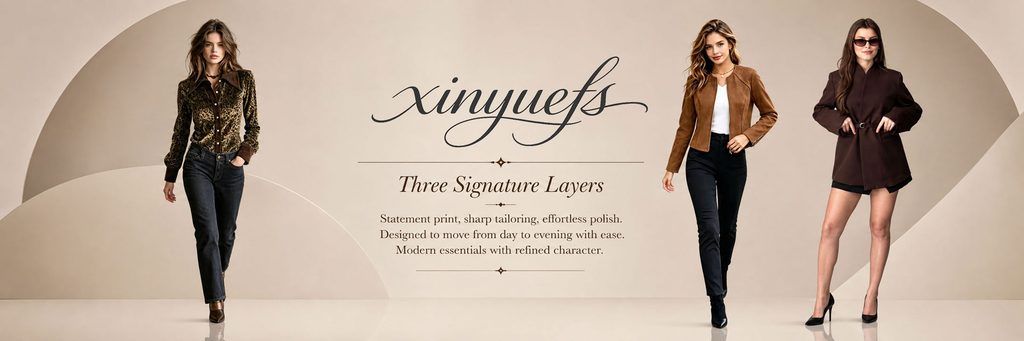
The first poster serves as the visual opening of the entire store.
We arranged the three models on the left and right sides of the screen, and placed the brand name and core copy in the center to create a stable left-right balance of visual focus. The three sets of clothing respectively present a leopard print shirt, a brown short jacket and a dark suit shape. Through different materials and different silhouettes, they quickly convey to consumers that the brand has diversified wear capabilities.
The background does not use real street scenes, but uses beige geometric curved surfaces and soft architectural structures. This processing can reduce the interference of irrelevant elements and allow consumers to see the model and clothing at first glance.
In terms of color, we kept the background in a low-saturated warm beige color, allowing black, brown and leopard print to naturally become the visual focus. The large blank space in the center is used to carry copywriting such as the brand name and “Three Signature Layers”.
The purpose of this picture is not to introduce a certain item, but to tell consumers: this brand focuses on modern women’s clothing with mature texture, exquisite tailoring and daily practicality.
Second photo: Highlight the product personality of the zebra print shirt
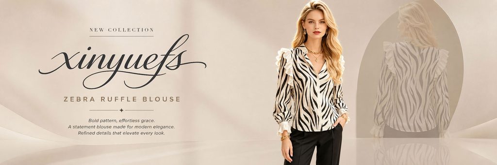
The second poster focuses on a black and white zebra print ruffled shirt.
Since the product itself already has a very strong pattern, we deliberately controlled the complexity of the background and made the off-white space and curved buildings become auxiliary elements.
In terms of typesetting, we adopt the structure of left text and right person. The left side retains the larger brand name, and uses “Zebra Ruffle Blouse” to directly indicate the product type; the right side arranges models to fully display the collar, ruffles, cuffs and overall shape of the shirt.
We also added a low-transparency back shadow effect to the right rear of the model so that the same piece of clothing can reflect both front and back information. Compared with simply placing two product images, this approach has a more magazine-like feel and will not disrupt the overall visual order.
The black and white zebra pattern forms a strong but restrained contrast with the beige space, allowing consumers to quickly lock in the product.
Picture 3: Enhance the high-end feel of the suit through tailoring
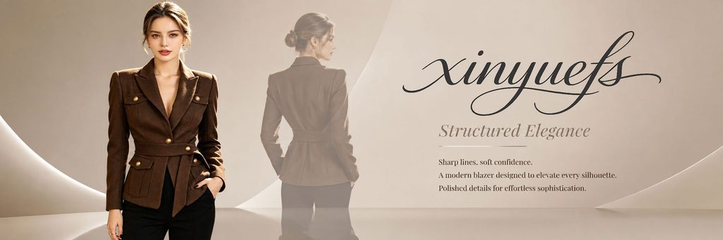
The third poster focuses on a brown waisted blazer.
What this kind of product really needs to express is not the color, but the version and structure. Therefore, we made the front model take up a larger proportion, clearly showing the shoulder line, belt, metal buttons and pocket structure.
At the same time, we added a translucent back shape behind the model so that consumers can understand the waist cinching and back contour.
A large clean space is left on the right side for the brand name and “Structured Elegance” theme copy.
Here we continue to use the beige, light coffee and dark brown system to create a natural transition between the product and the scene. We further enhance the three-dimensionality of the suit by focusing the light on the model’s shoulders and the edges of the garment.
The core logic of this poster is to “use space to set off the cut.” We avoided adding decorative props because the suit itself is the visual centerpiece of the picture.
Photo 4: Use minimalist space to highlight the white dress
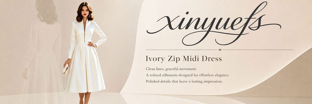
The fourth poster shows a white zip-up waist midi dress.
White products can easily lose their outline if placed directly on a pure white background, so we used a cream background with a slight warm tone and differentiated the edges of the product through shadows and light.
The model is placed on the left side, and the back is faded to show both the front and back structures of the clothing. On the right side, a large area of brand name, product name “Ivory Zip Midi Dress” and a three-line short description are used to establish an information hierarchy.
We specially reduced the decorative elements in this one to make the picture more like the lookbook of a high-end women’s clothing brand.
The white dress itself has a strong elegance attribute, so we did not use flowers, furniture or complex life scenes, but enhanced its lightness through a streamlined arc structure.
This allows consumers to focus on the hemline, waistline and overall proportions.
Picture 5: Establish a clear entrance to women’s clothing classification
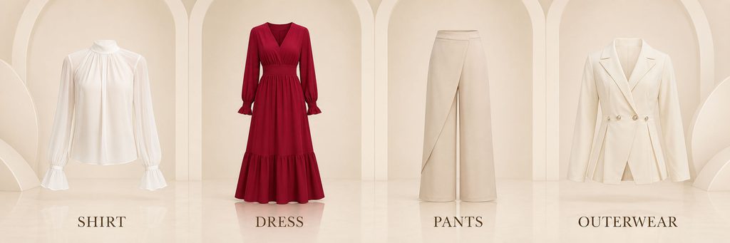
The fifth picture is different from the first four product theme posters. It plays the role of store classification navigation.
We place the four core categories of SHIRT, DRESS, PANTS, and OUTERWEAR in four arched spaces, with only one representative product appearing in each area.
The biggest advantage of this approach is that the information is very clear.
Consumers do not need to read complicated instructions. They only need to look at the clothing outline and the category name at the bottom to determine what category each area corresponds to.
The background continues the arch language in the entire visual set, so that the category page will not suddenly deviate from the brand style. At the same time, sufficient distance is maintained between the four products to avoid the crowded feeling of an ordinary product list.
Visually, we set the red dress as the most obvious color focus in the entire picture, using it to break the monotony of the large area of off-white.
This method of “one key color + multiple neutral colors” also allows the classified posters to maintain a sense of elegance.
Picture 6: Constructing the overall women’s clothing image of the brand
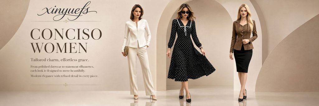
The sixth poster returns to the multi-model group.
We chose three distinct looks, namely a white suit, a black polka-dot skirt and a brown slim-fitting suit, to demonstrate the brand’s dressing capabilities from commuting, daily life to light formal occasions.
Use the large title “CONCISO WOMEN” on the left, paired with the brand name and a short description. There is a large distance between the three models on the right, so that each set of clothing has an independent display area.
The key to this one is not to introduce a certain product, but to enhance the integrity of the brand.
For SHEIN stores, if all posters only emphasize single products, consumers will easily understand the store as a collection of ordinary products. Therefore, we added this kind of brand image poster to help consumers establish the awareness of “what style this store is” through the overall shape.
Picture 7: The outerwear series forms the visual theme of autumn and winter.
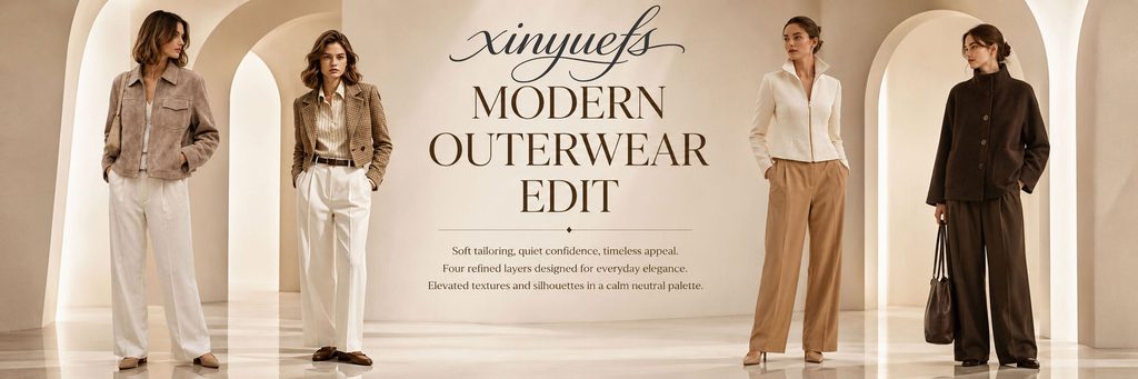
The seventh one revolves around the “Modern Outerwear Edit”.
We selected four models to display different coats, including light brown short coats, plaid suits, white stand-collar coats and dark brown long coats.
In order to prevent the four models from appearing crowded, we made the characters stand in different arched structures and placed the core copy in the center of the picture.
This layout creates an effect similar to a fashion display space.
In terms of color, off-white, light brown, camel and dark brown all belong to the same warm color system, so even if the four sets of clothing have different styles, the entire picture remains highly unified.
We hope that when consumers browse this picture, they can directly feel the “autumn and winter texture” and “high-end commuting” instead of simply seeing four coats.
Picture 8: Highlighting the richness of the shirt series
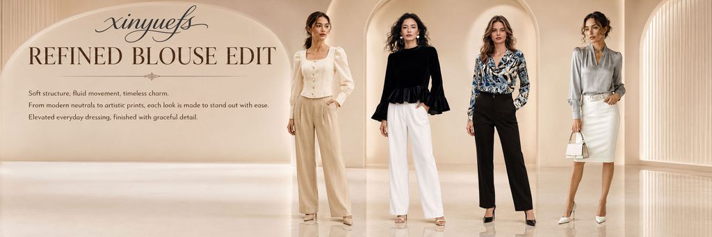
The eighth one mainly shows different types of women’s shirts.
We arranged four models to wear cream crop tops, black ruffled tops, printed shirts and silver-grey satin shirts, creating changes in fabrics, colors and silhouettes.
Use “REFINED BLOUSE EDIT” as the headline on the left side, and leave enough text space so that the picture will not lose its sense of breathing due to the appearance of four models at the same time.
The most important thing about this article is to let consumers know that the brand’s shirts are not just one type of basic commuting style, but cover different directions such as simplicity, elegance, printing and light luxury.
The background continues with arches and cream-colored buildings, giving the characters a sense of space similar to a boutique display window.
This unified architectural language is also one of the most important brand identity elements of the entire set of posters.
Photo 9: Complete the visual ending of the series with a dress
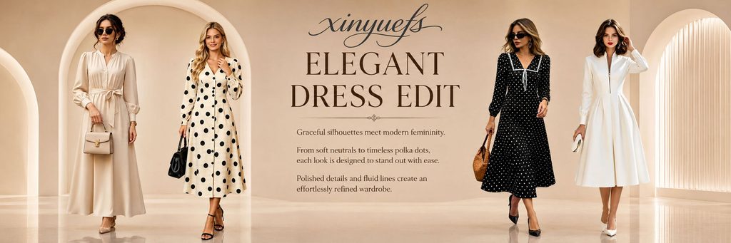
The final poster shows four different styles of dresses.
On the left is a light beige waist-length skirt and a polka-dot dress, while on the right is a black polka-dot skirt and a white simple dress. We placed “ELEGANT DRESS EDIT” in the center of the frame, allowing the four models to create a visual balance around the title.
Compared with ordinary dress product pictures, we pay more attention to the “series sense”.
Although the colors and details of the four garments differ, they all revolve around elegance, slim fit, femininity and light formal wear. Therefore, when consumers browse this page, they will naturally feel that this is a series of dresses that have been selected and matched, rather than randomly arranged products.
The arches on both sides and the large blank space in the middle further enhance the overall sense of space, while also preventing the models from blocking each other.