Project overview
This case shows 6 Russian works of Ozon from the gray home appliance series. They connect different products with a common visual system, and then change the display focus around the structure, use and specifications of each product. The focus of the explanation is: maintain the series vision, while changing the focus of information according to product characteristics. For brands and sellers who need to plan a series of product images, this arrangement provides a specific reference between unified identification and single product differences.
| Услуги | Industry | Платформа |
| Ozon series product main product image design | Home department store | Озон |
| Project requirements | target market | design style |
| Maintain the series vision while changing the focus of information based on product features | Russia | Minimalist gray tone · Technological texture · Clear information |
| project budget | Delivery content | Delivery time |
| ¥400 | 6 case display pictures | 5 working days |
design challenge
This group contains multiple products and does not constitute a continuous secondary product image of the same product. It is necessary to use a unified gray system to establish a sense of series, and then assign different information methods to cleaning, electrical appliances, lamps and tableware, and single product functional links cannot be applied.
Design strategy: Let the entire group of works form a clear information relationship
01 First distinguish the product objects, and then determine the focus of each picture
The works involve “cleaning home appliances → trimmers → headphones → lamps → handheld vacuum cleaners → tableware sets”. Each picture organizes the content around the corresponding product, and does not combine the capacity, power or functions of different products into one model. What the series have in common is the visual identity, while the information tasks are determined individually by product characteristics.
02 Use a consistent visual language to connect different reading tasks
Gray-white backgrounds and low-saturated text run through each product; the whole machine occupies the main area, with home photos, accessories display and a small amount of warm light changing according to product responsibilities. The unified style serves the entire group identification, and composition changes serve different contents; the main title, auxiliary labels and product proportions in the picture jointly determine the reading order.
03 Let different products retain their own purchase issues
Maintaining a series vision while changing the focus of information according to product characteristics is the organizing focus of this body of work. Lists, parameters, parts and scenes are suitable for different products: first look at what each product needs to explain, and then select the corresponding screen, instead of applying the same parameter layout to all products.
Dismantling the work: explaining the screen arrangement and information responsibilities of each picture
Figure 1|Cleaning home appliances: Put the machine into the home environment
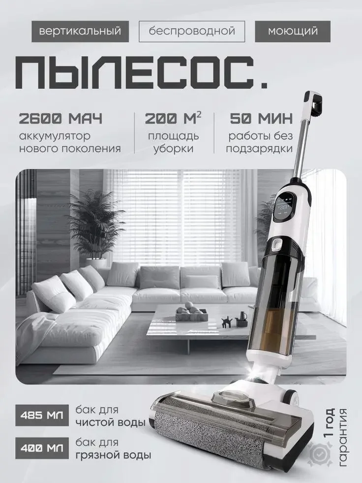
The upright cleaning equipment is juxtaposed with the photo of the living room. The upper number area organizes the battery, usage range and duration, and the lower part distinguishes the theme of the water tank.
The environment explains the purpose, and the numbers explain the verification direction. The two are separated to prevent daily photos from covering the key body.
Figure 2|Trimmer: Let the host and replacement parts establish a relationship

The trimmer occupies the center, with three accessories arranged around it, and numbered labels are arranged in the blank space on the side.
The accessories are directly related to the host, helping to understand the composition of the set. The gray information remains unified but does not use the scene logic of cleaning home appliances.
Figure 3|Headphones: Using outlines and labels to support identification
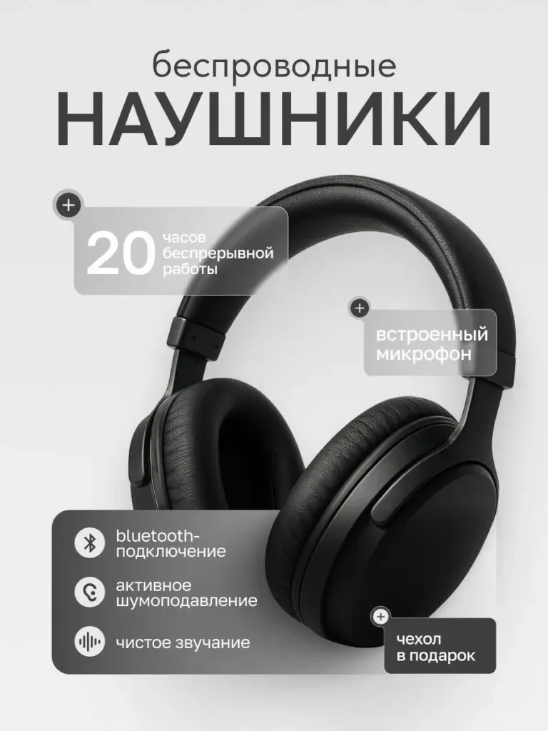
The headset is displayed in a large way, and the themes of connection, call and battery life are arranged around it with rectangular labels.
The black outline is easy to distinguish on the light background, and the labels divide the functions into groups, which is suitable for looking at the appearance first and then checking the corresponding information.
Figure 4|Lamps: Use local warm light to break the gray rhythm
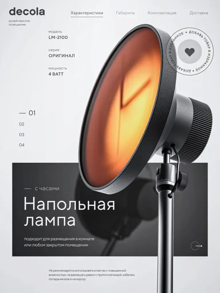
The round lamp head and bracket are enlarged diagonally, and the warm-colored luminous area becomes the focus. The model number and description are retained on the left side.
This picture uses the luminous surface to explain the lighting theme, and the information area does not need to copy the parameter card structure of the headset.
Figure 5|Handheld vacuum cleaner: protruding nozzle and holding shape
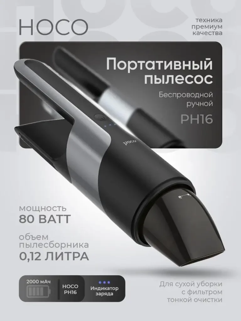
The dark-colored handheld vacuum cleaner is placed diagonally in the center. The long nozzle remains intact with the body. The power, capacity and battery themes are organized below.
The product posture explains the structure first, and then uses a few parameters to help check. There is no need to repeat the previous cleaning theme with another large picture of the living room.
Figure 6|Tableware set: explain the purchase contents in terms of quantity and arrangement

Tableware such as knives, forks, spoons, etc. are unfolded diagonally, with 24 pieces and 6-person themes placed on the right side, and the material text is reserved separately.
The orderly arrangement highlights the relationship between the sets, and the quantity is the main check point. The overall gray style still echoes the previous electrical appliances page.
Delivery summary and design value
The entire team delivers with a clear division of labor
The 6 works in this case cover “Cleaning Home Appliances → Trimmers → Headphones → Lamps → Handheld Vacuum Cleaners → Tableware Sets”. The number of images depends on the actual content, and each image has its own theme while maintaining an overall identity through color, text hierarchy, or composition.
Procurement issues can be more easily mapped to specific information
Focusing on the gray home appliance series, the work will “maintain the series vision while changing the focus of information according to product characteristics” and implement it into different images. When brands plan similar designs, they can first list the content that consumers need to identify, understand and check, and then determine the tasks and order of primary and secondary product images.
Value is based on interpretive methods and authentic works
The whole machine, part, scene and information cards provide different reading entrances, helping to organize product descriptions more clearly. The value of this case is the visible design expression and information division of labor; changes in click-through rates, sales, and conversion rates require additional statistical or test data support.
The parameters, materials and functions in this article are used to explain the content of the accompanying pictures. The specific specifications, applicable conditions and accompanying items are subject to the product information of the corresponding model.
Plan clearer product images for your Ozon products
If you also need to plan primary and secondary product images for your Ozon gray home appliance series, you can submit product links, existing pictures or product information to AIRSANG, explain the target market and required picture group range, and communicate the information organization and visual direction suitable for the product.
Consultation email: [email protected] · Telephone: 177-5952-2770