Project overview
The product picture of the smart watch with built-in Bluetooth headset needs to explain the two-in-one structure through the scenes of opening the cover, taking it and wearing it. This case focuses on the existing 7 Russian works of Ozon, dismantling the arrangements for product identification, theme description and condition verification. For brands and sellers who are preparing to produce pictures of similar products, the focus is not only on the style of the pictures, but also on understanding how different pictures distribute information so that product-related questions have corresponding reading positions.
| Услуги | Industry | Платформа |
| Ozon product primary and secondary product images design | Digital 3C | Озон |
| Project requirements | target market | design style |
| Explain the 2-in-1 structure with images of opening, taking and wearing the lid | Russia | Sense of technology, sense of future, sense of dynamics |
| project budget | Delivery content | Delivery time |
| ¥400 | 7 case display pictures | 4 working days |
design challenge
The structure of the earphones stored in the watch is not easy to understand based on the surface appearance alone. It is necessary to provide step-by-step instructions through the opening status, action arrows and character wearing, and at the same time arrange the watch screen and daily functions on their own pages.
Design strategy: Let the entire group of works form a clear information relationship
01 Allocate information tasks first, and then arrange the key points of the screen
The work is expanded according to “2-in-1 overview → screen → opening structure → access action → motion → call music → function summary”. Figure 1 establishes the identification first, and then switches the composition and description position according to the actual theme. This division of information allows different questions to have their own place, reducing the need to pile up all the text in the first image, and preventing subsequent images from simply repeating the same product photo.
02 Use a consistent visual language to connect different reading tasks
The silver-white and dark blue backgrounds alternate, and the black body is paired with a green and blue title; the halo, structural arrows and character movements connect the technical theme and daily scenes. The unified style serves the entire group identification, and composition changes serve different contents; the main title, auxiliary labels and product proportions in the picture jointly determine the reading order.
03 Reduce the explanation to specific parts, actions or choices
The focus of this series of works is to explain the two-in-one structure through images of opening, taking, and wearing. When dismantling, look at the correspondence between the whole machine and parts, themes and conditions: when there is structural information, look at the positional relationship, when there is scene information, look at the objects used, and when there are numbers, look at the categories and limiting conditions. Letting each picture answer a specific question has more explanatory value than repeatedly emphasizing the excellence of the product.
Dismantling the work: explaining the screen arrangement and information responsibilities of each picture
Figure 1 | Two-in-one overview: using two states to clarify product composition
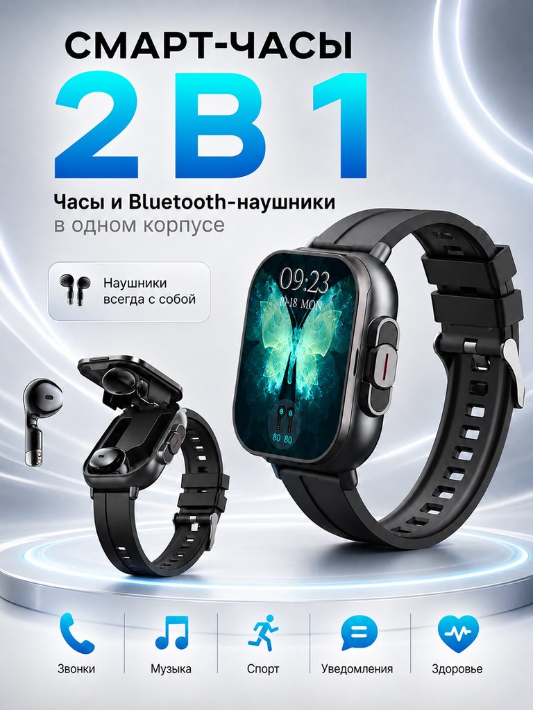
The closed watch appears at the same time as the open headphone compartment, with the 2-in-1 title at the top and the lower icons summarizing calls, music and activities.
The open and closed status directly explains the product relationship, which is easier to establish recognition than writing the names of earphones and watches separately.
Figure 2|Screen display: Keep the size consistent with the interface
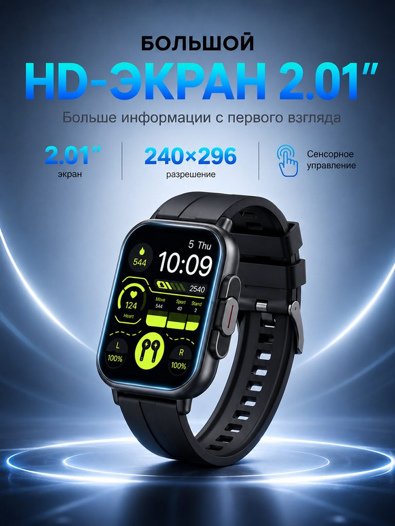
The watch is placed diagonally in a dark blue halo, with 2.01 inches, 240×296 and touch annotations concentrated on the top.
The appearance and interface are responsible for identification, the specification bar is responsible for verification, and the screen information is separated into a clear theme.
Figure 3|Open cover structure: showing the headphone compartment and storage position
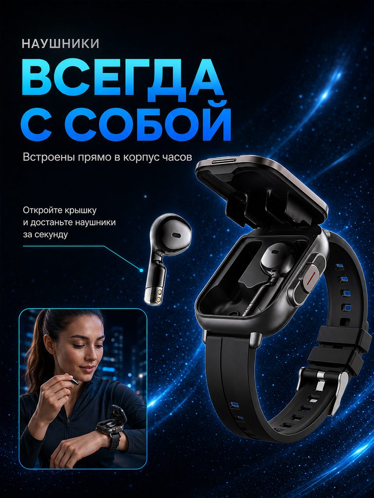
When the cover is opened, the position of the earphones and the compartment are clearly visible, a thin line connects the body, and a small picture of the character’s access is added in the corner.
The structure and movements of the whole machine are presented at the same time, answering where to put the earphones and how to take them out of the watch.
Figure 4|Retrieval action: Use arrows to connect the structure and wearing
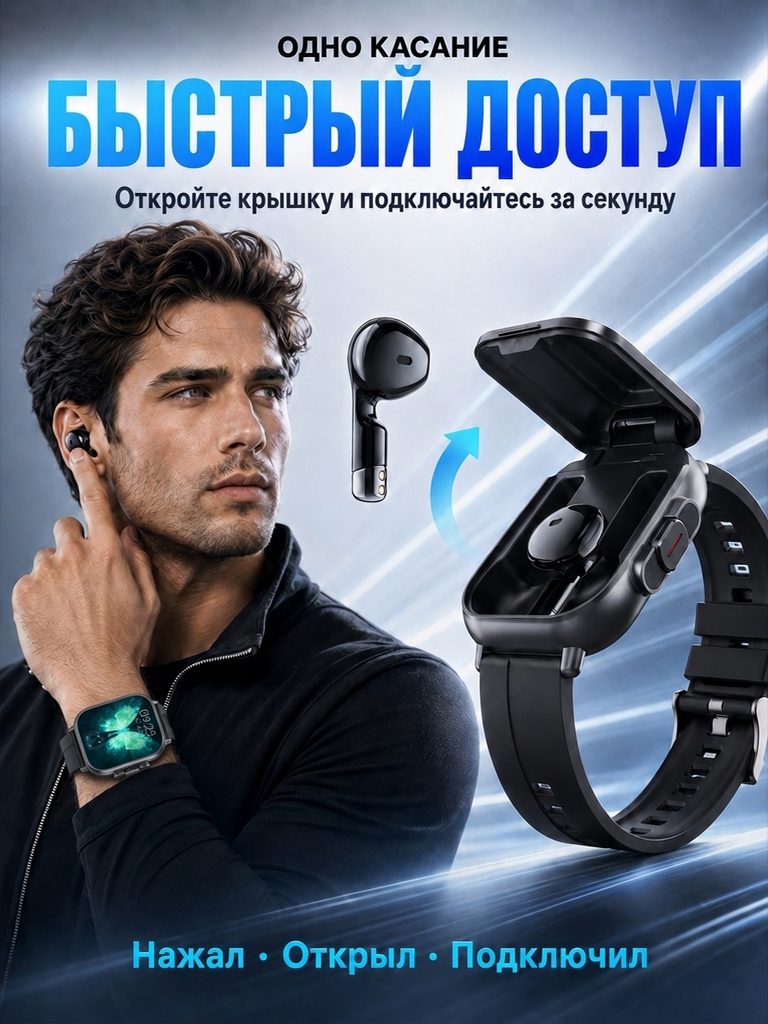
The open-cover watch and floating earphones occupy the right side, with the arrow pointing in the direction of removal, and the character is wearing the earphones on the left side.
The arrows explain the actions, and the characters explain the usage status, pushing the structural explanation to the understanding level of real operations.
Figure 5|Sports scene: Put the wrist interface back into the activity
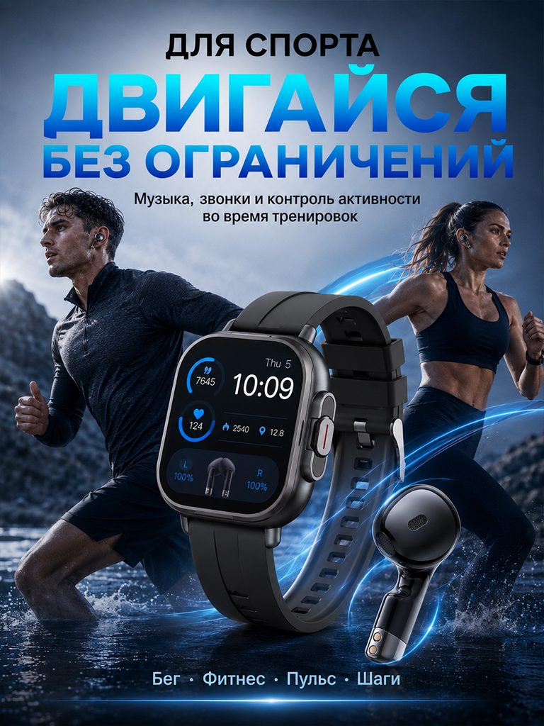
Running figures are arranged in the background, the watch activity interface and headphones are enlarged in the front, and the text at the bottom distinguishes the activity theme.
The characters provide environmental reference, and the interface retains functional positions, allowing the movement page and the open structure page to take on different tasks.
Figure 6|Call music: Use the call interface to illustrate the contact topic
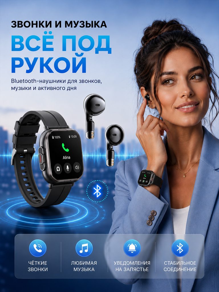
The character wears headphones and raises his wrist. The enlarged watch displays the incoming call, and the Bluetooth and music icons are listed below.
Actions and interfaces make the call theme concrete, and icons further differentiate between contacts, music, and notifications.
Figure 7|Function summary: centrally check daily information
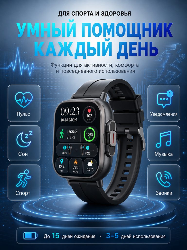
The watch is centered, with heart rate, sleep, activity, notification, music and call icons arranged on both sides, with different battery life calibers reserved at the bottom.
The last page puts the functions into the same index for easy review; the interface health theme is not used as a medical test conclusion.
Delivery summary and design value
The entire team delivers with a clear division of labor
The 7 works in this case respectively cover “2-in-1 overview → screen → opening structure → access action → motion → call music → function summary”. The number of images depends on the actual content, and each image has its own theme while maintaining an overall identity through color, text hierarchy, or composition.
Procurement issues can be more easily mapped to specific information
Focusing on the smart watch with built-in Bluetooth headset, the work implements the “two-in-one structure using the images of opening the cover, taking it and wearing it” into different images. When brands plan similar designs, they can first list the content that consumers need to identify, understand and check, and then determine the tasks and order of primary and secondary product images.
Value is based on interpretive methods and authentic works
The whole machine, part, scene and information cards provide different reading entrances, helping to organize product descriptions more clearly. The value of this case is the visible design expression and information division of labor; changes in click-through rates, sales, and conversion rates require additional statistical or test data support.
The parameters, materials and functions in this article are used to explain the content of the accompanying pictures. The specific specifications, applicable conditions and accompanying items are subject to the product information of the corresponding model.
Plan clearer product images for your Ozon products
If your Ozon built-in Bluetooth headset smart watch also needs to plan primary and secondary product images, you can submit product links, existing pictures or product information to AIRSANG, explain the target market and required picture group range, and communicate the information organization and visual direction suitable for the product.
Consultation email: [email protected] · Telephone: 177-5952-2770