Project overview
The product picture of the LED desktop makeup mirror needs to use lighting contrast, pivot movement and touch to explain the function. This case focuses on the existing 7 Russian works of Ozon, dismantling the arrangements for product identification, theme description and condition verification. For brands and sellers who are preparing to produce pictures of similar products, the focus is not only on the style of the pictures, but also on understanding how different pictures distribute information so that product-related questions have corresponding reading positions.
| Услуги | Industry | Платформа |
| Ozon product primary and secondary product images design | Beauty and personal care | Озон |
| Project requirements | target market | design style |
| Expand functions using lighting contrast, hinge movements and touch instructions | Russia | High-end texture, black gold light luxury, intuitive functions |
| project budget | Delivery content | Delivery time |
| ¥450 | 7 case display pictures | 5 working days |
design challenge
The vanity mirror is both a desktop item and also includes lighting and touch functions. The picture group needs to distinguish between mirrors, lighting, angle adjustment and power supply. The size and operation cannot be expressed only by photos of people wearing makeup.
Design strategy: Let the entire group of works form a clear information relationship
01 Allocate information tasks first, and then arrange the key points of the screen
The work is expanded according to “Beauty main vision → Charging back → Size → Three kinds of lights → Rotary → Touch → Structural theme”. Figure 1 establishes the identification first, and then switches the composition and description position according to the actual theme. This division of information allows different questions to have their own place, reducing the need to pile up all the text in the first image, and preventing subsequent images from simply repeating the same product photo.
02 Use a consistent visual language to connect different reading tasks
The black background sets off the white ring light and light-colored mirror, the rose gold pole connects the beauty theme, and the red label, white card and partial picture bear instructions. The unified style serves the entire group identification, and composition changes serve different contents; the main title, auxiliary labels and product proportions in the picture jointly determine the reading order.
03 Reduce the explanation to specific parts, actions or choices
The focus of this group of works is to use lighting contrast, pivot movements and touch controls to illustrate the unfolding functions. When dismantling, look at the correspondence between the whole machine and parts, themes and conditions: when there is structural information, look at the positional relationship, when there is scene information, look at the objects used, and when there are numbers, look at the categories and limiting conditions. Letting each picture answer a specific question has more explanatory value than repeatedly emphasizing the excellence of the product.
Dismantling the work: explaining the screen arrangement and information responsibilities of each picture
Figure 1 | Main vision of beauty: let the purpose and body appear at the same time
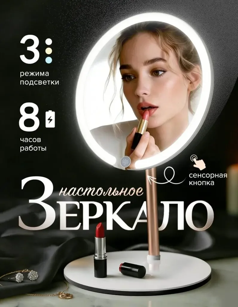
A makeup character appears in the mirror, lipstick is placed in front of the mirror, the ring light shines clearly, and the mode and battery life themes are listed on the left.
The specular reflection illustrates the use of the object, the intact struts and base retain the form, and the functional summary does not obscure the main structure.
Figure 2|Back side of charging: Put the interface and cable together
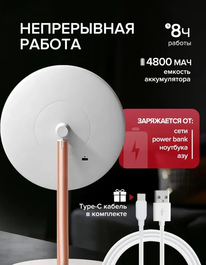
The back of the mirror occupies the main area, with the Type-C cable at the bottom, and the battery and power supply themes are organized independently on the side.
The back picture makes up for the interfaces that cannot be seen in the first picture, the wires are responsible for explaining the energy replenishment method, and the numerical card retains the check entry.
Figure 3|Dimensions: Distinguish lens diameter from total height
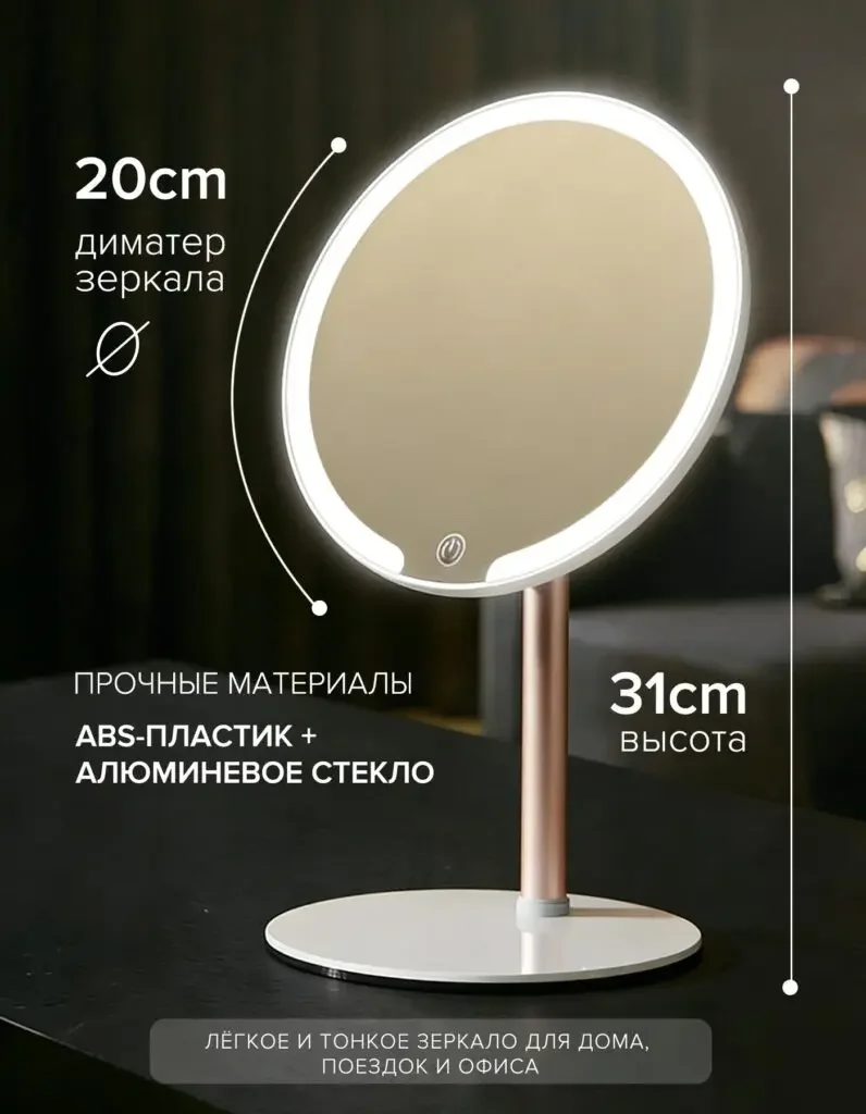
The diameter and height are marked with arcs and vertical lines respectively next to the front mirror body, and the material theme is left on the left side.
There are different markings in different directions to help determine the size of the mirror and the occupation of the desktop, not just the compact appearance.
Figure 4|Lighting comparison: three states displayed side by side
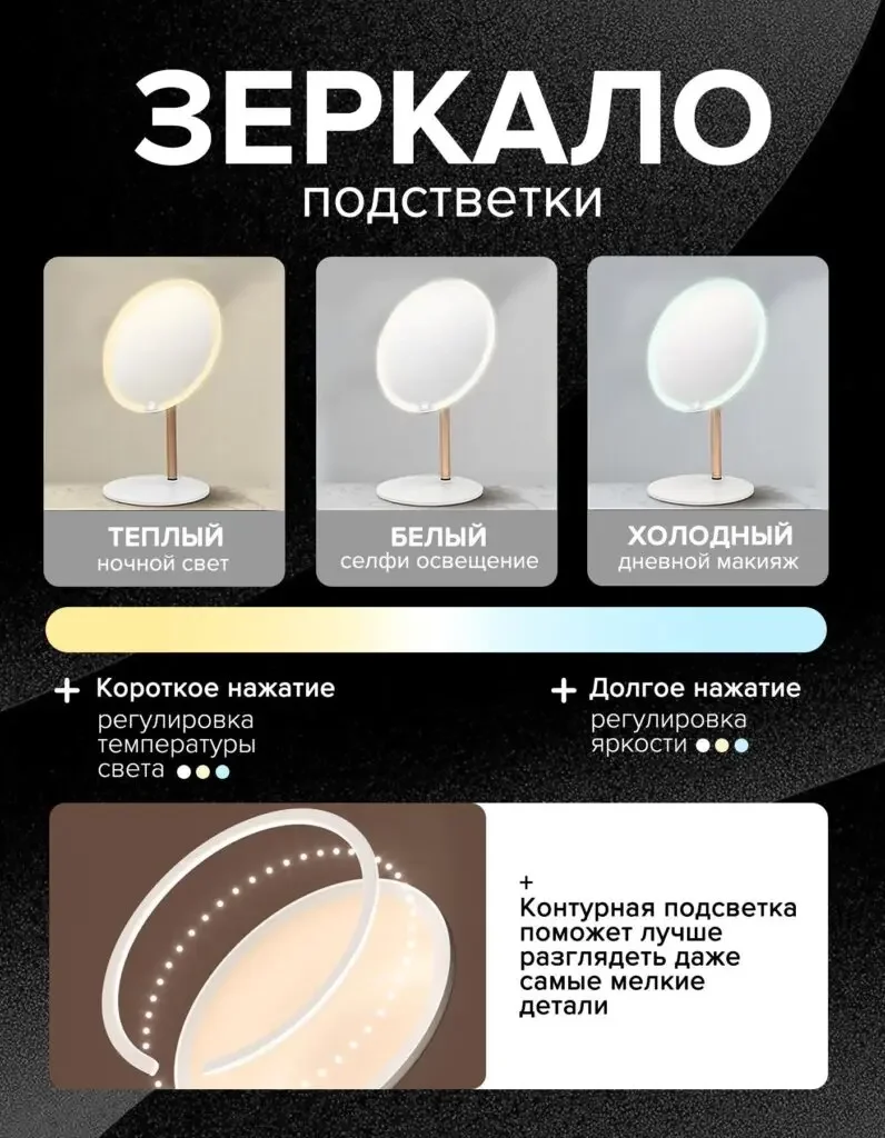
Warm, white and cool lights are presented in three columns, and the lower color bar and touch text correspond to the mode and brightness theme.
Side-by-side images are easier to compare than single luminescence images, and short press and long press instructions are further connected to the operation method.
Figure 5|Rotation axis action: let the angle adjustment range have a directional reference
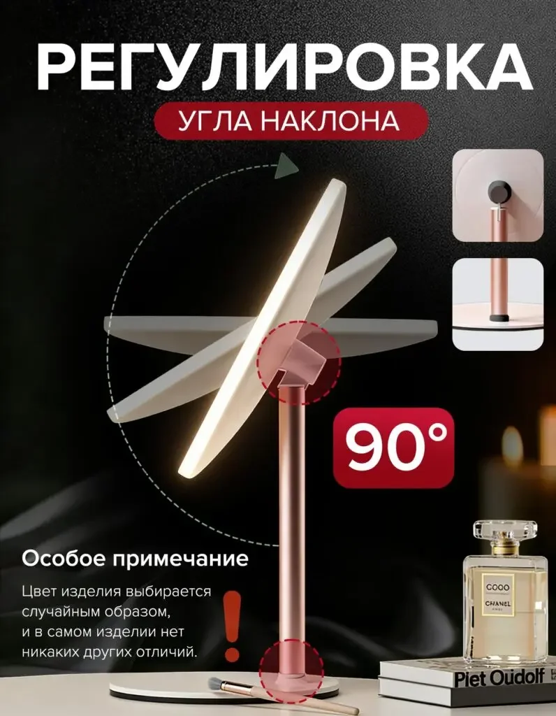
The mirror body is superimposed at multiple angles, the arc arrow surrounds the axis of rotation, and the 90° label and close-up of the support pole are displayed independently.
Angle overlays illustrate range of motion, detail maps explain where adjustments are involved, and users can map numbers to actions.
Figure 6|Touch instructions: Directly position the control area
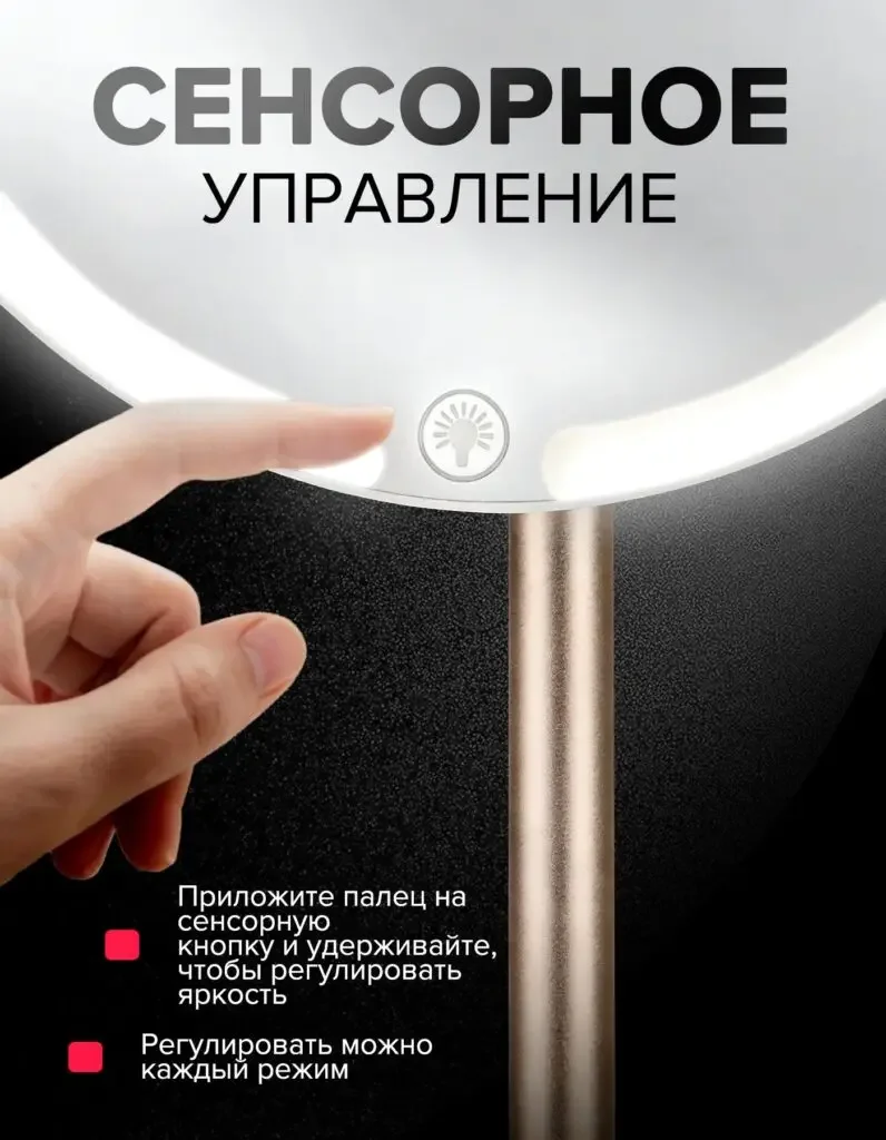
When your finger is close to the touch icon on the lower edge of the mirror, the light ring is greatly enlarged, and the operation instructions are listed below.
Fingers provide positional reference, and short text explains the input method, forming an easy-to-find operation page.
Figure 7|Structural theme: using overall and local restraints
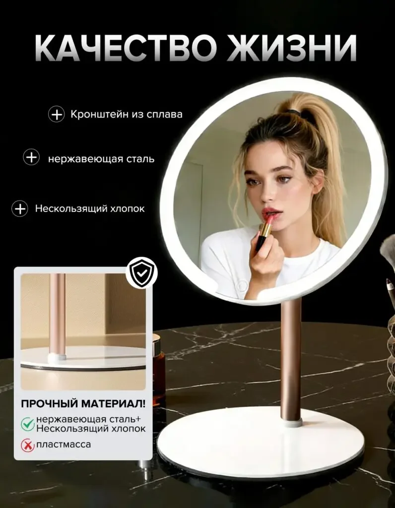
The whole machine is retained on the right side, and the small structural diagram and material theme card on the lower left supplement the support, base and other information.
The end page returns to the support and contact parts. The material theme is described according to the material, and the long-term durability results are not directly inferred.
Delivery summary and design value
The entire team delivers with a clear division of labor
The 7 works in this case cover “main visual of beauty → charging back → size → three kinds of lights → hinge → touch → structural theme”. The number of images depends on the actual content, and each image has its own theme while maintaining an overall identity through color, text hierarchy, or composition.
Procurement issues can be more easily mapped to specific information
Focusing on the LED desktop makeup mirror, the work will “use lighting contrast, pivot movements and touch instructions to expand functions” into different images. When brands plan similar designs, they can first list the content that consumers need to identify, understand and check, and then determine the tasks and order of primary and secondary product images.
Value is based on interpretive methods and authentic works
The whole machine, part, scene and information cards provide different reading entrances, helping to organize product descriptions more clearly. The value of this case is the visible design expression and information division of labor; changes in click-through rates, sales, and conversion rates require additional statistical or test data support.
The parameters, materials and functions in this article are used to explain the content of the accompanying pictures. The specific specifications, applicable conditions and accompanying items are subject to the product information of the corresponding model.
Plan clearer product images for your Ozon products
If you also need to plan primary and secondary product images for your OzonLED desktop makeup mirror, you can submit product links, existing pictures or product information to AIRSANG, explain the target market and required picture group range, and communicate the information organization and visual direction suitable for the product.
Consultation email: [email protected] · Telephone: 177-5952-2770