


In the highly competitive Озон marketplace, hardware accessories require more than simple product photography. They demand clarity, authority, and immediate functional communication. When we design main images for hardware accessories such as kitchen faucets, shower hoses, electric water heaters, and stainless steel mixers, we focus on visual hierarchy, performance highlights, and trust-building cues that convert scrolling into clicks.
Below, we break down the strategy behind each main image and explain why every design decision directly supports higher click-through rates and stronger marketplace positioning.
| Срок доставки | Категория | Платформа приложений |
| 9 дней | Hardware accessories | Озон |
| Участники проекта (дизайнеры) | Расходы | Эффект |
| Линь Чжан | $140 | Store traffic📈182% |
1. Flexible Black Kitchen Faucet – Emphasizing Functionality and Movement
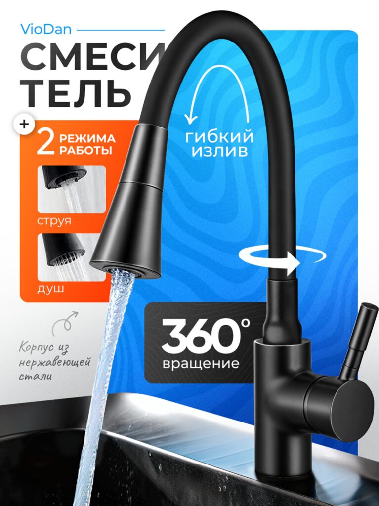
In the first image, we presented a matte black flexible kitchen faucet with dual spray modes and 360° rotation. Instead of placing it on a plain white background, we structured the layout using bold blue and orange panels to segment information visually.
We highlighted three core selling points:
- 2 working modes (stream and shower)
- Flexible spout
- Вращение на 360°
- Stainless steel body
Why did we design it this way?
On Ozon, shoppers scan quickly. If they cannot identify key features within two seconds, they move on. So we used:
- Large, high-contrast typography for “360° rotation”
- Arrow indicators to visually demonstrate flexibility
- Inset close-ups of water flow modes
- A strong matte black product rendering for premium appeal
The blue background communicates reliability and technology. The orange accent box isolates feature information and increases contrast, making it instantly readable even on mobile devices.
We also allowed the water stream to extend naturally into the sink area. This creates realism and demonstrates performance instead of merely stating it.
The result: a functional product feels dynamic and modern, not static or industrial.
2. Stainless Steel Curved Faucet – Lifestyle and Material Focus
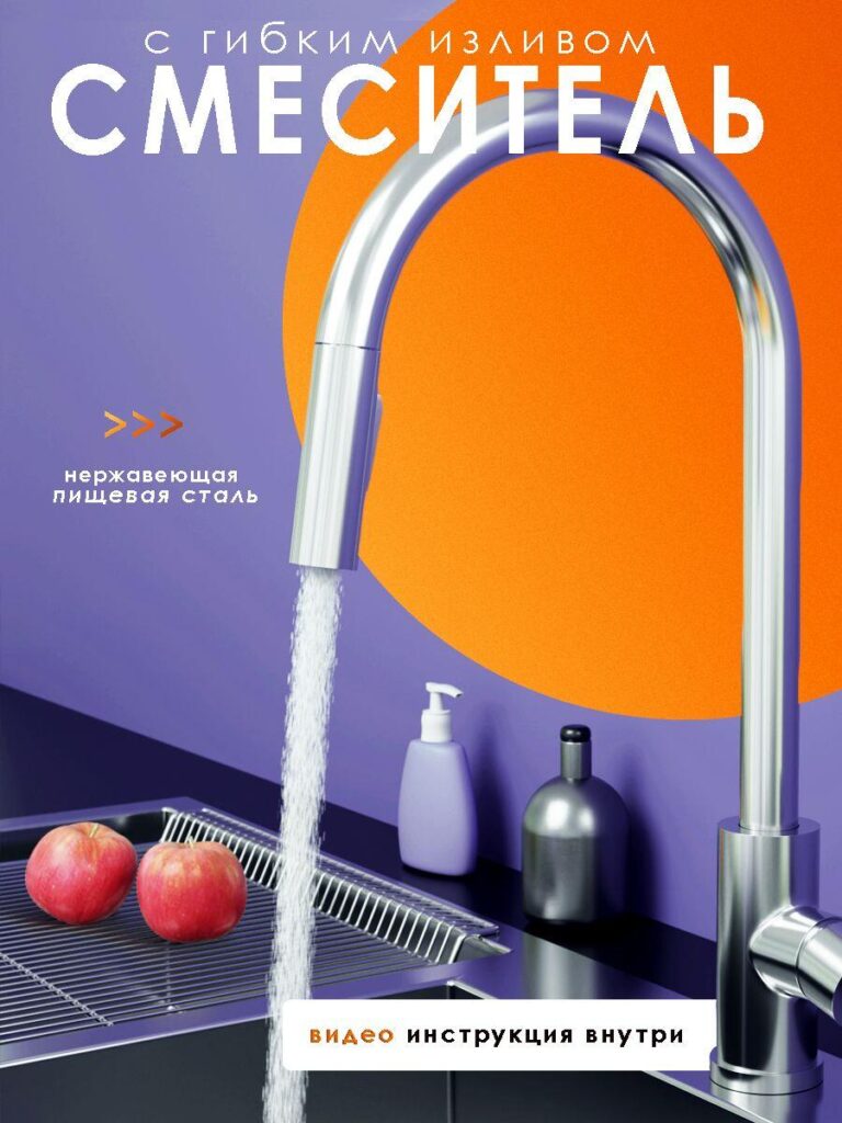
In the second image, we shifted strategy. Instead of focusing on feature icons, we built a lifestyle-driven composition.
We placed the polished stainless steel faucet in a modern kitchen setting with apples, soap dispensers, and structured color blocking (purple and orange backdrop).
Why?
Hardware accessories often risk looking cold and mechanical. By introducing lifestyle elements:
- We increase relatability.
- We show scale and real-world use.
- We soften the industrial tone.
The large curved orange shape behind the faucet frames the silhouette and draws the eye directly to the arc. The typography stretches across the top, reinforcing product category dominance.
We also emphasized “food-grade stainless steel” to strengthen quality perception. In hardware, material trust equals conversion power.
This image balances emotional lifestyle appeal with technical credibility.
3. Shower Hose – Technical Reliability and Precision
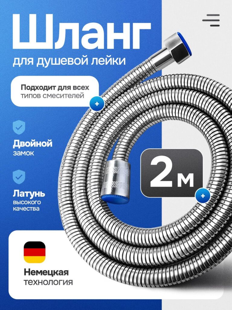
For the shower hose main image, we adopted a clean, structured layout using a blue-and-white split background.
The coiled metal hose dominates the composition. We intentionally zoomed in to emphasize texture and durability.
Key highlights included:
- Universal compatibility
- Double locking system
- High-quality brass connectors
- 2-meter length
- German technology badge
Why zoom in?
Because hardware buyers want durability proof. Showing texture and connection detail communicates engineering quality better than text alone.
The large “2M” badge becomes a focal anchor. On Ozon, numeric clarity increases comprehension speed.
We also added shield-style icons to visually symbolize security and strength. These small cues subconsciously reinforce reliability.
This image is engineered for technical buyers who prioritize specs and durability.
4. Instant Water Heater Faucet – Performance and Innovation
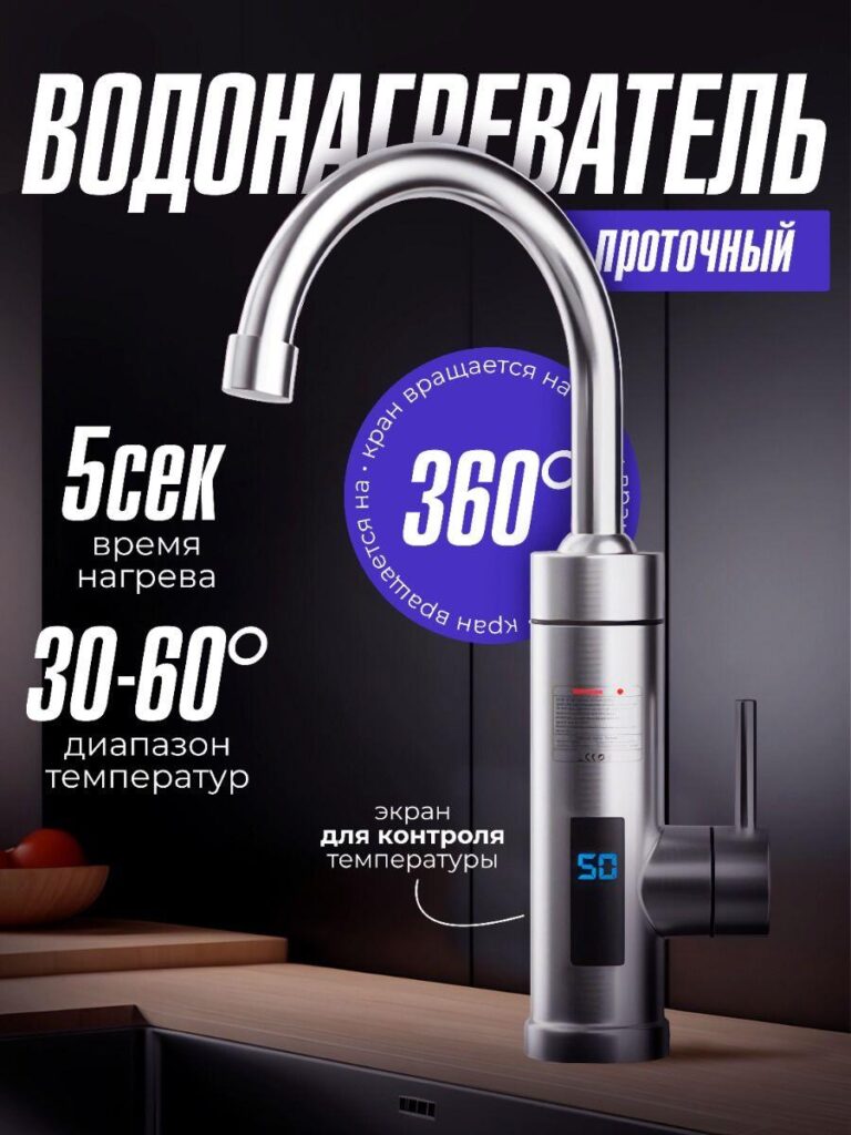
In this design, we moved into a darker, premium aesthetic.
The instant water heater faucet is presented against a deep black and purple background. Instead of cluttering the design, we emphasized performance metrics:
- 5-second heating time
- 30–60°C temperature range
- Вращение на 360°
- Digital temperature display
Why dark background?
Black backgrounds create contrast with stainless steel surfaces, enhancing perceived value and modernity. It also distinguishes the product from standard faucets.
We highlighted the digital screen because innovation drives clicks. Showing a live temperature display instantly differentiates this model from basic mixers.
The circular 360° graphic reinforces motion. In hardware main images, visual cues that demonstrate functionality outperform static labels.
This image positions the product as high-tech rather than ordinary plumbing hardware.
5. Chrome Kitchen Mixer – European Quality and Warranty Trust
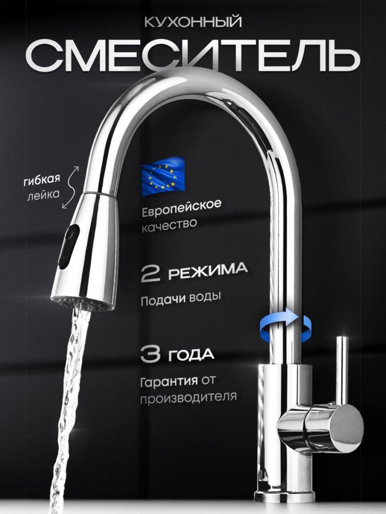
In the fifth image, we leaned heavily into trust signals.
We used a dark, minimalist background to elevate the polished chrome finish. The faucet reflects light dramatically, reinforcing premium material quality.
Highlighted elements include:
- European quality badge
- 2 water modes
- 3-year manufacturer warranty
- Гибкая распылительная головка
- Вращение на 360°
Why emphasize warranty?
On Ozon, hardware returns can be costly. Shoppers look for reassurance before purchasing installation-based products.
The 3-year guarantee acts as a psychological safety net.
We kept typography vertically aligned to guide the eye downward along the faucet’s shape. This alignment mirrors the product structure and maintains visual flow.
The blue rotational arrow introduces movement while maintaining a clean design.
This image focuses on credibility and durability.
6. Square Stainless Steel Mixer – Structural Strength and Minimalism
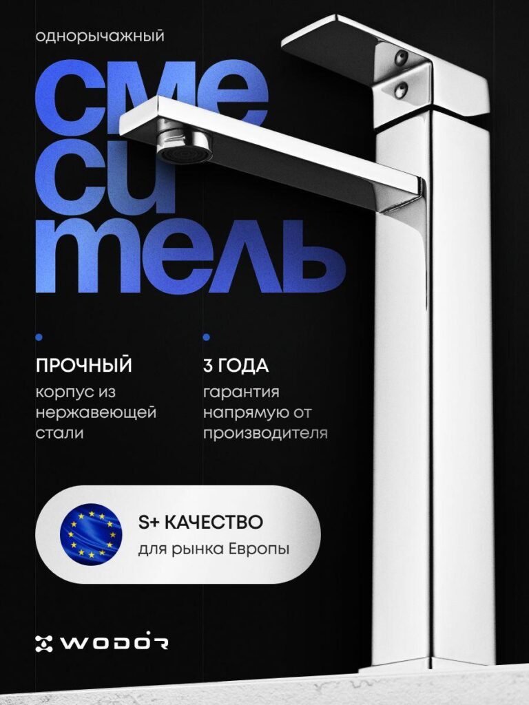
The final image presents a square, architectural faucet with sharp lines and industrial precision.
We intentionally used a bold typographic overlay behind the product silhouette. Large blue lettering partially sits behind the faucet, creating depth.
Key points highlighted:
- Single-lever control
- Solid stainless steel body
- 3-year direct manufacturer warranty
- S+ quality for European market
Why bold typography in background?
Because it increases perceived scale and authority. When the product overlaps typography, it creates dimensional layering, which visually elevates the brand.
We minimized decorative elements to maintain a clean industrial feel. This faucet appeals to modern minimalist kitchens.
The European quality badge reinforces export-level standards. In hardware, origin and certification cues significantly impact buyer confidence.
Strategic Principles Behind All Ozon Hardware Accessories Main Images
Across all images, we followed consistent principles:
1. Visual Hierarchy First
The product must dominate 60–70% of the frame. Text supports, never overwhelms.
2. Feature Isolation
Each main image communicates 3–5 core benefits. Overloading reduces clarity.
3. Motion Indicators
Arrows, rotation graphics, and flowing water demonstrate functionality visually.
4. Material Emphasis
Close-ups, reflections, and texture zoom-ins build trust in metal hardware.
5. Contrast Engineering
Blue signals technology.
Orange drives attention.
Black signals premium.
White communicates cleanliness.
6. Numeric Anchoring
360°, 2M, 5 sec, 3 years — numbers increase cognitive retention.
Почему этот подход работает на озоновом кольце
Озон shoppers scroll rapidly on mobile. The winning main image must:
- Communicate category instantly
- Demonstrate function visually
- Highlight durability cues
- Build trust within seconds
Hardware accessories are practical purchases. Buyers care about compatibility, longevity, and installation reliability.
By combining technical clarity with premium visual treatment, we transform everyday plumbing components into aspirational, high-value products.
Each image in this series was crafted not as decoration, but as a conversion tool.
From flexible kitchen faucets to shower hoses and instant water heaters, we designed every visual to reduce hesitation and accelerate decision-making.
Hardware accessories may seem utilitarian — but with the right main image strategy, they become powerful, high-converting marketplace listings.
At the intersection of engineering precision and visual persuasion, we build hardware product imagery that drives measurable results.
This is the strategic methodology we implement for our clients at АИРСАНГ.


Спроектируем и создадим для вас WordPress-сайт или корпоративный сайт с полной системой электронной коммерции.
Ценовой диапазон: от $200.00 до $2,500.00Нестандартные требования или специальные предложения
Первоначальная цена составляла: $2.00.$1.00Текущая цена: $1.00. Дизайн главного изображения для домашнего физиотерапевтического устройства Amazon: пояснения.
Введение: Создание достоверного изображения для домашних терапевтических приборов на Amazon При разработке главного изображения для домашнего терапевтического прибора на Amazon мы в первую очередь...

Дизайн основного изображения для конвертации помады на Amazon.
Введение: Разработка главного образа помады, которая продается на Amazon Когда мы разрабатываем главный образ для помады Amazon, наша ответственность выходит далеко за рамки...

Что делает основное изображение жидкой тональной основы Amazon конвертируемым?
Введение. Разработка дизайна основного изображения для жидкой тональной основы на Amazon — это не просто создание красивого внешнего вида продукта. На Amazon основное изображение и...

Разработка эффективного основного изображения Amazon для фильтрующих картриджей
Введение. Разработка основного изображения для Amazon — это не просто создание привлекательного внешнего вида товара. Речь идёт о ясности, доверии и мгновенном понимании, особенно для...

Сравнение пяти тем WordPress для сайтов о домашних животных
Введение. Выбор подходящей темы WordPress для сайтов, посвященных домашним животным, — это не просто решение, связанное с дизайном; оно напрямую влияет на удобство использования, масштабируемость и долгосрочный рост бизнеса. Уход за домашними животными и...

Создание масштабируемого веб-сайта на WordPress для научно-ориентированного бренда: проект AminoUSA
Введение. В современном цифровом пространстве веб-сайт — это больше, чем просто место для размещения информации о товарах. Для научно-ориентированных брендов, работающих в регулируемых или научно-исследовательских отраслях, это….

Создание масштабируемого магазина Shopify для глобального бренда ножей: проект CoolKatana
Введение. В трансграничной электронной коммерции веб-сайт Shopify — это больше, чем просто витрина магазина. Для брендов, работающих в нишевых, ориентированных на культуру категориях, веб-сайт должен делать гораздо больше, чем...

Разработка высокоэффективного магазина Shopify для карточек Pokémon.
Введение. В мире электронной коммерции коллекционных товаров, особенно на рынке коллекционных карточных игр Pokémon, веб-сайт должен делать больше, чем просто перечислять товары...

Высокоэффективный дизайн Shopify для индивидуального бренда стационарной торговой точки.
Введение. В условиях современной конкурентной среды электронной коммерции, особенно в сегменте персонализированных подарков и коллекционных товаров, веб-сайт на платформе Shopify должен делать гораздо больше, чем просто отображать товары. Он...

Пример разработки веб-сайта на платформе Shopify для премиального цветочного бренда.
Введение. В условиях современной конкурентной среды электронной коммерции веб-сайт на платформе Shopify должен делать гораздо больше, чем просто отображать товары. Он должен мгновенно передавать ценность бренда, направлять пользователей...

Пример проекта дизайна на Shopify: магазин ретро-игр
Введение. В условиях высокой конкуренции в сфере электронной коммерции визуальная ясность и эмоциональная связь часто определяют, станет ли посетитель клиентом. Это особенно актуально в...

Пример проекта по дизайну на Shopify: Tactical Rescue Brand
Введение. Эффективный веб-сайт на Shopify делает больше, чем просто отображает товары — он передает цель, укрепляет доверие и помогает пользователям принимать уверенные решения о покупке. Это особенно важно...

Пример разработки веб-сайта на платформе Shopify для бренда электровелосипедов.
Введение. На современном конкурентном рынке электровелосипедов веб-сайт на платформе Shopify должен делать больше, чем просто демонстрировать товары — он должен рассказывать историю, вызывать доверие и направлять пользователей...

Масштабируемая платформа электронной коммерции Shopify для креативного бренда.
Введение. Когда креативные бренды растут, их веб-сайты часто с трудом успевают за развитием. По мере расширения ассортимента продукции, увеличения объема контента и роста трафика многие бренды, ориентированные на визуальное оформление...

Пример разработки веб-сайта на платформе Shopify для бренда товаров для дома.
Введение. На высококонкурентном рынке товаров для дома визуальная идентичность — это уже не просто эстетика, она напрямую влияет на доверие, поведение покупателей при просмотре товаров и принятие решений о покупке. Для...

Пример создания масштабируемого сайта с платной подпиской на WordPress.
Введение. Для современных брендов электронной коммерции веб-сайт — это уже не просто цифровая витрина. Это движок, поддерживающий подписки, создание контента, построение доверия и т.д.

Высокоэффективный дизайн WordPress для брендов, ориентированных на взрослую аудиторию.
Введение. На высококонкурентных рынках электронной коммерции одних лишь ярких визуальных элементов недостаточно. Успешный веб-сайт на WordPress должен направлять посетителей по четкому и целенаправленному маршруту, который….

Масштабируемый веб-сайт электронной коммерции по продаже секс-кукол на WordPress
Введение. Запуск высокоэффективного веб-сайта для трансграничной электронной коммерции — это не просто размещение товаров в интернете. Для брендов, работающих на высококонкурентных рынках, ориентированных на визуальный контент, веб-сайт...