


Введение
Designing a main image set for a wire stripper on Озон is not about making the tool look “cool.”
It is about making every function instantly understandable, even to a buyer who does not read specifications carefully.
This project focuses on a multifunction wire stripper, and the goal of the main image design was very clear:
to translate complexity into clarity, while maintaining strong visual impact in Ozon’s highly competitive tools category.
From the first hero image to the final application scenes, every image was designed to answer one silent buyer question:
“Can this tool really do everything I need, and can I trust it?”
Below, we break down each image and explain the design logic behind it.
| Срок доставки | Категория | Платформа приложений |
| 7 дней | wire stripper | Озон |
| Участники проекта (дизайнеры) | Расходы | Эффект |
| Линь Чжан | $110 | Sales📈296% |
Image 1: Hero Main Image – Multifunction at First Glance
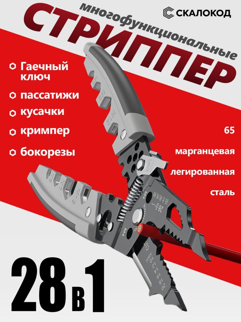
The first image serves as the primary Ozon main image, and its job is to stop scrolling.
Design Intent
Ozon buyers often decide within seconds whether to click a product.
For this reason, we placed the wire stripper diagonally, fully opened, revealing its internal structure and multiple working areas.
This pose immediately communicates:
- It is not a basic wire stripper
- It integrates multiple tools in one body
- It looks solid, professional, and industrial-grade
Visual Hierarchy
The red-and-white background creates strong contrast, helping the black metal body stand out clearly.
Large typography emphasizes:
- “Multifunction”
- “28 in 1”
- Core tool categories (cutting, crimping, stripping)
This layout ensures that even on a small mobile screen, buyers instantly understand:
this is a high-value, all-in-one tool, not a single-function product.
Image 2: Functional Breakdown – Explaining Complexity Visually
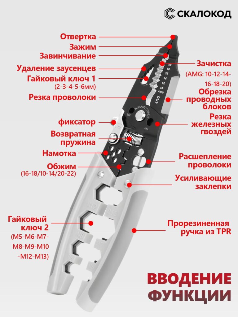
This image is the technical explanation image.
Why This Image Matters
Multifunction tools often fail on Ozon because buyers feel overwhelmed.
To avoid this, we clearly labeled each functional zone with callouts and red indicator points.
The image explains:
- Wire stripping ranges (AWG sizes)
- Crimping sections
- Cutting edges
- Lock mechanism
- Return spring
- Nut wrench areas
Design Choice
Instead of long paragraphs of text, we used:
- Short, precise labels
- Clear directional lines
- High contrast red markers
This approach mirrors industrial instruction diagrams, which builds trust and reduces hesitation.
The buyer no longer guesses how the tool works — they see it.
Image 3: Material Focus – 65 Manganese Alloy Steel
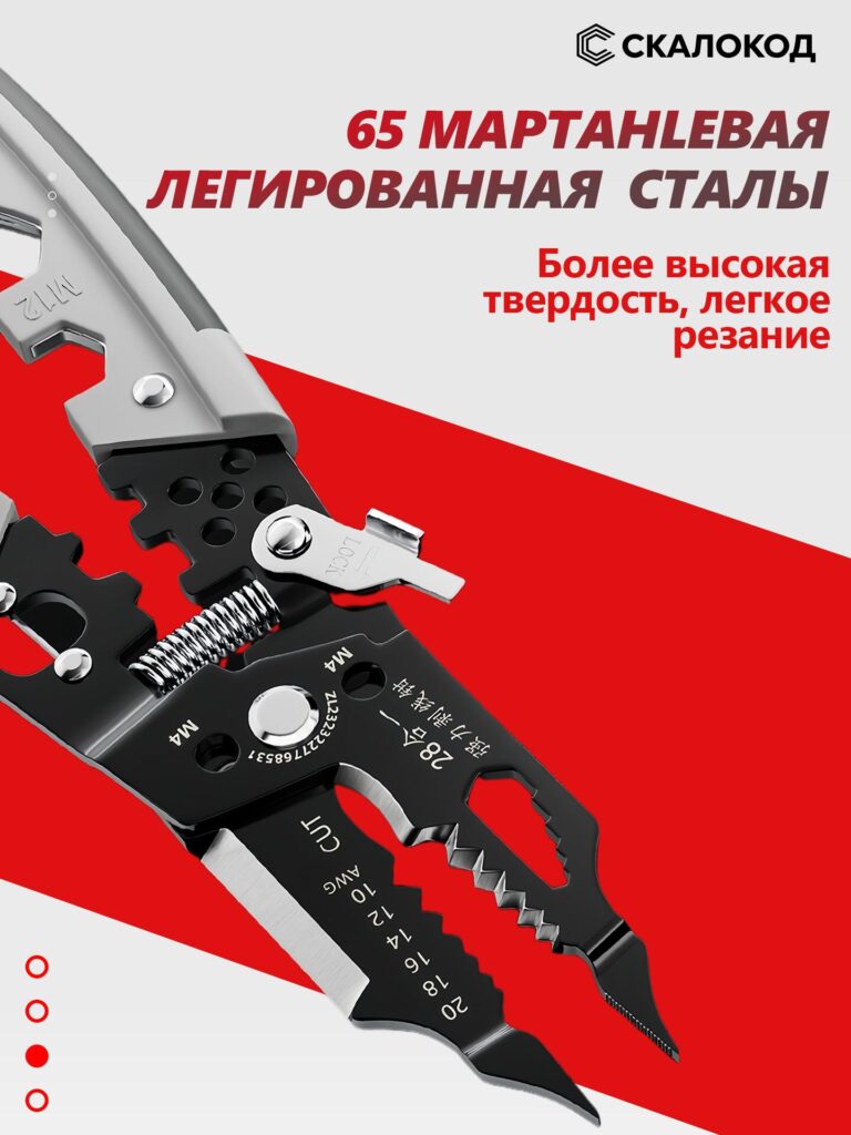
This image focuses entirely on material credibility.
Why Material Needs Its Own Image
On Ozon, tools are often compared on:
- Durability
- Cutting performance
- Lifespan
We highlighted 65 manganese alloy steel with a close-up angle that shows:
- Sharp cutting edges
- Solid thickness
- Reinforced pivot points
Visual Messaging
The typography emphasizes:
- Higher hardness
- Easier cutting
- Professional-grade metal
By isolating material quality into a single image, we ensure buyers clearly understand:
this tool is not made from cheap steel.
Image 4: Waterproof & Anti-Corrosion Performance
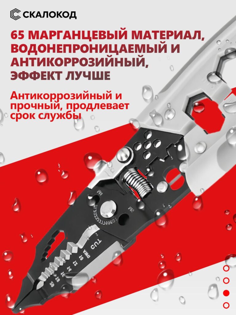
This image introduces environmental resistance.
Design Purpose
Electricians and DIY users often work in:
- Humid environments
- Outdoor spaces
- Construction sites
To visually communicate durability, we added water droplets across the tool surface.
Why Visual Effects Matter
Instead of simply saying “anti-corrosion,” the image shows it.
The droplets reinforce:
- Waterproof coating
- Rust resistance
- Long-term usability
This image reassures buyers that the tool will not degrade quickly, even under tough conditions.
Image 5: Ergonomic TPR Handle – Comfort and Control
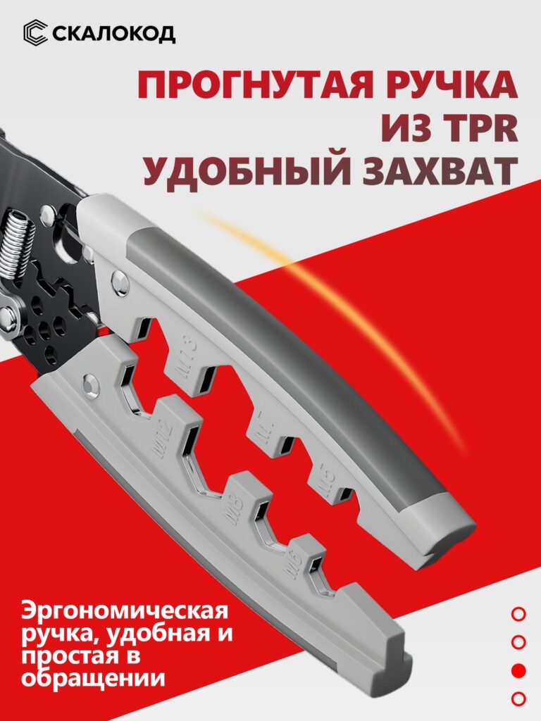
This image focuses on user comfort.
Design Insight
Many Ozon tool listings ignore ergonomics, but hand tools are used for long periods.
Fatigue is a real concern.
The curved TPR handle is shown in close-up to highlight:
- Non-slip grip
- Soft-touch material
- Ergonomic contour
Emotional Impact
This image speaks to comfort, not power.
It tells the buyer:
“You can use this tool longer, with less strain.”
That emotional reassurance is often the difference between saving a product and purchasing it.
Image 6: Application Scenarios – Real-World Use
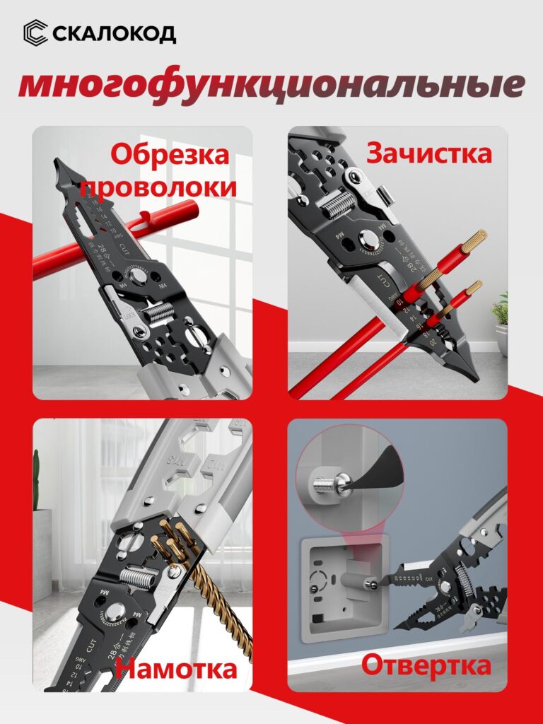
This is a multi-scene application image, divided into four functional scenarios.
Why Scenarios Convert Better
Buyers trust products more when they see real use cases instead of isolated product shots.
Each quadrant shows:
- Wire cutting
- Wire stripping
- Wire twisting
- Screwdriver function
Design Strategy
Мы использовали:
- Clean indoor environments
- Real wires and sockets
- Natural tool angles
This avoids looking staged or unrealistic.
The buyer can imagine using the tool immediately — a key conversion trigger.
Overall Visual Strategy for Ozon
Across all images, we followed three core principles:
1. Clarity Over Decoration
No unnecessary effects. Every visual element explains something functional.
2. Strong Contrast for Mobile Viewing
Red, white, and black ensure readability on small screens.
3. Trust Through Detail
Close-ups, material emphasis, and labeled functions reduce uncertainty.
Why This Main Image Set Works on Ozon
This design approach aligns perfectly with Ozon’s buyer behavior:
- Buyers skim fast
- Buyers compare aggressively
- Buyers distrust vague listings
By structuring the image set as a visual story, we guide the buyer step by step:
from curiosity → understanding → confidence → purchase.
Заключительные мысли
A wire stripper may look like a simple tool, but selling it successfully on Озон requires strategic visual communication.
This main image set does not rely on exaggerated claims.
Instead, it proves value visually, function by function, image by image.
That is the core philosophy behind this design.
If you are building a cross-border product listing, especially in competitive tool categories, image strategy is not optional — it is decisive.
This is exactly the type of visual system we specialize in at АИРСАНГ, helping brands translate complex products into clear, conversion-focused listings for global marketplaces.


Спроектируем и создадим для вас WordPress-сайт или корпоративный сайт с полной системой электронной коммерции.
Ценовой диапазон: от $200.00 до $2,500.00Нестандартные требования или специальные предложения
Первоначальная цена составляла: $2.00.$1.00Текущая цена: $1.00. Дизайн главного изображения для домашнего физиотерапевтического устройства Amazon: пояснения.
Введение: Создание достоверного изображения для домашних терапевтических приборов на Amazon При разработке главного изображения для домашнего терапевтического прибора на Amazon мы в первую очередь...

Дизайн основного изображения для конвертации помады на Amazon.
Введение: Разработка главного образа помады, которая продается на Amazon Когда мы разрабатываем главный образ для помады Amazon, наша ответственность выходит далеко за рамки...

Что делает основное изображение жидкой тональной основы Amazon конвертируемым?
Введение. Разработка дизайна основного изображения для жидкой тональной основы на Amazon — это не просто создание красивого внешнего вида продукта. На Amazon основное изображение и...

Разработка эффективного основного изображения Amazon для фильтрующих картриджей
Введение. Разработка основного изображения для Amazon — это не просто создание привлекательного внешнего вида товара. Речь идёт о ясности, доверии и мгновенном понимании, особенно для...

Сравнение пяти тем WordPress для сайтов о домашних животных
Введение. Выбор подходящей темы WordPress для сайтов, посвященных домашним животным, — это не просто решение, связанное с дизайном; оно напрямую влияет на удобство использования, масштабируемость и долгосрочный рост бизнеса. Уход за домашними животными и...

Создание масштабируемого веб-сайта на WordPress для научно-ориентированного бренда: проект AminoUSA
Введение. В современном цифровом пространстве веб-сайт — это больше, чем просто место для размещения информации о товарах. Для научно-ориентированных брендов, работающих в регулируемых или научно-исследовательских отраслях, это….

Создание масштабируемого магазина Shopify для глобального бренда ножей: проект CoolKatana
Введение. В трансграничной электронной коммерции веб-сайт Shopify — это больше, чем просто витрина магазина. Для брендов, работающих в нишевых, ориентированных на культуру категориях, веб-сайт должен делать гораздо больше, чем...

Разработка высокоэффективного магазина Shopify для карточек Pokémon.
Введение. В мире электронной коммерции коллекционных товаров, особенно на рынке коллекционных карточных игр Pokémon, веб-сайт должен делать больше, чем просто перечислять товары...

Высокоэффективный дизайн Shopify для индивидуального бренда стационарной торговой точки.
Введение. В условиях современной конкурентной среды электронной коммерции, особенно в сегменте персонализированных подарков и коллекционных товаров, веб-сайт на платформе Shopify должен делать гораздо больше, чем просто отображать товары. Он...

Пример разработки веб-сайта на платформе Shopify для премиального цветочного бренда.
Введение. В условиях современной конкурентной среды электронной коммерции веб-сайт на платформе Shopify должен делать гораздо больше, чем просто отображать товары. Он должен мгновенно передавать ценность бренда, направлять пользователей...

Пример проекта дизайна на Shopify: магазин ретро-игр
Введение. В условиях высокой конкуренции в сфере электронной коммерции визуальная ясность и эмоциональная связь часто определяют, станет ли посетитель клиентом. Это особенно актуально в...

Пример проекта по дизайну на Shopify: Tactical Rescue Brand
Введение. Эффективный веб-сайт на Shopify делает больше, чем просто отображает товары — он передает цель, укрепляет доверие и помогает пользователям принимать уверенные решения о покупке. Это особенно важно...

Пример разработки веб-сайта на платформе Shopify для бренда электровелосипедов.
Введение. На современном конкурентном рынке электровелосипедов веб-сайт на платформе Shopify должен делать больше, чем просто демонстрировать товары — он должен рассказывать историю, вызывать доверие и направлять пользователей...

Масштабируемая платформа электронной коммерции Shopify для креативного бренда.
Введение. Когда креативные бренды растут, их веб-сайты часто с трудом успевают за развитием. По мере расширения ассортимента продукции, увеличения объема контента и роста трафика многие бренды, ориентированные на визуальное оформление...

Пример разработки веб-сайта на платформе Shopify для бренда товаров для дома.
Введение. На высококонкурентном рынке товаров для дома визуальная идентичность — это уже не просто эстетика, она напрямую влияет на доверие, поведение покупателей при просмотре товаров и принятие решений о покупке. Для...

Пример создания масштабируемого сайта с платной подпиской на WordPress.
Введение. Для современных брендов электронной коммерции веб-сайт — это уже не просто цифровая витрина. Это движок, поддерживающий подписки, создание контента, построение доверия и т.д.

Высокоэффективный дизайн WordPress для брендов, ориентированных на взрослую аудиторию.
Введение. На высококонкурентных рынках электронной коммерции одних лишь ярких визуальных элементов недостаточно. Успешный веб-сайт на WordPress должен направлять посетителей по четкому и целенаправленному маршруту, который….

Масштабируемый веб-сайт электронной коммерции по продаже секс-кукол на WordPress
Введение. Запуск высокоэффективного веб-сайта для трансграничной электронной коммерции — это не просто размещение товаров в интернете. Для брендов, работающих на высококонкурентных рынках, ориентированных на визуальный контент, веб-сайт...