


A Conversion-Focused Visual Strategy for a 3-in-1 Smartphone Stand
На высококонкурентных рынках, таких как Озон, shoppers do not read first—they scan. A product’s main image set must communicate function, value, and usability within seconds, especially in the phone accessories category, where products often look similar at first glance.
For this phone holder, our design goal was clear: use structured, step-by-step visuals to instantly explain versatility, stability, and ease of use, while maintaining a clean, friendly, and trustworthy aesthetic that resonates with Ozon’s audience.
Rather than relying on abstract lifestyle storytelling, we focused on functional clarity. Every image in this set serves a specific role in guiding the customer from awareness to confidence. Below, we break down the design logic behind each image and explain how visual hierarchy, layout, color, and information density work together to improve click-through and conversion.
| Срок доставки | Категория | Платформа приложений |
| 8 дней | phone holder | Озон |
| Участники проекта (дизайнеры) | Расходы | Эффект |
| Линь Чжан | $150 | Sales📈260% |
Image 1: Main Image — Instant Product Recognition and Core Value
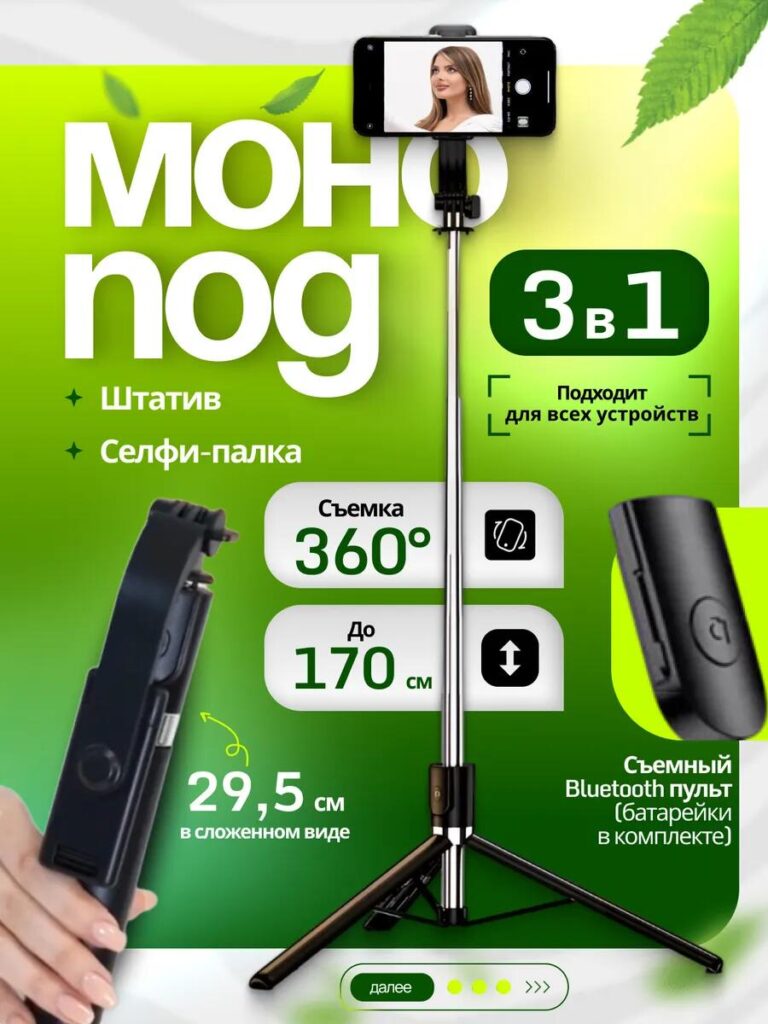
The first image functions as the visual anchor of the entire listing. We positioned the phone holder fully extended and centered, ensuring the product is clearly visible without cropping. This immediately communicates scale, structure, and completeness.
Large typography highlights the “3-in-1” concept because multifunctionality is the product’s strongest competitive advantage. Instead of listing features in long text, we used short, bold labels paired with icons to make the information readable even on small screens.
Key specifications—such as 360° rotation, adjustable height up to 170 cm, and compact folded length—appear in clearly separated visual blocks. This modular layout helps shoppers quickly absorb technical details without feeling overwhelmed. The green gradient background adds freshness and energy while maintaining contrast for white text, ensuring excellent readability on mobile devices.
This image answers the buyer’s first question immediately: What is this product, and why should I click?
Image 2: Detachable Bluetooth Remote — Solving a Real User Pain Point
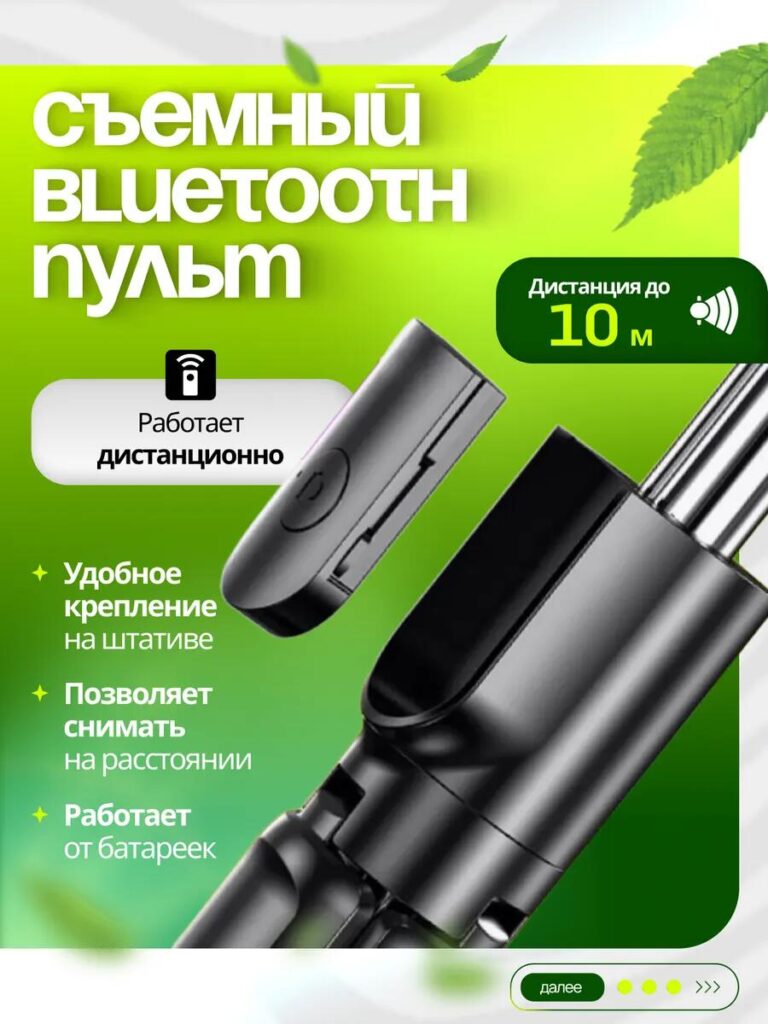
The second image zooms in on the detachable Bluetooth remote, one of the product’s most practical features. Instead of showing it as a small accessory, we enlarged it and placed it next to the stand to visually reinforce that it is included, not optional.
We designed this image to communicate freedom and convenience. Clear callouts explain that the remote works wirelessly, operates up to 10 meters, and runs on batteries. These details remove common buyer doubts, such as compatibility or setup complexity.
By isolating the remote on a clean background and pairing it with simple icons, we made the feature feel intuitive and reliable. This image is especially important for content creators, solo travelers, and users who take group photos, as it highlights hands-free operation without technical jargon.
Image 3: Structural Advantages — Stability and Build Quality
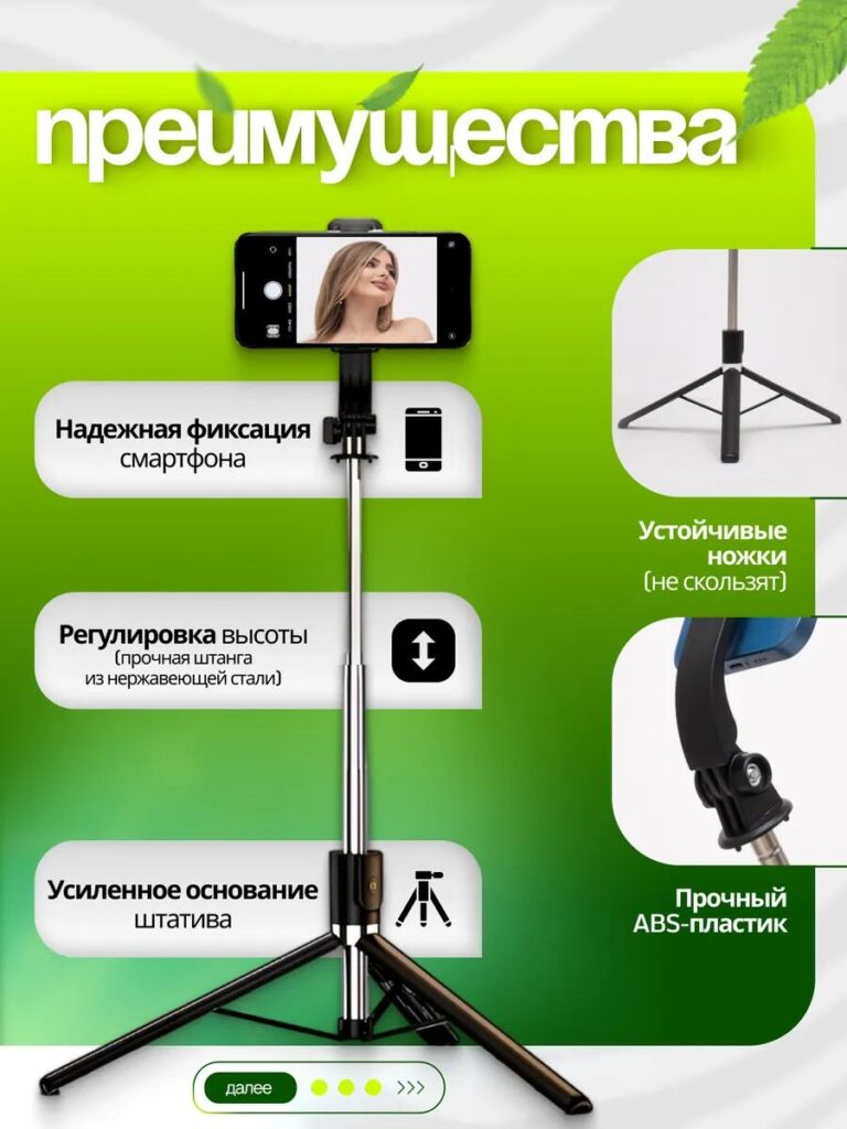
Trust is critical when selling phone holders, especially tall or adjustable ones. In the third image, we focused on structural reliability.
We visually separated each physical advantage: strong smartphone grip, reinforced tripod base, height adjustment mechanism, and durable ABS plastic components. Close-up shots help users see material quality and construction details that are often hard to judge online.
The layout follows a vertical reading path, guiding the eye naturally from top to bottom. Each benefit is paired with a concise explanation, reinforcing that the product is not just flexible, but also stable and safe for expensive smartphones.
This image reassures buyers that the stand will not wobble, tip over, or damage their device.
Image 4: Gift Inclusion — Increasing Perceived Value
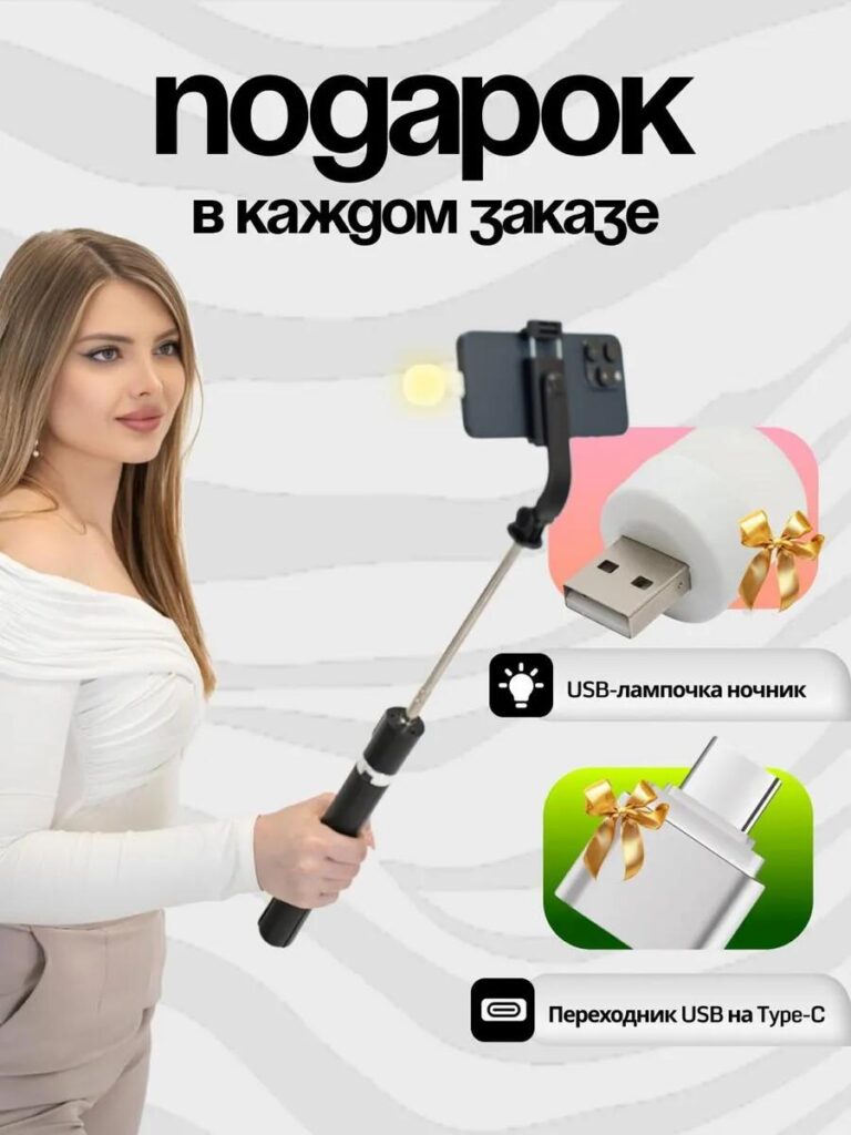
The fourth image introduces bonus accessories included with every order, such as a USB lamp and a USB-to-Type-C adapter. From a design perspective, this image is not about features—it is about value perception.
We deliberately used a softer background and lifestyle composition featuring a model to add emotional appeal. The gift icons and ribbon graphics clearly signal that these items come at no extra cost, triggering a positive psychological response.
This image helps reduce purchase hesitation by making the offer feel more generous. It also differentiates the listing from similar products that do not include accessories, even if the base price is similar.
Image 5: 3-in-1 Usage Scenarios — Versatility in One Glance
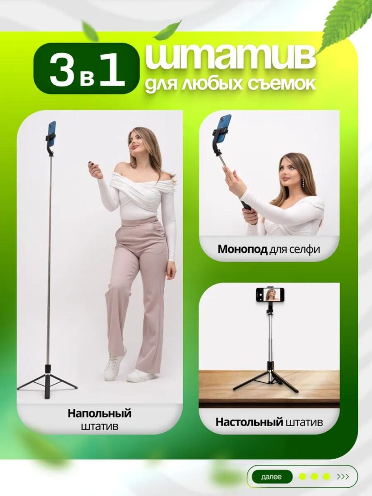
This image visually explains the three main usage modes: floor tripod, selfie stick, and tabletop stand. Rather than describing these modes in text, we showed them side by side to make the transformation instantly understandable.
We used consistent framing and spacing to keep the composition clean. Each mode is labeled clearly, ensuring shoppers immediately grasp how the product adapts to different environments—home, travel, work, or content creation.
This image is especially effective for users who need one device for multiple purposes, reinforcing the idea that they do not need to buy separate accessories.
Image 6: Angle and Rotation Flexibility — Creative Control
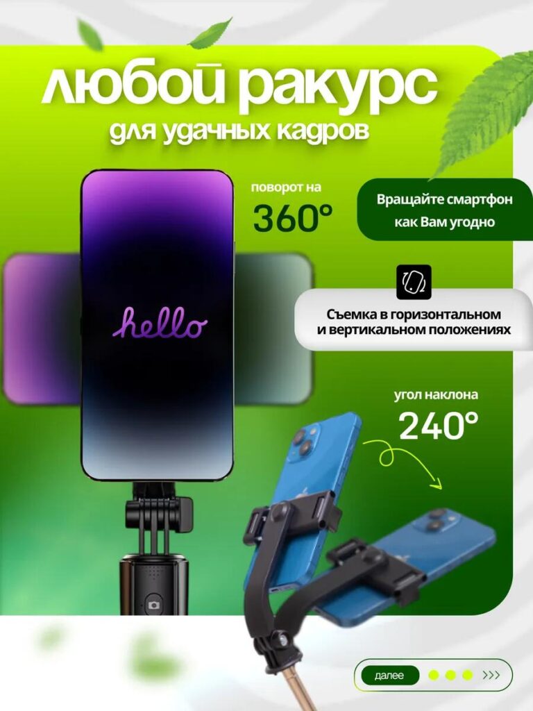
The sixth image focuses on movement and adjustability, two features that are difficult to convey through words alone.
By visually demonstrating 360° rotation and a 240° tilt angle, we allow users to imagine how they can frame shots in both vertical and horizontal orientations. Arrows and motion indicators guide the viewer’s understanding without cluttering the design.
This image appeals strongly to vloggers, livestreamers, and social media users who need flexible camera angles. It reinforces the product’s role as a creative tool, not just a basic holder.
Image 7: Portability — Designed for Everyday Carry
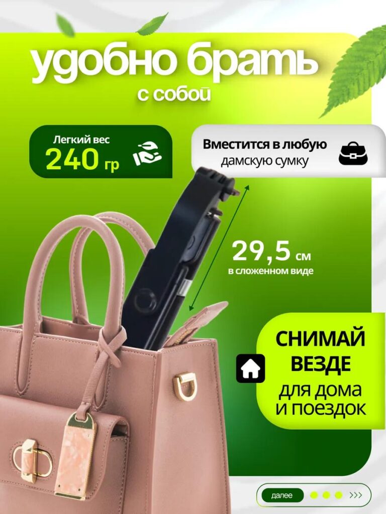
Portability often determines whether a phone stand becomes part of a user’s daily routine. In this image, we showed the product folded and placed inside a handbag to visually confirm its compact size.
Clear measurements and weight indicators communicate that the stand is lightweight and easy to carry. Instead of abstract claims, we used a real-world context that instantly makes sense.
This image reduces friction for buyers who travel frequently or want a stand they can bring anywhere without inconvenience.
Image 8: Bluetooth Pairing Guide — Reducing Post-Purchase Friction
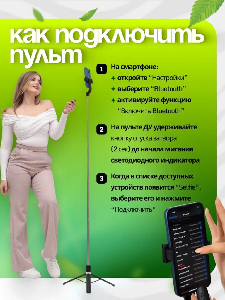
The final image serves an instructional purpose. We included a simple, step-by-step Bluetooth pairing guide to eliminate confusion after purchase.
From a design standpoint, this image builds confidence. It reassures users that setup is quick and easy, even for non-technical customers. Visual numbering and minimal text keep the process clear and approachable.
By addressing usability upfront, this image helps reduce returns, negative reviews, and customer support inquiries—an often overlooked but crucial aspect of high-quality marketplace design.
Overall Design Strategy: Why This Image Set Works on Ozon
This main image design follows three core principles:
- Clarity before creativity
Every image answers a specific customer question. No visuals are decorative without purpose. - Удобство чтения с учетом мобильных устройств
Large text, strong contrast, and structured layouts ensure clarity on small screens. - Progressive storytelling
The image sequence guides users from product overview, to feature understanding, to usage confidence.
By combining technical accuracy with visual simplicity, this design turns a functional product into an easy decision for the buyer.
Заключительные мысли
Эффективный Озон main image design is not about adding more text or flashy graphics—it is about strategic visual communication. For this phone holder, we used a clear narrative structure, consistent styling, and feature-driven layouts to maximize trust and conversion.
This approach reflects the same methodology we apply across cross-border e-commerce platforms: understanding user behavior first, then designing visuals that remove doubt and highlight value.
If you are looking to improve product performance through professional, platform-optimized visual systems, this is exactly the type of design thinking we apply at АИРСАНГ.


Спроектируем и создадим для вас WordPress-сайт или корпоративный сайт с полной системой электронной коммерции.
Ценовой диапазон: от $200.00 до $2,500.00Нестандартные требования или специальные предложения
Первоначальная цена составляла: $2.00.$1.00Текущая цена: $1.00. Дизайн главного изображения для домашнего физиотерапевтического устройства Amazon: пояснения.
Введение: Создание достоверного изображения для домашних терапевтических приборов на Amazon При разработке главного изображения для домашнего терапевтического прибора на Amazon мы в первую очередь...

Дизайн основного изображения для конвертации помады на Amazon.
Введение: Разработка главного образа помады, которая продается на Amazon Когда мы разрабатываем главный образ для помады Amazon, наша ответственность выходит далеко за рамки...

Что делает основное изображение жидкой тональной основы Amazon конвертируемым?
Введение. Разработка дизайна основного изображения для жидкой тональной основы на Amazon — это не просто создание красивого внешнего вида продукта. На Amazon основное изображение и...

Разработка эффективного основного изображения Amazon для фильтрующих картриджей
Введение. Разработка основного изображения для Amazon — это не просто создание привлекательного внешнего вида товара. Речь идёт о ясности, доверии и мгновенном понимании, особенно для...

Сравнение пяти тем WordPress для сайтов о домашних животных
Введение. Выбор подходящей темы WordPress для сайтов, посвященных домашним животным, — это не просто решение, связанное с дизайном; оно напрямую влияет на удобство использования, масштабируемость и долгосрочный рост бизнеса. Уход за домашними животными и...

Создание масштабируемого веб-сайта на WordPress для научно-ориентированного бренда: проект AminoUSA
Введение. В современном цифровом пространстве веб-сайт — это больше, чем просто место для размещения информации о товарах. Для научно-ориентированных брендов, работающих в регулируемых или научно-исследовательских отраслях, это….

Создание масштабируемого магазина Shopify для глобального бренда ножей: проект CoolKatana
Введение. В трансграничной электронной коммерции веб-сайт Shopify — это больше, чем просто витрина магазина. Для брендов, работающих в нишевых, ориентированных на культуру категориях, веб-сайт должен делать гораздо больше, чем...

Разработка высокоэффективного магазина Shopify для карточек Pokémon.
Введение. В мире электронной коммерции коллекционных товаров, особенно на рынке коллекционных карточных игр Pokémon, веб-сайт должен делать больше, чем просто перечислять товары...

Высокоэффективный дизайн Shopify для индивидуального бренда стационарной торговой точки.
Введение. В условиях современной конкурентной среды электронной коммерции, особенно в сегменте персонализированных подарков и коллекционных товаров, веб-сайт на платформе Shopify должен делать гораздо больше, чем просто отображать товары. Он...

Пример разработки веб-сайта на платформе Shopify для премиального цветочного бренда.
Введение. В условиях современной конкурентной среды электронной коммерции веб-сайт на платформе Shopify должен делать гораздо больше, чем просто отображать товары. Он должен мгновенно передавать ценность бренда, направлять пользователей...

Пример проекта дизайна на Shopify: магазин ретро-игр
Введение. В условиях высокой конкуренции в сфере электронной коммерции визуальная ясность и эмоциональная связь часто определяют, станет ли посетитель клиентом. Это особенно актуально в...

Пример проекта по дизайну на Shopify: Tactical Rescue Brand
Введение. Эффективный веб-сайт на Shopify делает больше, чем просто отображает товары — он передает цель, укрепляет доверие и помогает пользователям принимать уверенные решения о покупке. Это особенно важно...

Пример разработки веб-сайта на платформе Shopify для бренда электровелосипедов.
Введение. На современном конкурентном рынке электровелосипедов веб-сайт на платформе Shopify должен делать больше, чем просто демонстрировать товары — он должен рассказывать историю, вызывать доверие и направлять пользователей...

Масштабируемая платформа электронной коммерции Shopify для креативного бренда.
Введение. Когда креативные бренды растут, их веб-сайты часто с трудом успевают за развитием. По мере расширения ассортимента продукции, увеличения объема контента и роста трафика многие бренды, ориентированные на визуальное оформление...

Пример разработки веб-сайта на платформе Shopify для бренда товаров для дома.
Введение. На высококонкурентном рынке товаров для дома визуальная идентичность — это уже не просто эстетика, она напрямую влияет на доверие, поведение покупателей при просмотре товаров и принятие решений о покупке. Для...

Пример создания масштабируемого сайта с платной подпиской на WordPress.
Введение. Для современных брендов электронной коммерции веб-сайт — это уже не просто цифровая витрина. Это движок, поддерживающий подписки, создание контента, построение доверия и т.д.

Высокоэффективный дизайн WordPress для брендов, ориентированных на взрослую аудиторию.
Введение. На высококонкурентных рынках электронной коммерции одних лишь ярких визуальных элементов недостаточно. Успешный веб-сайт на WordPress должен направлять посетителей по четкому и целенаправленному маршруту, который….

Масштабируемый веб-сайт электронной коммерции по продаже секс-кукол на WordPress
Введение. Запуск высокоэффективного веб-сайта для трансграничной электронной коммерции — это не просто размещение товаров в интернете. Для брендов, работающих на высококонкурентных рынках, ориентированных на визуальный контент, веб-сайт...