


Введение
A flower delivery website should never feel like a simple product catalog. Flowers carry emotion, timing, memory, apology, celebration, comfort, and love. When customers send flowers across long distances, especially across countries, they need more than beautiful product images. They need confidence. They need clarity. They need to believe that the bouquet they choose will arrive fresh, on time, and close to what they imagined.
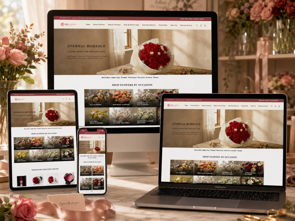
For this WordPress flower delivery website, we designed the entire experience around one central idea: make international flower gifting feel personal, elegant, and easy. Every section supports that idea in a different way. The homepage builds emotion first, then helps users shop by occasion, compare products, understand service advantages, trust the process, learn the brand story, and finally feel reassured by customer reviews. The product page continues that same logic by combining strong product visuals, service guarantees, secure checkout signals, detailed descriptions, delivery coverage, and related product recommendations.
We approached this project from a designer’s perspective, not only thinking about how the site looks, but also thinking about how each visitor feels while browsing. Many customers may order from the United States, the United Kingdom, Australia, Canada, or other countries while sending flowers to loved ones in China. That means the website must solve several concerns at once: language clarity, emotional appeal, payment trust, delivery reliability, product quality, and order confidence.
The result is a visual system that blends classic floral elegance with practical e-commerce structure. The design uses warm colors, serif typography, romantic photography, spacious layouts, clear navigation, and trust-focused content to guide users from inspiration to purchase.
| Срок доставки | Категория | Тип веб-сайта |
| 14days | Fresh flowers | WordPress |
| Участники проекта (дизайнеры) | Расходы | Эффект |
| Нэнси | $1700 | Sales📈254% |
Hero Banner: Creating Romance From the First Screen
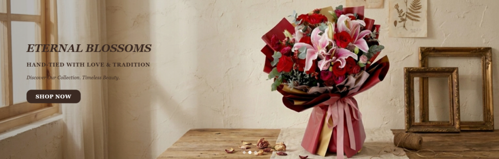
Designing an Emotional First Impression
The hero banner sets the emotional tone for the entire website. We designed it to feel romantic, refined, and timeless rather than overly commercial. The large bouquet on the right side immediately becomes the visual focus. Its rich red roses, soft pink lilies, layered wrapping, and ribbon details communicate premium gifting before the user reads a single word.
We placed the text on the left side because this creates a balanced composition. The left area has enough negative space for the headline, subtitle, and call-to-action button, while the right area gives the bouquet room to shine. This structure also supports natural reading behavior. Users first notice the large floral image, then move toward the headline and button.
Why We Used a Vintage Interior Style
The background uses a warm, nostalgic interior with soft beige walls, a wooden table, vintage frames, botanical prints, and gentle window light. We chose this direction because it gives the flower arrangement a story. Instead of placing the bouquet on a plain white background, we positioned it within a lifestyle scene that feels intimate and meaningful.
Flowers are often connected to personal memories. A vintage setting makes the bouquet feel like part of a romantic letter, an old photograph, or a carefully prepared gift. This helps the website speak to emotion, not just price.
Typography and Button Strategy
The headline uses a classic serif typeface to support the feeling of tradition and elegance. Serif typography works especially well for floral brands because it feels mature, emotional, and premium. The button uses a dark brown tone that matches the warm visual palette while still creating strong contrast. We made the call-to-action direct and simple: “Shop Now.” A hero section should inspire, but it must also guide users toward action.
This first screen tells visitors what kind of brand they are entering: warm, romantic, reliable, and gift-focused.
Occasion Category Grid: Helping Customers Choose Faster
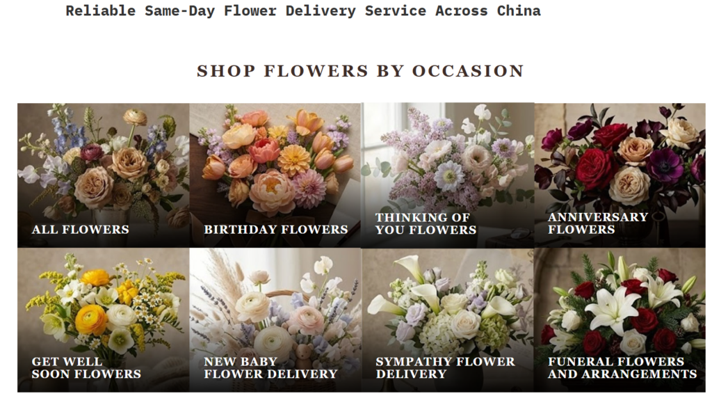
Why Occasion-Based Shopping Matters
After the hero banner, we designed the “Shop Flowers by Occasion” section to make browsing easier. Flower customers often do not begin with a specific product in mind. They begin with a reason: a birthday, an anniversary, a get-well message, a sympathy gesture, or a funeral arrangement. That is why occasion-based navigation is so important.
Instead of forcing users to scroll through a general product list, we give them immediate paths based on emotional intent. This reduces decision fatigue and helps customers find a suitable bouquet faster.
Using a Grid for Clarity
We used a clean grid layout because it allows visitors to scan several categories at once. Each card has a large floral image and a bold category title. The visual card format works better than a plain text menu because flowers are highly visual products. Customers can quickly feel the mood of each category before clicking.
For example, birthday flowers can use brighter, warmer colors, while sympathy or funeral categories may use softer whites and more restrained arrangements. This visual difference helps users make decisions naturally.
Dark Gradient for Readability
We placed white serif category titles over the images and added a dark gradient at the bottom of each card. This improves text readability without covering the floral photography completely. The gradient also adds depth and gives the grid a more polished look.
From a conversion perspective, this section performs two jobs. It beautifies the homepage and functions as a practical navigation system. Good e-commerce design should always combine visual appeal with user guidance.
Fresh Picks: Turning Product Discovery Into Emotion
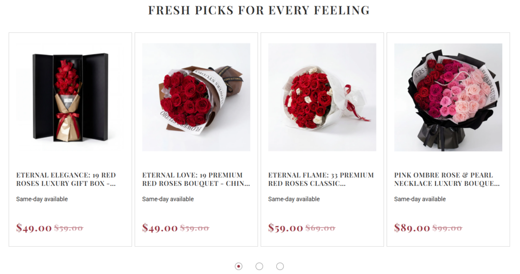
Building a Curated Product Moment
The “Fresh Picks for Every Feeling” section introduces featured products in a way that feels curated rather than random. We designed this section to help users discover popular or emotionally relevant bouquets without needing to enter a category page first.
The headline matters. Instead of saying only “Featured Products,” we used a more emotional phrase. “Every Feeling” connects the products with moods and personal intentions. This small wording choice helps the section feel aligned with the emotional nature of flower gifting.
Why Four Product Cards Work Well
We displayed four product cards across the page to create a balanced and easy-to-scan layout. Four cards give customers enough variety without overwhelming them. Each card includes a product image, product title, same-day availability message, sale price, and original price.
This structure gives users the information they need at a glance. They can compare product style, price, and service availability without opening every product page.
Clean Product Backgrounds for Better Focus
The product images use clean, light backgrounds. This keeps attention on the bouquets, packaging, and color details. For floral gifting, presentation matters. Customers want to see the bouquet shape, wrapping material, color combination, and luxury feel. A clean product card supports this by removing unnecessary visual noise.
Pricing as a Conversion Tool
We highlighted sale prices in a stronger color and showed original prices with a crossed-out treatment. This gives customers an immediate sense of value. The same-day availability text also works as a trust and urgency signal. It reassures customers that the product is not only beautiful, but also practical for urgent gifting.
This section balances beauty, information, and conversion. It invites customers to browse while quietly answering important purchase questions.
“What Makes Us Different”: Turning Service Details Into Trust
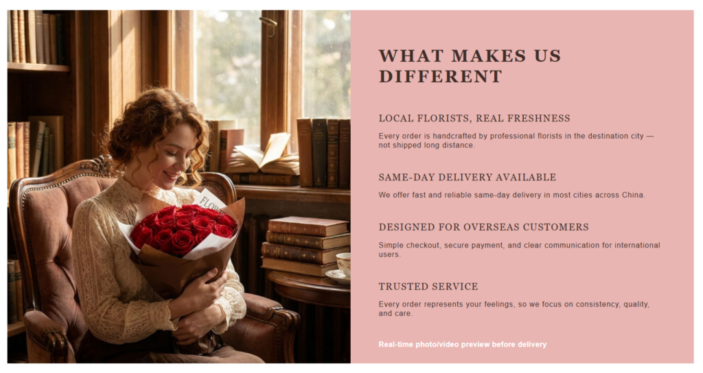
Why We Added a Trust Section
Flower delivery across countries creates uncertainty. Customers may wonder if the flowers will be fresh, whether the recipient city is covered, whether the payment is safe, and whether the final bouquet will look like the product photo. We designed the “What Makes Us Different” section to answer these concerns directly.
Instead of hiding service benefits inside a long FAQ page, we placed the strongest trust points on the homepage. This helps customers feel safe before they reach checkout.
Split Layout for Emotion and Information
The section uses a two-column layout. The left side shows a warm lifestyle image of a woman holding roses in a classic interior. The right side presents the service advantages on a soft pink background. This split design works because it combines emotional imagination with practical reassurance.
The image helps customers picture the joy of receiving flowers. The text explains why the service can deliver that experience reliably.
Key Service Messages
We organized the right side around four major points: local florists, same-day delivery, overseas customer support, and trusted service. Each point speaks to a specific concern.
Local florists suggest freshness and faster preparation. Same-day delivery supports urgency. Overseas customer support reassures international buyers. Trusted service communicates care and consistency.
We also included a final line about real-time photo or video preview before delivery. This detail is especially powerful because it reduces uncertainty. Customers sending flowers from overseas often cannot see the bouquet in person. A preview gives them confidence before the order reaches the recipient.
Color Choice and Brand Tone
The soft pink background supports the romantic floral identity while helping this section stand apart from the white product areas. It feels warm without becoming too bright. We kept the text dark and structured so users can scan the content easily.
This section does not simply decorate the page. It solves trust problems and makes the service feel dependable.
Promotion and Best Sellers: Combining Urgency With Popular Choices
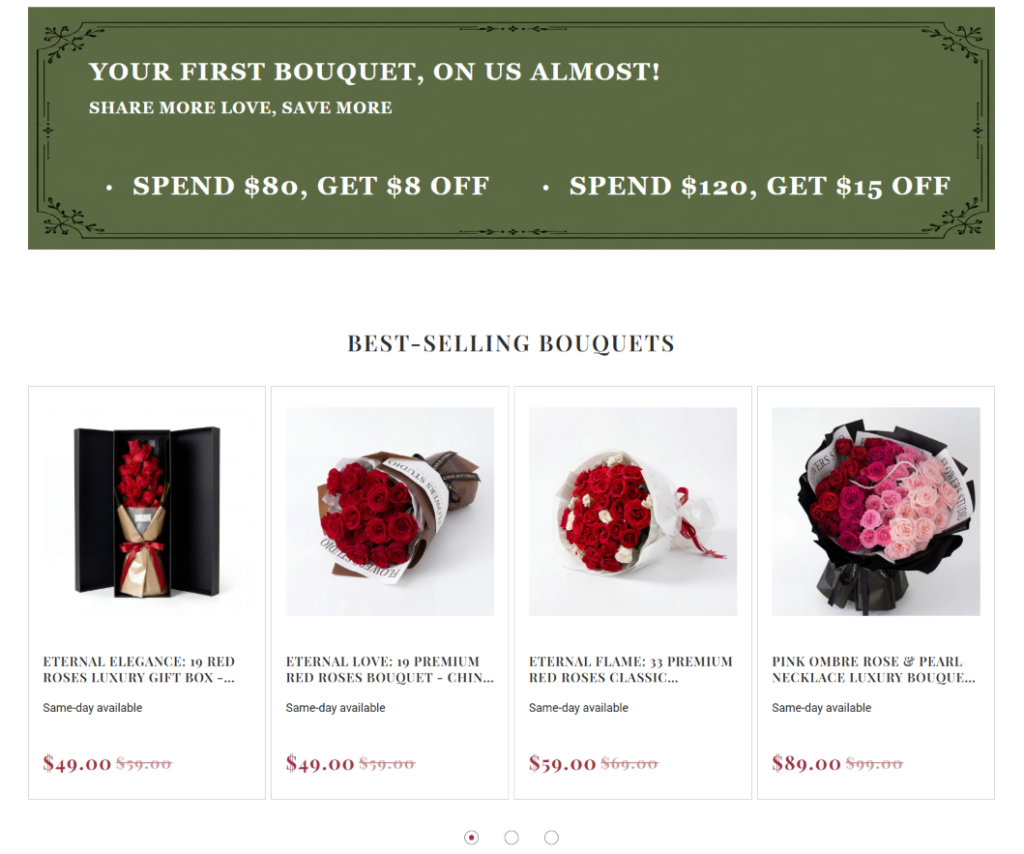
Designing a Promotion That Still Feels Premium
The promotional banner uses a deep green background, white serif text, and decorative border details. We chose green because it contrasts strongly with the lighter page background and connects naturally with floral freshness. The decorative frame gives the promotion a classic gift-card feeling rather than a loud discount-ad feeling.
Many discount blocks look aggressive and can weaken a premium brand. We avoided that by using elegant typography, balanced spacing, and a restrained color palette. The offer becomes noticeable but still tasteful.
Why the Offer Appears Before Best Sellers
We placed the promotional banner before the “Best-Selling Bouquets” section to create motivation before product browsing. The visitor sees the savings message first, then immediately sees popular products below. This sequence can encourage action because customers understand both the offer and where to use it.
Best Sellers Reduce Decision Fatigue
The “Best-Selling Bouquets” section helps users who do not want to browse too much. Popular products act as social shortcuts. When customers see best-selling bouquets, they feel that other people have already chosen and trusted these options.
This is especially useful in flower gifting because the customer may be ordering for an important occasion. They want to avoid mistakes. A best-seller section makes the decision feel safer.
Consistent Product Card Design
We kept the product card style consistent with the earlier product section. This gives the website a unified shopping experience. Users do not need to relearn the layout. They already understand where to find the product image, title, service note, and price.
The carousel dots below the products suggest that more items are available without making the homepage too long. This is a clean way to provide variety while protecting the page’s visual rhythm.
Four Simple Steps: Making International Flower Delivery Feel Easy
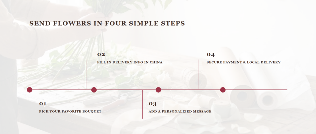
Why Process Design Matters
For international customers, sending flowers to China may feel complicated. They may wonder how to choose a bouquet, enter the delivery address, add a message, pay securely, and confirm delivery. We designed the “Send Flowers in Four Simple Steps” section to remove that uncertainty.
The section turns a potentially stressful process into a clear journey.
Horizontal Timeline Structure
We used a horizontal timeline because it communicates progress visually. The customer can understand the full process in a few seconds: pick a bouquet, fill in delivery information in China, add a personalized message, and complete secure payment with local delivery.
This format works better than a long paragraph because it breaks the process into small, manageable steps. Each step feels simple.
Soft Background and Strong Guide Line
The background image shows floral work in a soft, faded style. We applied a light overlay so the content remains readable. The background keeps the section connected to the handmade floral theme, while the timeline gives it structure.
The deep red line and dots guide the eye from step one to step four. This color connects with the rose palette used throughout the site. It also adds enough contrast to make the process clear.
Alternating Step Placement
We placed some steps above the line and others below it to create visual rhythm. A flat row of text can feel static. Alternating the step positions makes the section more dynamic while still staying organized.
This design choice helps the customer feel that the order process is straightforward, guided, and safe.
Our Story: Giving the Brand a Human Voice
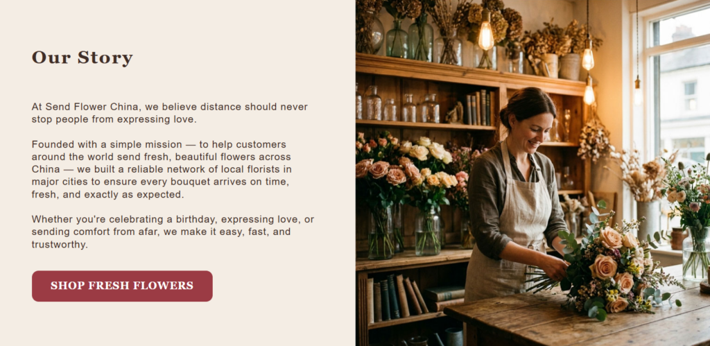
Why Brand Story Belongs on the Homepage
A flower delivery website needs more than product listings. Customers are sending personal feelings, so the brand must feel human. The “Our Story” section gives the site warmth and identity.
We placed this section after the service and shopping sections because users first need to understand what the website offers. Once they know the products and process, the story deepens their emotional connection.
Text and Image Balance
The left side contains the brand story in a clean, readable layout. The right side shows a florist working in a warm studio environment. This combination creates a strong message: the brand is not just an online storefront; real people prepare the flowers with care.
The text explains the mission of helping customers around the world send fresh flowers across China. The image supports that message visually with a florist, natural light, wooden shelves, and flower arrangements.
Building Trust Through Craftsmanship
The florist workshop scene communicates handmade quality. It shows that floral arrangements come from skill and attention, not from a faceless warehouse. For gift categories, craftsmanship creates emotional value.
The warm lighting and natural textures make the brand feel approachable. The visual tone also matches the homepage hero and trust sections, creating a consistent brand atmosphere.
Call-to-Action Placement
The button “Shop Fresh Flowers” appears after the story. This placement matters. After users read the brand mission and see the florist at work, they have a stronger emotional reason to browse products. The button turns that emotion into action without feeling forced.
This section strengthens brand credibility while keeping the customer journey moving.
Customer Testimonials: Adding Social Proof for Overseas Buyers
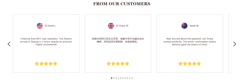
Why Reviews Are Essential
Customer reviews are one of the strongest trust tools on an e-commerce website. They matter even more for international flower delivery because customers may never meet the florist or see the final bouquet in person before delivery.
We designed the “From Our Customers” section to show that real buyers from different locations have successfully used the service.
Card-Based Layout for Credibility
Each review appears inside a clean white card with generous spacing. This layout makes each testimonial feel separate, organized, and easy to read. We avoided heavy decorative elements because reviews should feel honest and straightforward.
The cards include customer names, country flags, review text, and star ratings. These details help create a sense of authenticity and international reach.
Why Country Flags Help
Country flags quickly communicate that the service supports overseas customers. A visitor from the United States, the United Kingdom, Australia, or another country can see that people outside China have already placed orders successfully.
This visual cue supports one of the website’s main positioning points: helping global customers send flowers across China.
Slider Arrows and Dots
We used slider arrows and navigation dots to show that more testimonials are available. This keeps the section clean while still presenting depth. Users can explore more reviews without the page becoming too long.
From a design perspective, testimonials function as the emotional proof layer. The site has already shown products, service benefits, process clarity, and brand story. Reviews confirm that those promises feel real to customers.
Footer: Ending With Clear Navigation and Trust
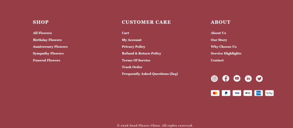
Why the Footer Matters
A footer should not be treated as an afterthought. It is the final navigation and reassurance area of the website. We designed the footer to be bold, structured, and consistent with the brand’s floral identity.
The deep rose background creates a strong closing moment. It connects with the rose-based product visuals and gives the page a warm, memorable finish.
Three-Column Navigation Structure
We organized the footer into three main columns: Shop, Customer Care, and About. This structure helps users quickly find what they need.
The Shop column points users back to major flower categories. The Customer Care column includes important support pages such as cart, account, privacy policy, return policy, terms of service, order tracking, and FAQs. The About column gives access to brand-related pages such as About Us, Our Story, Why Choose Us, Service Highlights, and Contact.
This layout supports both shoppers and cautious buyers. Some users may want to keep browsing. Others may want to check policies before placing an order.
Social and Payment Signals
We placed social media icons and payment badges on the right side. These elements help the website feel active, legitimate, and secure. Familiar payment logos reduce checkout anxiety, especially for international users.
The copyright line at the bottom completes the page and gives the site a professional finish. The footer works as both a navigation tool and a trust-building section.
Product Detail Page: Designing for Confidence and Conversion
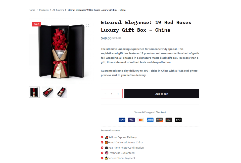
Why the Product Page Needs More Depth
The product detail page carries the final responsibility for conversion. A homepage can inspire users, but the product page must help them decide. We designed the page to answer practical questions while maintaining the premium floral tone.
The product page for the luxury red rose gift box uses a clean two-column layout at the top. The left side presents the product gallery. The right side presents the title, price, product summary, quantity selector, add-to-cart button, secure checkout icons, and service guarantee list.
Product Gallery With Multiple Angles
Luxury floral gifts depend heavily on presentation. Customers want to know how the bouquet looks from different angles, especially when it arrives in a box. We included thumbnail images under the main product image so users can explore the product visually.
Further down the page, we used a larger visual section showing the front view, lying down view, and side view. This gives customers a clearer understanding of the packaging, bouquet structure, and gift presentation.
The goal is to reduce uncertainty. When customers can see multiple angles, they feel more confident that the product will match expectations.
Purchase Area for Fast Decision-Making
On the right side, we placed the most important purchase details close together. The product title clearly describes the bouquet. The sale price appears near the top, helping users understand value quickly. The short description explains the product’s premium character and emotional use case.
The quantity selector and add-to-cart button sit directly below the summary. This makes the buying path clear. We used a strong dark button to create contrast and make the action obvious.
Secure Checkout and Service Guarantees
Below the button, we included secure checkout icons and service guarantee points. This is critical for customers ordering from overseas. They need to trust the payment process and delivery promise.
The service guarantee list reinforces several important points: express delivery, delivery across China, real-time photo confirmation, freshness, and secure payment. Each point reduces a specific concern.
Product Description as a Sales Story
Below the main purchase area, the description section continues the sales experience. We structured the content with clear headings such as product name, boutique aesthetics, reasons international senders trust the boxed roses, product specifications, and delivery coverage.
This approach makes the description easier to scan. Customers who want emotional reassurance can read the story. Customers who want practical details can find specifications and delivery information quickly.
Delivery Cities and Related Products
We added a delivery city section because flower delivery depends heavily on location. Showing major cities helps customers understand coverage and reinforces operational credibility.
The related products section appears near the bottom to encourage continued browsing. If the current bouquet is not the perfect fit, users can compare other options without starting over. This supports conversion by keeping shoppers engaged.
Footer Continuity on the Product Page
The product page ends with the same structured footer used across the site. This creates consistency and gives customers another chance to access support, policies, categories, and brand information before leaving.
A strong product page must sell, reassure, and guide. This design does all three.
Overall Design Strategy: Emotion First, Trust Always
A Consistent Visual Language
Across the website, we maintained a consistent design language. Serif typography gives the site a classic and elegant personality. Warm backgrounds, deep rose colors, soft pink sections, vintage interiors, and floral photography create emotional continuity.
This consistency matters because customers should feel that every page belongs to the same brand. A unified style makes the website look more professional and trustworthy.
Designing for Overseas Customers
The website serves customers who may be physically far from the delivery destination. That creates unique design challenges. We addressed those challenges by making service information visible throughout the journey.
Same-day delivery, local florists, secure payment, bilingual communication, photo or video confirmation, and order tracking all support overseas buyers. We did not hide these details. We placed them in sections where they naturally reduce hesitation.
Balancing Beauty and Usability
A flower website must be beautiful, but beauty alone does not create sales. Users also need clear navigation, visible categories, readable product cards, simple steps, policy access, and trustworthy checkout signals.
We designed each section to support both emotion and usability. The hero inspires. The category grid organizes. Product cards help comparison. Trust sections answer doubts. The timeline simplifies the process. The story humanizes the brand. Testimonials prove reliability. The footer supports navigation. The product page completes the conversion path.
Why This Structure Works for Flower Delivery
Flower delivery is emotional commerce. Customers are not only buying flowers; they are sending a message. The design must respect that emotion while still making the transaction simple.
This site structure works because it follows the customer’s mental journey. First, they feel inspired. Then, they choose an occasion. Next, they explore products. After that, they check trust factors. Then, they understand the ordering process. They learn the brand story. They see customer proof. Finally, they land on a product page that gives them enough visual, emotional, and practical information to buy.
Заключение
This WordPress flower delivery website succeeds because it treats every design section as part of a complete customer journey. The homepage does not simply display flowers; it builds emotion, organizes choices, highlights service advantages, explains the process, and proves credibility. The product page does not simply show one bouquet; it gives customers multiple images, clear purchase actions, secure payment signals, service guarantees, detailed product storytelling, delivery information, and related product options.
From a designer’s perspective, the strongest part of this project is its balance. The visual style feels romantic and premium, but the layout remains practical and easy to use. The brand story feels warm, but the service details stay clear. The product cards look elegant, but the pricing and availability remain easy to understand. The footer feels decorative, but it still works as a useful navigation and trust area.
For businesses that sell emotional products online, this kind of design approach matters. Customers need to feel something, but they also need to trust the process. This website shows how thoughtful independent-site design can combine storytelling, conversion strategy, and user reassurance into one complete experience. At АИРСАНГ, this is exactly the type of cross-border website design thinking we focus on: helping brands present their products beautifully, communicate trust clearly, and guide customers toward confident action.


Спроектируем и создадим для вас WordPress-сайт или корпоративный сайт с полной системой электронной коммерции.
Ценовой диапазон: от $200.00 до $2,500.00custom-requirements-or-special-quotations
Первоначальная цена составляла: $2.00.$1.00Текущая цена: $1.00. Дизайн главного изображения для домашнего физиотерапевтического устройства Amazon: пояснения.
Введение: Создание достоверного изображения для домашних терапевтических приборов на Amazon При разработке главного изображения для домашнего терапевтического прибора на Amazon мы в первую очередь...

Дизайн основного изображения для конвертации помады на Amazon.
Введение: Разработка главного образа помады, которая продается на Amazon Когда мы разрабатываем главный образ для помады Amazon, наша ответственность выходит далеко за рамки...

Как хакеры крадут электронные письма администраторов WordPress (и как им это предотвратить)
Начнем с неприятной истины: ваша электронная почта администратора WordPress, вероятно, гораздо более публична, чем вы думаете. А хакеры? Им это нравится. Для них ваш...

Что делает основное изображение жидкой тональной основы Amazon конвертируемым?
Введение. Разработка дизайна основного изображения для жидкой тональной основы на Amazon — это не просто создание красивого внешнего вида продукта. На Amazon основное изображение и...

Разработка эффективного основного изображения Amazon для фильтрующих картриджей
Введение. Разработка основного изображения для Amazon — это не просто создание привлекательного внешнего вида товара. Речь идёт о ясности, доверии и мгновенном понимании, особенно для...

Повторные атаки на WordPress: реальная угроза или преувеличенный миф?
Давайте сначала кое-что проясним. Атаки повторного воспроизведения не выглядят страшно. Они не взламывают пароли. Они не внедряют вредоносный код с зелёным хакерским текстом, разлетающимся повсюду. Они действуют коварно...

Как скопировать страницы WordPress, ничего не сломав
Давайте посмотрим правде в глаза. Иногда вам не хочется создавать новую страницу. Вам нужна та же самая страница… но немного другая. Тот же макет. Те же блоки. Те же настройки. Потому что….

Сравнение пяти тем WordPress для сайтов о домашних животных
Введение. Выбор подходящей темы WordPress для сайтов, посвященных домашним животным, — это не просто решение, связанное с дизайном; оно напрямую влияет на удобство использования, масштабируемость и долгосрочный рост бизнеса. Уход за домашними животными и...

Сравнение пяти тем оформления для интернет-магазинов купальников
Введение. Выбор правильной тематики для независимого магазина купальников или нижнего белья — это не просто визуальное решение, оно напрямую влияет на коэффициент конверсии, масштабируемость и долгосрочную перспективу...

Как отключить комментарии в WordPress (не сойдя с ума)
Давайте поговорим о комментариях в WordPress. В теории комментарии — это здорово. Они стимулируют дискуссии. Они создают сообщество. Они делают ваш сайт “живым”. А на практике? Зачастую они притягивают...

Создание масштабируемого веб-сайта на WordPress для научно-ориентированного бренда: проект AminoUSA
Введение. В современном цифровом пространстве веб-сайт — это больше, чем просто место для размещения информации о товарах. Для научно-ориентированных брендов, работающих в регулируемых или научно-исследовательских отраслях, это….

Создание масштабируемого магазина Shopify для глобального бренда ножей: проект CoolKatana
Введение. В трансграничной электронной коммерции веб-сайт Shopify — это больше, чем просто витрина магазина. Для брендов, работающих в нишевых, ориентированных на культуру категориях, веб-сайт должен делать гораздо больше, чем...

Разработка высокоэффективного магазина Shopify для карточек Pokémon.
Введение. В мире электронной коммерции коллекционных товаров, особенно на рынке коллекционных карточных игр Pokémon, веб-сайт должен делать больше, чем просто перечислять товары...

Высокоэффективный дизайн Shopify для индивидуального бренда стационарной торговой точки.
Введение. В условиях современной конкурентной среды электронной коммерции, особенно в сегменте персонализированных подарков и коллекционных товаров, веб-сайт на платформе Shopify должен делать гораздо больше, чем просто отображать товары. Он...

Как связаться со службой поддержки Shopify: простое и понятное руководство
Управление магазином Shopify должно приносить удовольствие, а не путаницу. Когда возникают вопросы или проблемы замедляют вашу работу, Shopify предлагает несколько вариантов поддержки в зависимости от ситуации...

Как деактивировать магазин Shopify: понятное и практичное руководство
Деактивация магазина Shopify — несложная процедура, но она влечет за собой последствия, которые многие продавцы упускают из виду. В этом руководстве процесс описан простым и понятным языком...

Пример разработки веб-сайта на платформе Shopify для премиального цветочного бренда.
Введение. В условиях современной конкурентной среды электронной коммерции веб-сайт на платформе Shopify должен делать гораздо больше, чем просто отображать товары. Он должен мгновенно передавать ценность бренда, направлять пользователей...

Пример проекта дизайна на Shopify: магазин ретро-игр
Введение. В условиях высокой конкуренции в сфере электронной коммерции визуальная ясность и эмоциональная связь часто определяют, станет ли посетитель клиентом. Это особенно актуально в...