Focusing on lithium iron phosphate energy storage batteries, we organize the internal structure and multi-scenario information into a set of English product diagrams. The entire set of works adopts the visual language of black and green technology, scene synthesis, and matrix information. Through the division of labor in different pictures, the product appearance, local information, and usage scenarios are gradually presented.
| Услуги | Industry | Платформа |
|---|---|---|
| Amazon primary and secondary product images design | Digital 3C | Amazon |
| Project requirements | target market | design style |
| Internal structure and multi-scene information | English content display | Black and green technology, scene synthesis, matrix information |
| Project quotation | Delivery content | Delivery time |
| ¥600 | 9 product primary and secondary product images | 4 days |
Design Challenge: Let different information have its place
Energy storage batteries have a wide range of use scenarios, and their structure and connection themes are also intensive. We organized the internal diagrams, scenes, specifications and comparison information separately, and used a unified green logo to string together the entire set of pictures.
Our design strategy
The green title and information bar echo the body, and the dark products match the bright scenes to maintain recognition.
Use tables, sections, and leads for complex topics, rather than stacking all the information on a single scene.
Internal structure: unfold the shell and components in layers
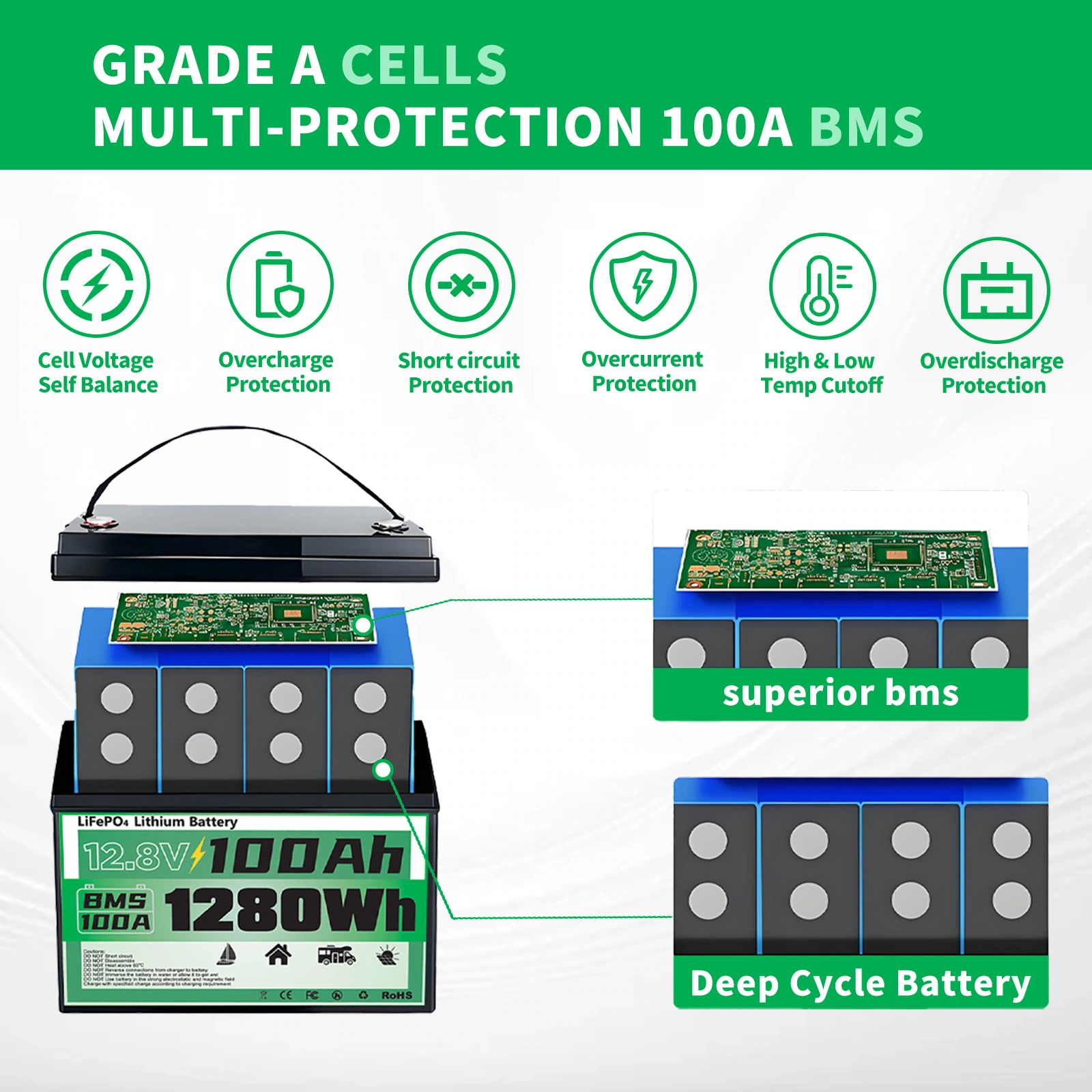
We disassemble the casing, internal batteries and control components longitudinally, and the green icon bar at the bottom accepts supplementary information. The structural diagram and text occupy one layer each, with legible distances between components.
RV Scenario: Use Prospect Products to Establish Product Anchors
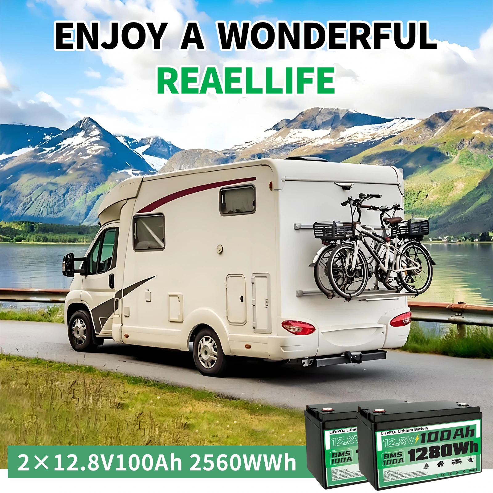
We placed the battery pack in front of the lakeside RV scene, with a green information strip underneath to unify the text. The environment is responsible for conveying the theme, and the products remain large enough to not be swallowed up by the scenery.
Boat Situation: The sidebar stores multiple information
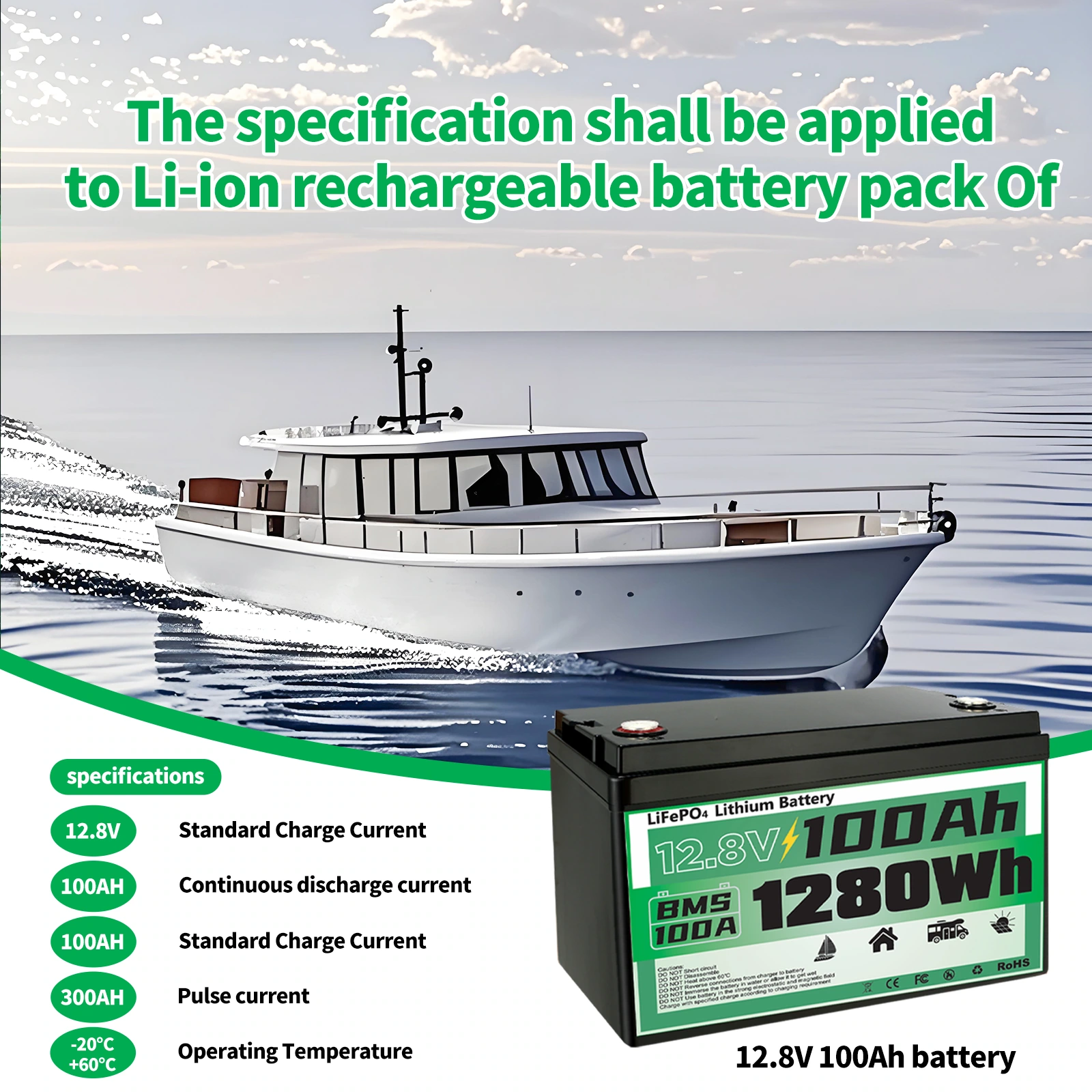
We arranged the boat at the top, the battery in the lower right foreground, and the green button-like information blocks on the left arranged vertically. Each of the three areas has its own responsibilities, and clear boundaries are maintained between scenarios, products, and descriptions.
Four applications: organizing different environments with grids
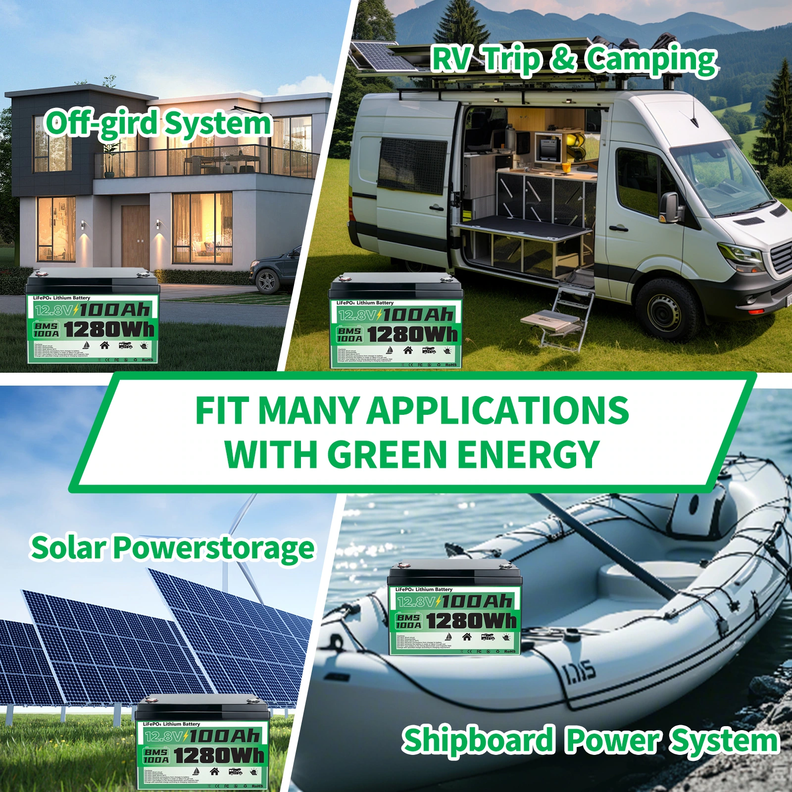
We divided scenes such as RVs, boats, and off-grids into four grids, and unified the title position and margins. Different backgrounds are collapsed into the same frame, allowing the reader to move through the app’s themes one by one.
Home electricity theme: product and icon layering
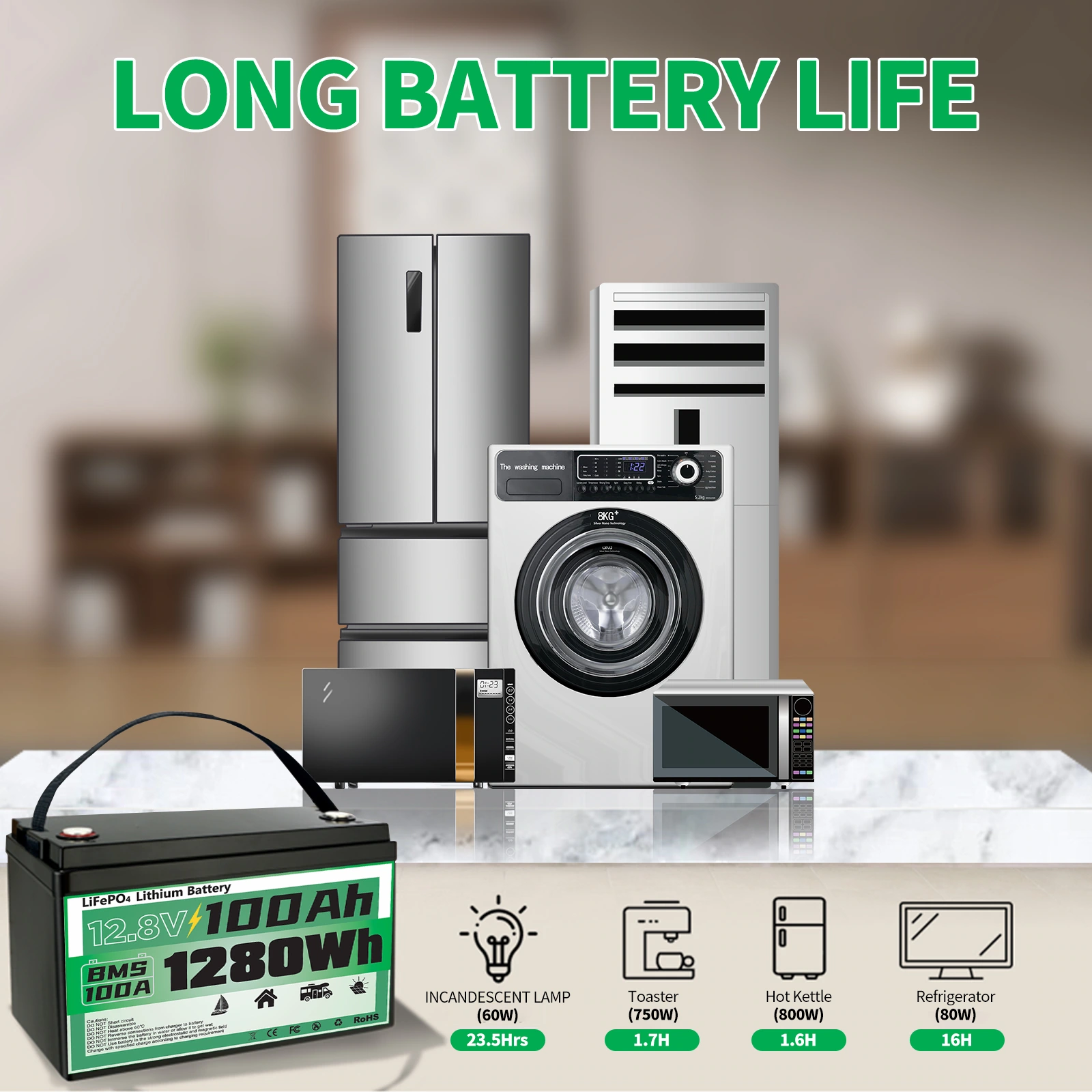
We leave the home appliance environment in the background, the battery is enlarged in the foreground, and there is an icon bar below. Icons and environments are illustrated separately, eliminating the need to search for each small label in a complex background.
Environmental contrast: using warm and cold zones to express the theme
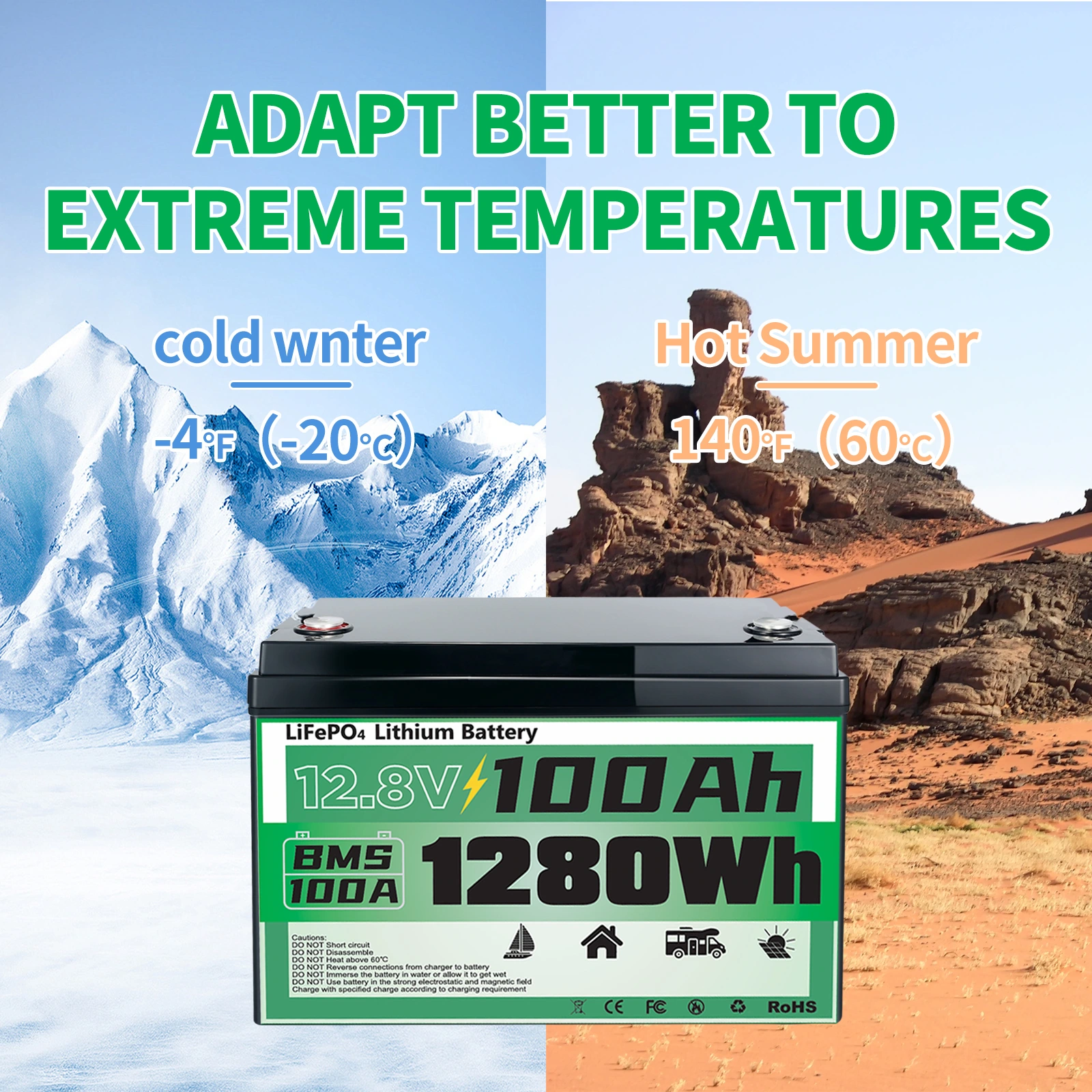
We use the two environments of winter and summer to form a left-right contrast, and the main battery maintains a stable position. The contrast between warm and cool colors helps readers identify partitions, illustrating text remaining in relatively clean areas.
Information comparison: putting content back into aligned tables
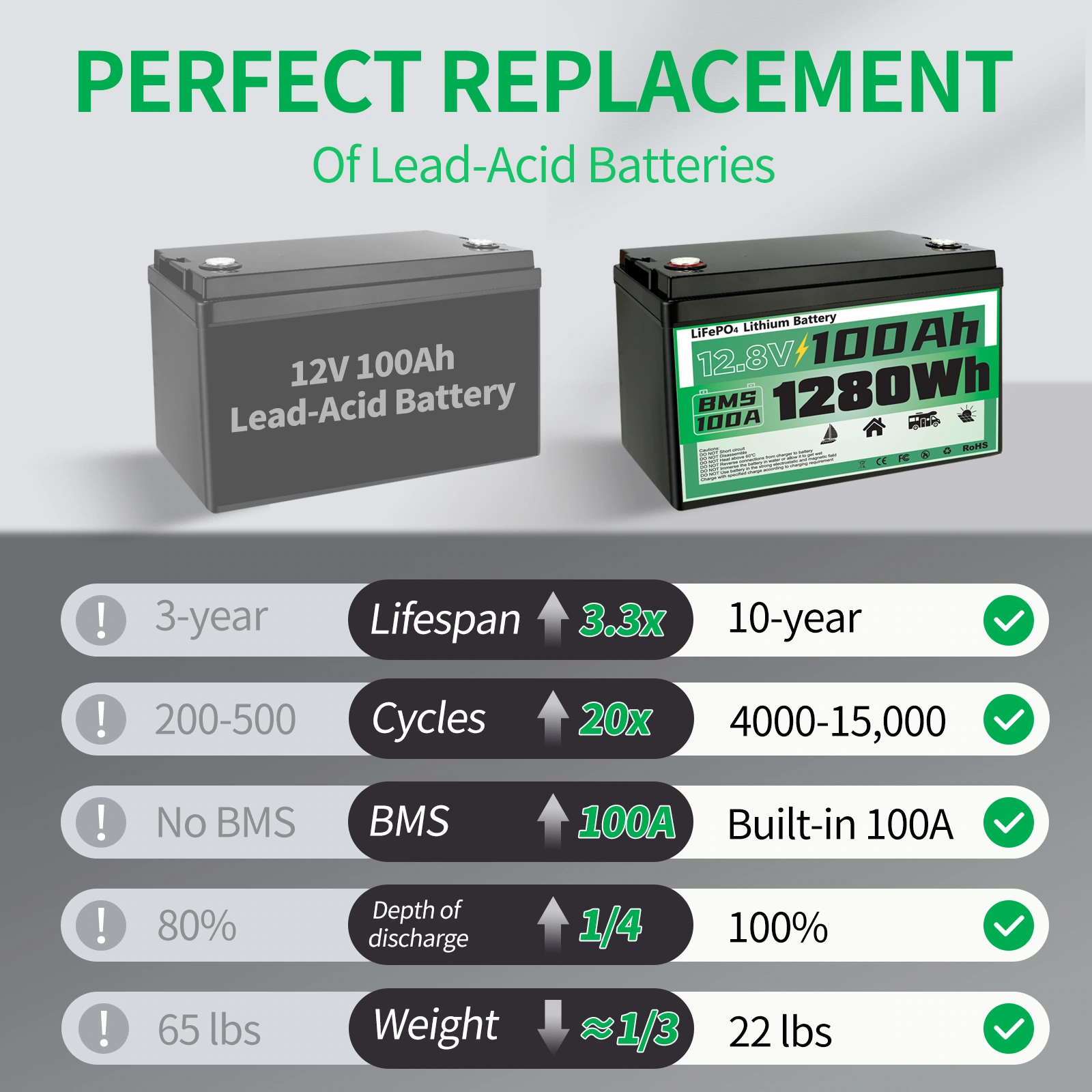
We use gray and green to distinguish the two columns, checkmarks and row spacing to form the scan path. The same information is placed in the same position, and comparative themes are presented through typographic order.
Connection diagram: controlling density with branch structure
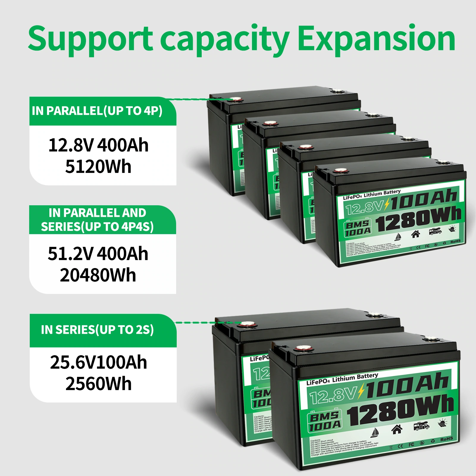
We divided the different arrangement diagrams into three rows, and the product combinations in each row corresponded to the information blocks. Green title blocks divide chapters, leaving space between connecting lines and main bodies, making complex graphics easier to identify.
Terminals and specifications: close-up and table are divided into separate areas
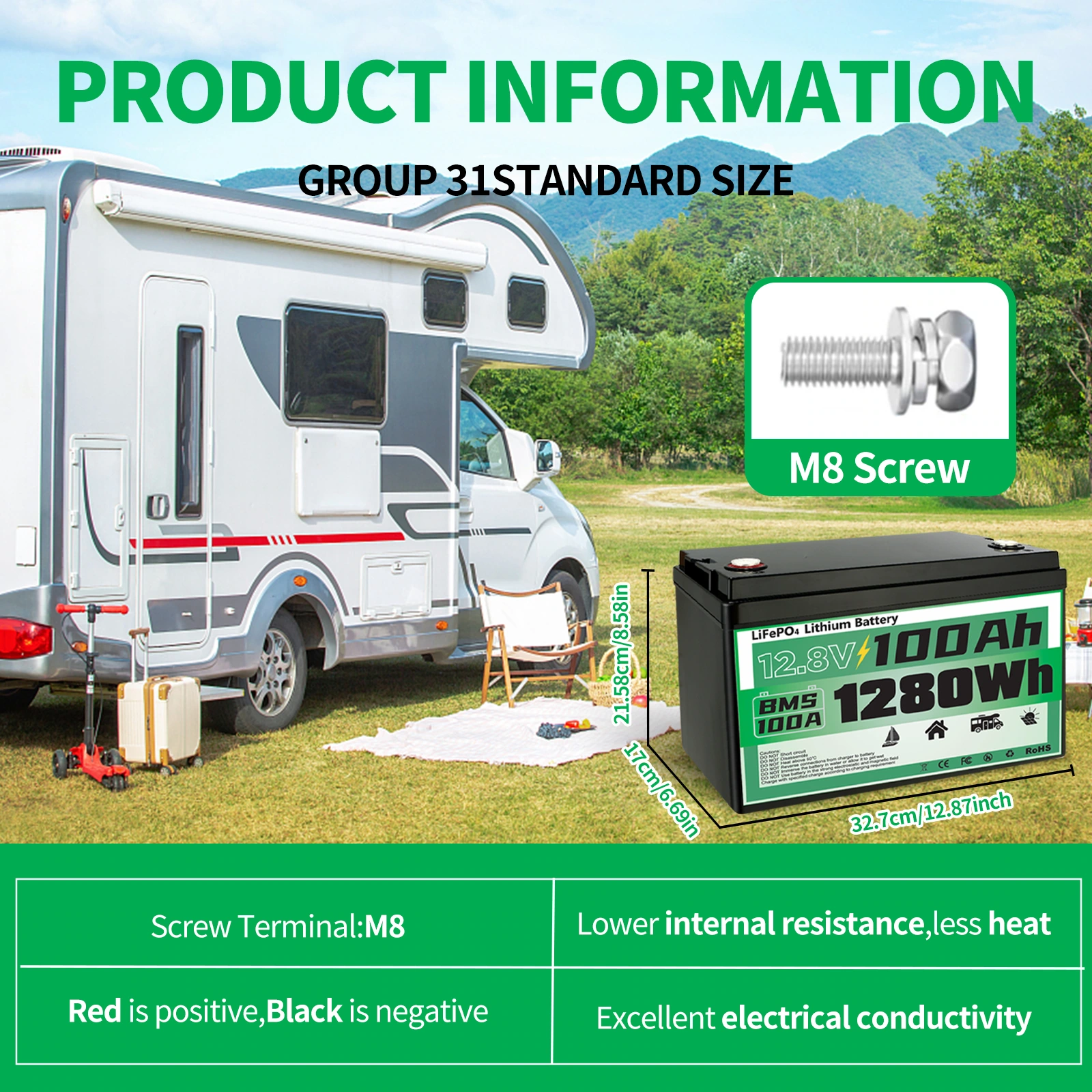
We use terminal close-ups to supplement the details, and then use dimension lines and double-column text to organize the specification theme. The background scene is set back appropriately so that micro details and information tables do not block each other.
Deliver and design value
This set of works contains a total of 9 product pictures. We arrange the responsibilities of different pictures around the internal structure and multi-scene information, and use black and green technology, scene synthesis, and matrix information to maintain the visual consistency of the entire set. From overall identification to partial explanation, the pictures complement each other, allowing readers to find information based on their own concerns.
Develop a clear visual expression for your products
You can provide us with existing product information, physical photos and key points to be displayed. We will combine the product structure, style differences and usage scenarios to plan image content and layout suitable for Amazon product display.