


Введение
Wholesale eCommerce requires a fundamentally different approach from traditional retail design. Instead of appealing to impulse-driven shoppers, wholesale buyers prioritize efficiency, clarity, pricing transparency, and trust. When designing the Shopify опыт для Everful Wholesale, our goal was to create a digital environment that feels professional, easy to navigate, and optimized for bulk purchasing behavior.
Rather than focusing purely on aesthetics, we approached this project through the lens of usability, conversion flow, and buyer psychology. Every visual decision—from layout structure to product presentation—was carefully crafted to reduce friction and guide users toward inquiry or purchase.
This article explores how we designed the Everful Wholesale Shopify store, highlighting our design process, strategic thinking, challenges, and the final results achieved.
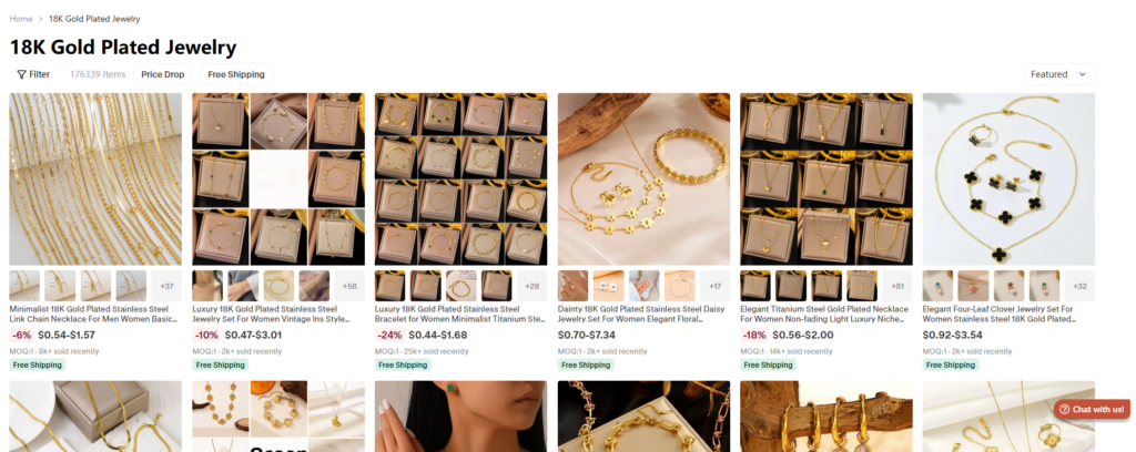
| Срок доставки | Категория | Платформа приложений |
| 26days | Ювелирные изделия | shopify |
| Участники проекта (дизайнеры) | Расходы | Эффект |
| Нэнси | $2800 | flow📈272% |
Понимание бренда и целей проекта
Defining the Target Audience
The first step in our design process was identifying the core audience: wholesale buyers, distributors, and small business owners. Unlike retail customers, these users:
- Prefer quick access to product catalogs
- Require clear pricing structures
- Value trust signals and reliability
- Often browse with intent, not curiosity
This understanding shaped every design decision moving forward.
Establishing Key Objectives
We aligned the project around several core goals:
- Create a clean, scalable Shopify layout
- Improve product discoverability
- Highlight wholesale advantages (pricing, MOQ, shipping)
- Build trust through structured content
- Ensure a seamless mobile experience
Стратегия дизайна главной страницы
Создание сильного первого впечатления
The homepage acts as the digital storefront. For Everful Wholesale, we designed a hero section that immediately communicates:
- Что предлагает бренд
- Who it serves
- Why it’s different
We used bold lifestyle imagery combined with concise messaging to establish credibility within seconds.
Structuring for Clarity and Flow
Instead of overwhelming users, we organized the homepage into a logical flow:
1. Hero Section
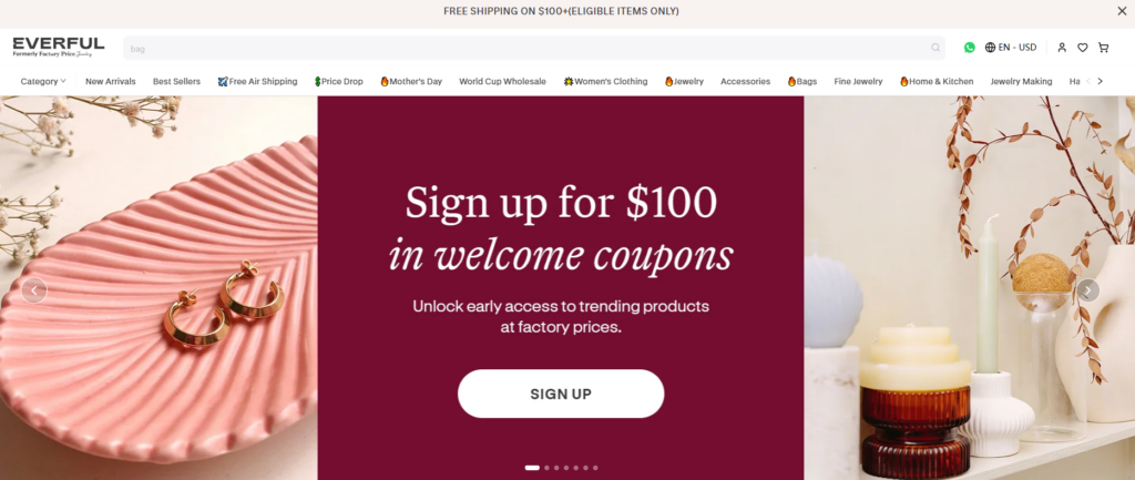
Clear headline + supporting text + strong CTA
2. Category Navigation
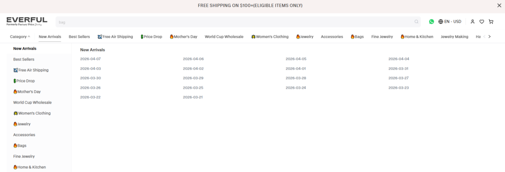
We introduced visually distinct product categories, allowing users to jump directly into relevant collections.
3. Value Proposition Section

We highlighted key wholesale benefits such as:
- Конкурентные цены
- No minimum order requirements
- Fast global shipping
4. Featured Products
Carefully selected items with clean layouts to maintain visual consistency.
5. Trust Signals
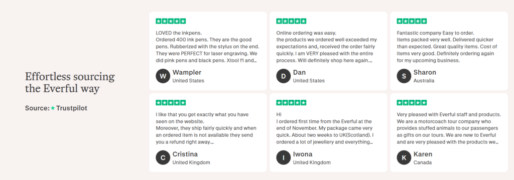
Customer testimonials, brand story, and business credibility elements were integrated to build confidence.
Visual Design Approach
We intentionally avoided overly decorative elements. Instead, we focused on:
- Neutral color palettes for a professional tone
- Consistent spacing to enhance readability
- Четкая типографическая иерархия
- High-quality product imagery
This approach ensures the design feels modern, reliable, and easy to scan.
Collection and Product Page Optimization
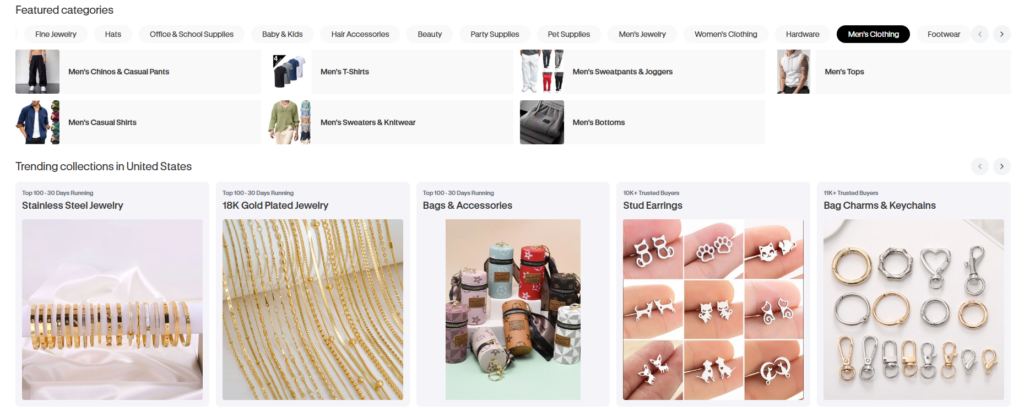
Improving Product Discovery
Wholesale buyers often browse large inventories. To support this behavior, we designed collection pages that:
- Use clean grid layouts
- Emphasize product thumbnails
- Maintain consistent spacing and alignment
We ensured that users can quickly scan multiple products without visual fatigue.
Product Page Design Principles
The product page is where conversion happens. Our design focused on:
Clear Information Hierarchy
We structured content to highlight:
- Product name
- Pricing details
- Key features
- Bulk purchase incentives
Visual Emphasis
Large product images allow users to evaluate quality and details.
Simplified Decision-Making
We minimized distractions and ensured that the “Add to Cart” or inquiry actions remain highly visible.
Designing for Wholesale Buyer Behavior
Reducing Friction in Navigation
Wholesale users value speed. We optimized navigation by:
- Keeping menus simple and structured
- Reducing unnecessary clicks
- Ensuring consistent layout patterns
Enhancing Trust Through Design
Trust is critical in wholesale transactions. We incorporated:
- Clean “About” and brand story sections
- Clear shipping and policy pages
- Consistent branding across all pages
Mobile Experience Optimization
A significant portion of users browse on mobile devices. We ensured:
- Responsive layouts
- Touch-friendly navigation
- Оптимизированное масштабирование изображения
Наш процесс проектирования
Research and Benchmarking
We analyzed leading wholesale Shopify stores to identify:
- Best practices in layout structure
- Effective visual hierarchy
- Common user pain points
This research informed our design direction.
Wireframing and Structure Planning
Before moving into visual design, we created structured wireframes to:
- Map out user journeys
- Define content placement
- Ensure logical flow across pages
Visual Design Execution
We translated wireframes into a polished design by:
- Applying consistent typography
- Selecting cohesive color schemes
- Designing reusable components
This ensured scalability and consistency throughout the site.
Трудности, с которыми мы столкнулись
Balancing Simplicity and Information Density
Wholesale websites require a lot of information, but too much content can overwhelm users. We addressed this by:
- Prioritizing essential information
- Using visual hierarchy to guide attention
- Breaking content into digestible sections
Maintaining Brand Identity While Optimizing UX
We needed to ensure the design reflects the brand while still being conversion-focused. This required careful alignment between:
- Visual style
- Content tone
- Functional layout
Handling Large Product Catalogs
Organizing a wide range of products without clutter was a key challenge. We solved this through:
- Structured category systems
- Consistent product card design
- Clear navigation pathways
Our Solutions and Design Methodology
Modular Design System
We developed a flexible design system that allows:
- Простое обновление контента
- Consistent styling across pages
- Scalable expansion for future products
Макеты, ориентированные на конверсию
Every section was designed with a purpose:
- Guide users
- Reduce hesitation
- Encourage action
Content-Driven Design
Instead of relying on visual effects, we emphasized:
- Clear messaging
- Structured content
- Strategic placement of CTAs
Результаты и влияние
After implementing the new design, the Shopify store achieved:
- Improved navigation clarity
- Enhanced product visibility
- Более сильное восприятие бренда
- Улучшена юзабилитиность для мобильных устройств.
Most importantly, the site now provides a smoother and more intuitive experience for wholesale buyers, aligning with their expectations and behaviors.
Заключение
Designing a Shopify wholesale store requires more than visual appeal—it demands a deep understanding of user behavior, business goals, and conversion strategy. Through a structured approach focused on clarity, usability, and trust, we successfully transformed Everful Wholesale into a high-performing digital storefront.
На сайте АИРСАНГ, we specialize in designing conversion-driven Shopify experiences tailored for cross-border eCommerce brands. From homepage strategy to product presentation, our focus is always on helping businesses build scalable, user-friendly, and high-converting online stores.


Спроектируем и создадим для вас WordPress-сайт или корпоративный сайт с полной системой электронной коммерции.
Ценовой диапазон: от $200.00 до $2,500.00custom-requirements-or-special-quotations
Первоначальная цена составляла: $2.00.$1.00Текущая цена: $1.00. Дизайн главного изображения для домашнего физиотерапевтического устройства Amazon: пояснения.
Введение: Создание достоверного изображения для домашних терапевтических приборов на Amazon При разработке главного изображения для домашнего терапевтического прибора на Amazon мы в первую очередь...

Дизайн основного изображения для конвертации помады на Amazon.
Введение: Разработка главного образа помады, которая продается на Amazon Когда мы разрабатываем главный образ для помады Amazon, наша ответственность выходит далеко за рамки...

Как хакеры крадут электронные письма администраторов WordPress (и как им это предотвратить)
Начнем с неприятной истины: ваша электронная почта администратора WordPress, вероятно, гораздо более публична, чем вы думаете. А хакеры? Им это нравится. Для них ваш...

Что делает основное изображение жидкой тональной основы Amazon конвертируемым?
Введение. Разработка дизайна основного изображения для жидкой тональной основы на Amazon — это не просто создание красивого внешнего вида продукта. На Amazon основное изображение и...

Разработка эффективного основного изображения Amazon для фильтрующих картриджей
Введение. Разработка основного изображения для Amazon — это не просто создание привлекательного внешнего вида товара. Речь идёт о ясности, доверии и мгновенном понимании, особенно для...

Повторные атаки на WordPress: реальная угроза или преувеличенный миф?
Давайте сначала кое-что проясним. Атаки повторного воспроизведения не выглядят страшно. Они не взламывают пароли. Они не внедряют вредоносный код с зелёным хакерским текстом, разлетающимся повсюду. Они действуют коварно...

Как скопировать страницы WordPress, ничего не сломав
Давайте посмотрим правде в глаза. Иногда вам не хочется создавать новую страницу. Вам нужна та же самая страница… но немного другая. Тот же макет. Те же блоки. Те же настройки. Потому что….

Сравнение пяти тем WordPress для сайтов о домашних животных
Введение. Выбор подходящей темы WordPress для сайтов, посвященных домашним животным, — это не просто решение, связанное с дизайном; оно напрямую влияет на удобство использования, масштабируемость и долгосрочный рост бизнеса. Уход за домашними животными и...

Сравнение пяти тем оформления для интернет-магазинов купальников
Введение. Выбор правильной тематики для независимого магазина купальников или нижнего белья — это не просто визуальное решение, оно напрямую влияет на коэффициент конверсии, масштабируемость и долгосрочную перспективу...

Как отключить комментарии в WordPress (не сойдя с ума)
Давайте поговорим о комментариях в WordPress. В теории комментарии — это здорово. Они стимулируют дискуссии. Они создают сообщество. Они делают ваш сайт “живым”. А на практике? Зачастую они притягивают...

Создание масштабируемого веб-сайта на WordPress для научно-ориентированного бренда: проект AminoUSA
Введение. В современном цифровом пространстве веб-сайт — это больше, чем просто место для размещения информации о товарах. Для научно-ориентированных брендов, работающих в регулируемых или научно-исследовательских отраслях, это….

Создание масштабируемого магазина Shopify для глобального бренда ножей: проект CoolKatana
Введение. В трансграничной электронной коммерции веб-сайт Shopify — это больше, чем просто витрина магазина. Для брендов, работающих в нишевых, ориентированных на культуру категориях, веб-сайт должен делать гораздо больше, чем...

Разработка высокоэффективного магазина Shopify для карточек Pokémon.
Введение. В мире электронной коммерции коллекционных товаров, особенно на рынке коллекционных карточных игр Pokémon, веб-сайт должен делать больше, чем просто перечислять товары...

Высокоэффективный дизайн Shopify для индивидуального бренда стационарной торговой точки.
Введение. В условиях современной конкурентной среды электронной коммерции, особенно в сегменте персонализированных подарков и коллекционных товаров, веб-сайт на платформе Shopify должен делать гораздо больше, чем просто отображать товары. Он...

Как связаться со службой поддержки Shopify: простое и понятное руководство
Управление магазином Shopify должно приносить удовольствие, а не путаницу. Когда возникают вопросы или проблемы замедляют вашу работу, Shopify предлагает несколько вариантов поддержки в зависимости от ситуации...

Как деактивировать магазин Shopify: понятное и практичное руководство
Деактивация магазина Shopify — несложная процедура, но она влечет за собой последствия, которые многие продавцы упускают из виду. В этом руководстве процесс описан простым и понятным языком...

Пример разработки веб-сайта на платформе Shopify для премиального цветочного бренда.
Введение. В условиях современной конкурентной среды электронной коммерции веб-сайт на платформе Shopify должен делать гораздо больше, чем просто отображать товары. Он должен мгновенно передавать ценность бренда, направлять пользователей...

Пример проекта дизайна на Shopify: магазин ретро-игр
Введение. В условиях высокой конкуренции в сфере электронной коммерции визуальная ясность и эмоциональная связь часто определяют, станет ли посетитель клиентом. Это особенно актуально в...