


Введение
In the competitive world of niche eCommerce, design is not decoration—it is strategy. When building a Shopify website for a brand like CoolKatana, the objective goes far beyond showcasing products. The goal is to translate craftsmanship, heritage, and bold visual identity into a high-conversion digital experience.
CoolKatana operates in a visually intense and culturally rich category. Their products—Japanese-inspired swords, anime katanas, and collectible weapons—carry emotional value, collector appeal, and lifestyle symbolism. To support this positioning, the Shopify website needed to feel powerful, immersive, and premium while remaining intuitive and conversion-focused.
This case study explores how we approached the Shopify website design for CoolKatana, the challenges we encountered, the strategy behind our design decisions, and how our structured methodology helped elevate both brand authority and user engagement.
| Срок доставки | Категория | Платформа приложений |
| 21 день | Katana | shopify |
| Участники проекта (дизайнеры) | Расходы | Эффект |
| Линь Чжан | $1100 | Purchase Rate📈265% |
Понимание бренда и его целевой аудитории
Before designing a single section, we focused on clarity: Who is the customer? What emotional triggers drive purchase decisions? What visual cues communicate authenticity and trust?
CoolKatana’s audience includes:
- Anime enthusiasts
- Collectors of Japanese-style swords
- Martial arts practitioners
- Cosplayers
- Gift buyers seeking statement pieces
This audience values:
- Visual drama
- Authentic craftsmanship
- Cultural storytelling
- Product detail and close-up imagery
- Clear specifications and trust signals
We designed the Shopify experience to reflect these priorities from the very first scroll.
Defining the Project Goals
Основные цели
- Strengthen brand authority through immersive visual design
- Improve product discoverability across multiple sword categories
- Increase engagement through storytelling and rich product presentation
- Support higher average order values
- Create a structured, scalable Shopify layout
Design-Focused KPI Targets
- Higher click-through rate from homepage to collections
- Increased product page dwell time
- Improved add-to-cart behavior
- Enhanced trust perception
Because we specialize in Shopify design rather than technical development, our focus centered on layout structure, visual hierarchy, conversion psychology, and brand storytelling—not backend engineering.
Наш процесс разработки дизайна для Shopify
We follow a structured and repeatable methodology when designing Shopify websites.
1. Research & Brand Analysis
We began by analyzing:
- Competitor sword and collectible websites
- Industry visual trends
- Shopify layout best practices
- Existing CoolKatana branding elements
We identified a key opportunity: most competitor sites relied on either overly dark themes or generic layouts. We decided to balance cinematic drama with structured usability.
2. Information Architecture Planning
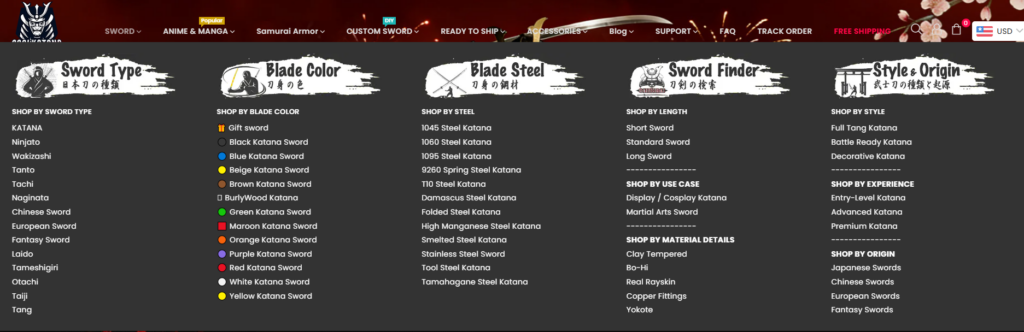
We reorganized the navigation structure to prioritize:
- Best-selling katanas
- Anime-inspired collections
- Functional swords vs. decorative pieces
- Armors and accessories
- Рекламные баннеры
Clear hierarchy reduces cognitive friction and improves exploration.
3. Wireframing Conversion-Focused Layouts
We designed wireframes that emphasized:
- Hero impact
- Четкая сегментация по категориям
- Trust indicators
- Социальное доказательство
- Рекламные баннеры
- Upsell modules
Only after structural clarity did we move into full visual design.
Стратегия дизайна главной страницы
The homepage is the brand’s digital stage. For CoolKatana, we crafted it as an immersive experience.
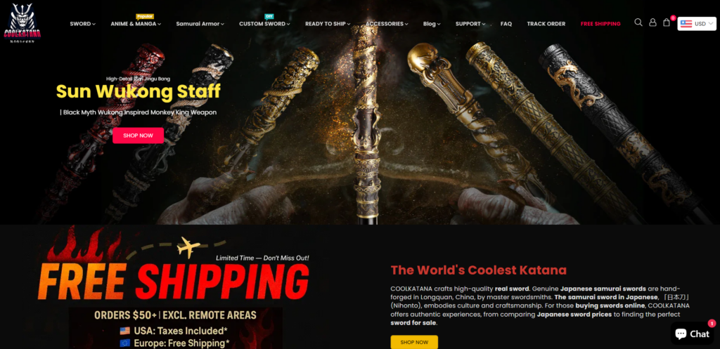
Hero Section: Cinematic Authority
We designed a bold hero area featuring:
- Dramatic samurai imagery
- High-contrast red and black tones
- Immediate promotional messaging
- Clear call-to-action buttons
This approach delivers instant emotional engagement while guiding users toward collections.
Category Highlights
Instead of overwhelming users, we structured the homepage into clean, segmented product blocks:
- Best-Selling Real Katanas
- Handmade Samurai Swords
- Anime Replica Swords
- Ninja & Chinese Swords
- Armor and Samurai Gear
Each block uses consistent spacing, premium product photography, and hover interactions to reinforce quality.
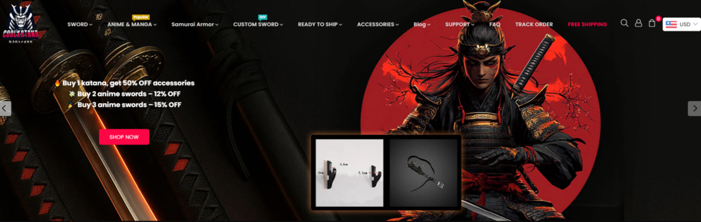
Promotional Strategy Integration
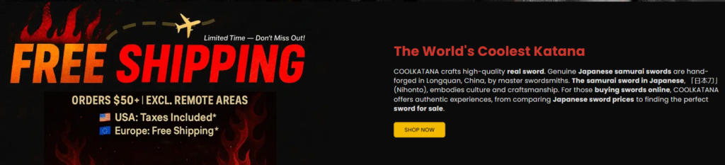
We integrated:
- Free shipping banners
- Limited-time offers
- Discount code placements
- Scarcity cues
All promotional elements were designed to feel intentional—not cluttered.
Product Page Design Excellence
The product page is where conversion happens. Our design priorities were clarity, detail, and trust.
Visual Hierarchy
We structured product pages with:
- Large, high-resolution sword imagery
- Zoom-in capability emphasis (design-focused presentation)
- Clean variant selectors
- Prominent price positioning
- Visible review ratings
Trust Signals
We added strategically placed:
- Shipping assurances
- Warranty messaging
- Quality guarantees
- Tax & duty information
These reduce hesitation in high-ticket purchases.
Storytelling Sections
For higher-value swords, we designed long-form product storytelling blocks:
- Blade material explanation
- Craftsmanship process
- Historical inspiration
- Usage recommendations
This elevates the perceived value and justifies premium pricing.
Visual Identity and Brand Cohesion
Color Palette
We leaned into:
- Deep black backgrounds
- Bold crimson highlights
- Metallic accents
- Neutral grays for balance
This palette reinforces strength and tradition while keeping the interface modern.
Типография
We selected strong, legible fonts that complement the dramatic visuals without compromising readability.
Image Treatment
Product imagery was refined to ensure:
- Consistent lighting
- Clear blade detail
- Dark premium backgrounds
- Subtle shadowing for depth
Visual consistency builds trust.
Design Challenges We Solved
Challenge 1: Avoiding Visual Overload
Sword websites can easily feel chaotic. We introduced disciplined spacing, grid systems, and structured blocks to maintain clarity.
Challenge 2: Balancing Drama with Usability
While dark themes are powerful, they can reduce readability. We adjusted contrast, button clarity, and typography scaling to ensure accessibility.
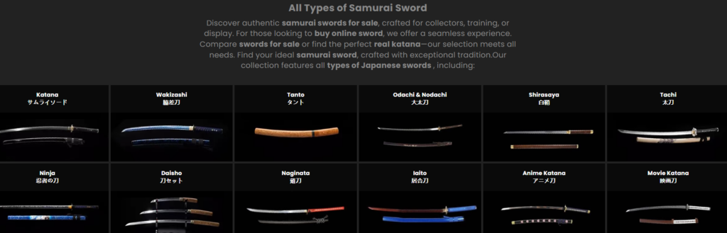
Challenge 3: Managing Large Product Catalogs
We created segmented collection layouts that allow customers to filter visually through:
- Тип
- Вдохновение
- Цена
- Popularity
Structured categorization increases browsing efficiency.
Our Design Methodology in Action
We believe Shopify design is about controlled storytelling.
Our method includes:
- Strategic hierarchy planning
- Conversion-based layout structuring
- Brand-aligned visual direction
- Promotional integration
- Scalable section systems
We do not rely on heavy customization or complex coding. Instead, we maximize Shopify’s ecosystem through structured design thinking and visual optimization.
Measurable Impact of Strategic Shopify Design
Although this case study focuses on design rather than analytics reporting, the structural improvements created clear performance advantages:
- Improved homepage engagement flow
- Cleaner product presentation
- Stronger brand authority perception
- Enhanced upsell visibility
- Better promotional clarity
Design clarity directly influences purchase confidence.
Why Shopify Design Matters in Niche Markets
In specialized categories like collectible swords, customers do not purchase impulsively. They research, compare, and evaluate authenticity.
A strong Shopify website design:
- Reduces friction
- Builds credibility
- Reinforces brand narrative
- Encourages deeper exploration
- Supports higher price positioning
Для CoolKatana, design became the bridge between craftsmanship and commerce.
Our Competitive Advantages in Shopify Design
Deep eCommerce Visual Strategy
We design for conversion first, aesthetics second—while making them work together seamlessly.
Brand-Led Thinking
Every layout decision reflects brand identity.
Scalable Systems
Our designs allow future collection expansion without losing visual consistency.
Promotion-Integrated Layouts
We design discount, bundle, and shipping messaging as part of the experience—not as afterthoughts.
Final Results and Takeaways
Он CoolKatana Shopify redesign transformed the website from a simple product catalog into an immersive, authority-driven eCommerce experience.
Через:
- Structured homepage storytelling
- Clean product hierarchy
- Premium visual presentation
- Strategic promotional integration
- Четкая сегментация по категориям
We created a high-impact Shopify website aligned with the brand’s identity and growth ambitions.
The project demonstrates how thoughtful Shopify design can elevate niche brands into premium digital destinations.
Заключение
CoolKatana’'s Shopify website showcases what happens when design strategy meets strong brand storytelling. Instead of relying on aggressive marketing alone, the website itself becomes a conversion engine—structured, immersive, and persuasive.
If you are looking to transform your Shopify store through strategic layout design, visual hierarchy optimization, and brand-driven storytelling, our team specializes in exactly that. At the intersection of cross-border eCommerce and conversion-focused Shopify design, АИРСАНГ delivers premium digital experiences built for long-term growth.


Спроектируем и создадим для вас WordPress-сайт или корпоративный сайт с полной системой электронной коммерции.
Ценовой диапазон: от $200.00 до $2,500.00custom-requirements-or-special-quotations
Первоначальная цена составляла: $2.00.$1.00Текущая цена: $1.00. Дизайн главного изображения для домашнего физиотерапевтического устройства Amazon: пояснения.
Введение: Создание достоверного изображения для домашних терапевтических приборов на Amazon При разработке главного изображения для домашнего терапевтического прибора на Amazon мы в первую очередь...

Дизайн основного изображения для конвертации помады на Amazon.
Введение: Разработка главного образа помады, которая продается на Amazon Когда мы разрабатываем главный образ для помады Amazon, наша ответственность выходит далеко за рамки...

Как хакеры крадут электронные письма администраторов WordPress (и как им это предотвратить)
Начнем с неприятной истины: ваша электронная почта администратора WordPress, вероятно, гораздо более публична, чем вы думаете. А хакеры? Им это нравится. Для них ваш...

Что делает основное изображение жидкой тональной основы Amazon конвертируемым?
Введение. Разработка дизайна основного изображения для жидкой тональной основы на Amazon — это не просто создание красивого внешнего вида продукта. На Amazon основное изображение и...

Разработка эффективного основного изображения Amazon для фильтрующих картриджей
Введение. Разработка основного изображения для Amazon — это не просто создание привлекательного внешнего вида товара. Речь идёт о ясности, доверии и мгновенном понимании, особенно для...

Повторные атаки на WordPress: реальная угроза или преувеличенный миф?
Давайте сначала кое-что проясним. Атаки повторного воспроизведения не выглядят страшно. Они не взламывают пароли. Они не внедряют вредоносный код с зелёным хакерским текстом, разлетающимся повсюду. Они действуют коварно...

Как скопировать страницы WordPress, ничего не сломав
Давайте посмотрим правде в глаза. Иногда вам не хочется создавать новую страницу. Вам нужна та же самая страница… но немного другая. Тот же макет. Те же блоки. Те же настройки. Потому что….

Сравнение пяти тем WordPress для сайтов о домашних животных
Введение. Выбор подходящей темы WordPress для сайтов, посвященных домашним животным, — это не просто решение, связанное с дизайном; оно напрямую влияет на удобство использования, масштабируемость и долгосрочный рост бизнеса. Уход за домашними животными и...

Сравнение пяти тем оформления для интернет-магазинов купальников
Введение. Выбор правильной тематики для независимого магазина купальников или нижнего белья — это не просто визуальное решение, оно напрямую влияет на коэффициент конверсии, масштабируемость и долгосрочную перспективу...

Как отключить комментарии в WordPress (не сойдя с ума)
Давайте поговорим о комментариях в WordPress. В теории комментарии — это здорово. Они стимулируют дискуссии. Они создают сообщество. Они делают ваш сайт “живым”. А на практике? Зачастую они притягивают...

Создание масштабируемого веб-сайта на WordPress для научно-ориентированного бренда: проект AminoUSA
Введение. В современном цифровом пространстве веб-сайт — это больше, чем просто место для размещения информации о товарах. Для научно-ориентированных брендов, работающих в регулируемых или научно-исследовательских отраслях, это….

Создание масштабируемого магазина Shopify для глобального бренда ножей: проект CoolKatana
Введение. В трансграничной электронной коммерции веб-сайт Shopify — это больше, чем просто витрина магазина. Для брендов, работающих в нишевых, ориентированных на культуру категориях, веб-сайт должен делать гораздо больше, чем...

Разработка высокоэффективного магазина Shopify для карточек Pokémon.
Введение. В мире электронной коммерции коллекционных товаров, особенно на рынке коллекционных карточных игр Pokémon, веб-сайт должен делать больше, чем просто перечислять товары...

Высокоэффективный дизайн Shopify для индивидуального бренда стационарной торговой точки.
Введение. В условиях современной конкурентной среды электронной коммерции, особенно в сегменте персонализированных подарков и коллекционных товаров, веб-сайт на платформе Shopify должен делать гораздо больше, чем просто отображать товары. Он...

Как связаться со службой поддержки Shopify: простое и понятное руководство
Управление магазином Shopify должно приносить удовольствие, а не путаницу. Когда возникают вопросы или проблемы замедляют вашу работу, Shopify предлагает несколько вариантов поддержки в зависимости от ситуации...

Как деактивировать магазин Shopify: понятное и практичное руководство
Деактивация магазина Shopify — несложная процедура, но она влечет за собой последствия, которые многие продавцы упускают из виду. В этом руководстве процесс описан простым и понятным языком...

Пример разработки веб-сайта на платформе Shopify для премиального цветочного бренда.
Введение. В условиях современной конкурентной среды электронной коммерции веб-сайт на платформе Shopify должен делать гораздо больше, чем просто отображать товары. Он должен мгновенно передавать ценность бренда, направлять пользователей...

Пример проекта дизайна на Shopify: магазин ретро-игр
Введение. В условиях высокой конкуренции в сфере электронной коммерции визуальная ясность и эмоциональная связь часто определяют, станет ли посетитель клиентом. Это особенно актуально в...