


Введение
В условиях жесткой конкуренции в сфере электронной коммерции визуальная ясность и эмоциональная связь часто определяют, станет ли посетитель покупателем. Это особенно актуально для нишевых категорий, таких как ретро-игры, где покупатели руководствуются не только техническими характеристиками продукта, но и ностальгией, эстетикой и чувством принадлежности к сообществу.
В этом тематическом исследовании рассматривается, как мы сотрудничали с Ретро разработать Shopify Витрина магазина, которая создает ощущение полного погружения, интуитивно понятна и ориентирована на конверсию — без чрезмерной технической кастомизации. Вместо этого мы сосредоточились на стратегии дизайна, логике компоновки, визуальном повествовании и структуре, ориентированной на пользователя, чтобы превратить каталог товаров в привлекательный брендовый опыт.
Вместо того чтобы рассматривать этот проект как простое “оформление магазина”, мы подошли к нему как к полноценной визуальной системе дизайна: системе, которая обеспечивает баланс между гибкостью продвижения, доступностью товаров и эмоциональной привлекательностью, оставаясь при этом масштабируемой для будущих кампаний и запусков продуктов.
| Срок доставки | Категория | Платформа приложений |
| 22 дня | игровая консоль | Shopify |
| Участники проекта (дизайнеры) | Расходы | Эффект |
| Линь Чжан | $2800 | Коэффициент покупки📈241% |
Понимание бренда и его целевой аудитории
Магазин ретро-игр, отвечающий современным требованиям.
ToRetro ориентирован на глобальную аудиторию любителей ретро-игр, коллекционеров и покупателей, впервые приобретающих портативные консоли, вдохновленные классическими игровыми эпохами. Задача была ясна:
Как спроектировать витрину, которая будет вызывать ностальгию, но при этом не выглядеть устаревшей?
С самого начала наше дизайнерское направление было сосредоточено на трех ключевых аспектах восприятия бренда:
- Игривый, но заслуживающий доверия
- Вдохновленный ретро-стилем, но при этом современный.
- Богатый, но не перегруженный ассортимент продукции.
Влияние поведения аудитории на дизайн
В ходе наших предварительных исследований и обсуждений с клиентами мы выявили несколько ключевых моделей поведения целевой аудитории:
- Посетители часто просматривают несколько категорий товаров, прежде чем принять решение.
- Визуальное сравнение (цвета, форм-факторы, версии) важнее технических характеристик.
- Акции и ограниченные предложения оказывают сильное влияние на время совершения покупки.
Эти выводы повлияли на каждое наше дизайнерское решение — от структуры главной страницы до макета карточек товаров.
Цели и задачи проектирования
Прежде чем приступить к визуальной реализации, мы определили четкие, ориентированные на дизайн цели проекта.
Основные проектные цели
- Произведите сильное первое впечатление в течение первых 3-5 секунд.
- Сделайте просмотр веб-страниц увлекательным, легким и познавательным.
- Выделите рекламные акции, не жертвуя визуальной иерархией.
- Создайте главную страницу, которая легко адаптируется к сезонным кампаниям.
Второстепенные бизнес-цели (подкрепленные проектированием)
- Улучшите поиск товаров в различных коллекциях.
- Уменьшите визуальное неудобство на мобильных устройствах.
- Поощряйте более глубокую прокрутку и изучение контента в разных категориях.
Наша задача заключалась не в изменении базовой функциональности Shopify, а в максимальном улучшении уже имеющихся сильных сторон платформы за счет продуманных дизайнерских решений.
Наш процесс разработки дизайна для Shopify
Шаг 1 – Визуальный аудит и сравнительный анализ с конкурентами
Мы начали с полного визуального аудита существующего сайта и проанализировали предложения конкурирующих магазинов ретро-игр и электроники. Это помогло нам выявить:
- Чрезмерное использование темных макетов, снижающих читаемость.
- Несоответствие расстояния между карточками товаров.
- Рекламные баннеры, конкурирующие с основным контентом.
Исходя из этого, мы сформулировали принцип проектирования:
Каждый раздел должен заслужить свое место как визуально, так и стратегически.
Шаг 2 – Структура главной страницы и визуальная иерархия
Главная страница стала основой всего пользовательского опыта.
Дизайн главного раздела
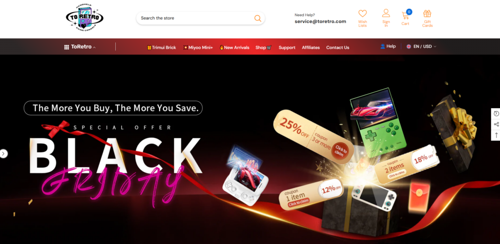
Главный баннер был разработан не только для объявления о рекламных акциях — он задает эмоциональный тон бренда.
Ключевые дизайнерские решения включали:
- Высококонтрастные визуальные эффекты с неоновыми акцентами.
- Четкая рекламная информация (“Черная пятница”, ограниченные предложения)
- Изображения товаров расположены таким образом, чтобы создать глубину и движение.
Этот раздел сразу же вызывает восторг, при этом текст легко читается.
Блоки доверия функций
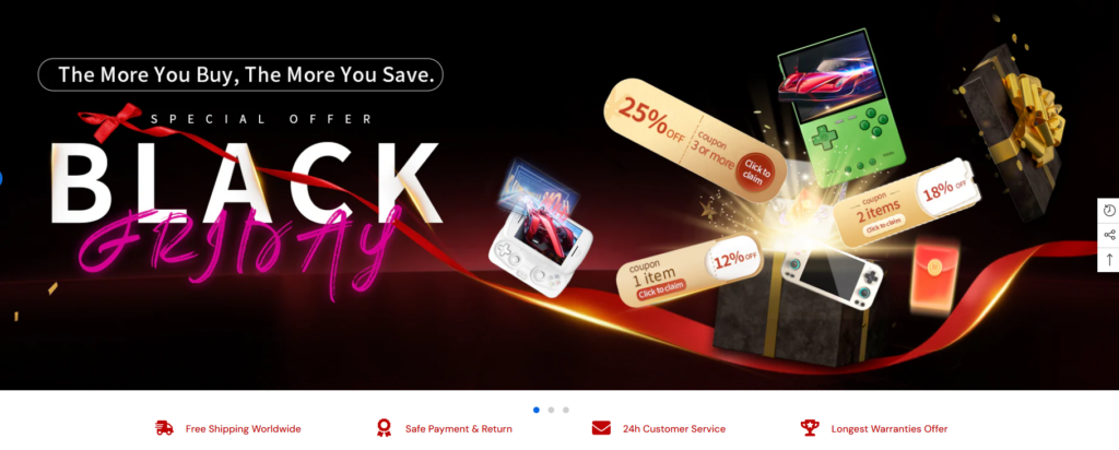
Непосредственно под главным элементом мы разместили ряд индикаторов доверия на основе значков:
- Бесплатная доставка
- Безопасные платежи
- Служба поддержки клиентов
- Гарантийное обслуживание или сообщение об удовлетворении потребностей
Эти элементы незаметны, но играют решающую роль в снижении нерешительности у посетителей, приезжающих впервые.
Шаг 3 – Поиск продукта посредством проектирования
Планировка "Коллекция-Первый"
Вместо того чтобы перегружать пользователей бесконечным количеством товаров, мы построили главную страницу на основе тщательно отобранных коллекций, таких как:
- Представлены ретро-портативные устройства
- Новые поступления
- Игровые приставки для начинающих и для энтузиастов
В каждом блоке коллекции используются единые стили карточек, интервалы и поведение при наведении курсора для создания визуального ритма.
Оптимизация товарных карточек
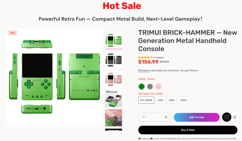
Не внося изменений в основную систему управления продуктами Shopify, мы усовершенствовали презентацию, сосредоточившись на следующих аспектах:
- Чистое выравнивание предметной фотографии
- Четкая иерархия цен (цена со скидкой против первоначальной цены)
- Индикаторы цветовых вариантов, которые интуитивно понятны
Это позволяет пользователям быстро сравнивать варианты, не открывая множество вкладок.
Разработка дизайна для рекламных кампаний и промоакций.
Сезонная гибкость заложена изначально.
Одной из ключевых потребностей ToRetro была возможность проводить частые рекламные акции — «Черную пятницу», предложения с ограниченным количеством товара и тематические распродажи.
Наше решение заключалось в разработке готовых к использованию в рекламных кампаниях разделов, которые можно визуально обновлять без перестройки структуры страницы.
Примеры включают:
- Рекламные баннеры во всю ширину
- Выделены разделы товаров “Горячие предложения”.
- Анимированные или иллюстрированные разделители, сигнализирующие о срочности.
Благодаря модульной планировке магазин может сохранять визуальную новизну, поддерживая при этом единый стиль.
Решение проектных задач
Задача 1 – Управление главной страницей, на которой слишком много информации о товаре.
При наличии десятков наименований товаров существовал риск визуальной перегрузки.
Наше дизайнерское решение:
- Четкое разделение разделов с помощью цвета и интервалов.
- Ограничение предварительного просмотра каждой коллекции определенным количеством товаров.
- Побуждая к более глубокому изучению с помощью подсказок “Посмотреть все”.
Такой подход позволяет легко просматривать главную страницу, одновременно демонстрируя разнообразие.
Задание 2 – Сочетание ностальгии и современного пользовательского опыта
Ретро-эстетика может быстро привести к загромождению пространства или затруднению восприятия.
Наше дизайнерское решение:
- Используйте ностальгические цветовые акценты, не жертвуя при этом контрастом.
- Сочетайте игривый графический стиль с современной типографикой.
- Поддерживайте согласованность выравнивания и систем координат.
В результате получилось что-то вдохновленное прошлым, но явно созданное для современных пользователей.
Задача 3 – Мобильный опыт без компромиссов
Значительная часть трафика ToRetro поступает от пользователей мобильных устройств.
При проектировании мы учитывали следующие факторы:
- Удобные для сенсорного управления карточки с описанием товаров
- Упрощенная иерархия навигации
- Вертикальное расстояние оптимизировано для прокрутки большим пальцем.
Каждый раздел был разработан с учетом визуальной ориентации на мобильные устройства, чтобы обеспечить четкость изображения на экранах меньшего размера.
Результаты и визуальное воздействие
Чего удалось достичь в результате реализации проекта
После внедрения новой системы дизайна витрина магазина ToRetro достигла нескольких ключевых результатов:
- Более сильный фирменный стиль, соответствующий культуре ретро-игр.
- Улучшен визуальный поток от главного раздела к разделу поиска товаров.
- Главная страница, которая поддерживает как рассказывание историй, так и продажи.
- Большая гибкость для будущих кампаний и обновлений контента.
Самое главное, что теперь сайт выглядит цельным — каждая страница и раздел используют один и тот же визуальный язык.
Почему этот проект отражает нашу философию дизайна Shopify
Мы считаем, что великолепный дизайн Shopify — это не разработка собственного кода или сложные процессы. Это:
- Понимание намерений пользователя
- Структурирование контента с определенной целью
- Использование визуальных средств для принятия решений
- Разработка систем, масштабируемых вместе с брендом.
Этот проект демонстрирует, как продуманный дизайн сам по себе может улучшить опыт электронной коммерции и способствовать достижению реальных бизнес-целей.
Заключение
Он Ретро Shopify Веб-сайт — яркий пример того, как стратегический дизайн может превратить ориентированный на продукт магазин в запоминающийся бренд. Сосредоточившись на логике компоновки, визуальном повествовании и структуре, ориентированной на пользователя, мы помогли создать витрину магазина, которая выглядит привлекательной, заслуживающей доверия и готовой к развитию.
Такой подход отражает то, как мы помогаем брендам превратить Shopify не просто в платформу для продаж, а в визуальное продолжение их идентичности.
В основе этого проекта лежит та же философия, которой мы руководствуемся во всей нашей работе. АИРСАНГДизайн должен не просто хорошо выглядеть, он должен эффективно работать на благо бренда.


Спроектируем и создадим для вас WordPress-сайт или корпоративный сайт с полной системой электронной коммерции.
Ценовой диапазон: от $200.00 до $2,500.00Нестандартные требования или специальные предложения
Первоначальная цена составляла: $2.00.$1.00Текущая цена: $1.00. Дизайн главного изображения для домашнего физиотерапевтического устройства Amazon: пояснения.
Введение: Создание достоверного изображения для домашних терапевтических приборов на Amazon При разработке главного изображения для домашнего терапевтического прибора на Amazon мы в первую очередь...

Дизайн основного изображения для конвертации помады на Amazon.
Введение: Разработка главного образа помады, которая продается на Amazon Когда мы разрабатываем главный образ для помады Amazon, наша ответственность выходит далеко за рамки...

Что делает основное изображение жидкой тональной основы Amazon конвертируемым?
Введение. Разработка дизайна основного изображения для жидкой тональной основы на Amazon — это не просто создание красивого внешнего вида продукта. На Amazon основное изображение и...

Разработка эффективного основного изображения Amazon для фильтрующих картриджей
Введение. Разработка основного изображения для Amazon — это не просто создание привлекательного внешнего вида товара. Речь идёт о ясности, доверии и мгновенном понимании, особенно для...

Сравнение пяти тем WordPress для сайтов о домашних животных
Введение. Выбор подходящей темы WordPress для сайтов, посвященных домашним животным, — это не просто решение, связанное с дизайном; оно напрямую влияет на удобство использования, масштабируемость и долгосрочный рост бизнеса. Уход за домашними животными и...

Создание масштабируемого веб-сайта на WordPress для научно-ориентированного бренда: проект AminoUSA
Введение. В современном цифровом пространстве веб-сайт — это больше, чем просто место для размещения информации о товарах. Для научно-ориентированных брендов, работающих в регулируемых или научно-исследовательских отраслях, это….

Создание масштабируемого магазина Shopify для глобального бренда ножей: проект CoolKatana
Введение. В трансграничной электронной коммерции веб-сайт Shopify — это больше, чем просто витрина магазина. Для брендов, работающих в нишевых, ориентированных на культуру категориях, веб-сайт должен делать гораздо больше, чем...

Разработка высокоэффективного магазина Shopify для карточек Pokémon.
Введение. В мире электронной коммерции коллекционных товаров, особенно на рынке коллекционных карточных игр Pokémon, веб-сайт должен делать больше, чем просто перечислять товары...

Высокоэффективный дизайн Shopify для индивидуального бренда стационарной торговой точки.
Введение. В условиях современной конкурентной среды электронной коммерции, особенно в сегменте персонализированных подарков и коллекционных товаров, веб-сайт на платформе Shopify должен делать гораздо больше, чем просто отображать товары. Он...

Пример разработки веб-сайта на платформе Shopify для премиального цветочного бренда.
Введение. В условиях современной конкурентной среды электронной коммерции веб-сайт на платформе Shopify должен делать гораздо больше, чем просто отображать товары. Он должен мгновенно передавать ценность бренда, направлять пользователей...

Пример проекта по дизайну на Shopify: Tactical Rescue Brand
Введение. Эффективный веб-сайт на Shopify делает больше, чем просто отображает товары — он передает цель, укрепляет доверие и помогает пользователям принимать уверенные решения о покупке. Это особенно важно...

Пример разработки веб-сайта на платформе Shopify для бренда электровелосипедов.
Введение. На современном конкурентном рынке электровелосипедов веб-сайт на платформе Shopify должен делать больше, чем просто демонстрировать товары — он должен рассказывать историю, вызывать доверие и направлять пользователей...

Масштабируемая платформа электронной коммерции Shopify для креативного бренда.
Введение. Когда креативные бренды растут, их веб-сайты часто с трудом успевают за развитием. По мере расширения ассортимента продукции, увеличения объема контента и роста трафика многие бренды, ориентированные на визуальное оформление...

Пример разработки веб-сайта на платформе Shopify для бренда товаров для дома.
Введение. На высококонкурентном рынке товаров для дома визуальная идентичность — это уже не просто эстетика, она напрямую влияет на доверие, поведение покупателей при просмотре товаров и принятие решений о покупке. Для...

Пример создания масштабируемого сайта с платной подпиской на WordPress.
Введение. Для современных брендов электронной коммерции веб-сайт — это уже не просто цифровая витрина. Это движок, поддерживающий подписки, создание контента, построение доверия и т.д.

Высокоэффективный дизайн WordPress для брендов, ориентированных на взрослую аудиторию.
Введение. На высококонкурентных рынках электронной коммерции одних лишь ярких визуальных элементов недостаточно. Успешный веб-сайт на WordPress должен направлять посетителей по четкому и целенаправленному маршруту, который….

Масштабируемый веб-сайт электронной коммерции по продаже секс-кукол на WordPress
Введение. Запуск высокоэффективного веб-сайта для трансграничной электронной коммерции — это не просто размещение товаров в интернете. Для брендов, работающих на высококонкурентных рынках, ориентированных на визуальный контент, веб-сайт...
Разработка веб-сайта на Shopify для бренда силиконовых кукол.
Введение. В условиях высокой конкуренции и высокой визуальной чувствительности ниш электронной коммерции дизайн веб-сайта – это не только эстетика, но и доверие, ясность, эмоциональный отклик и...