


Introduction
Designing a Main image design for Amazon Liquid foundation is never just about making a product look beautiful. On Amazon, the main image and its supporting image set must work as a silent salesperson. Within a few seconds, customers need to understand what the product is, who it is for, what problems it solves, and why it deserves trust—often before they read a single bullet point or review.
For this liquid foundation project, our goal was clear: create a cohesive, conversion-focused Amazon image system that communicates bare-skin comfort, long wear, oil control, smart color adaptation, and eco-conscious positioning, while strictly aligning with Amazon’s visual expectations for the beauty category. Every image in this set has a specific role, and together they build a complete narrative—from first impression to purchase confidence.
Below, we walk through each image in detail, explaining the design logic, visual hierarchy, and conversion intent behind every creative decision.
| Deliver Time | Category | Application Platform |
| 8days | Liquid Foundation | Amazon |
| Designers Involved | Cost | Effect |
| Lin Zhang | $150 | Conversion rate📈303% |
Image 1: Bare Skin Comfort — Establishing the Core Promise
The first image introduces the emotional foundation of the product: “Bare Skin Comfort.” This image is designed to communicate gentleness, skin affinity, and everyday wearability at a glance.
From a visual perspective, the warm beige and nude tones immediately align with the liquid foundation category while reinforcing a natural, skin-like finish. The serum drop texture flowing beside the bottle signals hydration and smooth application, subtly suggesting skincare-level comfort rather than heavy makeup coverage.
Key design decisions:
- Large, confident headline typography to anchor the core benefit.
- Supporting claims such as “98% Natural Origin Reduces Irritation” positioned clearly but not aggressively.
- Minimalist icons for waterproof, sterile, and durable performance to support trust without overwhelming the viewer.
This image works as a soft entry point—it reassures customers who may be sensitive-skin users or those seeking a lightweight, breathable foundation.
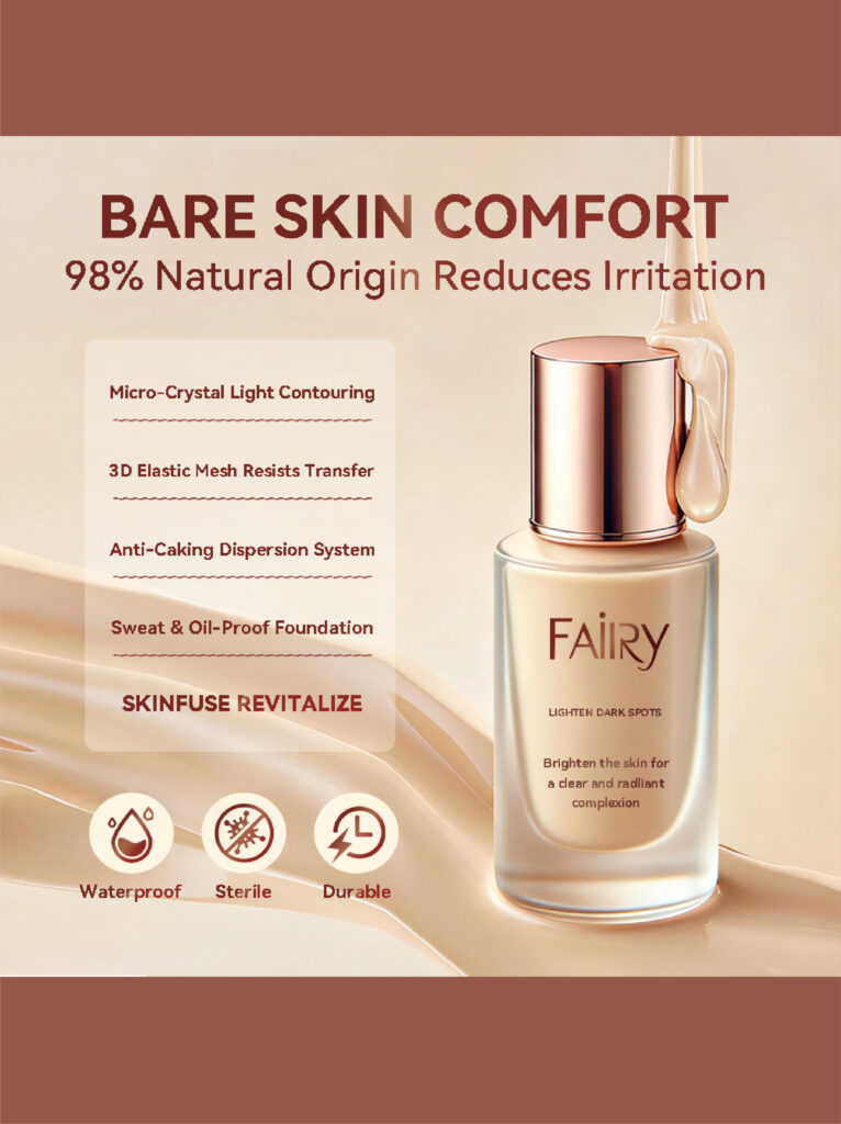
Image 2: Beauty That Cares — Sustainability Meets Performance
The second image shifts the narrative from comfort to values and responsibility. Here, the focus is on refillable packaging and carbon footprint reduction, positioning the liquid foundation as a modern, conscious beauty choice.
The close-up face shot reinforces skin realism and natural texture, while the cream swatch demonstrates blendability and tone adaptability. The visual contrast between the soft human skin and the refined product bottle strengthens emotional connection.
Design highlights:
- Clear headline hierarchy emphasizing “Beauty That Cares.”
- Structured A/B/C feature layout to simplify information scanning.
- “Reducing Carbon Footprint by 72%” presented as a strong but clean data point.
This image appeals to environmentally aware shoppers without sacrificing luxury aesthetics—an important balance for Amazon beauty customers.
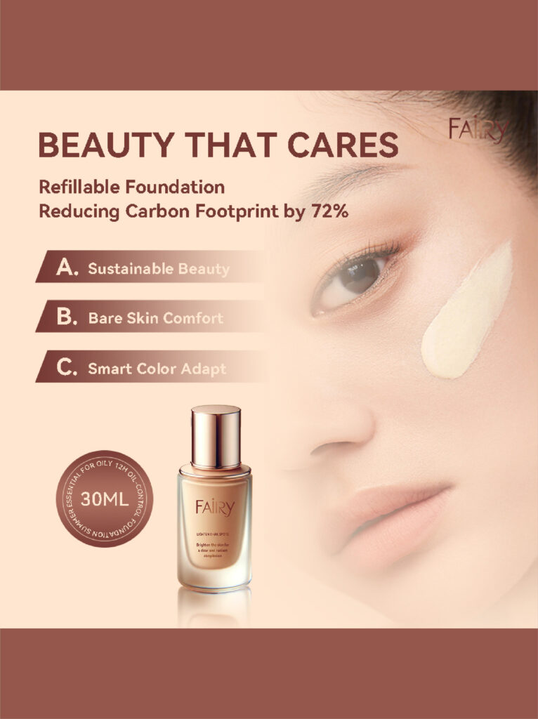
Image 3: 24H Wear Test Passed — Proof Over Promise
Trust is critical in the liquid foundation category. The third image is designed to provide evidence-based reassurance.
The “24H Wear Test Passed” headline immediately signals durability and performance. Supporting claims like bamboo charcoal oil absorption and dermatologist testing are paired with checkmark icons to create a sense of certification and reliability.
The before-and-after skin comparison is intentionally subtle:
- No exaggerated transformations.
- Focus on even tone, reduced shine, and smoother texture.
This restraint helps avoid skepticism and aligns with Amazon’s preference for realistic, credible beauty imagery.
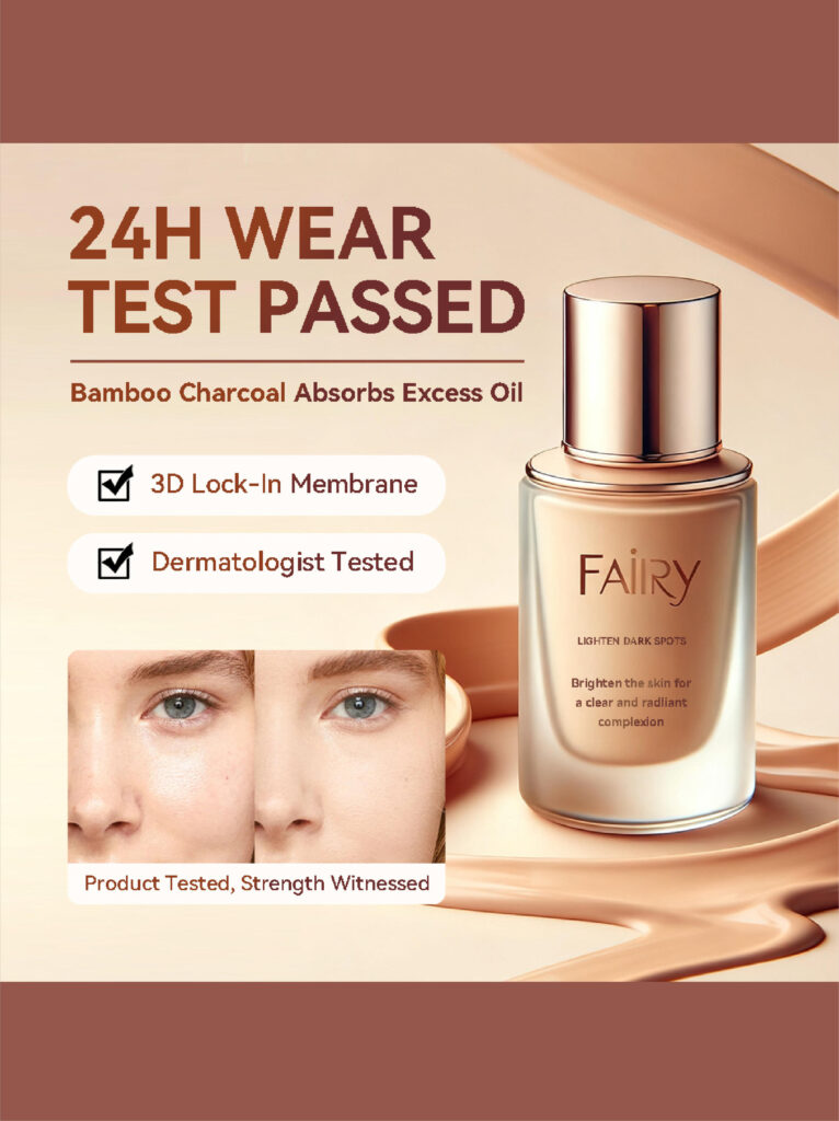
Image 4: Smart Color Adapt — Explaining the Technology
Color matching is one of the biggest barriers to buying liquid foundation online. This image directly addresses that concern through visual storytelling.
The angled bottle placement adds motion and modernity, while the flowing foundation background reinforces fluidity and adaptability. The step-by-step callouts (“Skinfuse,” “Long-Wear,” “Mineral Oil”) break down the formulation benefits in a way that feels technical yet accessible.
Why this matters:
- It reduces shade anxiety.
- It explains how the product adapts, not just that it does.
- It positions the foundation as intelligent and advanced, not generic.
This image acts as an educational bridge, turning curiosity into confidence.
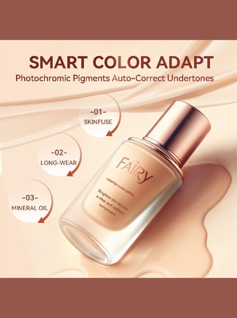
Image 5: Flawless Conceal — Sensory and Skin-Safe Messaging
The fifth image brings the conversation back to finish and feel. “Flawless Conceal” is communicated through creamy textures, soft lighting, and close-up application visuals.
The creamy splash surrounding the bottle visually reinforces:
- Soft-focus coverage
- Luminous but controlled glow
- Skin-friendly formulation
The inclusion of EWG certification and post-procedure safety messaging targets a more informed beauty consumer—someone who reads ingredient lists and values dermatological safety.
This image is especially effective for customers with sensitive or recently treated skin, helping broaden the product’s appeal.
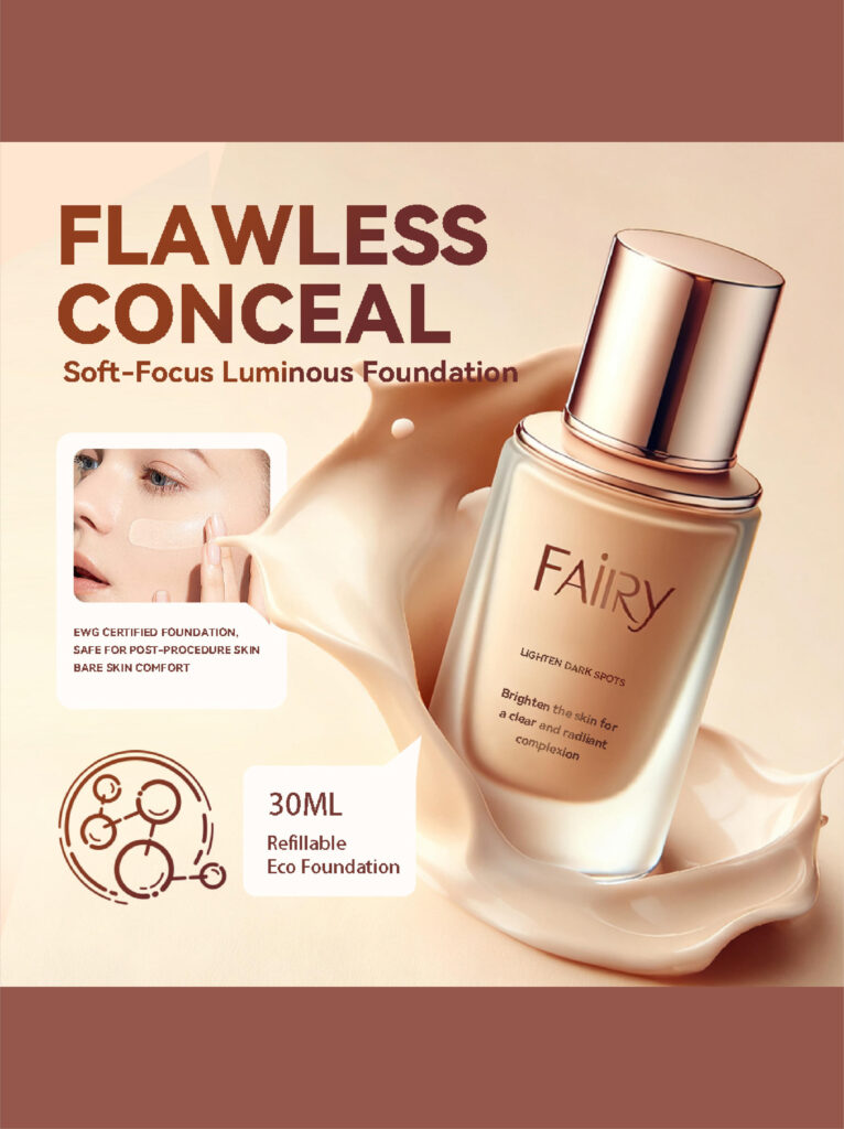
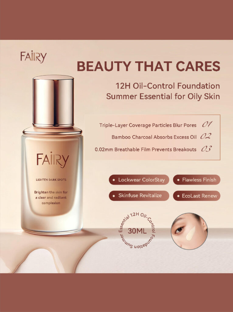
Image 6: Beauty That Cares — Feature Consolidation and Decision Support
The final image acts as a conversion closer. It consolidates performance claims into a clean, scannable layout that supports last-second decision-making.
Key features like:
- 12H oil control
- Triple-layer coverage particles
- Breathable film technology
are presented in a structured, comparison-friendly format. The circular skin inset reinforces real-world application, while the centered bottle shot maintains product authority.
This image is designed to answer remaining objections quickly—ideal for mobile shoppers who scroll fast and decide quickly.
Cohesive Design Strategy Across the Set
While each image serves a distinct purpose, the entire set is unified by:
- A consistent warm-neutral color palette
- Premium metallic highlights on the bottle
- Soft gradients and fluid textures to echo liquid behavior
- Clear typographic hierarchy optimized for Amazon’s mobile-first environment
This consistency builds brand credibility and helps the product stand out without appearing visually chaotic.
Why This Main Image Design Works for Amazon
From a conversion standpoint, this Main image design for Amazon Liquid foundation succeeds because it:
- Communicates benefits before features
- Balances emotional appeal with technical credibility
- Reduces common online beauty purchase anxieties
- Aligns luxury aesthetics with marketplace clarity
Rather than relying on one “hero” image to do everything, this system distributes information logically across multiple visuals, guiding the customer step by step toward confidence and purchase.
Final Thoughts
A successful Amazon liquid foundation listing is built on clarity, trust, and restraint. This project demonstrates how thoughtful visual structure, realistic skin representation, and benefit-driven storytelling can transform a competitive beauty product into a confident, high-conversion listing.
This image system was designed and executed by AIRSANG, where we specialize in creating conversion-focused Amazon visuals that balance aesthetics, compliance, and real buyer psychology.


Conceber e construir um sítio Web WordPress ou um sítio empresarial com um sistema de comércio eletrónico completo para si.
Faixa de preço: $200.00 a $2,500.00Requisitos personalizados ou orçamentos especiais
O preço original era: $2.00.$1.00O preço atual é: $1.00. Explicação do design da imagem principal para o dispositivo de fisioterapia doméstica da Amazon
Introdução: Construindo uma imagem confiável para dispositivos de terapia doméstica na Amazon Ao projetar a imagem principal de um dispositivo de terapia doméstica na Amazon, nosso principal...
Design da imagem principal para conversão de batom da Amazon
Introdução: Conceber uma imagem principal de batom que vende na Amazon Quando concebemos uma imagem principal para um batom da Amazon, a nossa responsabilidade vai muito além...

How Hackers Steal WordPress Admin Emails (And How to Stop Them)
Vamos começar com uma verdade incómoda: o seu e-mail de administrador do WordPress é provavelmente muito mais público do que pensa e os hackers? Eles adoram isso. Para eles, o seu...
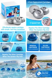
Como projetar uma imagem principal eficaz para cartuchos de filtro Amazon
Introdução: Criar uma imagem principal para a Amazon nunca se resume apenas a tornar um produto atraente. Trata-se de clareza, confiança e compreensão imediata — especialmente para...

Ataques de repetição no WordPress: ameaça real ou mito exagerado?
Vamos esclarecer uma coisa primeiro. Ataques de repetição não parecem assustadores. Eles não quebram senhas. Eles não injetam código malicioso com texto verde de hacker voando por toda parte. Eles são sorrateiros...

Como duplicar páginas do WordPress sem danificar nada
Vamos ser sinceros. Às vezes você não quer criar uma página nova. Você só quer a mesma página… mas um pouco diferente. Mesmo layout. Mesmos blocos. Mesmas configurações. Porque….
Comparativo de cinco temas WordPress para animais de estimação
Introdução Escolher o tema WordPress certo para o seu negócio de animais de estimação é mais do que uma decisão de design — afeta diretamente a usabilidade, a escalabilidade e o crescimento a longo prazo. Cuidados com animais de estimação e...

Comparando cinco temas de e-commerce de moda praia
Introdução: Escolher o tema certo para uma loja independente de moda praia ou lingerie não é apenas uma decisão visual — afeta diretamente as taxas de conversão, a escalabilidade e o sucesso a longo prazo...

Como desativar os comentários no WordPress (sem enlouquecer)
Vamos falar sobre os comentários do WordPress. Em teoria, os comentários são ótimos. Eles incentivam a discussão, constroem comunidade e dão vida ao seu site. Na prática? Muitas vezes, eles atraem...

Criando um site WordPress escalável para uma marca voltada para a ciência: o projeto AminoUSA
Introdução No cenário digital atual, um website é mais do que um lugar para listar produtos. Para marcas com foco em ciência que atuam em setores regulamentados ou voltados para pesquisa, um...

Construindo uma loja Shopify escalável para uma marca global de lâminas: O Projeto CoolKatana
Introdução No comércio eletrônico internacional, um site Shopify é muito mais do que uma vitrine. Para marcas que atuam em nichos de mercado e categorias culturais específicas, o site precisa fazer muito mais do que...