In the design of the Coupang product detail page of the silicone connection ring teether set, we organize the content around the connection combination and scene extension. Through off-white and warm brown, real-life baby photos, and unified circular icons, product identification, partial descriptions, and scene information are arranged at different levels, allowing readers to continue to understand the products in a clear order.
| Serviços | Industry | Plataforma |
|---|---|---|
| Coupang product detail page design | Maternity and baby products | Coupang |
| Project requirements | target market | design style |
| Connect combination and scene extension | Korean content display | Off-white warm brown, real baby photo, unified round icon |
| Project quotation | Delivery content | Delivery time |
| ¥1,500 | Version 1 product product detail page design | not disclosed |
Design challenge: Separate different reading tasks
This set of product detail pages should not only retain the appearance recognition of the silicone connecting ring teether set, but also accommodate different themes such as connection combinations and scene extensions. Instead of letting each picture carry all the information repeatedly, we separated the whole, parts and scenes, and controlled the distance between titles, pictures and descriptions.
Our design strategy
We use off-white, warm brown, real-life baby photos, and unified circular icons to establish a continuous visual language so that the subject can be clearly identified from the background. The title uses an obvious font size and weight hierarchy, and the supplementary description is relegated to the next level to avoid decoration, photos and text competing for attention at the same time.
In terms of content organization, we divide chapters according to the themes of real works: use larger pictures to establish overall relationships, use parts and diagrams to explain details, and then use bounded text areas or lists to organize supplementary information. Long pages create pauses through color blocks, cards, and white space between groups, and chapter switches can also be identified during continuous reading.
Character opening: scene photos establish product relationships
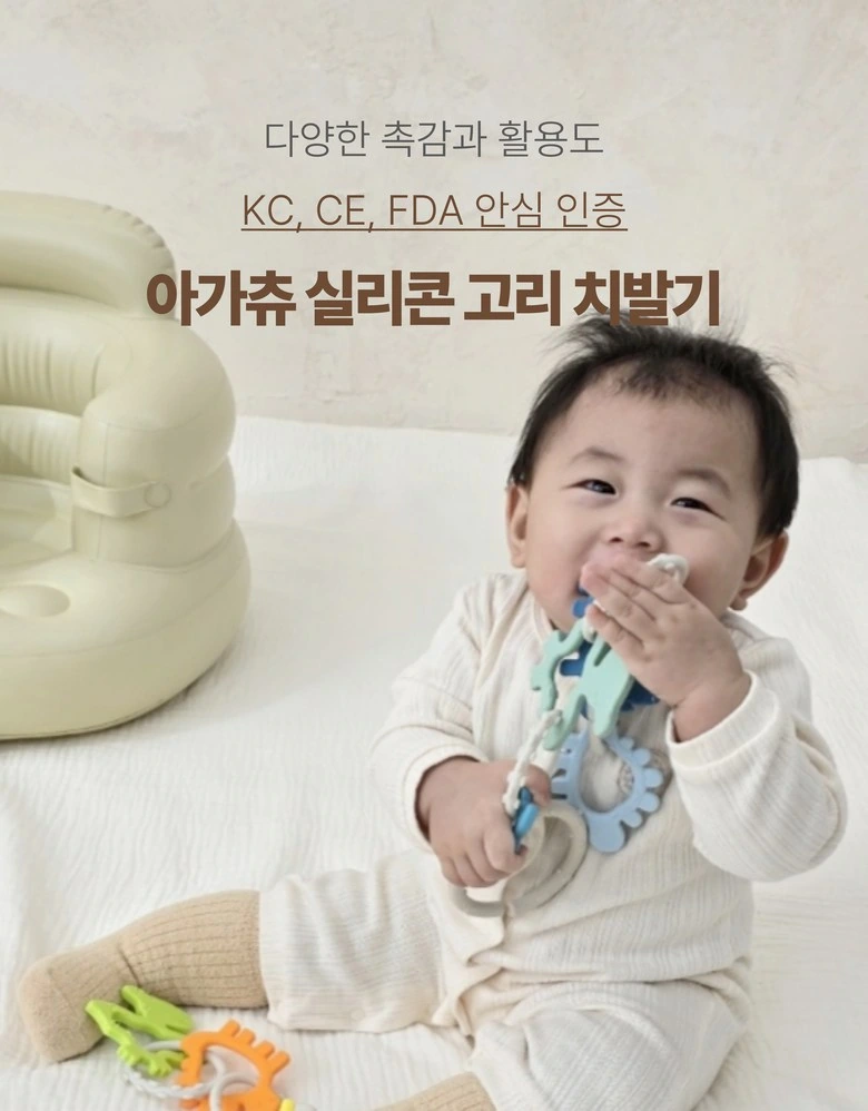
We place the baby with the connecting ring in a pastel domestic scene, with the title focused on the top. Light-colored photos leave enough space to keep the characters’ movements and product direction clear.
Combination tiling: presenting accessories in circular arrangements
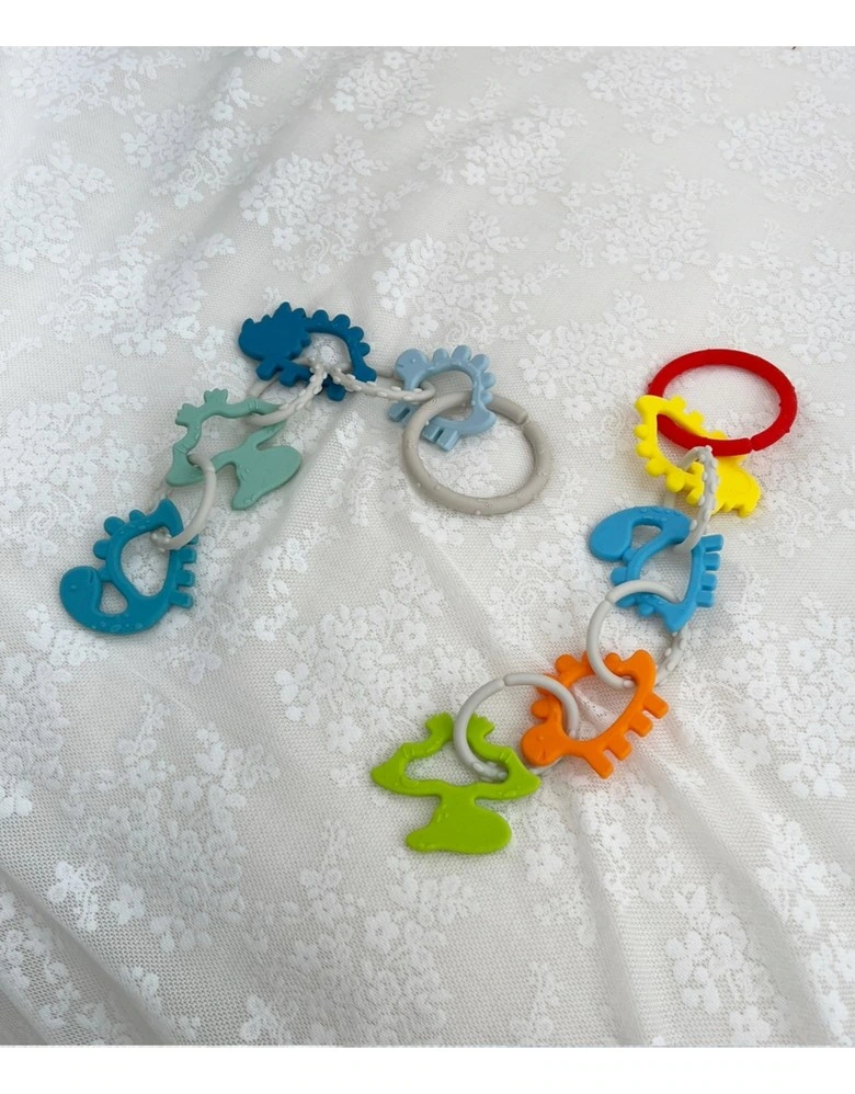
We arranged rings and styling pieces of different colors into a circle, with the fabric texture as a soft background. The colors are evenly distributed across the frame and the set combination is fully legible.
Topic Index: Six Icons Keeping a Common Scale
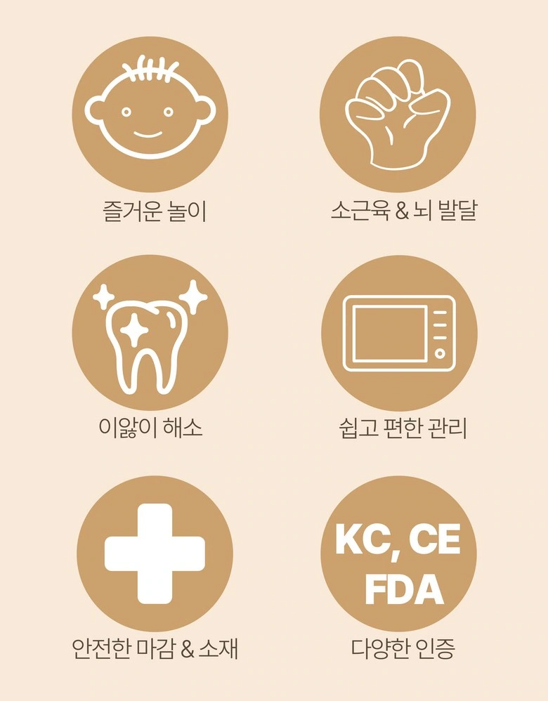
We use warm brown round icons to organize different topics, and short text is placed below the icons. The same spacing and font size give the index a neat rhythm, creating a reading change with the real-life photos.
Seat Scenario: Preserve Hitch Path
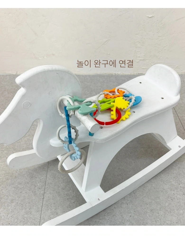
We unfolded the connecting ring along the edge of the seat, retaining the connection points and sagging relationship. Less text allows the structure to be directly observed, and the scene explains the spatial location.
Cart situation: use close-up to highlight the connection location
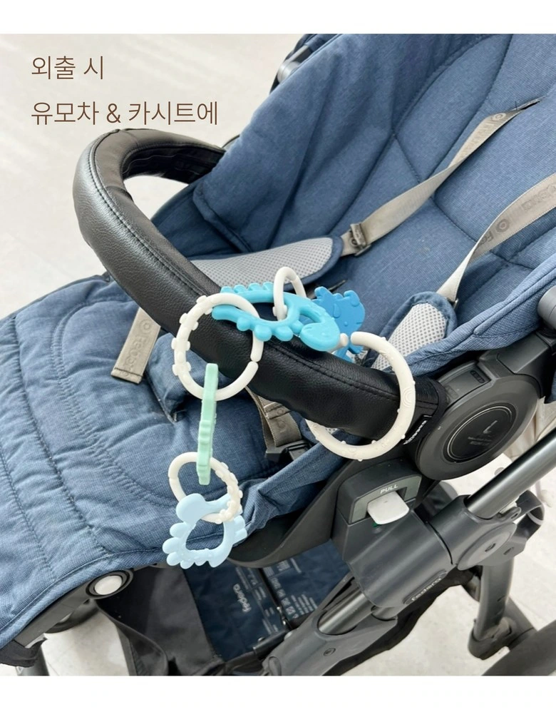
We show the relationship between the connecting ring and the cart from a closer angle, with the subject occupying the center of the frame. Text is placed above and does not cross hitch locations and accessories.
Structural details: partial circular frame connection tile combination
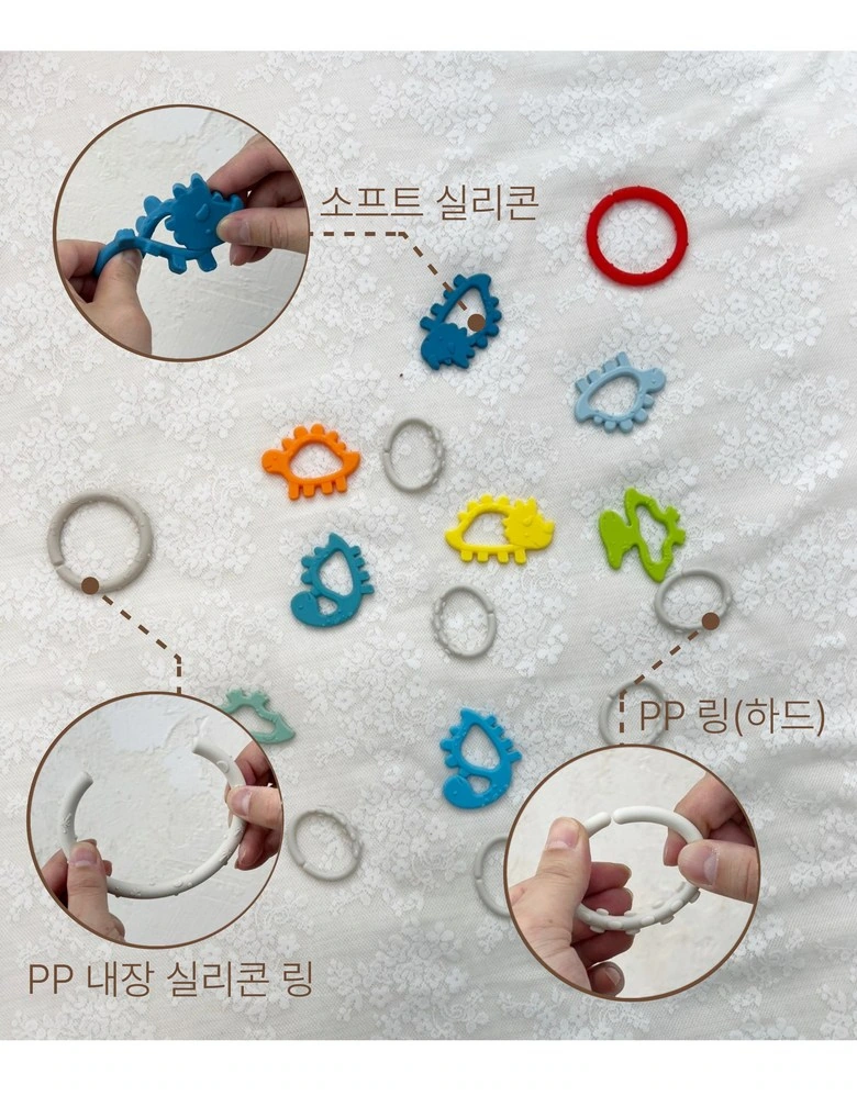
We spread out the styling pieces and supplemented the ring details with two circular close-ups. The description line expands along the outer edge, maintaining a clear correspondence between the main product image and the local part.
Comparative layout: keep local shapes comparable
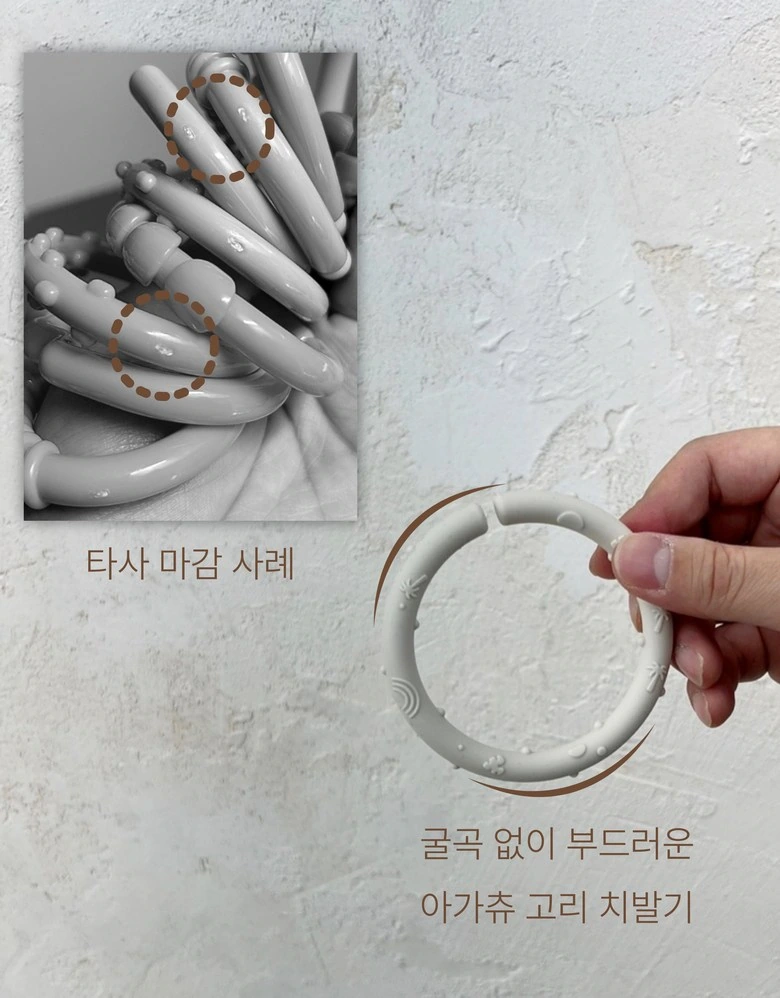
We use partial photos and single-ring close-ups to organize the contrasting themes. The off-white background makes the outline clearer. The two types of pictures are divided into areas, and the comparison text is not pressed into details.
Close up of people: putting the product back into the interactive process
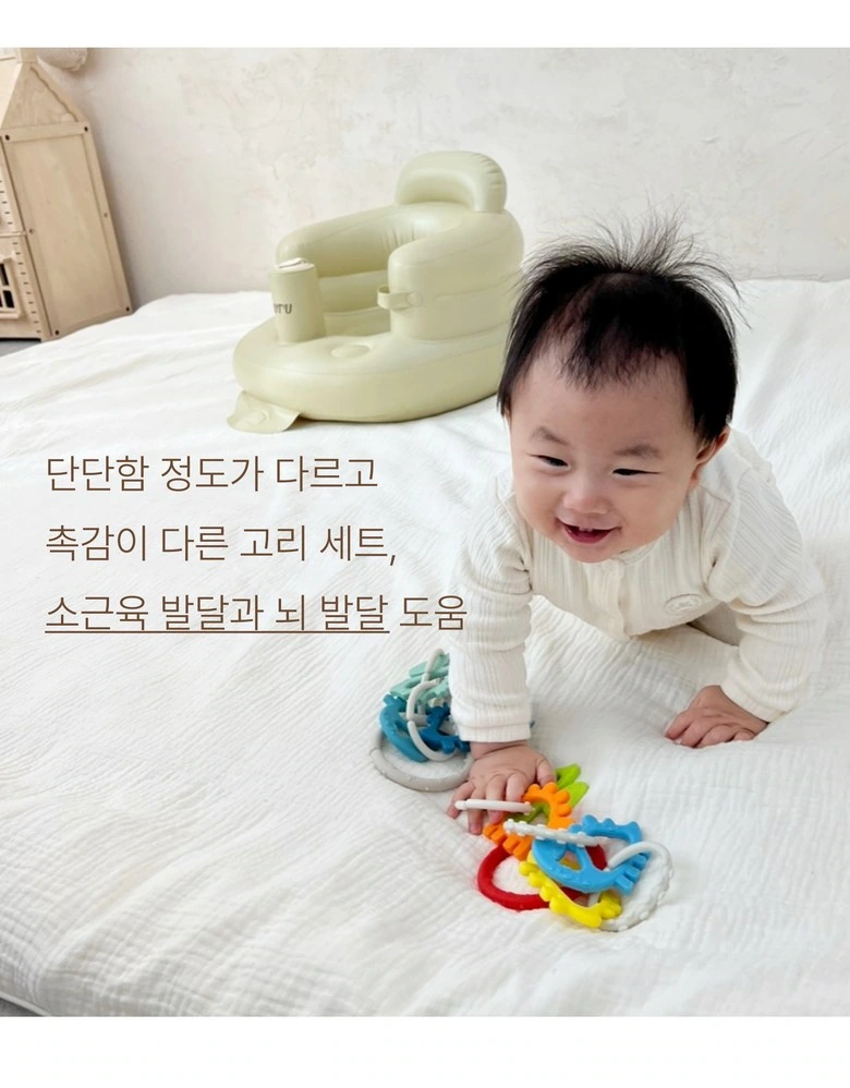
We retain the relationship between the baby’s hand and the connecting ring, and the text is concentrated in a clean area on one side. The warm home background continues the opening, and the scene and structure illustrate the natural connection.
Nursing index: icons correspond to parameters item by item
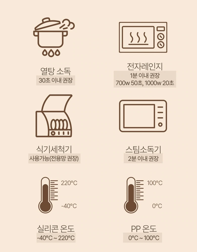
We organize care topics with six line drawing icons, with each instruction located below the corresponding graphic. Common line widths and regular rows and columns allow dense information to still have clear boundaries.
Series selection: two sets of combinations placed on the same card
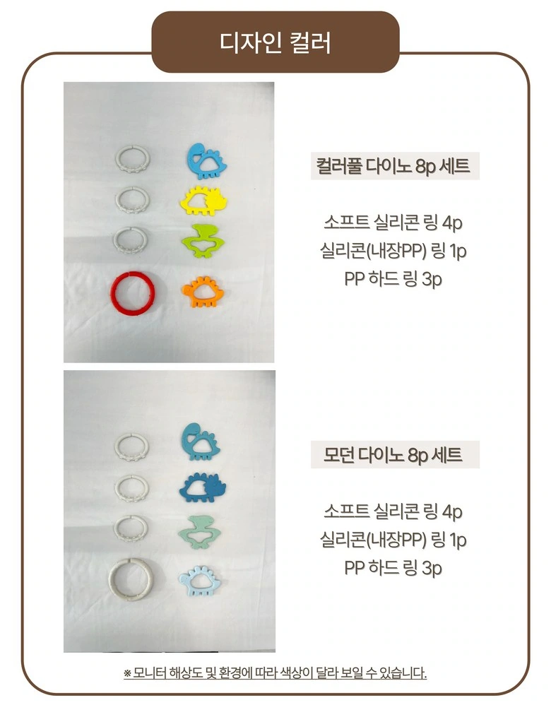
We divide the two color matching series into upper and lower areas. Accessories are placed on the left side, and short text is stored on the right side. Identical structures and brown borders help readers search group by group.
Environment extension: use two photos to organize the mounting locations
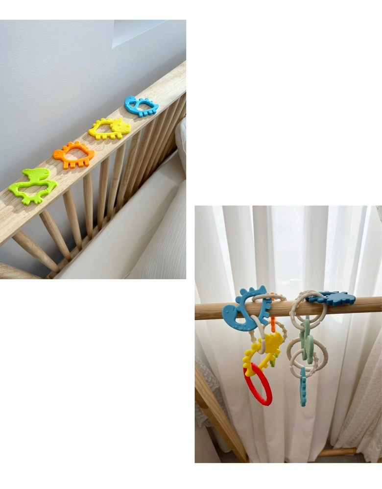
We present different mounting situations with up-and-down photos, with white spaces separating the backgrounds. Product color continues to serve as an identification cue in different contexts.
Specification finishing: size, packaging and material layering
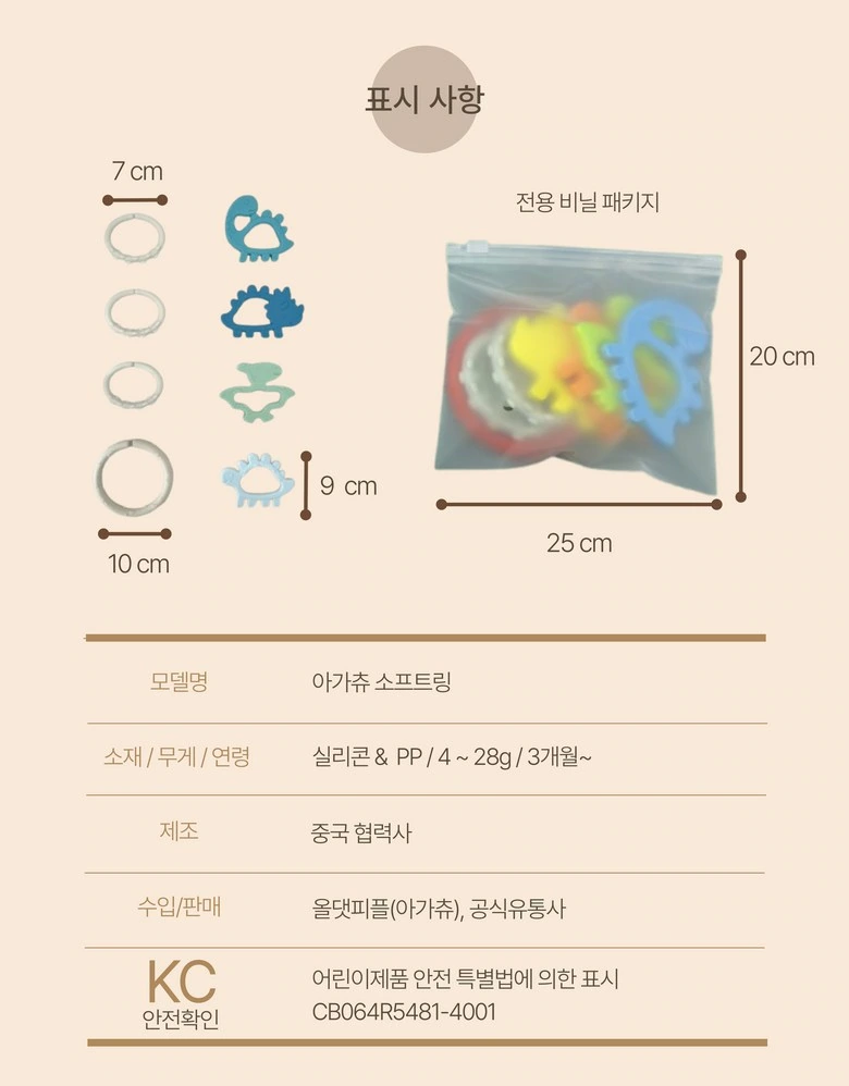
We use dimension lines to display accessories and packaging in the upper part, and arrange information in tables in the lower part. Use the same font weight and alignment to connect graphics and text to keep the final paragraphs of details neat.
Deliver and design value
Through this version of the product detail page, we establish a continuous reading path around connection combinations and scene extensions. Off-white and warm brown, real-life baby photos, and unified circular icons connect different chapters. The image scale, text level, and white space jointly distinguish the primary and secondary, so that the product overview and local descriptions complement each other.
Develop a clear Coupang visual expression for your product
You can provide us with product links, existing materials, and key points that need clarification. We will combine the product structure, style and usage scenarios to plan the appropriate picture group or product detail page content and layout.