Project overview
The client is a cross-border ecommerce brand that specializes in the sales of men’s sportswear and fitness equipment. It mainly targets male consumer groups with needs for fitness, running, basketball and outdoor sports. As the product enters the Amazon market, customers hope to further strengthen the product’s selling points through a more professional A+ page, solving the problem that ordinary product pictures cannot fully display size, fabric, compression support, sweat-wicking performance, and multi-scenario wear. Therefore, the customer came to us and hoped that we would re-plan the entire set of Amazon A+ visual content around men’s long-sleeved fitness compression garments. While maintaining a sense of sportiness and professionalism, we would also enhance consumers’ understanding of the product and purchase confidence through clear information levels, real-life scenes and functional visual design.
| Serviços | Industry | Plataforma |
| Amazon A+ | Sports and outdoor | Amazon |
| Project requirements | target market | design style |
| Improve click-through rate | Mundial | Professional sports|Technological functions|Refreshing and tough |
| project budget | Delivery content | Delivery time |
| ¥600 | 6 A+ | 5 working days |
Project Challenges
The core challenge of this project is how to clearly present the selling points of fitness compression garments such as size, shaping support, breathable and sweat-wicking, elastic fabrics, and multi-scenario wear in the limited Amazon A+ layout, while avoiding information duplication and visual congestion. In the early stage, we first sorted out the product parameters, fabric ingredients, target groups and main usage scenarios, and analyzed the page expressions of similar sportswear, and then re-divided the information levels according to consumers’ purchasing concerns. Then, we unified the visual system of black, white and blue, planned modules such as size, function, fabric, sports scene and wearing style, and established a clear and coherent visual logic for the entire subsequent A+ design.
Part 1: Reduce the cost of purchasing decisions with size guides
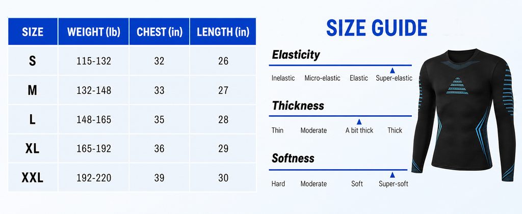
One of the most common problems with clothing products on Amazon is that consumers don’t know how to choose sizes.
So in the first image we focus directly on SIZE GUIDE SIZE GUIDE on the website without rushing to introduce product features.
The left side adopts a clear table structure, which arranges the five sizes S, M, L, XL, and XXL in order, and displays the weight, bust and length information respectively. Consumers do not need to read a lot of text, they only need to make horizontal comparisons based on their own body data to quickly find the right size.
We use high-saturation blue in the table header to visually echo the blue decorative lines of the product itself. We also use white and light gray as the main background of the table to keep the digital information clear enough.
On the right side, instead of continuing to stack parameters, a physical display of the product is added and passed Elasticity、Thickness、Softness Three dimensions further illustrate clothing attributes.
Consumers can not only know how big the clothes are, but also know that they have high elasticity, moderate thickness and soft wearing experience.
This kind of design can answer the most common questions consumers have about clothing products in advance:
“Is it too tight?”
“Is the fabric thick?”
“Is it comfortable to wear?”
We use visual scales instead of long explanations so that consumers can get the answer in a few seconds.
Second picture: Expand product use value through eight scenarios
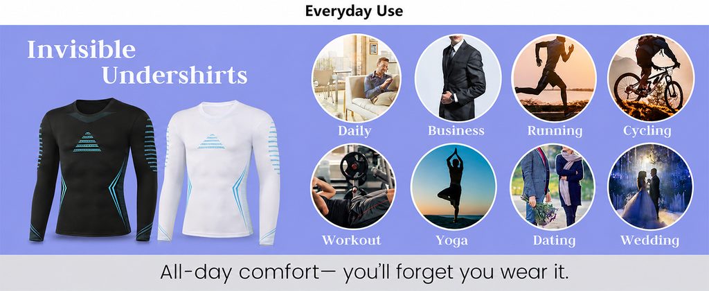
The core mission of the second picture is to make consumers realize that this is not a piece of sportswear that can only be worn in the gym.
Therefore, we use Everyday Use As the core concept of the entire module, different usage methods are demonstrated through eight circular scenes, including Daily, Business, Running, Cycling, Workout, Yoga, Dating and Wedding.
Two compression garments, black and white, are displayed on the left side at the same time, allowing consumers to quickly see the color options of the product while enhancing overall product awareness.
In this screen, we deliberately reduce complex parameters and instead create a sense of immersion through characters and life scenes.
For example, running, cycling and fitness are typical sports scenes, which can strengthen the professional sports attributes of the product; while business, dating and wedding scenes convey another important message to consumers – this fitness garment can also be used as the base layer inside a shirt, suit or other clothing.
At the bottom of the page add:
“All-day comfort—you’ll forget you wear it.”
This statement further emphasizes all-day comfort.
Through this design, we have expanded the product from a single “fitness compression garment” to a basic functional garment that can cover sports, commuting, daily and formal wear.
For Amazon products, the richer the usage scenarios, the easier it is for consumers to find purchase reasons related to their own lives.
Picture 3: Highlight shaping, back support and core wrapping
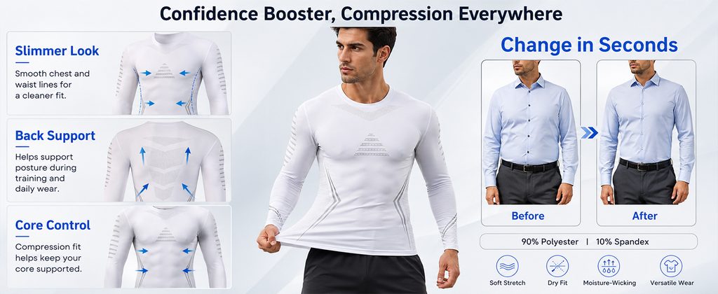
Consumers don’t buy compression garments just to absorb sweat and exercise.
Many consumers are also concerned about the body lines after wearing them.
So in the third A+ image we focus on Confidence Booster, Compression Everywhere on this topic.
In the middle of the picture, a male model wearing a white compression garment is used as the visual center, and the elasticity of the fabric is visually demonstrated through the model’s movements of stretching the hem.
On the left side, the three core areas are dismantled.
The first part is Slimmer Look。
We use blue arrows on the chest and waist to show the tightening direction of the clothes after they fit the body, so that consumers can directly understand that the product can help the body lines look cleaner.
The second part is Back Support。
Through the product image on the back and the upward arrow, we emphasize the wrapping feeling of the clothes on the back and posture area, allowing consumers to understand that this product is not only close-fitting, but also structurally designed for physical activities during training.
The third part is Core Control。
We further put the visual focus on the waist and abdomen area, and strengthened the sense of core wrapping through the inward shrinking arrows.
Join on the right Before / After Contrast.
We did not make the comparison too exaggerated, but used similar business outfits to let consumers understand the impact of the base compression garment on the outline of the outer shirt.
Four function icons of Soft Stretch, Dry Fit, Moisture-Wicking, and Versatile Wear are further added to the bottom, as well as the fabric ratio of 90% Polyester and 10% Spandex.
This screen actually undertakes a very important conversion task:
It transforms “compression clothing” from an abstract concept into a wearing effect that consumers can directly observe.
The fourth picture: Establishing a sense of product quality through fabric macro
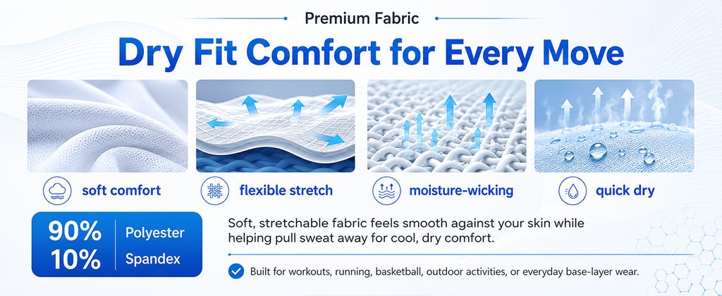
Sportswear has many functional selling points, but if all functions are expressed only through words, it will be difficult for consumers to truly trust them.
Therefore, the fourth image we focus specifically on Premium Fabric。
Main title use:
Dry Fit Comfort for Every Move
Direct emphasis on dryness, comfort and freedom of movement.
We arranged four groups of fabric visuals in the picture.
The first set features real fabric pleat macro, highlighting the soft touch.
The second group expresses fabric elasticity and air flow through multi-layered fiber structures and arrows.
The third group uses the fabric structure to amplify the effect and adds upward airflow arrows to express breathability and moisture removal.
The fourth group demonstrates rapid drying capabilities through water droplets and evaporation effects.
Correspond to the settings below:
soft comfort
flexible stretch
moisture-wicking
quick dry
Such a structure has an obvious advantage:
Consumers do not need to read long functional descriptions, but can quickly understand each fabric performance through pictures.
In the lower left corner we highlight again 90% Polyester + 10% Spandex , converting material data into an independent block of visual information to improve reading efficiency.
Fabric macro images are very important for Amazon A+.
Consumers can’t actually touch clothing when shopping online, so the design must help them “imagine touch.”
We transform the abstract fabric function into a concrete vision through fiber structure, water droplets, airflow and soft folds, making the product’s professional feel more credible.
Picture 5: Use real sports scenes to strengthen professional attributes
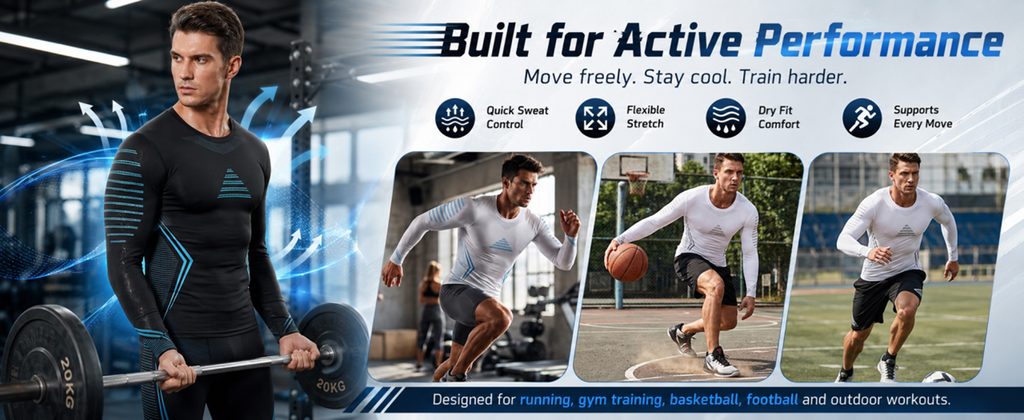
While the previous pages have explained sizing, comfort and fabric performance, the fifth page begins to further establish the sporty professional feel of the product.
we use Built for Active Performance As a core title, paired with:
Move freely. Stay cool. Train harder.
Let the entire module enter a more powerful sports context.
On the left is a large scene of a male model doing barbell training in the gym.
The black compression clothing and the dark fitness environment form a unified vision, while the blue lines on the product echo the blue dynamic effect in the picture.
We added upward airflow and dynamic lines to allow consumers to quickly understand that the product emphasizes breathability, sweat wicking, and comfort performance in high-intensity exercise environments.
On the right side, three different sports scenes are arranged, including strength training, basketball and outdoor running.
This combination can prevent consumers from limiting products to a certain type of sports.
The core functionality is further summarized using four icons at the top:
Quick Sweat Control
Flexible Stretch
Dry Fit Comfort
Supports Every Move
Iconized information can help mobile consumers browse quickly, while the sports scenes below are responsible for establishing emotions and a sense of user involvement.
The design focus of this screen is not to continue explaining the material, but to answer another question from consumers:
“Is this dress suitable for real exercise?”
We put the product into a real sports environment through character movements, fitness equipment, basketball and running venues, so that the elasticity, breathability and perspiration functions mentioned above can gain more specific scene support.
Picture 6: Showing how to wear alone or layered
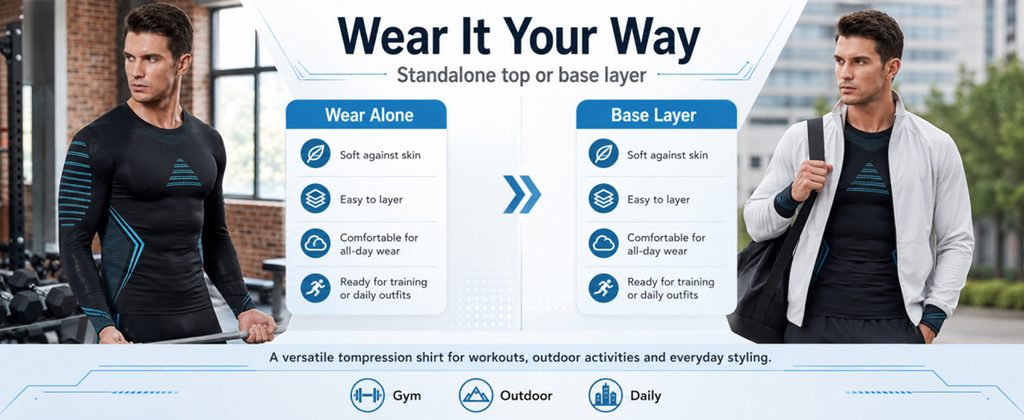
On the last screen of the A+ page, we did not continue to add more technical parameters, but put the focus back on how consumers actually use it.
The title adopts:
Wear It Your Way
The subtitle clearly states:
Standalone top or base layer
The left side shows a male model directly wearing a black compression garment for training, representing Wear Alone Single wear mode.
This style of wearing is suitable for gyms, strength training, running and other sports scenarios.
The right side shows a male model wearing a light-colored sports coat and a shoulder bag over a compression garment, representing Base Layer How to wear base.
This scene is obviously closer to daily commuting and outdoor life.
Two information cards are used to explain the wearing experience, including skin-friendly, easy to layer, suitable for all-day wear, and adaptable to training and daily matching.
We use an obvious blue directional arrow to connect the two styles of dressing, so that consumers can naturally understand:
The same product can switch between sports and daily life.
Three icons, Gym, Outdoor and Daily, are further added to the bottom of the page to summarize the usage scenarios of the entire set of A+.
As the last picture, this design is more effective than continuing to list parameters.
Because when consumers browse here, they have basically understood the product performance. What we need to do at this time is to help them complete their final purchase imagination:
“How can I wear it after I buy it?”
When consumers can clearly imagine the product entering their lives, their purchase intention is usually stronger.