Project overview
The product picture of the 28-in-1 wire stripper needs to break down the multi-functional slogan into specific parts and operations. This case focuses on the existing 6 Ozon Russian works, dismantling the arrangements for product identification, theme description and condition verification. For brands and sellers who are preparing to produce pictures of similar products, the focus is not only on the style of the pictures, but also on understanding how different pictures distribute information so that product-related questions have corresponding reading positions.
| Services | Industry | Platform |
| Ozon product primary and secondary product images design | Hardware tools | Ozon |
| Project requirements | target market | design style |
| Divide the multifunctional slogan into specific parts and operations | Russia | Industrial toughness, red and white high contrast, information graphics |
| project budget | Delivery content | Delivery time |
| ¥550 | 6 case display pictures | 6 working days |
design challenge
Multifunctional tools have dense information on hole locations, jaws, shears, and handles. The key is to map a general summary like 28 in 1 to a specific structure, and use operation diagrams to explain the purpose to avoid just repeating quantities.
Design strategy: Let the entire group of works form a clear information relationship
01 Allocate information tasks first, and then arrange the key points of the screen
The work is expanded according to “Tool Overview → Functional Position → Material Theme → Durable Theme → Handle Structure → Operation Scenario”. Figure 1 establishes the identification first, and then switches the composition and description position according to the actual theme. This division of information allows different questions to have their own place, reducing the need to pile up all the text in the first image, and preventing subsequent images from simply repeating the same product photo.
02 Use a consistent visual language to connect different reading tasks
The red oblique block forms a strong contrast with the gray and white background, the silver and black pliers body retains the outline, and the red guide lines, local magnification and four-square grid organize information uniformly. The unified style serves the entire group identification, and composition changes serve different contents; the main title, auxiliary labels and product proportions in the picture jointly determine the reading order.
03 Reduce the explanation to specific parts, actions or choices
The focus of this group of works is to break down the multifunctional slogan into specific parts and operations. When dismantling, look at the correspondence between the whole machine and parts, themes and conditions: when there is structural information, look at the positional relationship, when there is scene information, look at the objects used, and when there are numbers, look at the categories and limiting conditions. Letting each picture answer a specific question has more explanatory value than repeatedly emphasizing the excellence of the product.
Dismantling the work: explaining the screen arrangement and information responsibilities of each picture
Figure 1|Tool overview: first look at the overall and core themes
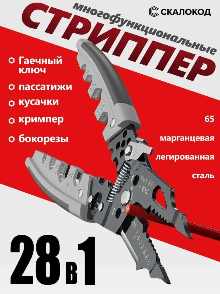
The unfolded pliers body is diagonally across the screen, 28 in 1 is located at the bottom, and the list and material text on the left are on both sides.
The open state makes both jaws and handles visible, quantity serves as the theme, and the function list provides access to further understanding.
Figure 2|Functional location: connect multiple parts with dotted lines
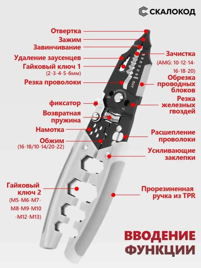
The tool is placed vertically in the center, and the red dotted lines connect the jaws, holes, springs and handles, indicating that they are distributed on both sides.
Guidelines map names to actual structures, allowing users to search by location instead of just reading a string of function names.
Figure 3|Material theme: enlarged jaws and connection structure
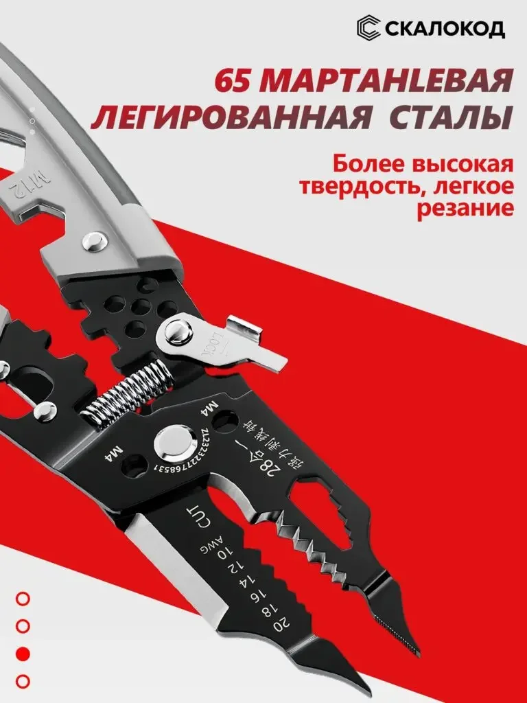
The close-up view of jaws, rivets and springs dominates the frame, with text on 65 manganese alloy steel at the top.
Partial magnification allows the material theme to be observed. The specification text is a material declaration, and the hardness test is not presumed based on the picture.
Figure 4|Durable theme: Using water droplets to highlight the surface description
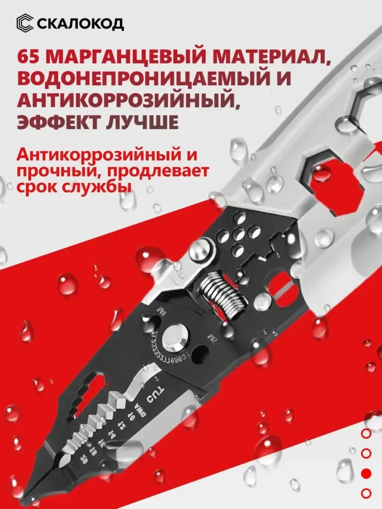
The silver and black tools are placed on a red and white background, with water droplets appearing on the surface, and anti-corrosion and other theme text concentrated on the top.
Water droplets are used to organize durable themes. The actual degree of anti-corrosion and waterproofing still needs to be supported by product data, and the picture group maintains information boundaries.
Figure 5 | Handle structure: focus on the grip contact area
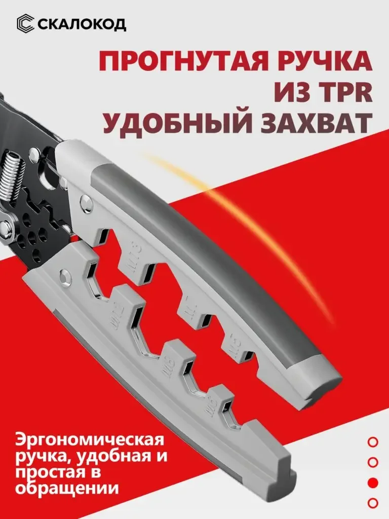
The handle is greatly enlarged, the TPR and holding instructions are on the upper part, and arrows are spread out near the handle.
Contact areas are displayed independently, so that the control theme is mapped to specific locations, rather than generally describing how useful the tool is.
Figure 6|Operation scenario: use four grids to explain typical uses
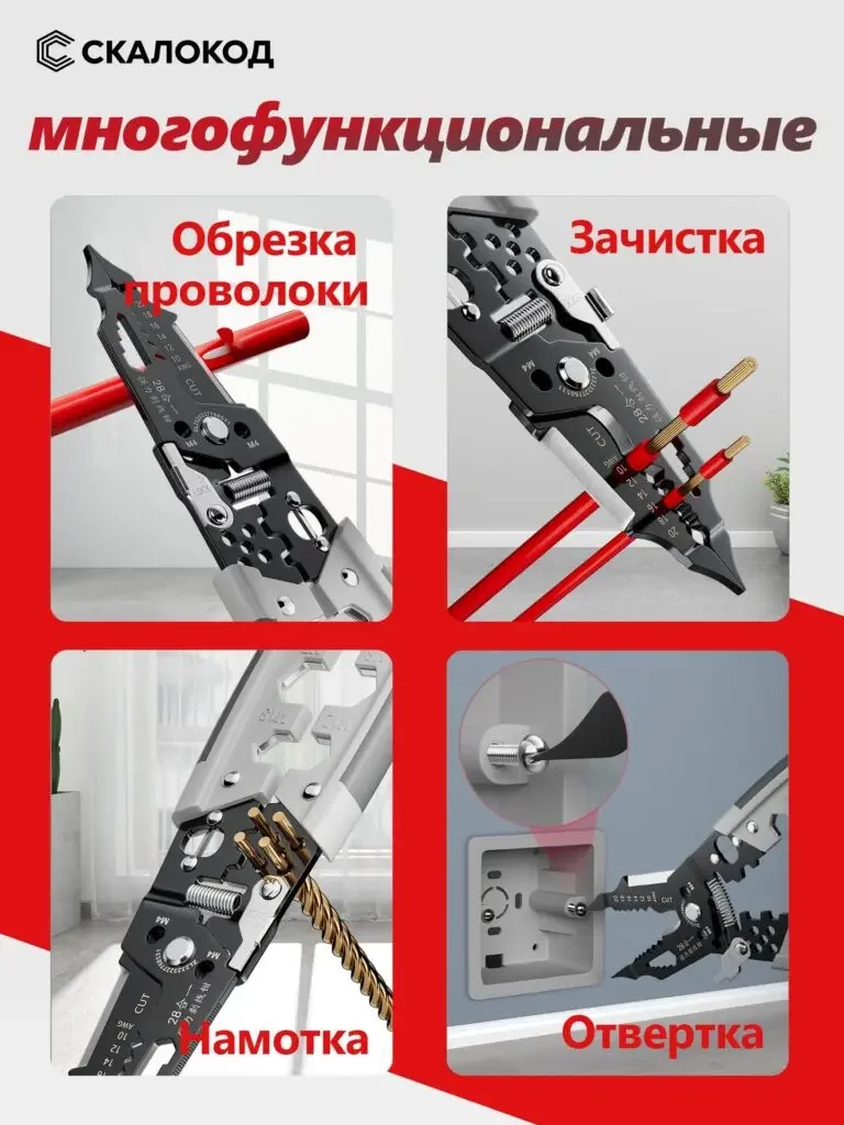
Cutting, stripping, winding and screwing operations are placed in four grids respectively, with short titles adjacent to the actions.
The function page shifts from structural names to specific operations, so consumers can understand the uses in the picture according to their own work tasks.
Delivery summary and design value
The entire team delivers with a clear division of labor
The 6 works in this case respectively cover “Tool Overview → Functional Position → Material Theme → Durable Theme → Handle Structure → Operation Scenario”. The number of images depends on the actual content, and each image has its own theme while maintaining an overall identity through color, text hierarchy, or composition.
Procurement issues can be more easily mapped to specific information
Focusing on the 28-in-1 wire stripper, the work will “break down the multifunctional slogan into specific parts and operations” and implement it into different images. When brands plan similar designs, they can first list the content that consumers need to identify, understand and check, and then determine the tasks and order of primary and secondary product images.
Value is based on interpretive methods and authentic works
The whole machine, part, scene and information cards provide different reading entrances, helping to organize product descriptions more clearly. The value of this case is the visible design expression and information division of labor; changes in click-through rates, sales, and conversion rates require additional statistical or test data support.
The parameters, materials and functions in this article are used to explain the content of the accompanying pictures. The specific specifications, applicable conditions and accompanying items are subject to the product information of the corresponding model.
Plan clearer product images for your Ozon products
If you also need to plan primary and secondary product images for your Ozon28-in-1 wire stripper, you can submit product links, existing pictures or product information to AIRSANG, explain the target market and required picture group range, and communicate the information organization and visual direction suitable for the product.
Consultation email: [email protected] · Telephone: 177-5952-2770