Project overview
The customer of this project is Rhino Rescue, a brand that specializes in tactical first aid kits, outdoor emergency and professional rescue equipment. Its products are targeted at outdoor adventurers, tactical users, medical and emergency rescue personnel and other groups of people. As the brand business expands, the original online visuals are no longer able to fully convey the professionalism and reliability of products in real emergency scenarios. Therefore, customers find AIRSANG, hoping to reorganize the overall visuals and user experience of the Shopify brand website. The project focuses on designing the homepage structure, scenario-based product display, brand story, product classification and trust content. It avoids excessive militarization while maintaining a tactical feel. It strengthens the brand’s professional image, user trust and conversion performance through clearer visual hierarchy and purchase paths.
| 서비스 | Industry | 플랫폼 |
| Website design and decoration | Sports and outdoor | shopify |
| Project requirements | target market | design style |
| Improve the overall visual quality and brand recognition of the website | 글로벌 | Tough tactics | Professional restraint | Realistic scenes |
| project budget | Delivery content | Delivery time |
| ¥6500 | Website construction and full-site page design | 18 working days |
Project Challenges
The biggest challenge at the beginning of the project was how to maintain the professionalism of the Rhino Rescue tactical first aid brand while avoiding an overly military look on the website, so as to cater to outdoor users, first responders and general safety protection consumers. At the same time, there are many brand product categories, application scenarios and story content. Without clear planning, it is easy to cause crowded information on the homepage and confusing browsing paths. To this end, we first sorted out the brand positioning, core user groups and purchasing needs before the formal design, and analyzed product classification, real usage scenarios, brand content and page priorities, further determined the visual style, information level and homepage browsing flow, and established a unified and clear design framework for subsequent Shopify website design.
Home Page Design: Building the First Impression
Above the fold area: convey the brand mission first, then consider promotions
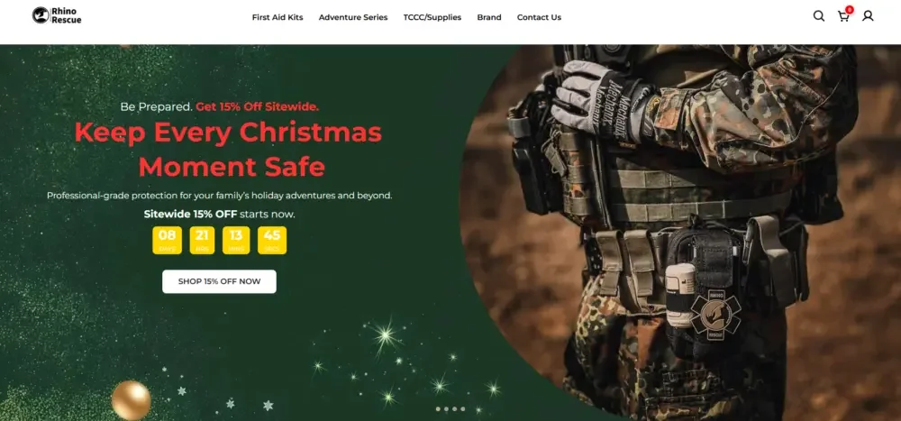
The first screen of the home page plays an important role in establishing the first impression and emotional tone of the brand. We did not directly use the product list or discount information as the opening, but gave priority to letting users quickly understand the brand positioning through real scenarios and brand mission.
Large-scale scene pictures show the application of tactical equipment in real environments, conveying the professionalism, seriousness and practical use value of the products immediately. At the same time, we also carefully incorporate seasonal marketing content such as holiday safety activities to support promotional needs without damaging the brand’s original professional image.
Key design considerations include:
- Clear title hierarchy allows users to quickly understand core information
- Control the number of action buttons to reduce user selection pressure
- Maintain a visual balance between images and text
The final first screen will not attract attention with excessive promotion, but will guide users to enter the website naturally through professional and restrained visual expression.
Modular content design to meet different user needs
“Meet different user needs” section
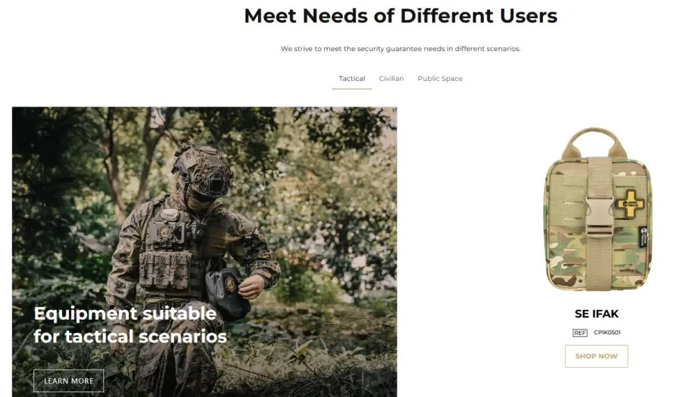
An important challenge in the project is how to serve different types of users at the same time without making the entire browsing experience appear fragmented.
To solve this problem, we adopt a modular content structure to clearly distinguish different usage scenarios while maintaining visual consistency across the entire page.
This section mainly uses:
- Picture display based on usage scenarios
- Short and direct copy
- 명확한 시각적 그룹화
After users enter the page, they can quickly identify products and usage scenarios related to them, thereby reducing the cost of finding information and improving browsing efficiency and page interaction.
Product focus display module
We do not present a huge product catalog to users at once, but present it more rhythmically through key product modules.
Each product module mainly highlights:
- Actual usage scenarios and application value
- Concise, easy-to-read product information
- Uniform spacing and layout
This design method can not only display a wide range of product types, but also keep the page clean, stable and easy to browse, avoiding the visual burden caused by a large number of products appearing at the same time.
Design around trust and professionalism
Restrained and professional hot products area
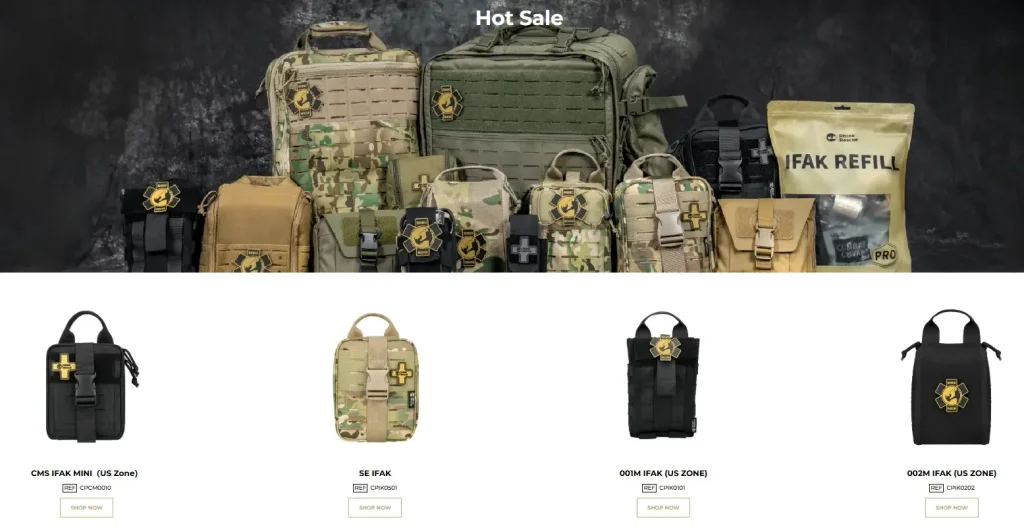
For brands with professional mission attributes, the promotional area can easily appear overly commercial if not handled properly.
Therefore, the “Hot Sale” hot product section does not use exaggerated marketing visuals, but highlights popular products in a more professional and restrained way.
우리는 다음을 사용했습니다:
- Neutral and controlled product light and shadow performance
- Uniform product size and arrangement
- Clear labels instead of lots of eye-catching promotional badges
This can highlight hot-selling products without destroying the overall serious and professional brand tone of the website, making promotional information more like product recommendations rather than forced sales.
Telling brand stories through visual design
Translate brand history into page structure
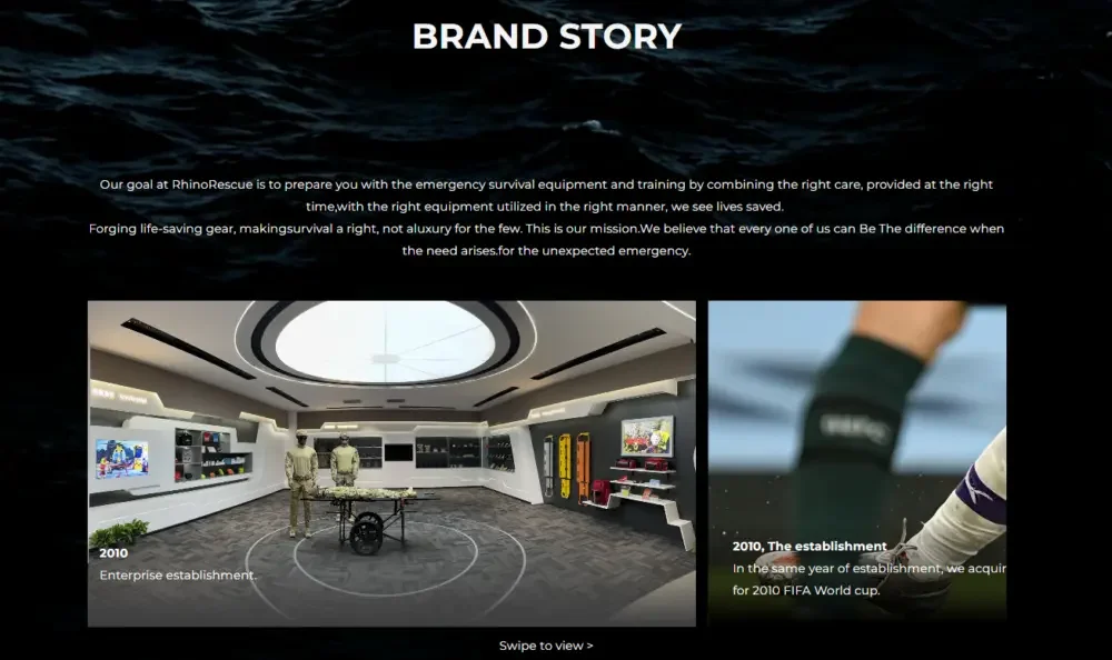
The brand story section plays an important role in building user trust.
Instead of using long paragraphs of brand introduction text, we integrated the brand’s development history into the page browsing process through a combination of visual storytelling and concise copywriting.
The main design methods include:
- Timeline content structure
- Real scene photography pictures
- Balance the display ratio of text and images
When users browse down the page, they can naturally understand the brand background and development history, without feeling the heaviness of reading traditional corporate promotional materials.
Community and partner information design
Join our partner network
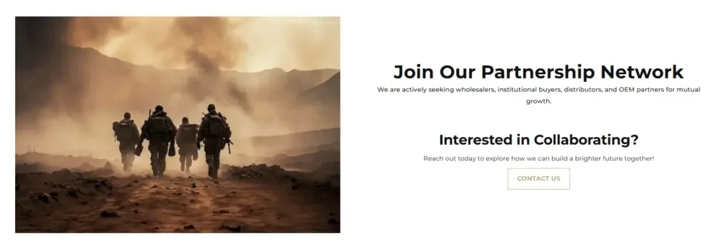
The design focus of this section is to create an open, friendly and cooperative brand atmosphere.
The page layout uses:
- More relaxed spacing between white space and content
- Scene pictures with more warmth and character
- Clear but not overemphasized action buttons
Our goal is for Rhino Rescue to be understood not just as a brand selling first aid equipment, but also as a partner in the entire safety, rescue and emergency response system.
Social Identity and Real Scenario Verification
Real users, real emergency scenarios
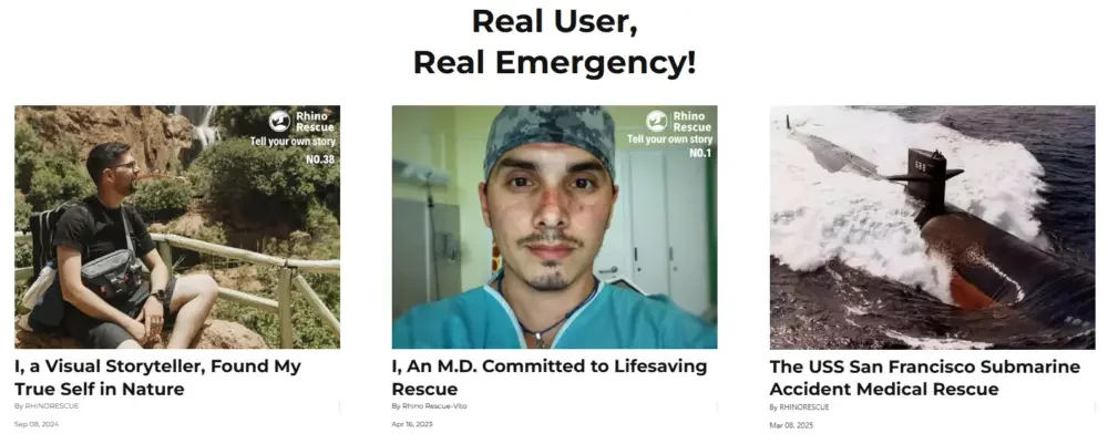
Real user stories and actual use cases are a very important part of building trust in your brand.
In this section, we pay more attention to the authenticity of the content rather than excessive packaging.
The main design methods include:
- Edit magazine-style content cards
- Natural, real photography pictures
- Clear visual distinction between different user stories
Through this content, a core message can be further conveyed to users: these products do not only exist in promotional pictures, but are professional equipment that are actually used by real users in real environments and emergency scenarios.