









Project overview
ESKUTE is an electric bicycle brand targeting the European market. Its products mainly cover usage scenarios such as urban commuting, outdoor riding and daily leisure travel. As the brand business and product lines continue to expand, the original online display needs to further strengthen the brand texture, product information expression and user purchasing experience. Therefore, the customer came to us and hoped to reorganize the overall visual and page structure of the website around the Shopify platform. The core requirements of the project include optimizing the visual hierarchy of the homepage, highlighting the performance and lifestyle value of electric-assisted bicycles, improving product display logic, and reducing user understanding costs through clearer navigation, product modules, and scenario-based content. We combined the browsing habits of European consumers with ESKUTE’s brand positioning to create a Shopify e-bike brand website experience that takes into account professionalism, lifestyle atmosphere and conversion efficiency.
| 서비스 | Industry | 플랫폼 |
| Website design and decoration | Sports and outdoor | shopify |
| Project requirements | target market | design style |
| Create a website that takes into account both brand presentation and sales conversion | 글로벌 | Simple and modern|Urban life|Natural vitality |
| project budget | Delivery content | Delivery time |
| ¥7300 | Website construction and full-site page design | 19 working days |
Project Challenges
The core challenge of this project is to simultaneously take into account the professional performance expression, brand lifestyle shaping and purchase conversion of electric bicycles within the limited page space. ESKUTE products involve battery life, motor power, configuration parameters and various riding scenarios. If there is too much information stacked up, it will easily cause page congestion and increase the cost of user understanding; however, if only the scene vision is emphasized, the professional credibility of the product will be weakened. Before starting the project, we first analyzed the European electric bicycle market, similar brand websites and high-converting Shopify stores. We also sorted out the browsing habits and purchasing concerns of target users, and planned the website information structure, page hierarchy, responsive layout, visual specifications and core CTA positions in advance to establish a unified direction for subsequent homepage, product page and mobile terminal design.
Home Page Design: Building the First Impression
The homepage is the most critical page in any Shopify store. For Eskute EU, we designed the homepage to be a brand narrative path with conversion as the core, guiding users from establishing interest at first sight to gradually entering product understanding and purchasing decisions.
Above the fold area: quickly establish visual impact
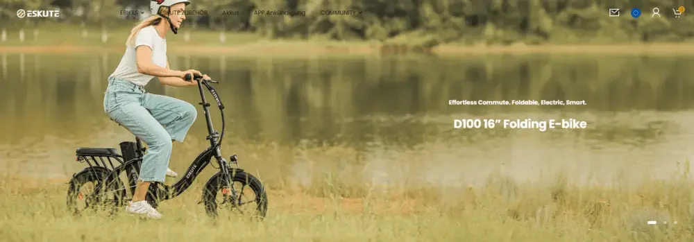
The first screen is the first interactive touch point for users after entering the website. Our design highlights include:
Full width lifestyle scene illustration
Using electric bicycle riding scenes in the real environment allows users to quickly understand the actual use of the product and enhance the sense of substitution.
Clear and powerful core title
Use concise and eye-catching titles to highlight product performance, free riding and travel experience, and quickly convey the brand’s core values.
Control the amount of text information
Avoid stacking too much text on the first screen to reduce users’ cognitive load and keep visuals, core information and action buttons clear.
Such a design can quickly establish an emotional connection and naturally guide users to the next step of browsing.
Product focus display module: reduce the difficulty of selection
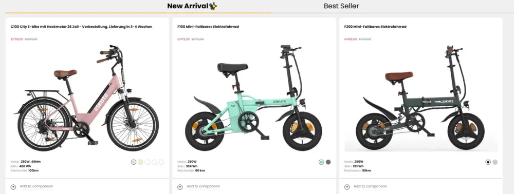
Instead of showing too many products to users at once, we adopt a modular product display method to make it easier for users to compare and choose.
Uniform and neat product cards
Maintain consistent image proportions, spacing, and information structure to make the entire product area clearer and more organized.
Visual display of core parameters
Key specifications such as battery capacity, cruising range, and motor power are directly displayed to help users quickly understand the differences between different models.
Delicate hover interaction
Enhance page interactivity with a slight hover effect without interfering with user browsing.
Clear prices and action buttons
Price and CTA buttons remain clearly visible, allowing users to quickly jump into product details or the purchase process once interested.
This module plays a key role in transitioning from “brand attraction” to “purchase decision”.
Lifestyle Narrative Module
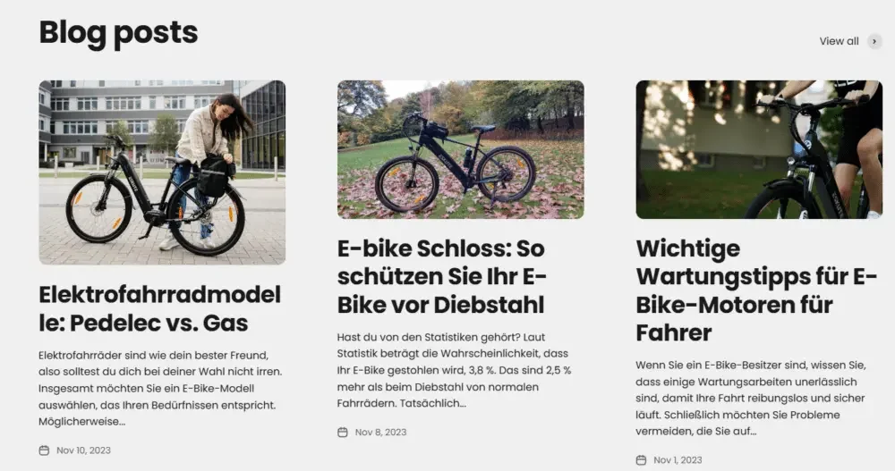
To make Eskute more than just a product website selling e-bikes, we included more lifestyle content to make the brand experience more complete.
Outdoor scene vision
Use natural scenery, city streets and real cycling environments to reinforce the brand’s lifestyle attributes.
Various usage scenarios
Products are displayed around different needs such as urban commuting, off-road cycling, and leisure travel, making it easier for users to find models and usage methods that suit them.
Concise and powerful auxiliary copywriting
Each visual module is paired with a short copy to explain the product value and scene advantages in fewer words.
Through this design approach, the website is no longer just a simple product catalog, but gradually forms a complete brand experience.
Product page design: both clear information and persuasiveness to purchase
If the homepage is responsible for attracting users’ attention, then the product page is responsible for driving the final purchase.
structured information hierarchy
We reorganized the information structure of the product page to ensure that users can quickly find the most important content.
Large size high definition product pictures
Through high-quality, multi-angle product vision, users can clearly understand the appearance, details and configuration of the vehicle model.
Clear product names and prices
Place the product title and price in a prominent position to reduce the time users spend looking for basic information.
List of core selling points
Use concise bullet points to present key features and benefits so users can scan them quickly.
Expandable detailed parameters
For more complex content such as technical specifications, dimensions, and battery information, a folded or unfolded structure is used for display.
This layered design retains complete information depth while avoiding showing users too much content at once.
Visual expression of product functions
Instead of relying on extensive text descriptions, we use a more intuitive visual approach to help users understand product functions.
Icon accessibility module
Combine some key selling points with concise icons to improve the efficiency of information identification.
Infographic layout
Through a combination of data, parameters and visual structures, more complex product performance is transformed into easier-to-understand information.
Product details close-up
Use partial enlarged pictures to highlight the motor, frame, battery, tires and other key components, allowing users to understand product quality more intuitively.
This visual expression can lower the threshold for understanding technical parameters.
Conversion-oriented page layout
Every key element in a product page is designed around increasing purchase conversions.
Fixed add to cart area
With the Sticky Add to Cart design, users can still make purchases at any time while browsing long pages.
Clear installment and delivery information
Place purchase-related information such as payment methods, installment options, and delivery policies in an easily discoverable location to reduce user concerns.
Promotions and Inventory Tips
Properly display limited-time offers, inventory status or promotional information to enhance users’ purchasing motivation.
These designs can reduce friction in the buying process and drive users to complete decisions faster.
Other page design: improve the overall website ecology
A high-converting Shopify store can’t just rely on the homepage and product pages, but also needs other pages to work together to build a complete shopping experience.
Product Collection Pages: Browse and Filter More Efficiently
We have unified planning for the Collection page.
Continue the home page visual system
Maintain consistency in fonts, spacing, image style, and overall visual language.
Add filtering and sorting functions
Help users quickly narrow down their choices by price, model, usage or other criteria.
Highlight the differences between different models
Clearly present the main parameters and positioning in the product display, making it easier for users to make horizontal comparisons.
About Us and Brand Pages: Creating Emotional Connections
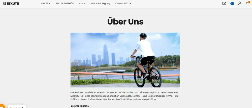
The brand page is not only used to introduce the company background, but also plays an important role in enhancing trust.
Deliver brand mission and values
Explain to users Eskute’s understanding of urban mobility, green transportation and cycling lifestyle.
Strengthen trust and authenticity
Enhance users’ recognition of the company through brand stories, real scenes and brand concepts.
Editable minimalist layout
Use a simpler, branded magazine-like layout to make the content more high-quality and readable.
Navigation and User Experience Process
In addition to the design of individual pages, we also reorganized the user browsing path of the entire website.
Simplified menu structure
Reduce unnecessary menu levels and make main product categories and important pages easier to find.
Establish clear classification logic
Reasonably group products according to product types, usage scenarios and user needs to reduce the difficulty for users to find products.
Mobile-first navigation design
Optimize menus, buttons, product browsing and page operation experiences for mobile users to ensure smooth access paths on different devices.
Through these optimizations, users can more naturally enter the category page, product page and purchase process from the homepage, reducing the sense of disorientation and improving the overall conversion efficiency.