Shopify product page design must first solve a specific problem: Can buyers clearly see the product on their mobile phone, select the correct specifications, and understand how much to pay, when they may receive the goods, and what are the conditions for returns before adding to the shopping cart? The page is beautiful but the information is scattered and buyers still have to look for it again and again. A checklist is provided below in actual order of purchase. It is suitable for retail product pages sold to overseas consumers; the display methods of different categories, sales regions, themes and applications should be based on the actual configuration of the store.
First check the first screen of the mobile phone: whether the product, price and purchase entrance are easy to find
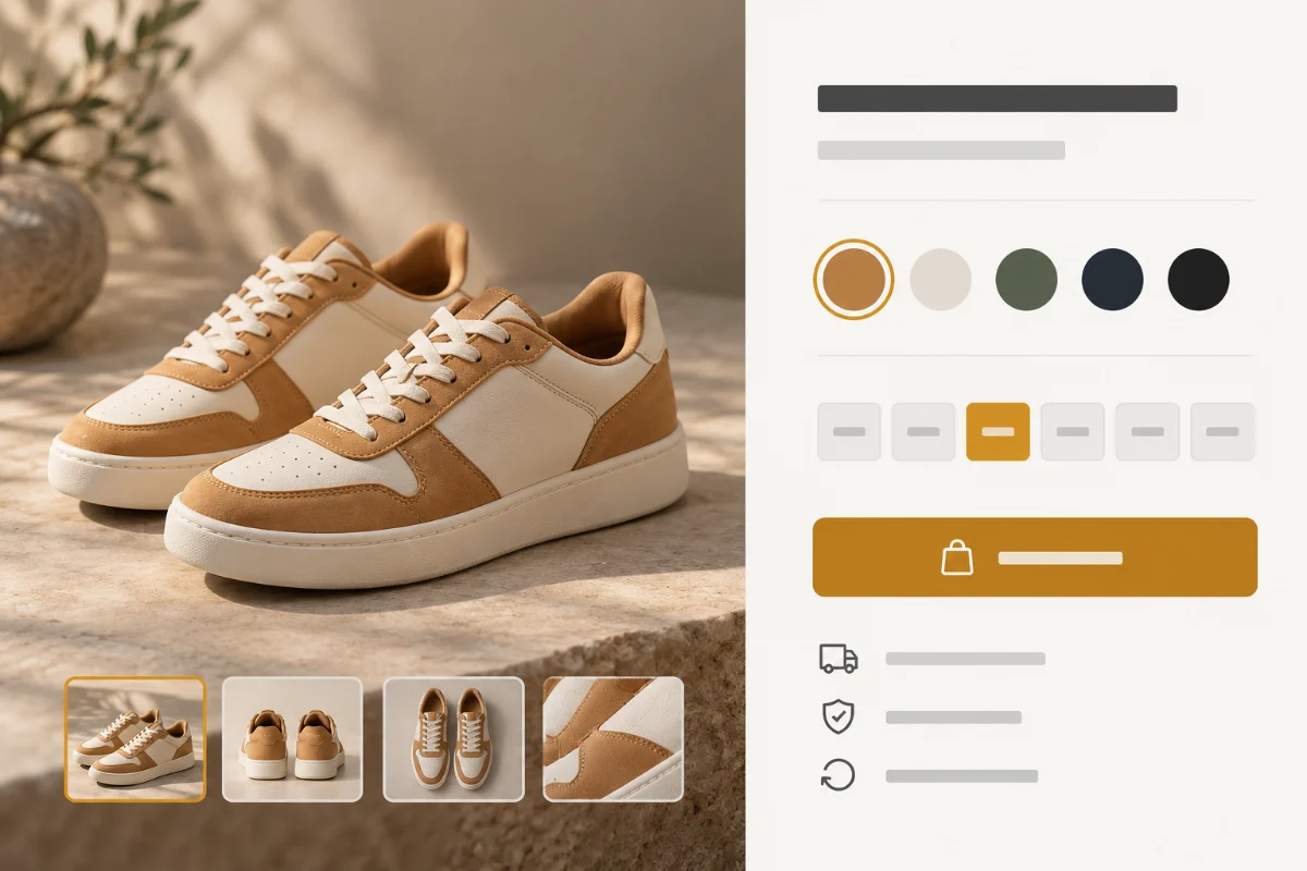
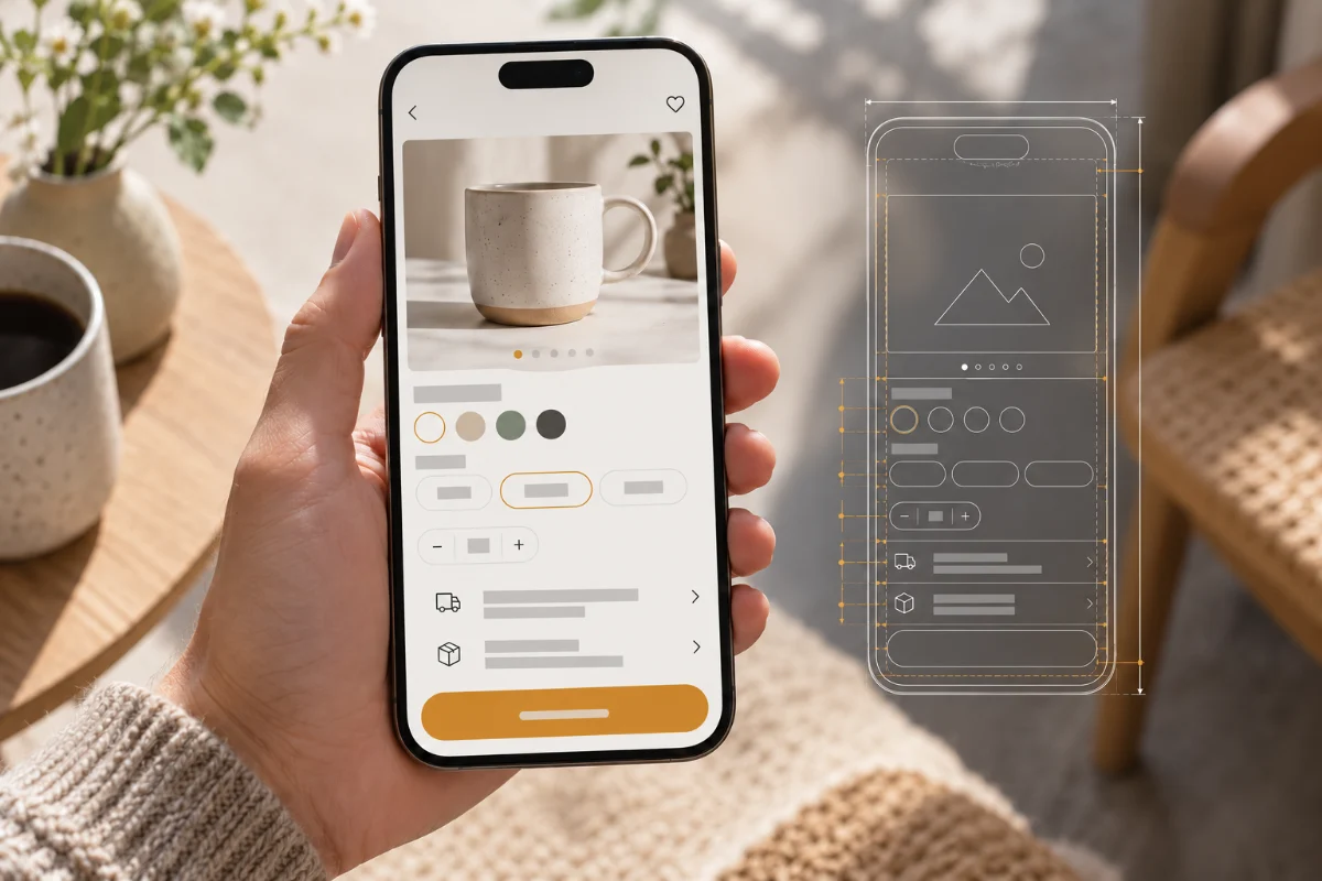
When entering a product detail page from an advertisement or category page, buyers usually first confirm “is this what I want?” Place a clear product name, a recognizable main product image, current selling price, optional specifications and a buy button in an easily discoverable location. If there is an underlined price in the promotional price, the marking method should be consistent with the real event; when there are different specifications and prices, do not let the first-screen price and the final option price conflict with each other. The selling points can be distilled down to a few sentences and the full materials, care and sizing instructions should remain below for those who need them.
Use a mobile phone to complete the first screen walkthrough
After opening the product page, without scrolling down, record the product name, main product image and price you see; scroll down again and observe how long it takes to find the specification entry and add purchase button. This does not require all content to be squeezed onto the same screen, but rather letting people know where to go next. Check out scenarios where narrower screens, longer localized titles, and price discounts all come together. If the fixed add-on column blocks the specification options or return entry, the layout should be adjusted instead of just reducing the font size. Shopify Product page guide Clear pictures, purchase information and mobile experience are also listed as content that needs attention.
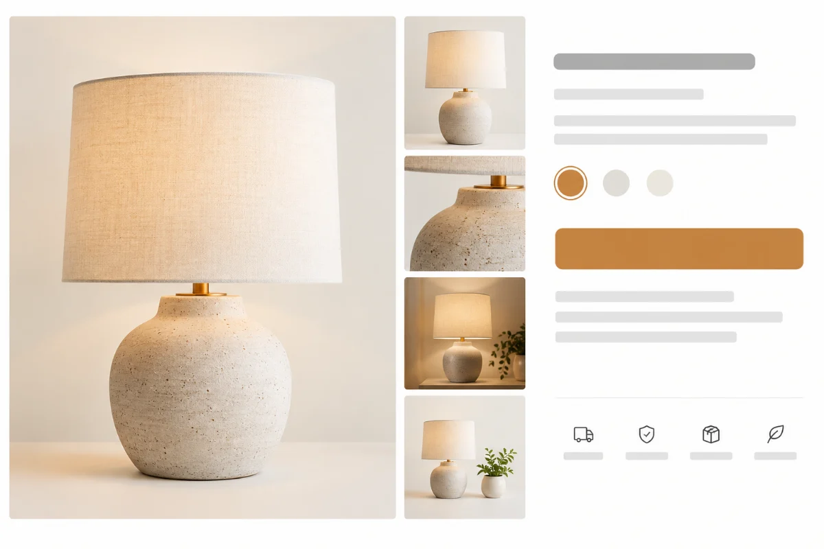
Pictures and variations answer “Which one did I choose?”
Product pictures should at least undertake several different tasks: the main product image helps identify the style, the side or back shows the structure, the detail pictures illustrate the material and workmanship, and the size reference or usage scene helps judge the proportion. Don’t fill a gallery with multiple nearly identical renderings, and don’t leave out text descriptions of size, color, or care restrictions that are only found in images. The image’s alt text should accurately describe the visible content and accommodate visitors who cannot load the image or who use a screen reader.
After switching colors or sizes, check the page feedback item by item
On the same product page, select colors, sizes, and other available combinations in sequence, and observe whether the option name, main product image, price, stock status, and purchase button change simultaneously. There is a functional boundary that needs to be noted: Shopify official Variation image help documentation Note that each variant can be assigned one image; more related images can be placed in the product media library. It cannot be assumed that the system will automatically switch the entire set of images for each variant. Additional effects implemented by the theme or application should be tested one by one in the real store. If the product information has not been sorted out completely, you can first look at the Product release and listing services , checking specifications, media, and descriptions as one document.
Especially test the situation where “the picture shows it is in stock, but the current size is out of stock”. If a combination is unavailable for purchase, the page should clearly indicate that the current selection is unavailable, rather than asking buyers to click to add to purchase before getting a vague error message. For products that require size judgment, such as clothing, place the size chart near the specification selection and indicate the measurement unit and method; for equipment products, compatible models are more useful than the vague “fits most devices”.
Shipping costs and return information must be clarified before purchasing.
“Free shipping,” “delivery within a few days,” and “return support” are not universal copywriting that can be applied. When selling to different countries or regions, the fees, delivery methods and estimated timeliness may be different; if the shipping cost must be calculated by address at checkout, clearly state “calculated at checkout” and make it easy for buyers to find the delivery policy. If you offer free shipping for a full purchase, clearly state the applicable areas, order thresholds and exceptions. Don’t let the icon imply that all orders are free. When the destination estimate can be displayed on the page, check whether the default region is consistent with the buyer’s actual delivery location.
The return instructions should answer when the deadline starts, what status can be returned, which products are exceptions, who bears the return shipping costs, and how to initiate an application. The product page is suitable for giving a brief summary related to the product and then linking to the complete policy; the policy content must be consistent with the checkout page, help page and customer service. Shopify Store policy settings instructions The presentation on the policy page and checkout is introduced, but whether the specific product theme automatically displays the entrance still needs to be confirmed at the store front desk.
The purpose of these two types of information is not to pile the full text of the policy next to the purchase button, but to allow buyers to see key restrictions when making a decision and to further view the complete terms. Exceptions especially need to be eye-catching and accurate for custom-made products, pre-sale products, or categories with high cross-border return costs. Merchants should fill in the content based on their own true policies and cannot directly copy other people’s refund promises.
For example, when the same product is sold in multiple countries, don’t just display an “Estimated Delivery” label without a region description. Fill in the delivery location, billing method and order processing time actually supported by the store; if the accurate cost can only be given at checkout, the calculation process should be explained in advance. Remote area surcharges and return addresses that are often asked by customer service should also be clearly stated in the complete policy.
Make a product page acceptance form using buyers’ questions
The following form is suitable for review by design, operations and customer service before going online. It compares buyer decision-making issues and page operations, and is not a guaranteed function of a certain theme. Every line is double-checked on real merchandise, real sellable combinations, and the narrow screen of a mobile phone.
| buyer questions | The information that the page should display | Mobile phone acceptance action |
|---|---|---|
| What does the product look like? | Clear main product image, structural details, and proportion reference | Zoom the main product image and switch galleries to see if the text is still readable |
| Which specification did I choose? | Current colors, sizes, pictures, prices and availability | Switch combinations one after another and watch for feedback; test out-of-stock options |
| How much does it cost to deliver? | Applicable regions, shipping rules, or checkout calculation instructions | Change the destination and check the information on the product page and checkout page |
| Can I return it if it doesn’t fit? | Deadlines, exceptions and full policy portal | Click the policy link to check the applicable conditions for this product |
| Add to cart? | Button state, success feedback and selected specifications | Check the items in your drawer or shopping cart after adding a purchase |
Conduct a mobile phone check based on the real purchase path
Take a product with multiple colors and sizes, enter the product detail page from the category page, select the color first, and then select the size. At this point, see if the picture, price, stock tip, and button status still point to the same combination. Then click Add Purchase and check the product name, specifications, quantity and price in the pop-up shopping cart drawer or shopping cart page. Finally, before entering checkout, check whether shipping instructions and returns policy can be found. In another round, select the out-of-stock combination, and the confirmation page will not add unavailable specifications to the shopping cart as normal products.
This path should work on at least one narrow phone size, and also check for click areas, image loading, pop-up closing, and back buttons. Stores selling internationally should also switch the target delivery country or region and check whether the currency and delivery conditions match. If the product page, shopping cart, and checkout instructions are inconsistent, give priority to correcting the real policy and product data, and then adjust the icon, copywriting, and component positions. This site’s previous Shopify product data checklist It can be used to continue to check the consistency of public product information and data sources; this article focuses on whether buyers can understand and operate on the product detail page.
Conclusion: Fix the product page according to the questions buyers will ask
A good Shopify product page design doesn’t just rely on an exquisite main product image. First, make sure that the product and specifications are understandable. After switching options, the pictures, prices, and availability are consistent; then put shipping costs, timeliness, and return conditions where buyers need to make decisions; and finally, use your mobile phone to walk through the real path from selecting specifications to additional purchases. Each item is based on the store policy, theme and target market, and will be retested after revision. If you are planning a new store or revising an existing product detail page, you can click Shopify e-commerce website building services Understand the page structure, product information, and the scope of collaboration for online acceptance.