


소개
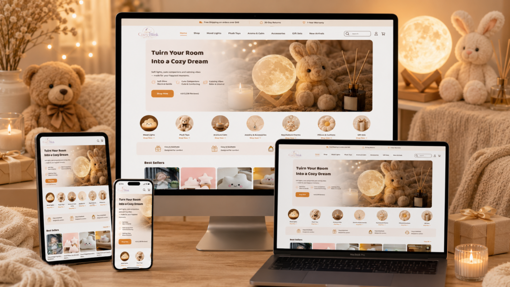
Cozy Blink presents more than a simple online store. It creates a warm, gentle, and emotionally driven shopping environment for customers who want soft lights, plush toys, calming scents, accessories, and thoughtful gifts. From the first screen to the footer, the website uses a consistent visual language built around comfort, softness, warmth, and easy browsing. As designers, we see this website as a strong example of how a lifestyle e-commerce brand can use mood, structure, and visual storytelling to make small products feel more meaningful.
The overall design does not rely on aggressive sales pressure. Instead, it builds a soft emotional world. Warm beige colors, rounded shapes, glowing light effects, cute product photography, and friendly typography all work together to make the visitor feel relaxed. This matters because Cozy Blink sells products that connect strongly with feelings: a cozy bedroom, a sweet gift, a peaceful evening, a cute companion, or a small moment of self-care. The design supports that emotional purpose from beginning to end.
As designers, we also notice how the page balances atmosphere and conversion. Every section looks gentle, but every section also has a clear function. The hero banner introduces the brand mood. The category icons help users shop quickly. The best-seller area builds product interest. The promotional cards create lifestyle desire. The review section builds trust. The footer turns the final area into both a navigation hub and a gifting reminder. This structure helps customers move naturally from inspiration to action.
| 배송 시간 | 범주 | 웹사이트 유형 |
| 7일 | Gift | 워드프레스 |
| 참여 디자이너 | 비용 | 효과 |
| 낸시 | $500 | Sales📈233% |
Hero Banner: Creating An Immediate Cozy Mood
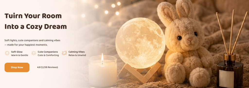
Why We Start With A Warm Emotional Scene
The first hero banner sets the emotional direction for the entire website. Instead of using a plain product image or a simple discount message, we designed the opening screen as a lifestyle moment. The moon lamp, plush bunny, candle, soft blanket, and aroma diffuser appear together in one warm scene. This combination immediately tells customers what kind of world Cozy Blink belongs to: soft lighting, cute companions, relaxing scents, and peaceful home moments.
We placed the main headline on the left side because users usually scan from left to right on desktop layouts. This gives the message strong visibility before the visitor focuses on the image. The headline “Turn Your Room Into a Cozy Dream” communicates the brand promise clearly. It does not only describe products; it describes a transformation. The customer is not simply buying a lamp or a plush toy. The customer is imagining a softer room, a better evening, and a more comforting personal space.
How Color And Light Support The Brand Feeling
The color palette plays a major role in this section. We used warm beige, soft cream, amber lighting, and brown typography to create an intimate feeling. These tones feel gentle and familiar, which matches the product categories. Bright white or cold gray would have made the page feel more commercial. Dark black would have created too much contrast for a cozy gift brand. Instead, the soft warm palette makes the website feel calm and approachable.
The glowing moon lamp also works as the visual center. It creates a natural light source inside the image, so the page feels warm rather than flat. The candle and background string lights reinforce this glow. As designers, we want the customer to feel the product atmosphere before reading too much copy. The light itself becomes part of the selling message.
Why We Use Short Feature Points
Under the subtitle, we placed three short feature points: soft glow, cute companions, and calming vibes. These points summarize the whole store in a simple way. Customers can understand the product world within seconds. The icons add a friendly rhythm and make the information easier to scan.
We avoided long paragraphs in the hero area because the top screen should not feel heavy. The visitor needs a quick emotional reason to stay and a clear action to continue. The orange “Shop Now” button creates that action. Its rounded shape feels friendly, while its stronger color makes it stand out from the soft background. This balance between softness and clarity helps the hero banner support both branding and conversion.
Category Icons: Making Product Discovery Feel Friendly
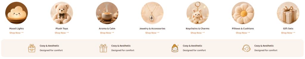
Why Circular Images Work For This Brand
The next section uses circular category images for Mood Lights, Plush Toys, Aroma & Calm, Jewelry & Accessories, Keychains & Charms, Pillows & Cushions, and Gift Sets. As designers, we chose circular images because they feel softer than sharp rectangular boxes. A circle has no hard corners, so it naturally matches the cute, cozy, and comforting personality of the brand.
Each category image uses a similar warm tone. This consistency prevents the section from feeling messy even though it introduces many different product types. The customer sees a broad product range, but the visual system keeps everything unified. This is important for lifestyle stores because too many unrelated product photos can weaken the brand identity. Here, the consistent lighting and soft backgrounds make different categories feel like part of the same cozy world.
Why We Place The Text Under Each Image
We placed the category title and “Shop Now” link directly under each image to create a simple visual path. The customer sees the product mood first, then reads the category name, then understands the action. This structure feels natural and reduces decision friction.
The “Shop Now” links use a warm accent color. They do not compete aggressively with the main hero button, but they still tell users that each category is clickable. This is a smart approach for a homepage because customers may enter the site with different intentions. Some may want a mood light. Some may want a plush toy. Some may need a gift set. The category row helps each visitor find a relevant direction quickly.
Why We Add The Value Bar Below
Below the category icons, we added a soft background value bar with icons and short benefit text. This area gives the page a stronger trust layer without interrupting the cozy mood. The repeated “Cozy & Aesthetic” message reinforces the brand’s promise of comfort and visual appeal.
The value bar also breaks the page into a more structured rhythm. Without it, the homepage could move too quickly from categories into products. With it, the user receives a small reassurance before shopping further. The light background block separates the content clearly while keeping the tone gentle. As designers, we use this kind of section to reduce uncertainty and remind customers that the store is not just cute, but also thoughtful and experience-focused.
Best Sellers: Turning Popular Products Into Quick Decisions
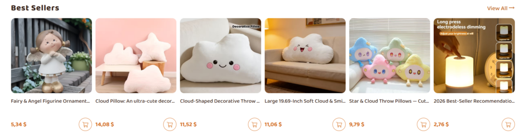
Why We Highlight Best Sellers Early
After the brand mood and category entry, the Best Sellers section introduces specific products. This order matters. We first create emotion, then we guide users into discovery, and then we show products that already feel popular or trusted. The “Best Sellers” title works as a simple social signal. It tells customers that these products are worth attention because other shoppers likely care about them.
We placed the “View All” link on the top right to give customers a secondary path. This keeps the section clean while still allowing deeper browsing. Users who want to scan can stay on the homepage. Users who want more options can enter the full collection.
Why The Product Cards Use Large Images
The product images take up most of the card area because Cozy Blink products are highly visual. Customers need to see softness, shape, lighting, texture, and cuteness. A small thumbnail would not communicate enough emotional value. By using large product images with rounded corners, we make each item feel more desirable and giftable.
The product row includes plush figures, cloud pillows, decorative cushions, cute character pillows, and a recommendation-style product image. These items share a soft visual language, but each one has a different personality. This gives the section variety without losing consistency.
Why Pricing And Cart Icons Stay Simple
We kept product names, prices, and cart icons easy to read. The layout avoids visual clutter and gives customers just enough information to make a quick judgment. The orange price color connects with the call-to-action system used across the page. This repeated accent color helps customers understand what matters: shop links, prices, and action buttons.
The small cart icons provide a direct action point. This is especially useful for best sellers because some customers may already be ready to buy after seeing a cute or low-priced item. At the same time, the cart icon does not dominate the card. The product image remains the emotional lead, while the icon supports conversion quietly.
Promotional Category Cards: Building Lifestyle Desire
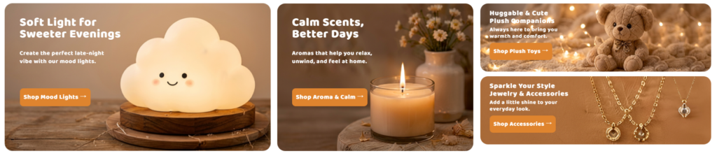
Why We Use A Mixed Card Layout
The promotional card section uses a more dynamic layout. Two larger cards appear on the left and center, while two smaller stacked cards appear on the right. This design creates visual hierarchy. The larger cards carry the main mood categories: mood lights and aroma products. The smaller cards introduce plush toys and accessories without making the page feel crowded.
As designers, we use mixed card sizes to avoid a repetitive homepage. If every section used the same row structure, the page would feel predictable. Here, the promotional banners add movement and make the browsing experience more engaging. They also allow different product stories to coexist in one section.
How Each Card Creates A Different Emotional Moment
The mood light card focuses on soft light for sweeter evenings. The large glowing cloud lamp becomes the main attraction. The message speaks to late-night comfort and personal atmosphere. This design works because lighting products sell best when customers can imagine the feeling they create in a room.
The aroma card uses a candle, flowers, and soft background blur to communicate relaxation. Instead of showing a product on a plain background, the card shows a peaceful moment. This helps customers connect aroma products with daily unwinding and emotional comfort.
The plush toy card uses a teddy bear and warm lights to communicate companionship. The message “Huggable & Cute Plush Companions” gives the product a feeling of emotional support. This approach works well for plush products because customers often buy them for comfort, decoration, or gifting.
The jewelry and accessories card uses close-up gold-toned imagery to add sparkle and elegance. This card slightly expands the brand world beyond soft home goods. It shows that Cozy Blink can include small stylish items while still keeping the cozy, warm visual tone.
Why The Buttons Stay Consistent
Each card includes a clear orange button. This consistency helps users understand that every banner leads to a category. The buttons use simple verbs such as “Shop Mood Lights,” “Shop Aroma & Calm,” “Shop Plush Toys,” and “Shop Accessories.” This direct language removes confusion.
We also placed the text directly over the images with strong contrast. The white text feels light and clean against the warm backgrounds. The copy stays short so the images can continue carrying the emotion. As designers, we want these banners to work like mini landing pages: each one gives a mood, a reason, and a next step.
Customer Reviews: Building Trust Through Warm Proof
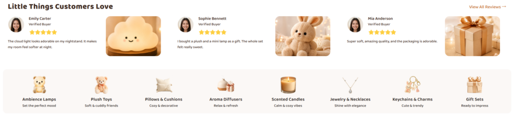
Why Reviews Appear Before The Footer
The review section appears after products and promotional banners, which makes strategic sense. By this point, the customer has seen the brand mood, categories, best sellers, and product stories. The next question becomes trust: Do people like these products? Are they giftable? Do they feel as cute and cozy as they look?
The section title, “Little Things Customers Love,” uses friendly language rather than a formal review heading. This makes the section feel personal. It also fits the product type. Cozy Blink sells small objects that create emotional value, so “little things” feels on-brand.
Why We Pair Reviews With Product Images
Each review includes a customer avatar, name, verified buyer label, star rating, review text, and a related product image. This combination makes the feedback feel more believable and more visual. A plain review list can feel dry, but product images keep the section connected to the store’s soft aesthetic.
The reviews are short and easy to scan. This matters because users do not want to read long blocks of text on a homepage. They want quick reassurance. The star ratings create instant trust, while the short comments communicate specific feelings such as adorable design, gift appeal, softness, quality, and cute packaging.
How The Lower Category Strip Extends The Shopping Path
Below the reviews, the design adds another category strip with small product icons. This is a smart transition. After users feel reassured by reviews, the page gives them another chance to shop. The strip includes categories such as Ambience Lamps, Plush Toys, Pillows & Cushions, Aroma Diffusers, Scented Candles, Jewelry & Necklaces, Keychains & Charms, and Gift Sets.
This section works like a secondary navigation system. It helps users who skipped the top categories or who became more interested after reading reviews. The soft background container visually groups the icons and keeps the layout calm. Each category includes a short supporting phrase, such as “Set the perfect mood” or “Soft & cuddly friends.” These micro-descriptions help users understand the emotional value behind each category.
Footer And Gifting Area: Ending With Warmth And Trust
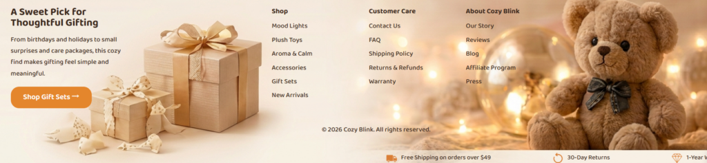
Why The Footer Feels Like A Promotional Section
The final section does more than list links. It combines a gifting banner, navigation columns, brand support pages, customer care links, copyright information, and trust badges. As designers, we see this as a strong choice because many users reach the footer when they are still deciding what to do next. Instead of ending with a plain footer, the site ends with another warm brand moment.
The left side promotes gift sets with the headline “A Sweet Pick for Thoughtful Gifting.” This message reminds customers that Cozy Blink products work well for birthdays, holidays, care packages, and small surprises. The gift boxes in the background support that message visually. The orange “Shop Gift Sets” button gives the footer a clear conversion path.
Why The Center Navigation Uses Clear Columns
The middle area organizes links into three groups: Shop, Customer Care, and About Cozy Blink. This structure improves usability. Customers can quickly find product categories, support information, or brand pages without searching through a long menu.
The Shop column includes core categories such as Mood Lights, Plush Toys, Aroma & Calm, Accessories, Gift Sets, and New Arrivals. The Customer Care column includes Contact Us, FAQ, Shipping Policy, Returns & Refunds, and Warranty. The About section includes Our Story, Reviews, Blog, Affiliate Program, and Press. This organization helps customers feel that the store has complete support and a clear brand presence.
Why The Teddy Bear Strengthens Brand Memory
The large teddy bear on the right adds personality to the footer. It prevents the final section from feeling purely functional. The warm lights and soft textures continue the emotional story that started in the hero banner. This creates a strong sense of visual closure. The customer begins the page with a cozy dream and ends the page with thoughtful gifting and a cute companion.
Why Bottom Trust Messages Matter
The bottom trust bar includes service highlights such as free shipping on qualifying orders, 30-day returns, and a 1-year warranty. These messages address common purchase concerns at the final stage of browsing. Customers may like the products, but they still need confidence before purchasing. Shipping, returns, and warranty information can reduce hesitation.
We placed these trust points at the bottom because they work as a final reassurance. They also repeat the trust messages used near the top of the site, creating consistency across the experience. Repetition matters in e-commerce design. When customers see the same supportive messages in multiple places, they remember them more easily.
Overall Design Strategy
A Soft Visual Identity From Start To Finish
The strongest part of the Cozy Blink design is consistency. The homepage does not jump between unrelated styles. It stays within a warm, soft, cute, and comforting design system. The colors, rounded shapes, glowing lights, product photography, and friendly type all support the same brand emotion.
This consistency helps customers understand the store quickly. They do not need to guess what Cozy Blink sells or how the brand wants them to feel. Every section communicates comfort, sweetness, and thoughtful gifting.
A Clear Balance Between Emotion And Shopping
The website also balances emotional storytelling with practical shopping structure. The hero section inspires. The category icons guide. The best sellers show specific products. The promotional banners deepen desire. The reviews build trust. The footer supports navigation and final reassurance.
This flow matters because good homepage design should not only look beautiful. It should move users forward. Cozy Blink does this by giving each section a clear purpose. No section feels random. Each part answers a different customer need: What is this brand? What can I buy? What is popular? How will it fit my life? Do people love it? Where can I go next?
A Design Built For Gift-Focused Buying
Cozy Blink also uses design to support gift purchasing. Gift shoppers often need emotional confidence. They want items that feel thoughtful, cute, safe, and easy to choose. The website supports that mindset through warm imagery, gift-set messaging, customer reviews, and soft category navigation.
The design avoids making the shopping process feel complicated. It uses short titles, simple buttons, direct categories, and easy product scanning. This is important because gift buyers may not know exactly what they want at first. A clear, emotional layout helps them discover ideas quickly.
결론
Cozy Blink shows how a cozy lifestyle store can turn simple products into a complete emotional shopping experience. The design uses warm visuals, soft lighting, rounded shapes, friendly copy, and clear navigation to create a calm and memorable brand world. Each section plays a specific role: the hero banner builds the first emotional connection, the category icons simplify discovery, the best sellers encourage product interest, the promotional cards create lifestyle desire, the reviews build trust, and the footer supports gifting, navigation, and final reassurance.
As designers, we value this approach because it proves that e-commerce design should do more than display products. A strong online store needs mood, structure, trust, and a clear path to action. Cozy Blink succeeds because it makes customers feel something first, then guides them smoothly toward shopping. For brands that want a warm, gift-focused, and conversion-friendly website experience, this design direction offers a strong reference. This is the kind of thoughtful independent website design work that AIRSANG helps businesses create with a stronger visual identity and a clearer shopping experience.


완전한 전자상거래 시스템을 갖춘 워드프레스 웹사이트 또는 기업 사이트를 디자인하고 구축하세요.
가격 범위: $200.00~$2,500.00custom-requirements-or-special-quotations
원래 가격: $2.00.$1.00현재 가격: $1.00. 아마존 가정용 물리치료 기기 메인 이미지 디자인 설명
소개 소개: 아마존에서 홈 테라피 기기의 신뢰할 수 있는 이미지 구축 아마존에서 홈 테라피 기기의 기본 이미지를 디자인할 때 기본 ...

아마존 립스틱 전환을 위한 메인 이미지 디자인
소개: 소개: 아마존에서 판매되는 립스틱 메인 이미지 디자인하기 아마존 립스틱의 메인 이미지를 디자인할 때 우리의 책임은 그 이상입니다.

해커들이 워드프레스 관리자 이메일을 훔치는 방법(그리고 이를 막는 방법)
불편한 진실부터 말씀드리자면, 워드프레스 관리자 이메일은 생각보다 훨씬 더 많이 공개되어 있습니다. 그들은 그것을 좋아합니다. 해커에게 여러분의...

아마존 리퀴드 파운데이션 메인 이미지 변환의 특징은 무엇일까요?
서론 아마존 리퀴드 파운데이션의 메인 이미지 디자인은 단순히 제품을 아름답게 보이게 하는 것만이 아닙니다. 아마존에서 메인 이미지와...

필터 카트리지 제품을 위한 효과적인 아마존 메인 이미지 디자인하기
서론 아마존 메인 이미지 디자인은 단순히 제품을 매력적으로 보이게 하는 것만이 아닙니다. 명확성, 신뢰, 그리고 즉각적인 이해를 제공하는 것이 중요합니다. 특히...

워드프레스에 대한 리플레이 공격: 실제 위협인가, 과장된 신화인가?
먼저 한 가지를 분명히 해두죠. 리플레이 공격은 겉보기에 무섭지 않습니다. 비밀번호를 날려버리지도 않고, 초록색 해커 텍스트가 사방에 흩날리는 악성 코드를 주입하지도 않습니다. 그저 교묘하게 이루어질 뿐입니다.

WordPress 페이지를 손상 없이 복제하는 방법
솔직히 말해봅시다. 때로는 새 페이지를 만들고 싶지 않을 때가 있죠. 그냥 기존 페이지를 약간만 다르게 하고 싶을 때가 있어요. 레이아웃도, 블록도, 설정도 그대로요. 왜냐하면...

반려동물 관련 워드프레스 테마 5가지 비교
서론 반려동물 관련 워드프레스 테마를 선택하는 것은 단순한 디자인 결정 이상의 의미를 지닙니다. 사용성, 확장성, 그리고 장기적인 비즈니스 성장에 직접적인 영향을 미치기 때문입니다. 반려동물 관리 및 관련...

수영복 온라인 쇼핑몰 테마 5가지 비교
서론 수영복이나 란제리 독립 매장에 적합한 테마를 선택하는 것은 단순히 시각적인 결정에 그치는 것이 아니라, 전환율, 확장성, 그리고 장기적인 성공에 직접적인 영향을 미칩니다.

워드프레스에서 댓글 기능을 끄는 방법 (정신줄 놓지 않고)
워드프레스 댓글에 대해 이야기해 봅시다. 이론적으로 댓글은 훌륭합니다. 토론을 장려하고, 커뮤니티를 형성하며, 웹사이트에 생동감을 불어넣습니다. 하지만 현실은 어떨까요? 댓글은 종종 문제를 야기하기도 합니다...

과학 중심 브랜드를 위한 확장 가능한 워드프레스 웹사이트 구축: 아미노USA 프로젝트
서론 오늘날의 디지털 환경에서 웹사이트는 단순히 제품을 나열하는 공간 이상의 의미를 지닙니다. 규제 산업이나 연구 중심 산업에서 활동하는 과학 기반 브랜드에게 웹사이트는 더욱 중요한 역할을 합니다.

글로벌 블레이드 브랜드를 위한 확장 가능한 쇼피파이 스토어 구축: 쿨카타나 프로젝트
서론: 국경을 넘나드는 전자상거래에서 Shopify 웹사이트는 단순한 매장 이상의 의미를 지닙니다. 특정 문화권에서 사업을 운영하는 브랜드의 경우, 웹사이트는 단순한 판매 공간을 넘어 훨씬 더 많은 기능을 수행해야 합니다.

포켓몬 카드 판매를 위한 높은 전환율을 자랑하는 쇼피파이 스토어 디자인하기
서론 수집품 전자상거래, 특히 포켓몬 트레이딩 카드 게임(TCG) 시장에서 웹사이트는 단순히 제품 목록을 나열하는 것 이상의 역할을 해야 합니다.

맞춤형 오프라인 브랜드에 최적화된 전환율 높은 쇼피파이 디자인
서론 오늘날 경쟁이 치열한 전자상거래 환경, 특히 맞춤형 선물 및 수집품 분야에서 Shopify 웹사이트는 단순히 제품을 전시하는 것 이상의 역할을 해야 합니다. ...

Shopify 고객 지원팀에 문의하는 방법: 간단하고 스트레스 없는 가이드
쇼피파이 스토어 운영은 흥미진진해야지 혼란스러워서는 안 됩니다. 궁금한 점이 생기거나 문제가 발생하여 진행이 늦어질 때, 쇼피파이는 상황에 따라 다양한 지원 경로를 제공합니다.

쇼피파이 스토어 비활성화 방법: 명확하고 실용적인 가이드
쇼피파이 스토어를 비활성화하는 것은 복잡하지 않지만, 많은 판매자가 간과하는 몇 가지 결과가 따릅니다. 이 가이드에서는 비활성화 과정을 간단하고 유익하게 설명합니다.

프리미엄 꽃집 브랜드를 위한 쇼피파이 웹사이트 디자인 사례 연구
서론 오늘날 경쟁이 치열한 전자상거래 환경에서 Shopify 웹사이트는 단순히 제품을 보여주는 것 이상의 역할을 해야 합니다. 브랜드 가치를 즉시 전달하고 사용자를 안내해야 합니다...

Shopify 디자인 사례 연구: 레트로 게임 스토어
서론: 경쟁이 치열한 전자상거래 환경에서 시각적 명확성과 감정적 연결은 방문자가 고객이 될지 여부를 결정짓는 중요한 요소입니다. 특히 다음과 같은 경우에 더욱 그렇습니다...