


소개
In the fast-growing peptide and research chemicals market, credibility, clarity, and structure are everything. When users land on a website in this niche, they are not just browsing—they are evaluating trust, product quality, and scientific legitimacy within seconds.
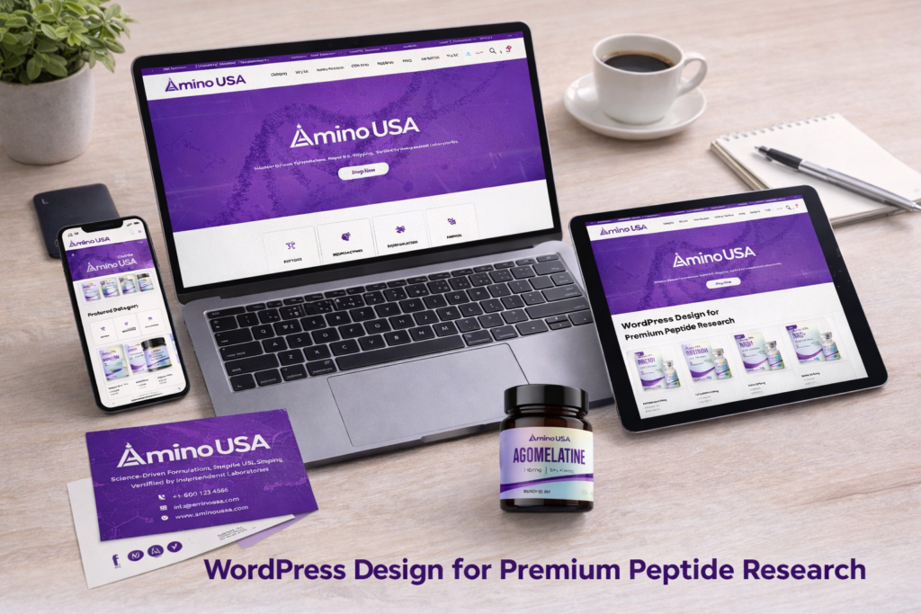
That’s exactly the challenge behind aminousa.com—a 워드프레스-based website designed to showcase premium peptide products while delivering a clean, research-focused user experience.
In this case study, we’ll walk through how we built this WordPress website from the ground up, how we structured its pages for both usability and conversion, and how thoughtful design decisions were integrated into the build process. While the homepage plays a central role, we’ll also explore how supporting pages contribute to the overall ecosystem.
| 배송 시간 | 범주 | 애플리케이션 플랫폼 |
| 22일 | health products | 워드프레스 |
| 참여 디자이너 | 비용 | 효과 |
| 린 장 | $2300 | Store traffic📈214% |
Understanding the Project Goals
Before any design or layout decisions, we aligned on a few critical objectives:
Core Goals
- Build a professional and trustworthy WordPress website
- Create a clear product categorization system
- Support conversion through structure, not aggressive selling
- Deliver a research-oriented browsing experience
- Ensure scalability for future product expansion
This project required a balance: the site needed to feel scientific and authoritative, but also modern and accessible.
Our WordPress Website Construction Approach
Structuring Before Designing
One of the biggest mistakes in website projects is starting with visuals instead of structure. For this project, we reversed that.
We began by mapping out:
- Product hierarchy (Peptides, Neuroactives, Bioregulators, Modulators)
- User entry points (homepage, search, category navigation)
- Conversion paths (product discovery → product detail → checkout)
This structure became the foundation of the WordPress build.
Homepage as the Conversion Hub
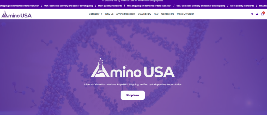
The homepage was designed and built as the central hub of the entire experience.
Key Sections We Built:
1. Hero Section (Trust First)
- Clean banner with minimal distractions
- Focus on scientific credibility and product quality
- Clear headline emphasizing purity and testing
2. Product Category Navigation
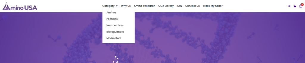
- Structured entry into key product groups
- Avoided overwhelming users with too many choices
- Designed for quick scanning and clarity
3. Featured & New Arrivals
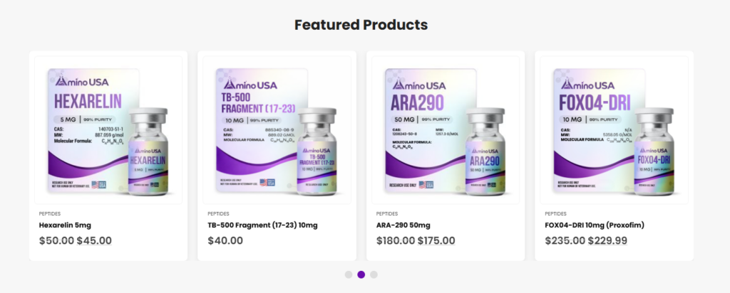
- Dynamic product grids
- Highlighted key items without clutter
- Balanced spacing and typography for readability
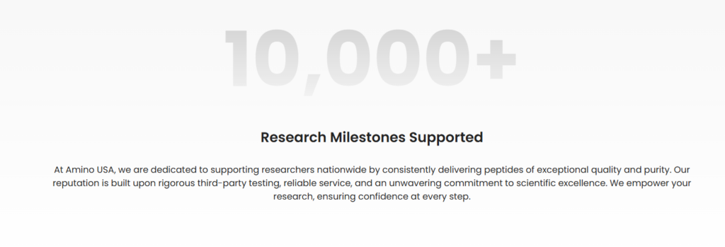
4. Trust-Building Blocks
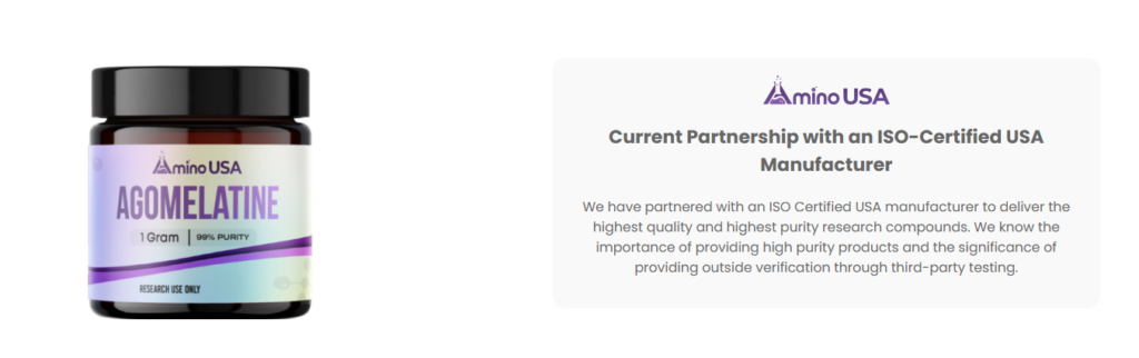
- Third-party testing mentions
- Quality assurance messaging
- Subtle but powerful credibility signals
5. Brand Story Section
- Positioned the brand as science-driven and reliable
- Focused on transparency and manufacturing standards
Category Pages That Guide, Not Confuse
Instead of treating category pages as simple product lists, we built them as guided experiences.
What We Implemented:
- Clear product grouping
- Consistent card design across all categories
- Easy scanning with structured spacing
- Visual hierarchy to highlight key products
Each category page acts as a secondary landing page, not just a directory.
Product Pages Focused on Clarity and Trust
In this niche, product pages must do more than sell—they must reassure.
Key Elements We Built:
- Clean product image layout
- Clear product naming and structure
- Organized specifications and descriptions
- Supporting trust signals (quality, testing, origin)
We avoided unnecessary visual noise and focused on information clarity.
Our Design Process Integrated Into the Build
Design and Build Working Together
We don’t treat design and website construction as separate steps. Instead, they evolve together.
Step-by-Step Process
1. Wireframe Planning
We defined layout structures before adding any visual styling.
2. Visual Direction
We selected:
- 깨끗한 흰색 배경
- Neutral tones
- Scientific and minimal typography
3. Section-Based WordPress Build
Each section was built modularly, allowing:
- Easy updates
- Flexible content replacement
- Scalable expansion
4. Content Alignment
We ensured that:
- Every section had a purpose
- Every message supported trust and clarity
Advantages of This WordPress Setup
이 접근 방식이 효과적인 이유
1. Clear Structure = Better Conversion
Users can quickly find what they need without confusion.
2. Trust-Focused Design
Instead of aggressive marketing, we used:
- 깔끔한 레이아웃
- Scientific tone
- Transparent messaging
3. Scalable System
New products and categories can be added easily without redesigning the entire site.
4. Consistent User Experience
From homepage to product page, everything feels unified.
우리가 직면했던 어려움
Real-World Problems in This Project
Challenge 1: Balancing Science and Simplicity
Too much technical detail overwhelms users. Too little reduces trust.
Challenge 2: Avoiding Visual Clutter
Ecommerce sites often become overcrowded quickly.
Challenge 3: Building Trust Without Overclaiming
We needed to communicate quality without sounding exaggerated.
당사의 솔루션
How We Solved These Challenges
Solution 1: Structured Content Layers
We layered information:
- First glance → simple
- Deeper scroll → more detailed
Solution 2: Minimalist Layout System
우리는 다음을 사용했습니다:
- 여백
- Consistent grids
- Controlled typography
Solution 3: Strategic Messaging Placement
Trust elements were placed exactly where users expect them:
- Near product information
- Within homepage sections
- Inside category introductions
Supporting Pages That Strengthen the Ecosystem
Beyond the Homepage
While the homepage is the core, supporting pages complete the experience.
About Page
- Reinforces brand credibility
- Explains manufacturing and quality standards
Collection Pages
- Help users navigate deeper into product categories
Informational Sections
- Provide context around usage and product types
- Improve overall trust and SEO relevance
The Results
What This Website Achieves
After completing the WordPress build and design integration, the site delivers:
- A clean and professional scientific brand image
- A structured and intuitive user journey
- 제품 검색 가능성 향상
- Stronger user trust and credibility
- A scalable system ready for growth
This is not just a website—it’s a conversion-focused digital foundation.
결론
Building a successful WordPress website is not about adding more features or complex functionality. It’s about creating a clear structure, aligning design with user expectations, and guiding visitors toward trust and action.
을 위한 aminousa.com, the key was combining thoughtful website construction with purposeful design, ensuring every section supports both usability and credibility.
At the end of the day, this is exactly where our expertise comes in.
에서 AIRSANG, we specialize in building and designing 워드프레스 and eCommerce websites that don’t just look good—but actually convert. From structure planning to visual execution, we focus on delivering websites that align with real business goals, especially in cross-border markets.
If you’re looking to build a high-performing website that reflects your brand and drives results, we’re here to help.


완전한 전자상거래 시스템을 갖춘 워드프레스 웹사이트 또는 기업 사이트를 디자인하고 구축하세요.
가격 범위: $200.00~$2,500.00사용자 지정 요구 사항 또는 특별 견적
원래 가격: $2.00.$1.00현재 가격: $1.00. 아마존 가정용 물리치료 기기 메인 이미지 디자인 설명
소개 소개: 아마존에서 홈 테라피 기기의 신뢰할 수 있는 이미지 구축 아마존에서 홈 테라피 기기의 기본 이미지를 디자인할 때 기본 ...

아마존 립스틱 전환을 위한 메인 이미지 디자인
소개: 소개: 아마존에서 판매되는 립스틱 메인 이미지 디자인하기 아마존 립스틱의 메인 이미지를 디자인할 때 우리의 책임은 그 이상입니다.

해커들이 워드프레스 관리자 이메일을 훔치는 방법(그리고 이를 막는 방법)
불편한 진실부터 말씀드리자면, 워드프레스 관리자 이메일은 생각보다 훨씬 더 많이 공개되어 있습니다. 그들은 그것을 좋아합니다. 해커에게 여러분의...

아마존 리퀴드 파운데이션 메인 이미지 변환의 특징은 무엇일까요?
서론 아마존 리퀴드 파운데이션의 메인 이미지 디자인은 단순히 제품을 아름답게 보이게 하는 것만이 아닙니다. 아마존에서 메인 이미지와...

필터 카트리지 제품을 위한 효과적인 아마존 메인 이미지 디자인하기
서론 아마존 메인 이미지 디자인은 단순히 제품을 매력적으로 보이게 하는 것만이 아닙니다. 명확성, 신뢰, 그리고 즉각적인 이해를 제공하는 것이 중요합니다. 특히...

워드프레스에 대한 리플레이 공격: 실제 위협인가, 과장된 신화인가?
먼저 한 가지를 분명히 해두죠. 리플레이 공격은 겉보기에 무섭지 않습니다. 비밀번호를 날려버리지도 않고, 초록색 해커 텍스트가 사방에 흩날리는 악성 코드를 주입하지도 않습니다. 그저 교묘하게 이루어질 뿐입니다.

WordPress 페이지를 손상 없이 복제하는 방법
솔직히 말해봅시다. 때로는 새 페이지를 만들고 싶지 않을 때가 있죠. 그냥 기존 페이지를 약간만 다르게 하고 싶을 때가 있어요. 레이아웃도, 블록도, 설정도 그대로요. 왜냐하면...

반려동물 관련 워드프레스 테마 5가지 비교
서론 반려동물 관련 워드프레스 테마를 선택하는 것은 단순한 디자인 결정 이상의 의미를 지닙니다. 사용성, 확장성, 그리고 장기적인 비즈니스 성장에 직접적인 영향을 미치기 때문입니다. 반려동물 관리 및 관련...

수영복 온라인 쇼핑몰 테마 5가지 비교
서론 수영복이나 란제리 독립 매장에 적합한 테마를 선택하는 것은 단순히 시각적인 결정에 그치는 것이 아니라, 전환율, 확장성, 그리고 장기적인 성공에 직접적인 영향을 미칩니다.

워드프레스에서 댓글 기능을 끄는 방법 (정신줄 놓지 않고)
워드프레스 댓글에 대해 이야기해 봅시다. 이론적으로 댓글은 훌륭합니다. 토론을 장려하고, 커뮤니티를 형성하며, 웹사이트에 생동감을 불어넣습니다. 하지만 현실은 어떨까요? 댓글은 종종 문제를 야기하기도 합니다...

과학 중심 브랜드를 위한 확장 가능한 워드프레스 웹사이트 구축: 아미노USA 프로젝트
서론 오늘날의 디지털 환경에서 웹사이트는 단순히 제품을 나열하는 공간 이상의 의미를 지닙니다. 규제 산업이나 연구 중심 산업에서 활동하는 과학 기반 브랜드에게 웹사이트는 더욱 중요한 역할을 합니다.

글로벌 블레이드 브랜드를 위한 확장 가능한 쇼피파이 스토어 구축: 쿨카타나 프로젝트
서론: 국경을 넘나드는 전자상거래에서 Shopify 웹사이트는 단순한 매장 이상의 의미를 지닙니다. 특정 문화권에서 사업을 운영하는 브랜드의 경우, 웹사이트는 단순한 판매 공간을 넘어 훨씬 더 많은 기능을 수행해야 합니다.

포켓몬 카드 판매를 위한 높은 전환율을 자랑하는 쇼피파이 스토어 디자인하기
서론 수집품 전자상거래, 특히 포켓몬 트레이딩 카드 게임(TCG) 시장에서 웹사이트는 단순히 제품 목록을 나열하는 것 이상의 역할을 해야 합니다.

맞춤형 오프라인 브랜드에 최적화된 전환율 높은 쇼피파이 디자인
서론 오늘날 경쟁이 치열한 전자상거래 환경, 특히 맞춤형 선물 및 수집품 분야에서 Shopify 웹사이트는 단순히 제품을 전시하는 것 이상의 역할을 해야 합니다. ...

Shopify 고객 지원팀에 문의하는 방법: 간단하고 스트레스 없는 가이드
쇼피파이 스토어 운영은 흥미진진해야지 혼란스러워서는 안 됩니다. 궁금한 점이 생기거나 문제가 발생하여 진행이 늦어질 때, 쇼피파이는 상황에 따라 다양한 지원 경로를 제공합니다.

쇼피파이 스토어 비활성화 방법: 명확하고 실용적인 가이드
쇼피파이 스토어를 비활성화하는 것은 복잡하지 않지만, 많은 판매자가 간과하는 몇 가지 결과가 따릅니다. 이 가이드에서는 비활성화 과정을 간단하고 유익하게 설명합니다.

프리미엄 꽃집 브랜드를 위한 쇼피파이 웹사이트 디자인 사례 연구
서론 오늘날 경쟁이 치열한 전자상거래 환경에서 Shopify 웹사이트는 단순히 제품을 보여주는 것 이상의 역할을 해야 합니다. 브랜드 가치를 즉시 전달하고 사용자를 안내해야 합니다...

Shopify 디자인 사례 연구: 레트로 게임 스토어
서론: 경쟁이 치열한 전자상거래 환경에서 시각적 명확성과 감정적 연결은 방문자가 고객이 될지 여부를 결정짓는 중요한 요소입니다. 특히 다음과 같은 경우에 더욱 그렇습니다...