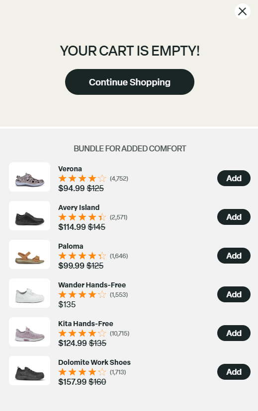
Designing a High-Converting Shopify Footwear Experience

Designing a High-Converting Shopify Footwear Experience

소개

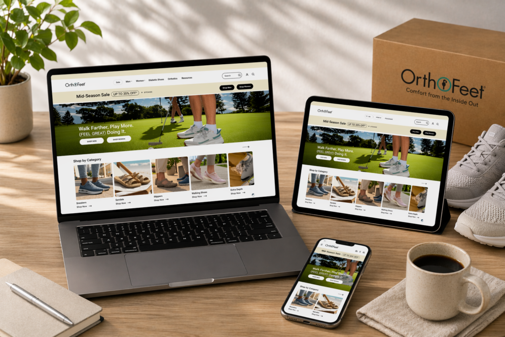
In today’s competitive eCommerce landscape, design is no longer just about aesthetics—it plays a central role in shaping user perception, guiding behavior, and driving conversions. When working on the 쇼피파이 웹사이트 Orthofeet, our goal was clear: create a seamless, intuitive, and visually compelling shopping experience that communicates comfort, innovation, and trust.

Rather than focusing on technical complexity, we approached this project through a design-first mindset. Every layout decision, visual hierarchy, and content structure was crafted to simplify the buying journey and highlight the brand’s core value—ergonomic comfort for everyday life. This case study explores how strategic Shopify design can transform a product-focused store into a conversion-driven digital experience.

배송 시간범주애플리케이션 플랫폼
22일Footwearshopify
참여 디자이너비용효과
린 장$2700판매📈279%

프로젝트 목표 및 전략적 방향

Understanding the Brand Positioning

Orthofeet is not just another footwear brand—it addresses specific customer needs such as foot pain, orthopedic support, and all-day comfort. This required a design approach that balances medical credibility with modern eCommerce aesthetics.

We defined three key goals:

  • Build trust through clarity and structure
  • Simplify product discovery for diverse user needs
  • Enhance conversion through guided navigation

Defining the User Journey

We mapped out a clear user flow:

  1. Land on homepage → understand brand value
  2. Browse by condition or category
  3. Explore product details and benefits
  4. Make a confident purchase decision

Every page and section was designed to support this journey without friction.

Shopify 디자인 접근 방식

A Design-First Philosophy

We focused entirely on visual communication, layout logic, and user experience, rather than backend development. This aligns with our belief that strong design alone can significantly improve performance.

Conversion-Oriented Structure

We implemented a layered structure:

  • Top-level clarity (hero + navigation)
  • Mid-level engagement (categories + benefits)
  • Bottom-level trust (reviews + guarantees)

This ensures users move naturally from awareness to action.

Homepage Design Breakdown

Hero Section: Immediate Value Communication

Designing a High-Converting Shopify Footwear Experience-Homepage Design Breakdown-Hero Section: Immediate Value Communication

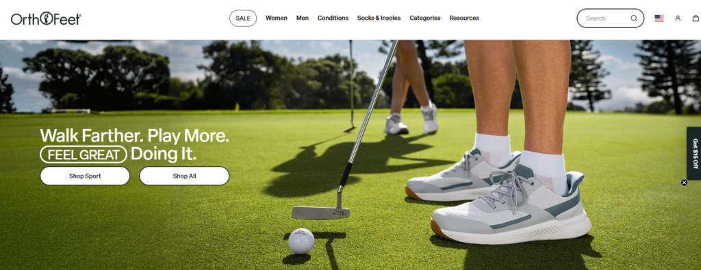
The hero section sets the tone for the entire experience.

Design Strategy:

  • Large lifestyle imagery showing real usage scenarios
  • Clear headline focused on comfort and relief
  • Supporting subtext explaining product benefits
  • Prominent CTA buttons like “Shop Now” or “Find Your Fit”

Result:
Users instantly understand what makes the brand different.

Navigation and Category Design

Designing a High-Converting Shopify Footwear Experience-Homepage Design Breakdown-Navigation and Category Design

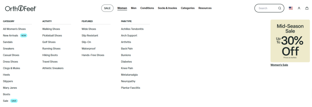
Instead of overwhelming users with too many options, we structured navigation around intent-based discovery.

Key Features:

  • Shop by category (men, women, styles)
  • Shop by condition (plantar fasciitis, arthritis, etc.)
  • Sticky navigation for easy access

Impact:
This reduces decision fatigue and helps users quickly find relevant products.

Product Highlight Section

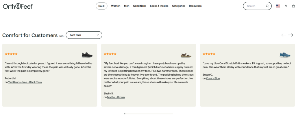
We emphasized best-selling and featured products with a clean grid layout.

Design Elements:

  • 일관된 제품 카드 간격
  • Clear product titles and pricing
  • Quick-view or hover interactions
  • Visual indicators for best sellers

Why it works:
It balances visual appeal with functional clarity, encouraging exploration.

Benefit-Focused Content Blocks

Designing a High-Converting Shopify Footwear Experience-Homepage Design Breakdown-Benefit-Focused Content Blocks

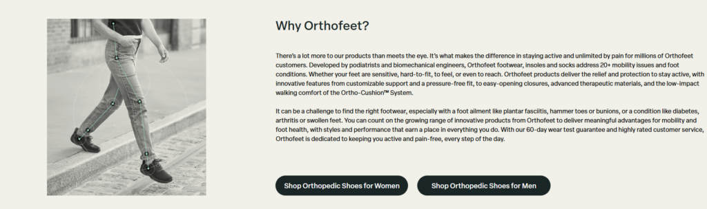
Instead of only showcasing products, we introduced educational design elements.

예시:

  • “Why Choose Orthofeet” sections
  • Icon-based feature highlights (comfort, support, pain relief)
  • Short, scannable text blocks

Outcome:
Users feel informed, not pressured—leading to higher trust.

Social Proof and Trust Signals

Designing a High-Converting Shopify Footwear Experience-Homepage Design Breakdown-Benefit-Focused Content Blocks

Trust is critical, especially for health-related products.

Design Integration:

  • Customer reviews with real images
  • Star ratings prominently displayed
  • Certifications and guarantees
  • Clear return and shipping policies

Effect:
Reduces hesitation and builds purchase confidence.

Product Page Design Strategy

Designing a High-Converting Shopify Footwear Experience-Product Page Design Strategy

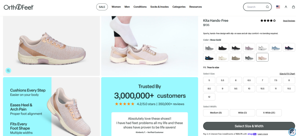
While the homepage attracts attention, product pages drive conversions.

Visual Hierarchy Optimization

We structured product pages to prioritize:

  1. Product images
  2. Key benefits
  3. Pricing and variants
  4. Add-to-cart action

Content Simplification

Instead of long paragraphs, we used:

  • Bullet points for features
  • Icons for quick understanding
  • Expandable sections for detailed info

Emotional + Functional Balance

We combined:

  • Lifestyle imagery (emotional appeal)
  • Technical benefits (functional clarity)

This ensures both logic and emotion support the purchase decision.

Supporting Pages and Ecosystem Design

Collection Pages

Designing a High-Converting Shopify Footwear Experience-Supporting Pages and Ecosystem Design-Collection Pages

We designed collection pages with:

  • Clear filtering options
  • Visual consistency
  • Balanced whitespace

This improves browsing efficiency and keeps users engaged.

About and Brand Story

Designing a High-Converting Shopify Footwear Experience-Supporting Pages and Ecosystem Design-About and Brand Story

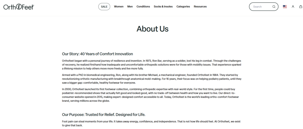
We crafted a brand story that reinforces:

  • Expertise in comfort footwear
  • Commitment to customer well-being
  • Authentic brand voice

Design-wise, we used:

  • Clean typography
  • Structured storytelling blocks
  • Subtle imagery

Mobile Experience Optimization

Since a large portion of traffic comes from mobile devices, we ensured:

  • Responsive layouts
  • Touch-friendly navigation
  • Simplified content hierarchy

The mobile experience mirrors the desktop version while prioritizing speed and usability.

우리가 직면했던 어려움

Communicating Medical Value Without Complexity

Orthopedic products often require explanation, but too much information can overwhelm users.

우리의 해결책:

  • Break down content into digestible sections
  • Use icons and visuals instead of heavy text
  • Highlight key benefits upfront

Balancing Functionality and Aesthetics

We needed to ensure the site feels modern while remaining highly functional.

Our Approach:

  • Minimalist design with purposeful elements
  • 강력한 시각적 계층 구조
  • Consistent spacing and typography

Reducing User Friction

Users may hesitate when choosing the right product.

Our Strategy:

  • Clear categorization
  • Guided navigation paths
  • Reinforced trust signals

결과 및 영향

After implementing the design strategy, the website achieved:

  • Improved user engagement through better navigation
  • Higher conversion rates due to simplified decision-making
  • Stronger brand perception with consistent visual identity

Most importantly, the site now clearly communicates its value—helping users find comfort-focused solutions with confidence.

Our Design Methodology in Practice

Step 1: Research and Positioning

We analyzed the brand, audience, and competitors.

Step 2: Structure Planning

We defined page hierarchy and user flow.

Step 3: Visual Design Execution

We created clean, modern layouts aligned with brand identity.

Step 4: Optimization and Refinement

We refined spacing, typography, and content clarity.

Why Design Matters More Than Ever

A well-designed Shopify website does more than look good—it:

  • Guides users intuitively
  • Builds trust instantly
  • Reduces friction in decision-making
  • Drives measurable business growth

In the case of Orthofeet, design became the bridge between product value and user understanding.

결론

This project demonstrates how a thoughtful, design-driven approach can elevate a Shopify store beyond basic functionality. By focusing on user experience, visual clarity, and conversion strategy, we transformed a product catalog into a cohesive and engaging shopping journey.

에서 AIRSANG, we specialize in creating 쇼피파이 그리고 워드프레스 experiences that prioritize design, clarity, and results. If you’re looking to build or redesign your eCommerce website with a focus on conversions and user experience, our team is ready to help you turn your vision into a high-performing digital presence.

전 세계 배송

AIRSANG 비용 효율적인 웹사이트 디자인, 브랜드 시각적 아이덴티티 및 전자상거래 솔루션을 제공합니다. Shopify와 WordPress부터 아마존 제품 이미지까지, 저희는 글로벌 브랜드가 온라인 비즈니스를 구축하고, 발전시키고, 성장시킬 수 있도록 지원합니다.

완전한 전자상거래 시스템을 갖춘 워드프레스 웹사이트 또는 기업 사이트를 디자인하고 구축하세요.
사용자 지정 요구 사항 또는 특별 견적

사용자 지정 요구 사항 또는 특별 견적

원래 가격: $2.00.현재 가격: $1.00.

비즈니스를 혁신할 준비가 되셨나요?

디지털 마케팅 대행사를 통해 비즈니스를 한 단계 더 발전시킬 수 있는 방법에 대해 자세히 알아보려면 전화를 예약하세요.