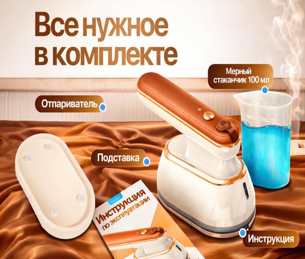
In the Coupang product detail page design of PDG’s thirteen makeup brushes, we organized the content around the set level and brush type index. Through light pink and white, close-ups of delicate bristles, and still lifes of people and appliances, product identification, local descriptions, and scene information are arranged at different levels, allowing readers to continue to understand the products in a clear order.
| 서비스 | Industry | 플랫폼 |
|---|---|---|
| Coupang product detail page design | Beauty and personal care | 쿠팡 |
| Project requirements | target market | design style |
| Set level and brush type index | Korean content display | Light pink and white, close-up of fine bristles, still life of people and appliances |
| Project quotation | Delivery content | Delivery time |
| ¥1,200 | Version 1 product product detail page design | not disclosed |
Design challenge: Separate different reading tasks
This set of product detail pages should not only retain the appearance identification of PDG’s thirteen makeup brushes, but also accommodate different themes such as set levels and brush type indexes. Instead of letting each picture carry all the information repeatedly, we separated the whole, parts and scenes, and controlled the distance between titles, pictures and descriptions.
Our design strategy
We use light pink and white, close-ups of delicate bristles, and still lifes of people and appliances to establish a continuous visual language so that the subject can be clearly identified from the background. The title uses an obvious font size and weight hierarchy, and the supplementary description is relegated to the next level to avoid decoration, photos and text competing for attention at the same time.
In terms of content organization, we divide chapters according to the themes of real works: use larger pictures to establish overall relationships, use parts and diagrams to explain details, and then use bounded text areas or lists to organize supplementary information. Long pages create pauses through color blocks, cards, and white space between groups, and chapter switches can also be identified during continuous reading.
Pink opening: first show the outline of the suit
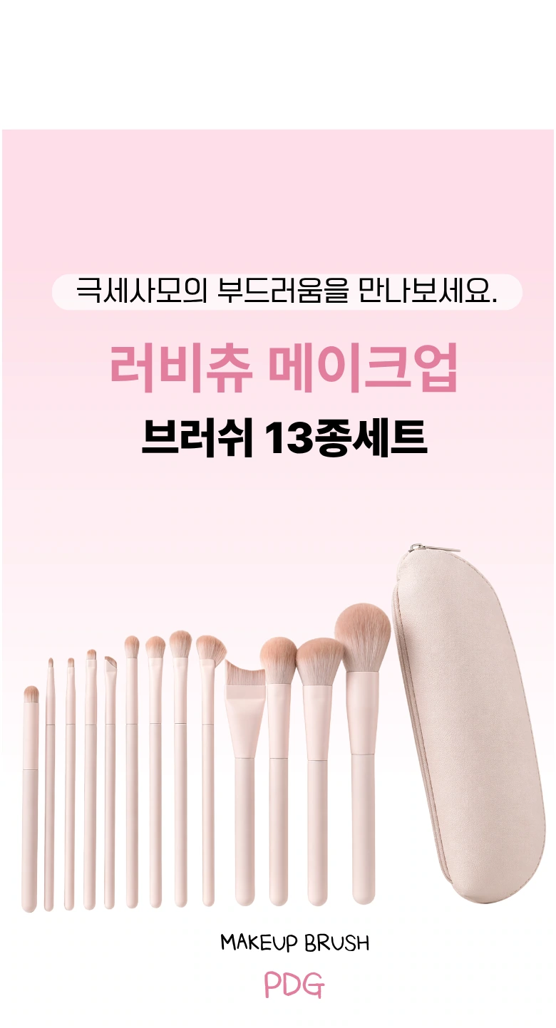
We use a light pink gradient to set aside the title area, and neatly arrange the brushes and storage bags below. There are gaps between the products, and the light base color makes the shape of the brush head more prominent.
Material Theme: Action Photo Connected Brush Close-up
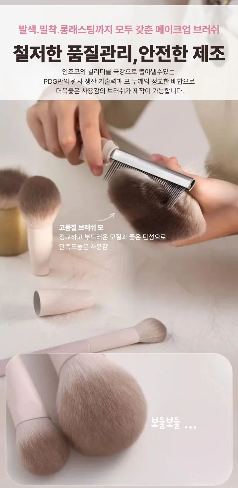
We use photos of hands and brushes to draw out the details, and zoom in on the bristles below. The upper and lower scales remain clearly divided, and the titles are concentrated in the cleaner light-colored areas.
Four-point index: Use icons to create a reading entrance
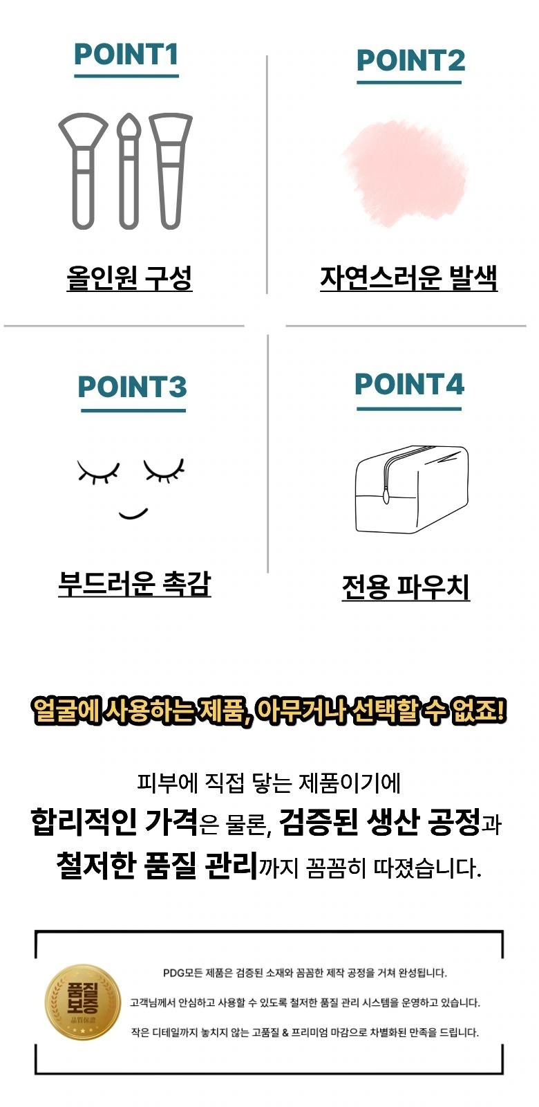
We arrange the four topics into two columns of icons, and add instructions below to maintain the same row width. A white background and large group spacing control dense information and give the index page a clear hierarchy.
Brush head combination: Use diagonal composition to enrich the rhythm
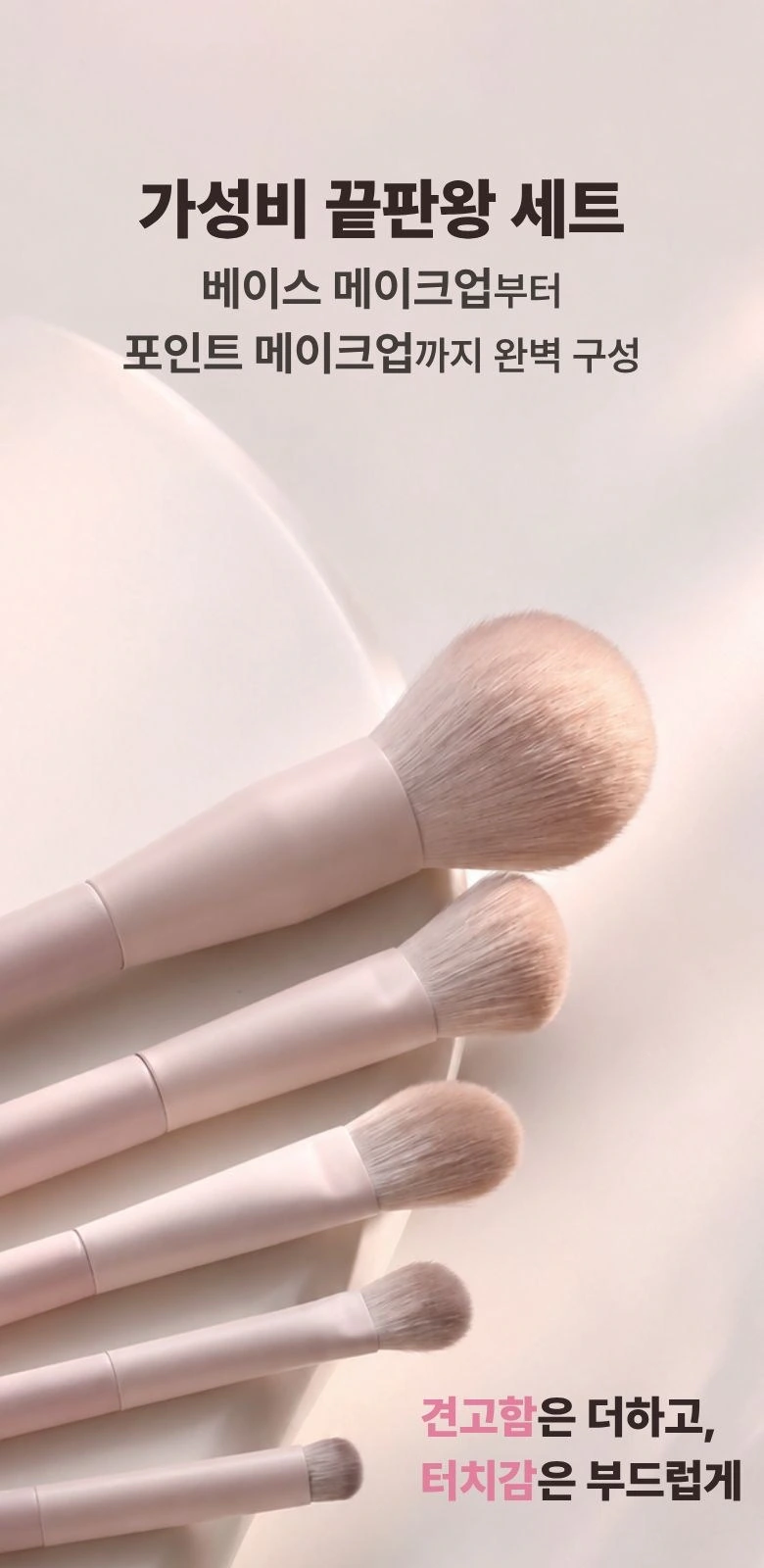
We spread out multiple brush heads along diagonal lines, and used a soft pink curved surface for the background. The text remains at the top, without overlapping the bristle outline, and the product remains the visual centerpiece.
Detailed columns: let the three close-ups unfold one by one
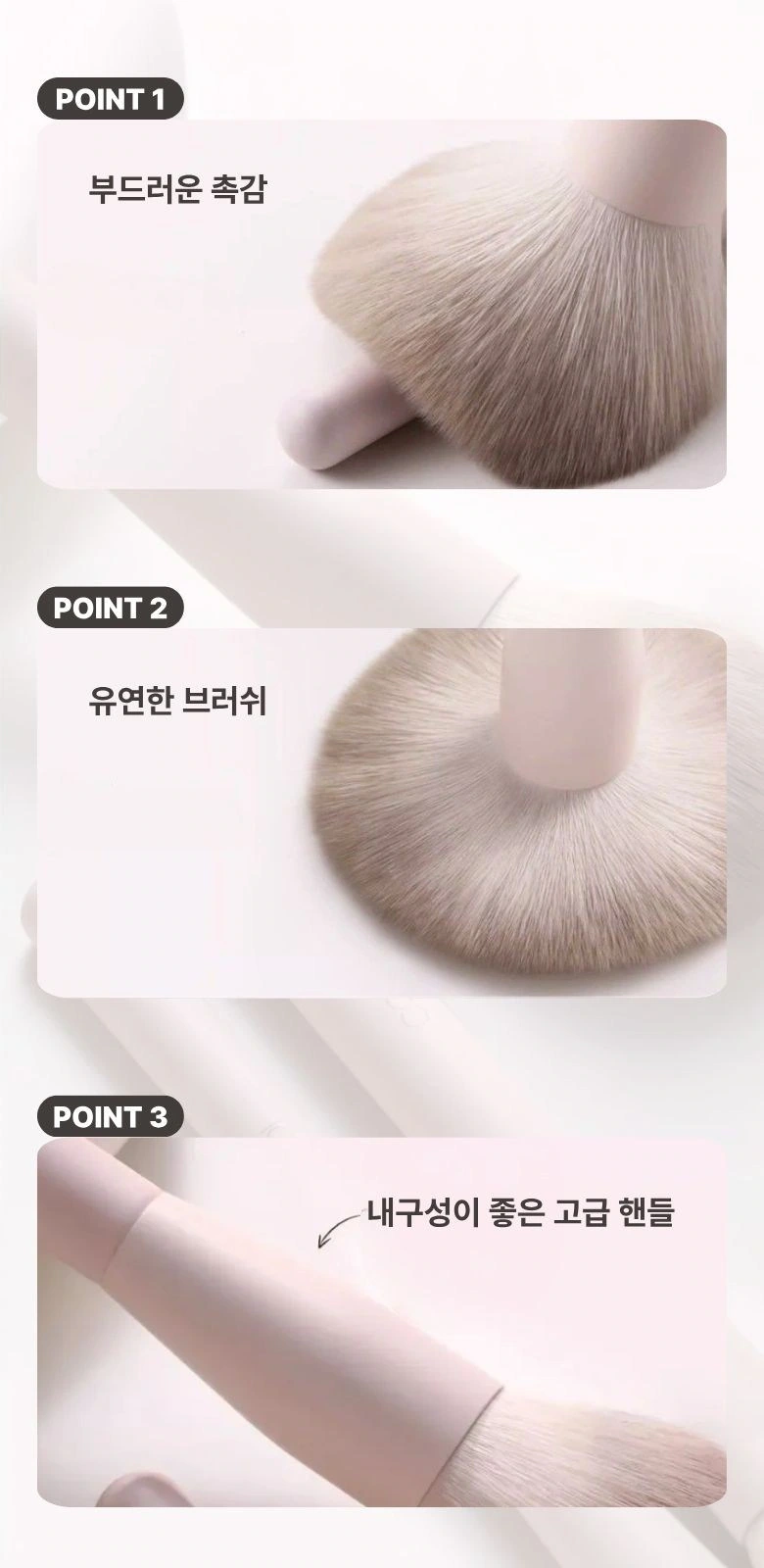
We divide the bristles, brush type and connection parts into three areas, and use numbers and titles to keep them corresponding. Leave pauses between partial photos to avoid crowding of material information.
Powder Situation: Let brush action take center stage
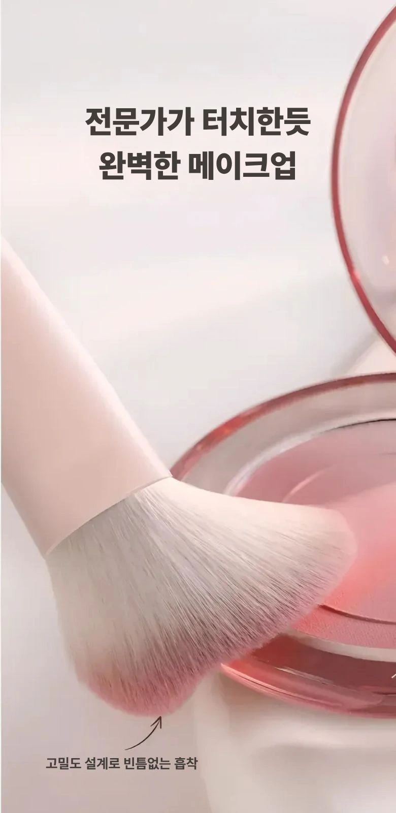
We put the brush head and the powder disk on the same screen, and the pink disk echoes the entire set of background colors. There is sufficient space for the title, and the theme is expressed through the relationship between objects in the picture.
Close-up of people: connecting makeup and tools
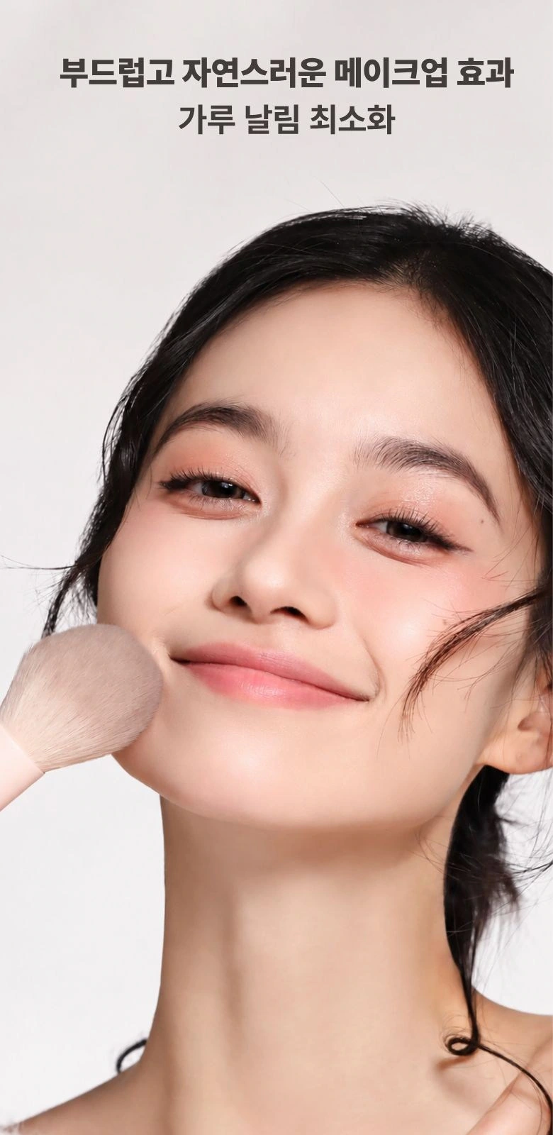
We placed the characters’ faces and brushes close together, and the light background reduced decorative interference. The title is layered with the photo so readers can see the action first and then read the description.
Another framing: continuing the soft portrait temperament
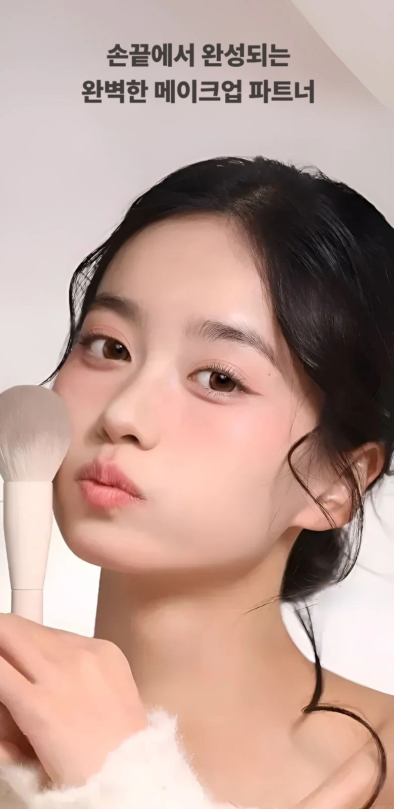
We continue the previous paragraph with a closer portrait composition, with the main title at the top. The pink brush handle echoes the overall tone, and the white space connects the reading rhythm of adjacent modules.
Desktop display: figures and scattered brushes in the same frame
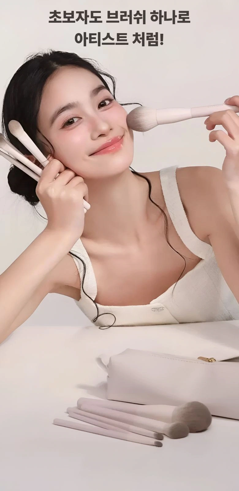
We combined character actions with desktop brushes and kept the background light. The foreground, characters and text are divided into different levels, allowing the set information to naturally return to the context of use.
Storage combination: extending from brushes to packaging
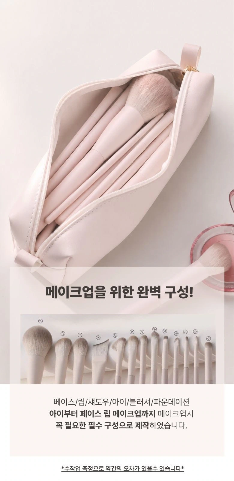
We use a close-up view of the storage bag to match the brush set below, leaving a place for instructions in the white text area. The upper and lower modules have boundaries so that the attachment information is not confused with the brush list.
The first half of the specification list: line-by-line correspondence of lines and brushes
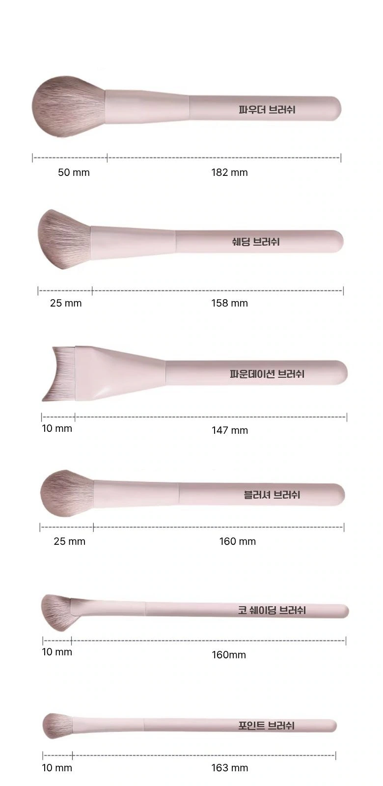
We arrange the different brush types in rows, with size lines and names next to the corresponding objects. White backgrounds and consistent line spacing make it easy to find items one by one, eliminating the need to hunt for specs in photos of scenes.
The second half of the spec list: ending with the same rules
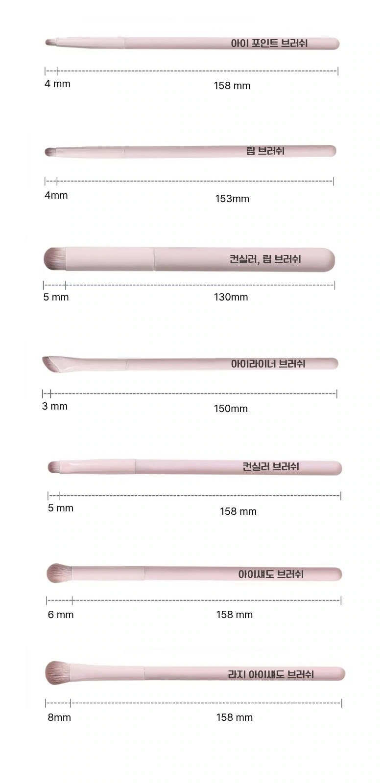
We keep the same font size, line height, and label direction in the remaining brush styles. The two specification pages form a continuous catalog, allowing even small eye brushes to have sufficient display space.
Deliver and design value
Through this version of the product detail page, we establish a continuous reading path around the package level and brush type index. Light pink and white, close-ups of delicate bristles, and still lifes of people and appliances connect different chapters. Image scale, text levels, and white space all work together to prioritize and complement each other, allowing product overviews and local descriptions to complement each other.
Develop a clear Coupang visual expression for your product
You can provide us with product links, existing materials, and key points that need clarification. We will combine the product structure, style and usage scenarios to plan the appropriate picture group or product detail page content and layout.