In the Coupang product detail page design of ASTRAE Makeup Brush Cleaner, we organized the content around usage steps and information levels. Through concise white and gray, blue titles, and black bottle labels, product identification, partial descriptions, and scene information are arranged at different levels, allowing readers to continue to understand the products in a clear order.
| 서비스 | Industry | 플랫폼 |
|---|---|---|
| Coupang product detail page design | Beauty and personal care | 쿠팡 |
| Project requirements | target market | design style |
| Usage steps and information levels | Korean content display | Simple white and gray, blue title, black bottle label |
| Project quotation | Delivery content | Delivery time |
| ¥1,100 | Version 1 product product detail page design | not disclosed |
Design challenge: Separate different reading tasks
This set of product detail pages should not only retain the appearance identification of ASTRAE makeup brush cleaner, but also accommodate different topics such as usage steps and information levels. Instead of letting each picture carry all the information repeatedly, we separated the whole, parts and scenes, and controlled the distance between titles, pictures and descriptions.
Our design strategy
We use concise white and gray, blue titles, and black bottle labels to establish a continuous visual language so that the subject can be clearly identified from the background. The title uses an obvious font size and weight hierarchy, and the supplementary description is relegated to the next level to avoid decoration, photos and text competing for attention at the same time.
In terms of content organization, we divide chapters according to the themes of real works: use larger pictures to establish overall relationships, use parts and diagrams to explain details, and then use bounded text areas or lists to organize supplementary information. Long pages create pauses through color blocks, cards, and white space between groups, and chapter switches can also be identified during continuous reading.
Brand opening: large characters and single bottle form the focus
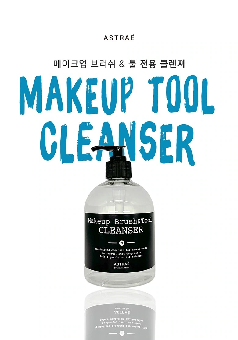
We carry the theme with large blue characters with a handwriting feel, and the bottle is placed in the center of the white background. The black bottle label and blue title form a hierarchy, and the reflection increases the volume but does not occupy the line of sight.
Content grouping: raw material graphics and product layering
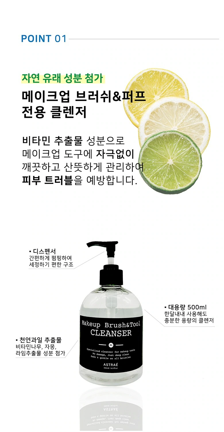
We place the citrus graphic at the top, and the bottle and short label below. A large section of white background allows for a sense of breathing, making the theme, objects and descriptions clear.
Close up of the bottle: hexagonal illustrations unfold around the subject
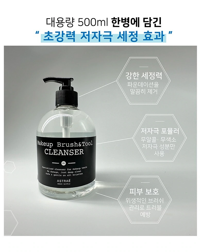
We took the larger single bottle as the center, and thin lines connected the surrounding hexagonal information areas. The gray and white background and lighter text maintain a technical feel, and the outline remains prominent.
Character card: two pieces of information have unified boundaries
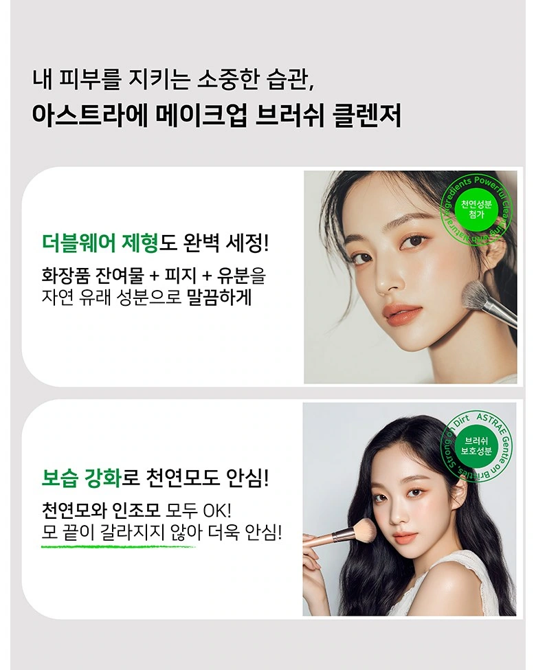
We use two white rounded-corner cards to organize the character photos and descriptions, with green text as partial emphasis. The same card width and margins connect two themes.
Operation tutorial: four-step diagrams corresponding line by line
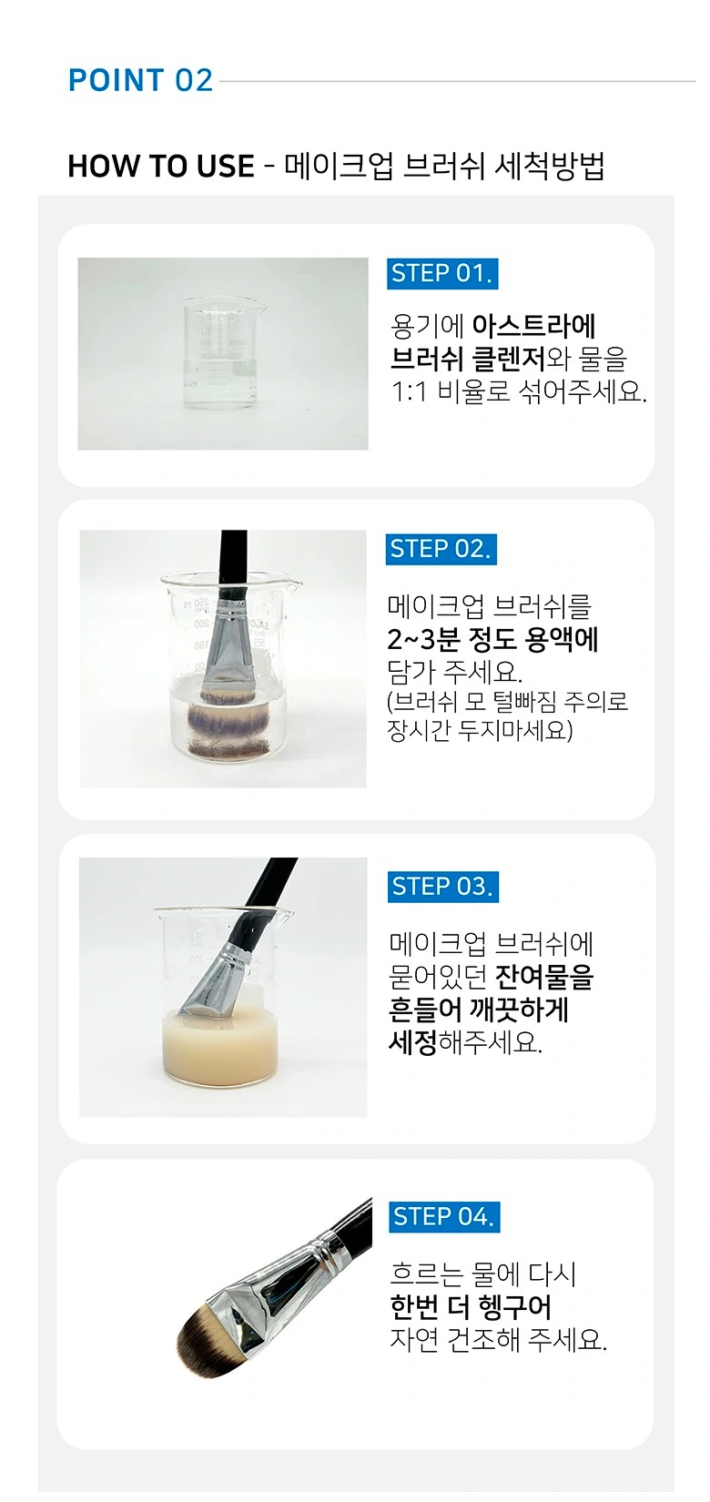
We have divided the cleaning process into four steps, numbered in blue close to the corresponding photo. Pictures and descriptions are divided left and right, making the operation paragraphs on long pages easier to read one by one.
Comparative display: the same brush head is displayed in the left and right columns
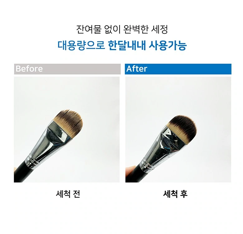
We use pictures in the left and right columns to organize the before and after status, and gray and blue title bands to distinguish the columns. Similar crops and the same scale draw the reader’s attention to the visual differences in the picture.
Dip Close-up: Circular Marker Positioning Observation Area
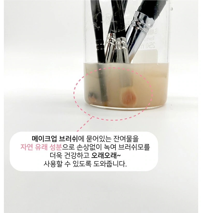
We enlarge the brush in the container and place the circular dotted line on the area that needs attention. The explanatory text remains on the card below, and the scenes remain in direct correspondence with the markers.
Data ending: product pictures and tables are divided into separate areas
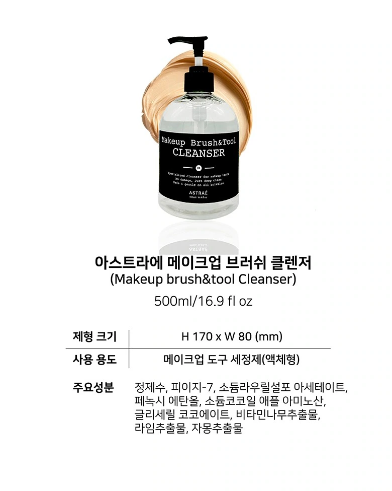
We place the bottles at the top and organize the dimensions and data themes in a concise table below. Font weight, horizontal lines, and white space work together to control density, and the final paragraphs should be kept regular.
Deliver and design value
Through this version of the product detail page, we establish a continuous reading path around usage steps and information levels. Simple white and gray, blue titles, and black bottle labels connect different chapters. The image scale, text level, and white space jointly distinguish the primary and secondary, allowing the product overview and local descriptions to complement each other.
Develop a clear Coupang visual expression for your product
You can provide us with product links, existing materials, and key points that need clarification. We will combine the product structure, style and usage scenarios to plan the appropriate picture group or product detail page content and layout.