


소개
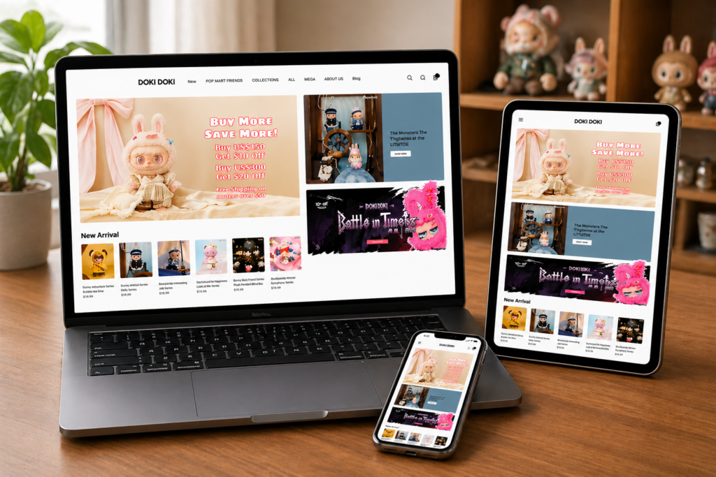
In today’s competitive eCommerce landscape, a visually compelling and strategically structured 쇼피파이 store is no longer optional—it’s essential. A well-designed website not only captures attention but also builds trust, guides user behavior, and ultimately drives conversions.
그만큼 Whoopea Shopify store is a strong example of how thoughtful design can elevate a brand’s online presence. By focusing on clarity, usability, and visual storytelling, we helped transform the site into a high-performing digital storefront. This case study explores how design—not code—played a central role in shaping a seamless and conversion-focused shopping experience.
| 배송 시간 | 범주 | 애플리케이션 플랫폼 |
| 19일 | doll | shopify |
| 참여 디자이너 | 비용 | 효과 |
| 린 장 | $2100 | Sales📈257% |
Understanding the Brand and Goals
Before any design work began, it was critical to understand Whoopea’s positioning, audience, and business objectives.
Brand Positioning
Whoopea operates in a product-driven niche where visual appeal and usability directly impact purchasing decisions. The brand needed a storefront that could:
- Communicate product value instantly
- Build trust with first-time visitors
- Support mobile-first shopping behavior
- Create a consistent and memorable brand identity
Project Goals
주요 목표
- Improve homepage clarity and structure
- Increase product discoverability
- Strengthen visual hierarchy and branding
- Enhance mobile user experience
- Drive higher conversion rates
Secondary Objectives
- Create scalable design systems for future growth
- Align all pages with a unified visual language
- Improve customer journey flow from entry to checkout
Design Strategy Overview
A Design-First Approach
Rather than focusing on technical complexity, we approached this project with a design-first mindset. Every decision was guided by how users interact with the interface and how design can influence behavior.
Key Principles Applied
- Clarity over complexity
- Visual hierarchy drives attention
- Consistency builds trust
- Mobile-first thinking improves conversions
- Storytelling enhances product perception
Homepage Design: The Core Conversion Engine
The homepage is the most critical entry point for any Shopify store. For Whoopea, we redesigned it to function as a structured sales funnel.
Hero Section Optimization
도전 과제
- Lack of clear messaging
- Weak visual focus
- No immediate value proposition
Design Solutions
- Introduced bold, high-impact lifestyle imagery
- Added concise headline communicating core value
- Included clear call-to-action (CTA) buttons
- Applied contrast and spacing for readability
Results
- Faster user understanding of brand offering
- Increased engagement with CTA elements
Product Discovery Layout
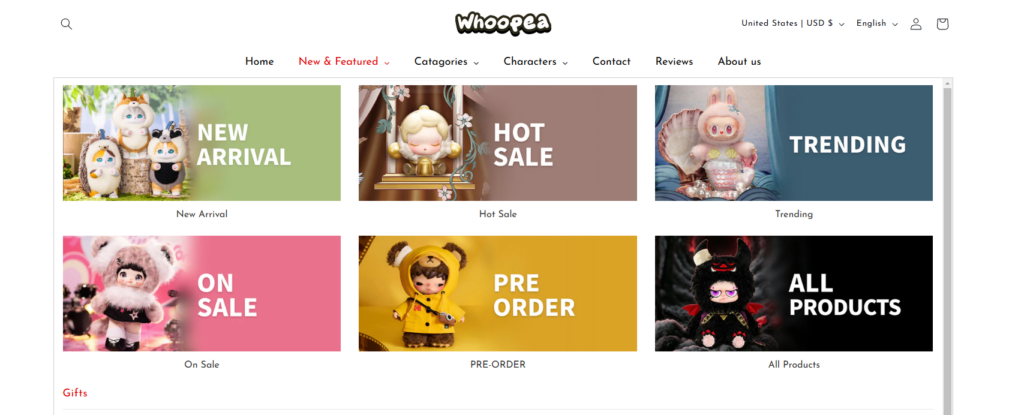
도전 과제
- Users struggled to find key products
- Categories lacked visual distinction
Design Solutions
- Created visually distinct category blocks
- Used consistent card-based layouts
- Integrated hover effects to enhance interaction
- Highlighted bestsellers and trending items
Results
- 향상된 탐색 명확성
- Increased product exploration
Trust-Building Elements
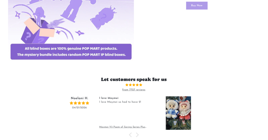
도전 과제
- Limited credibility signals
- No reinforcement of product quality
Design Solutions
- Added customer reviews and ratings
- Introduced trust badges and guarantees
- Highlighted shipping and service benefits
Results
- Stronger user confidence
- Reduced hesitation during purchase decisions
Product Page Design: Driving Purchase Decisions
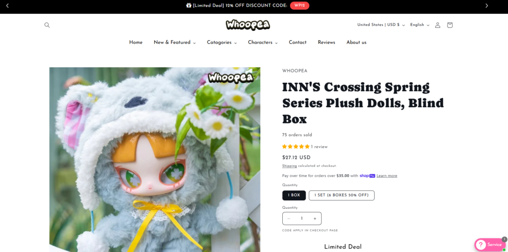
While the homepage attracts users, product pages convert them. We optimized these pages to remove friction and enhance persuasion.
Visual Presentation
Design Enhancements
- Large, high-resolution product images
- Multiple angles and contextual usage shots
- Clean background for focus
Information Hierarchy
Structure Improvements
- 명확한 제품명 및 가격
- Bullet-point feature highlights
- Easy-to-scan descriptions
Conversion Elements
Key Additions
- Prominent “Add to Cart” buttons
- Urgency indicators (e.g., limited stock)
- Social proof integration
Results
- Higher add-to-cart rates
- Improved decision-making speed
모바일 경험 최적화
Mobile traffic dominates modern eCommerce, so optimizing for smaller screens was essential.
도전 과제
- Cluttered layouts on mobile
- Difficult navigation
- Poor spacing and readability
Design Solutions
- Simplified layouts with vertical flow
- Increased button sizes for touch interaction
- Optimized typography for readability
- Reduced unnecessary elements
Results
- Smoother mobile browsing experience
- Increased mobile conversion rates
Design System and Consistency
Consistency is a critical factor in building trust and scalability.
Visual Language Development
We established a unified design system including:
- 타이포그래피 계층 구조
- Color palette usage
- Button styles
- Spacing rules
Benefits
- Cohesive brand identity
- Easier future updates
- Improved user familiarity
우리의 디자인 프로세스
A structured design process ensured efficiency and clarity throughout the project.
Step 1: Research and Analysis
- Competitor benchmarking
- User behavior insights
- Brand positioning evaluation
Step 2: Wireframing
- Defined layout structures
- Focused on user flow
- Prioritized key elements
Step 3: Visual Design
- Applied branding elements
- Designed high-fidelity UI
- Ensured visual consistency
Step 4: Iteration and Refinement
- Tested usability
- Adjusted layouts based on feedback
- Optimized for performance and clarity
Key Challenges and Solutions
Challenge 1: Overloaded Homepage
해결책: Simplified layout and improved hierarchy
Challenge 2: Weak Product Presentation
해결책: Enhanced imagery and structured content
Challenge 3: Low User Engagement
해결책: Introduced interactive elements and clear CTAs
Challenge 4: Inconsistent Branding
해결책: Built a unified design system
결과 및 영향
The design improvements delivered measurable business outcomes.
Performance Improvements
- Increased time on site
- Higher product page engagement
- Improved conversion rates
User Experience Gains
- Easier navigation
- Faster decision-making
- Stronger trust perception
Business Outcomes
- More consistent sales performance
- 고객 유지율 향상
- Enhanced brand positioning
Why Design Matters in Shopify Success
This project reinforces a key insight: design is not just about aesthetics—it’s a strategic business tool.
Design Drives:
- First impressions
- 사용자 신뢰
- Purchase decisions
- 브랜드 차별화
A well-designed Shopify store acts as a silent salesperson, guiding users seamlessly from discovery to conversion.
Our Approach to Shopify Design
We focus on creating design systems that are:
- Conversion-driven
- Brand-aligned
- 확장 가능
- User-focused
Rather than relying on technical complexity, we prioritize clarity, usability, and visual storytelling to deliver real business results.
결론
그만큼 Whoopea 쇼피파이 project demonstrates how strategic design can transform an online store into a high-performing sales platform. By focusing on user experience, visual clarity, and structured layouts, we created a website that not only looks professional but also converts effectively.
From homepage optimization to product page refinement and mobile experience enhancement, every design decision contributed to a more seamless and engaging shopping journey.
에서 AIRSANG, we specialize in turning Shopify stores into conversion-focused digital assets through design-first thinking, helping brands build stronger online presence and sustainable growth.


완전한 전자상거래 시스템을 갖춘 워드프레스 웹사이트 또는 기업 사이트를 디자인하고 구축하세요.
가격 범위: $200.00~$2,500.00사용자 지정 요구 사항 또는 특별 견적
원래 가격: $2.00.$1.00현재 가격: $1.00. 아마존 가정용 물리치료 기기 메인 이미지 디자인 설명
소개 소개: 아마존에서 홈 테라피 기기의 신뢰할 수 있는 이미지 구축 아마존에서 홈 테라피 기기의 기본 이미지를 디자인할 때 기본 ...

아마존 립스틱 전환을 위한 메인 이미지 디자인
소개: 소개: 아마존에서 판매되는 립스틱 메인 이미지 디자인하기 아마존 립스틱의 메인 이미지를 디자인할 때 우리의 책임은 그 이상입니다.

해커들이 워드프레스 관리자 이메일을 훔치는 방법(그리고 이를 막는 방법)
불편한 진실부터 말씀드리자면, 워드프레스 관리자 이메일은 생각보다 훨씬 더 많이 공개되어 있습니다. 그들은 그것을 좋아합니다. 해커에게 여러분의...

아마존 리퀴드 파운데이션 메인 이미지 변환의 특징은 무엇일까요?
서론 아마존 리퀴드 파운데이션의 메인 이미지 디자인은 단순히 제품을 아름답게 보이게 하는 것만이 아닙니다. 아마존에서 메인 이미지와...

필터 카트리지 제품을 위한 효과적인 아마존 메인 이미지 디자인하기
서론 아마존 메인 이미지 디자인은 단순히 제품을 매력적으로 보이게 하는 것만이 아닙니다. 명확성, 신뢰, 그리고 즉각적인 이해를 제공하는 것이 중요합니다. 특히...

워드프레스에 대한 리플레이 공격: 실제 위협인가, 과장된 신화인가?
먼저 한 가지를 분명히 해두죠. 리플레이 공격은 겉보기에 무섭지 않습니다. 비밀번호를 날려버리지도 않고, 초록색 해커 텍스트가 사방에 흩날리는 악성 코드를 주입하지도 않습니다. 그저 교묘하게 이루어질 뿐입니다.

WordPress 페이지를 손상 없이 복제하는 방법
솔직히 말해봅시다. 때로는 새 페이지를 만들고 싶지 않을 때가 있죠. 그냥 기존 페이지를 약간만 다르게 하고 싶을 때가 있어요. 레이아웃도, 블록도, 설정도 그대로요. 왜냐하면...

반려동물 관련 워드프레스 테마 5가지 비교
서론 반려동물 관련 워드프레스 테마를 선택하는 것은 단순한 디자인 결정 이상의 의미를 지닙니다. 사용성, 확장성, 그리고 장기적인 비즈니스 성장에 직접적인 영향을 미치기 때문입니다. 반려동물 관리 및 관련...

수영복 온라인 쇼핑몰 테마 5가지 비교
서론 수영복이나 란제리 독립 매장에 적합한 테마를 선택하는 것은 단순히 시각적인 결정에 그치는 것이 아니라, 전환율, 확장성, 그리고 장기적인 성공에 직접적인 영향을 미칩니다.

워드프레스에서 댓글 기능을 끄는 방법 (정신줄 놓지 않고)
워드프레스 댓글에 대해 이야기해 봅시다. 이론적으로 댓글은 훌륭합니다. 토론을 장려하고, 커뮤니티를 형성하며, 웹사이트에 생동감을 불어넣습니다. 하지만 현실은 어떨까요? 댓글은 종종 문제를 야기하기도 합니다...

과학 중심 브랜드를 위한 확장 가능한 워드프레스 웹사이트 구축: 아미노USA 프로젝트
서론 오늘날의 디지털 환경에서 웹사이트는 단순히 제품을 나열하는 공간 이상의 의미를 지닙니다. 규제 산업이나 연구 중심 산업에서 활동하는 과학 기반 브랜드에게 웹사이트는 더욱 중요한 역할을 합니다.

글로벌 블레이드 브랜드를 위한 확장 가능한 쇼피파이 스토어 구축: 쿨카타나 프로젝트
서론: 국경을 넘나드는 전자상거래에서 Shopify 웹사이트는 단순한 매장 이상의 의미를 지닙니다. 특정 문화권에서 사업을 운영하는 브랜드의 경우, 웹사이트는 단순한 판매 공간을 넘어 훨씬 더 많은 기능을 수행해야 합니다.

포켓몬 카드 판매를 위한 높은 전환율을 자랑하는 쇼피파이 스토어 디자인하기
서론 수집품 전자상거래, 특히 포켓몬 트레이딩 카드 게임(TCG) 시장에서 웹사이트는 단순히 제품 목록을 나열하는 것 이상의 역할을 해야 합니다.

맞춤형 오프라인 브랜드에 최적화된 전환율 높은 쇼피파이 디자인
서론 오늘날 경쟁이 치열한 전자상거래 환경, 특히 맞춤형 선물 및 수집품 분야에서 Shopify 웹사이트는 단순히 제품을 전시하는 것 이상의 역할을 해야 합니다. ...

Shopify 고객 지원팀에 문의하는 방법: 간단하고 스트레스 없는 가이드
쇼피파이 스토어 운영은 흥미진진해야지 혼란스러워서는 안 됩니다. 궁금한 점이 생기거나 문제가 발생하여 진행이 늦어질 때, 쇼피파이는 상황에 따라 다양한 지원 경로를 제공합니다.

쇼피파이 스토어 비활성화 방법: 명확하고 실용적인 가이드
쇼피파이 스토어를 비활성화하는 것은 복잡하지 않지만, 많은 판매자가 간과하는 몇 가지 결과가 따릅니다. 이 가이드에서는 비활성화 과정을 간단하고 유익하게 설명합니다.

프리미엄 꽃집 브랜드를 위한 쇼피파이 웹사이트 디자인 사례 연구
서론 오늘날 경쟁이 치열한 전자상거래 환경에서 Shopify 웹사이트는 단순히 제품을 보여주는 것 이상의 역할을 해야 합니다. 브랜드 가치를 즉시 전달하고 사용자를 안내해야 합니다...

Shopify 디자인 사례 연구: 레트로 게임 스토어
서론: 경쟁이 치열한 전자상거래 환경에서 시각적 명확성과 감정적 연결은 방문자가 고객이 될지 여부를 결정짓는 중요한 요소입니다. 특히 다음과 같은 경우에 더욱 그렇습니다...