


소개
In today’s competitive health and wellness market, a brand’s website must do more than showcase products—it must communicate trust, clarity, and scientific credibility while delivering a seamless shopping experience. For supplement brands like Sports Research, design plays a critical role in translating product efficacy into user confidence.
This project focused on crafting a 쇼피파이 storefront that balances clean aesthetics with conversion-driven structure. By aligning visual storytelling with user intent, we transformed the browsing journey into a guided path toward purchase, ensuring that every design decision contributes to clarity, engagement, and long-term brand trust.
| 배송 시간 | 범주 | 애플리케이션 플랫폼 |
| 25일 | Dietary Supplements | shopify |
| 참여 디자이너 | 비용 | 효과 |
| 낸시 | $2600 | Turnover📈215% |
브랜드와 시장에서의 위치 이해하기
Before diving into layout and visuals, we began by analyzing the brand’s positioning within the supplement industry.
A Brand Built on Trust and Science
Sports Research emphasizes:
- Scientifically backed ingredients
- Transparent sourcing
- Performance-driven results
These pillars required a design language that feels:
- Clean and clinical, but not cold
- Professional, yet approachable
- Informative without overwhelming
Target Audience Insights
The core audience includes:
- Fitness enthusiasts
- Health-conscious consumers
- Individuals seeking preventative wellness
These users typically:
- Compare multiple products
- Look for proof (certifications, reviews)
- Prefer quick access to key benefits
Design Goal: Reduce friction and increase confidence through clarity-first design.
홈페이지 디자인 전략
The homepage acts as the brand’s first impression and must immediately communicate value.
Hero Section: Instant Credibility and Clarity
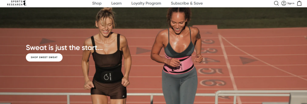
We designed a hero area that:
- Highlights flagship products
- Uses lifestyle-driven imagery (fitness, vitality, daily routines)
- Includes concise benefit-focused messaging
Instead of overwhelming users with dense text, the hero focuses on:
- One key message
- One primary CTA
- 강력한 시각적 계층 구조
Product Categorization for Fast Navigation
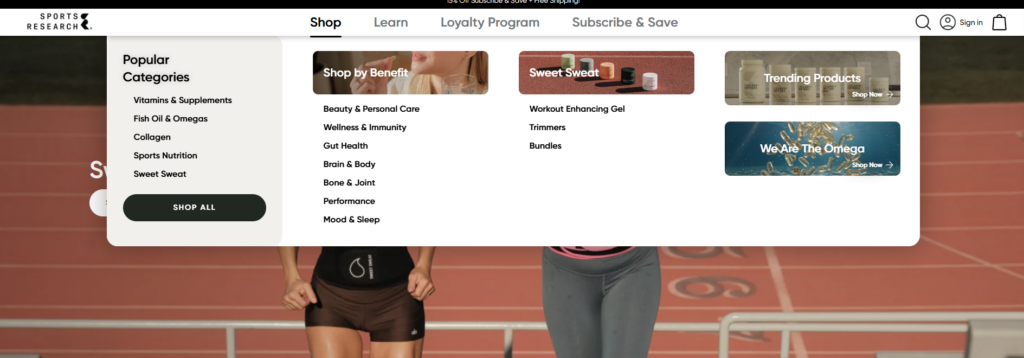
To improve usability, we structured product categories into:
- Vitamins & Supplements
- Collagen Products
- Sports Nutrition
Each category is presented with:
- Clear icons or imagery
- Short descriptors
- Quick-access links
This allows users to immediately identify where they belong.
Trust Signals Integrated Early
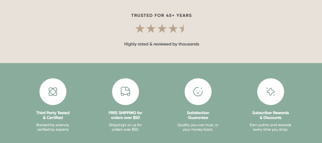
Rather than hiding credibility elements deeper in the site, we placed them prominently:
- Certifications (non-GMO, third-party tested)
- Customer reviews
- Brand claims (e.g., quality sourcing)
These elements reduce hesitation within the first few seconds.
Product Page Design: Turning Information into Conversion
Product pages are where design directly impacts sales performance.
Structuring Information for Scannability
We organized product pages into clear sections:
- Key benefits (top-level highlights)
- Ingredients breakdown
- Usage instructions
- Customer reviews
This layered approach allows users to:
- Quickly scan
- Dive deeper when needed
Visual Hierarchy and Content Balance
긴 문단 대신 다음과 같은 방법을 사용했습니다.
- Bullet points
- Icons
- Section dividers
This improves readability and keeps users engaged.
Lifestyle Imagery for Emotional Connection
We incorporated imagery that shows:
- Real-life usage scenarios
- Active lifestyles
- Wellness routines
This bridges the gap between product features and real-world benefits.
Design System and Visual Language
Consistency across the site is essential for brand recognition and usability.
Color Strategy
We used a palette that reflects:
- Health (greens, neutrals)
- Energy (accent tones)
- Cleanliness (white space dominance)
The goal was to:
- Maintain a clinical feel
- Avoid looking sterile or overly technical
Typography Choices
Typography was selected to:
- Ensure readability across devices
- Support hierarchy (headlines vs body text)
- Reinforce professionalism
We avoided overly decorative fonts to maintain clarity.
Iconography and Micro-Visuals
Custom icons were used to represent:
- Benefits
- Certifications
- Product features
These small details:
- Improve comprehension
- Add visual rhythm
- Reduce reliance on text
Designing for Conversion: UX Principles Applied
Clear Call-to-Action Placement
We ensured that CTAs are:
- Visible above the fold
- Repeated at logical intervals
- Consistent in style
This guides users naturally toward purchase.
인지 부하 감소
To simplify decision-making:
- We minimized unnecessary elements
- Grouped related information
- Used whitespace strategically
Mobile-First Considerations
Given that a large portion of traffic comes from mobile:
- Layouts were optimized for vertical scrolling
- Buttons were sized for touch interaction
- Content blocks were simplified
우리의 디자인 프로세스
A structured process ensures consistent and high-quality outcomes.
Discovery and Research
We started by:
- Analyzing competitors
- Reviewing existing brand assets
- Identifying user pain points
와이어프레임 및 구조 계획
Before visual design, we mapped:
- 페이지 계층 구조
- Content flow
- User journey
This ensures that design decisions are intentional.
시각 디자인 실행
We translated strategy into visuals by:
- Creating cohesive layouts
- Applying consistent branding
- Balancing aesthetics with usability
Iteration and Refinement
Design is never one-and-done. We:
- Tested layouts
- Adjusted based on usability insights
- Refined visual hierarchy
Challenges and Solutions
Challenge 1: Balancing Science and Simplicity
문제: Too much technical information can overwhelm users.
해결책:
We simplified content into digestible sections while preserving credibility.
Challenge 2: Standing Out in a Competitive Market
문제: Many supplement websites look similar.
해결책:
We introduced:
- Strong visual storytelling
- Clear brand differentiation
- Consistent design language
Challenge 3: Improving User Trust Quickly
문제: Users hesitate without proof.
해결책:
We integrated trust signals early and consistently across pages.
결과 및 영향
The redesigned Shopify storefront delivers:
Improved User Engagement
- Clear navigation reduces bounce rates
- Structured content increases time on site
Higher Conversion Potential
- Simplified product pages improve decision-making
- Strategic CTA placement drives action
Stronger Brand Identity
- Consistent visuals reinforce recognition
- Professional design builds credibility
Extending Design Beyond the Homepage
While the homepage sets the tone, we ensured consistency across:
컬렉션 페이지
- Clean grids
- Filter-friendly layouts
- Quick product comparisons
About Page
- Brand story presentation
- Mission and values
- Emotional connection with users
Blog and Educational Content

Educational content is key in the supplement industry. We designed:
- Readable article layouts
- Clear sectioning
- Visual aids for better understanding
Why Design Matters for Shopify Supplement Brands
In the health and wellness space, design is not just about aesthetics—it directly impacts trust and conversions.
잘 디자인된 쇼피파이 스토어:
- Communicates credibility instantly
- Simplifies complex information
- Guides users toward confident purchases
Without strong design, even the best products can struggle to convert.
결론
Designing a high-performing 쇼피파이 supplement website requires a deep understanding of both user psychology and brand positioning. By focusing on clarity, trust, and usability, we transformed the Sports Research storefront into a conversion-driven experience that aligns with modern consumer expectations.
에서 AIRSANG, we specialize in crafting Shopify design experiences that go beyond visuals. We build strategic, user-focused storefronts that help brands stand out, communicate effectively, and convert consistently in competitive global markets.


완전한 전자상거래 시스템을 갖춘 워드프레스 웹사이트 또는 기업 사이트를 디자인하고 구축하세요.
가격 범위: $200.00~$2,500.00custom-requirements-or-special-quotations
원래 가격: $2.00.$1.00현재 가격: $1.00. 아마존 가정용 물리치료 기기 메인 이미지 디자인 설명
소개 소개: 아마존에서 홈 테라피 기기의 신뢰할 수 있는 이미지 구축 아마존에서 홈 테라피 기기의 기본 이미지를 디자인할 때 기본 ...

아마존 립스틱 전환을 위한 메인 이미지 디자인
소개: 소개: 아마존에서 판매되는 립스틱 메인 이미지 디자인하기 아마존 립스틱의 메인 이미지를 디자인할 때 우리의 책임은 그 이상입니다.

해커들이 워드프레스 관리자 이메일을 훔치는 방법(그리고 이를 막는 방법)
불편한 진실부터 말씀드리자면, 워드프레스 관리자 이메일은 생각보다 훨씬 더 많이 공개되어 있습니다. 그들은 그것을 좋아합니다. 해커에게 여러분의...

아마존 리퀴드 파운데이션 메인 이미지 변환의 특징은 무엇일까요?
서론 아마존 리퀴드 파운데이션의 메인 이미지 디자인은 단순히 제품을 아름답게 보이게 하는 것만이 아닙니다. 아마존에서 메인 이미지와...

필터 카트리지 제품을 위한 효과적인 아마존 메인 이미지 디자인하기
서론 아마존 메인 이미지 디자인은 단순히 제품을 매력적으로 보이게 하는 것만이 아닙니다. 명확성, 신뢰, 그리고 즉각적인 이해를 제공하는 것이 중요합니다. 특히...

워드프레스에 대한 리플레이 공격: 실제 위협인가, 과장된 신화인가?
먼저 한 가지를 분명히 해두죠. 리플레이 공격은 겉보기에 무섭지 않습니다. 비밀번호를 날려버리지도 않고, 초록색 해커 텍스트가 사방에 흩날리는 악성 코드를 주입하지도 않습니다. 그저 교묘하게 이루어질 뿐입니다.

WordPress 페이지를 손상 없이 복제하는 방법
솔직히 말해봅시다. 때로는 새 페이지를 만들고 싶지 않을 때가 있죠. 그냥 기존 페이지를 약간만 다르게 하고 싶을 때가 있어요. 레이아웃도, 블록도, 설정도 그대로요. 왜냐하면...

반려동물 관련 워드프레스 테마 5가지 비교
서론 반려동물 관련 워드프레스 테마를 선택하는 것은 단순한 디자인 결정 이상의 의미를 지닙니다. 사용성, 확장성, 그리고 장기적인 비즈니스 성장에 직접적인 영향을 미치기 때문입니다. 반려동물 관리 및 관련...

수영복 온라인 쇼핑몰 테마 5가지 비교
서론 수영복이나 란제리 독립 매장에 적합한 테마를 선택하는 것은 단순히 시각적인 결정에 그치는 것이 아니라, 전환율, 확장성, 그리고 장기적인 성공에 직접적인 영향을 미칩니다.

워드프레스에서 댓글 기능을 끄는 방법 (정신줄 놓지 않고)
워드프레스 댓글에 대해 이야기해 봅시다. 이론적으로 댓글은 훌륭합니다. 토론을 장려하고, 커뮤니티를 형성하며, 웹사이트에 생동감을 불어넣습니다. 하지만 현실은 어떨까요? 댓글은 종종 문제를 야기하기도 합니다...

과학 중심 브랜드를 위한 확장 가능한 워드프레스 웹사이트 구축: 아미노USA 프로젝트
서론 오늘날의 디지털 환경에서 웹사이트는 단순히 제품을 나열하는 공간 이상의 의미를 지닙니다. 규제 산업이나 연구 중심 산업에서 활동하는 과학 기반 브랜드에게 웹사이트는 더욱 중요한 역할을 합니다.

글로벌 블레이드 브랜드를 위한 확장 가능한 쇼피파이 스토어 구축: 쿨카타나 프로젝트
서론: 국경을 넘나드는 전자상거래에서 Shopify 웹사이트는 단순한 매장 이상의 의미를 지닙니다. 특정 문화권에서 사업을 운영하는 브랜드의 경우, 웹사이트는 단순한 판매 공간을 넘어 훨씬 더 많은 기능을 수행해야 합니다.

포켓몬 카드 판매를 위한 높은 전환율을 자랑하는 쇼피파이 스토어 디자인하기
서론 수집품 전자상거래, 특히 포켓몬 트레이딩 카드 게임(TCG) 시장에서 웹사이트는 단순히 제품 목록을 나열하는 것 이상의 역할을 해야 합니다.

맞춤형 오프라인 브랜드에 최적화된 전환율 높은 쇼피파이 디자인
서론 오늘날 경쟁이 치열한 전자상거래 환경, 특히 맞춤형 선물 및 수집품 분야에서 Shopify 웹사이트는 단순히 제품을 전시하는 것 이상의 역할을 해야 합니다. ...

Shopify 고객 지원팀에 문의하는 방법: 간단하고 스트레스 없는 가이드
쇼피파이 스토어 운영은 흥미진진해야지 혼란스러워서는 안 됩니다. 궁금한 점이 생기거나 문제가 발생하여 진행이 늦어질 때, 쇼피파이는 상황에 따라 다양한 지원 경로를 제공합니다.

쇼피파이 스토어 비활성화 방법: 명확하고 실용적인 가이드
쇼피파이 스토어를 비활성화하는 것은 복잡하지 않지만, 많은 판매자가 간과하는 몇 가지 결과가 따릅니다. 이 가이드에서는 비활성화 과정을 간단하고 유익하게 설명합니다.

프리미엄 꽃집 브랜드를 위한 쇼피파이 웹사이트 디자인 사례 연구
서론 오늘날 경쟁이 치열한 전자상거래 환경에서 Shopify 웹사이트는 단순히 제품을 보여주는 것 이상의 역할을 해야 합니다. 브랜드 가치를 즉시 전달하고 사용자를 안내해야 합니다...

Shopify 디자인 사례 연구: 레트로 게임 스토어
서론: 경쟁이 치열한 전자상거래 환경에서 시각적 명확성과 감정적 연결은 방문자가 고객이 될지 여부를 결정짓는 중요한 요소입니다. 특히 다음과 같은 경우에 더욱 그렇습니다...