소개
오늘날 경쟁이 치열한 전자상거래 환경에서, 쇼피파이 store is more than just a sales channel—it’s a brand’s most important digital touchpoint. For Eskute EU, a fast-growing electric bike brand targeting the European market, the goal was clear: create a visually compelling, conversion-driven Shopify experience that communicates performance, trust, and lifestyle—all within seconds of landing on the site.
This project was not about simply “building a website.” It was about crafting a cohesive, high-impact design system that aligns product storytelling, user experience, and brand perception. From homepage hierarchy to product page clarity, every design decision was made to guide users smoothly from discovery to purchase.
In this article, we break down how we approached the Eskute EU Shopify design—from strategy to execution—focusing on the design thinking, challenges, and solutions that shaped the final result.
| 배송 시간 | 범주 | 애플리케이션 플랫폼 |
| 25일 | Electric Bicycle | shopify |
| 참여 디자이너 | 비용 | 효과 |
| 낸시 | $2800 | Turnover📈365% |
Project Overview: Defining the Design Direction
Understanding the Brand and Audience
Eskute operates in the electric bike category—a space where performance, reliability, and lifestyle appeal must coexist. The primary audience includes:
- Urban commuters seeking efficiency
- Outdoor enthusiasts looking for adventure
- Environmentally conscious consumers
This meant the design needed to balance technical credibility with aspirational storytelling.
Core Design Objectives
We established several key design goals early in the process:
- Create a premium yet approachable visual identity
- Highlight product benefits quickly and clearly
- Build trust through structured content and visual cues
- Optimize the layout for both desktop and mobile experiences
- Ensure scalability for future product expansion
Homepage Design: Structuring First Impressions
The homepage is the most critical page in any Shopify store. For Eskute EU, we designed it as a conversion-focused storytelling journey.
Hero Section: Immediate Impact

The hero section serves as the first interaction point. Our design approach focused on:
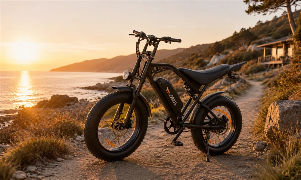
- Full-width lifestyle imagery featuring e-bikes in real environments
- Clear, bold headline emphasizing performance and freedom
- Minimal text to avoid cognitive overload
This creates an instant emotional connection while guiding users toward action.
Product Highlight Modules: Simplifying Decision-Making

Instead of overwhelming users with too many options, we used a modular product showcase layout:
- Clean product cards with consistent spacing
- Key specs presented visually (battery, range, motor power)
- Subtle hover effects to enhance interactivity
- Clear pricing and CTA placement
This section bridges inspiration and decision-making.
Lifestyle Storytelling Blocks

To elevate the brand beyond just “products,” we introduced lifestyle-driven sections:
- Scenic outdoor imagery
- Use-case scenarios (commuting, off-road riding, leisure)
- Short, impactful copy supporting each visual
This approach transforms the website from a catalog into a brand experience.
Product Page Design: Clarity Meets Persuasion
While the homepage attracts attention, the product page closes the sale.
Structured Information Hierarchy
We designed product pages to ensure users can quickly find what they need:
- Large, high-resolution product images
- 명확한 제품명 및 가격
- Bullet-point highlights for key features
- Expandable sections for detailed specifications
This layered approach prevents information overload while maintaining depth.
Visual Feature Explanation
Rather than relying on long paragraphs, we used visual storytelling:
- Icon-supported feature blocks
- Infographic-style layouts
- Close-up images highlighting product details
This makes complex technical information easier to understand.
Conversion-Oriented Layout
Every element on the product page supports conversion:
- Sticky add-to-cart area
- Clear financing or shipping information
- Urgency elements (limited stock, promotions)
These design choices reduce friction and encourage action.
Additional Pages: Supporting the Ecosystem
A high-performing Shopify store extends beyond the homepage and product pages.
Collection Pages: Organized Exploration
We designed collection pages to:
- Maintain visual consistency with the homepage
- Use filtering and sorting to simplify navigation
- Highlight key differences between models
About and Brand Pages: Building Emotional Connection

The “About” section was crafted to:
- Communicate brand mission and values
- Reinforce trust and authenticity
- Use a clean, editorial-style layout
Navigation and UX Flow
We streamlined the overall user journey:
- Simplified menu structure
- Logical category grouping
- Mobile-first navigation design
This ensures users can move effortlessly through the site.
Our Design Process: From Strategy to Execution
1. Research and Benchmarking
We analyzed:
- Competitor e-bike brands
- High-performing Shopify stores
- 사용자 행동 패턴
This helped us identify opportunities for differentiation.
2. Wireframing and Layout Planning
Before visual design, we created structured wireframes:
- Defined content hierarchy
- Established section flow
- Planned responsive behavior
3. Visual Design System
We developed a cohesive design system including:
- 타이포그래피 계층 구조
- Color palette aligned with brand identity
- Consistent spacing and grid system
4. Iterative Refinement
Through multiple revisions, we refined:
- Visual balance
- 콘텐츠 명확성
- CTA placement
Each iteration improved usability and performance.
Challenges and Solutions
Challenge 1: Balancing Technical and Lifestyle Messaging
Problem: Too much technical detail can overwhelm users, while too much lifestyle content can feel vague.
해결책:
We created a hybrid approach—combining visual storytelling with structured specs—ensuring both clarity and inspiration.
Challenge 2: Avoiding Visual Clutter
Problem: E-bike products often come with extensive information.
해결책:
우리는 다음을 사용했습니다:
- Collapsible sections
- Icon-based summaries
- Clean spacing
This keeps the interface clean and digestible.
Challenge 3: Mobile Optimization
Problem: A large portion of traffic comes from mobile devices.
해결책:
We designed mobile-first layouts with:
- Vertical stacking
- Touch-friendly buttons
- 최적화된 이미지 크기 조정
Results: A Cohesive, Conversion-Driven Experience
The final design delivers:
- A strong, premium brand presence
- 사용자 참여도 향상
- Clear product communication
- Seamless navigation across devices
Most importantly, the website now functions as a conversion engine, not just a product display.
Why Design Matters in Shopify Success
A Shopify store’s success is not determined by features alone—it’s driven by how those features are presented.
Effective design:
- Reduces friction in the buying journey
- 즉시 신뢰를 구축합니다
- Enhances perceived product value
- Guides users toward conversion
For brands like Eskute EU, design is the bridge between product and customer.
결론
Designing the Eskute EU Shopify store was about more than aesthetics—it was about creating a strategic, user-centered experience that drives results. By focusing on clarity, storytelling, and structured layouts, we transformed the website into a powerful tool for growth.
에서 AIRSANG, 저희는 다음 분야를 전문으로 합니다. 쇼피파이 design that blends visual storytelling with conversion strategy. From homepage architecture to product page optimization, we help brands turn their ideas into high-performing digital experiences. If you’re looking to elevate your Shopify store with professional, conversion-focused design, AIRSANG 도와드리겠습니다.