


소개
In the travel industry, a website does more than present information—it shapes the entire perception of a destination and determines whether a visitor becomes a traveler. When users explore train travel options across China, they expect a platform that feels trustworthy, intuitive, and visually immersive. A well-designed travel website must balance storytelling, usability, and clear booking pathways.
The China Trains section of the China Highlights website serves as a crucial gateway for travelers planning rail journeys across China. The goal of this project was to design a page that simplifies complex travel information while creating a compelling visual experience that encourages users to explore routes, understand the benefits of train travel, and confidently move toward booking.
This case study explains how the page was strategically designed from a 쇼피파이 user-experience and visual-structure perspective, focusing on layout clarity, travel inspiration, and conversion-driven navigation.
| 배송 시간 | 범주 | 애플리케이션 플랫폼 |
| 21days | Travel | shopify |
| 참여 디자이너 | 비용 | 효과 |
| 린 장 | $1000 | Store traffic📈217% |
Understanding the Project Goals
Before beginning any design work, it was important to understand the objectives behind the China Trains page.
주요 목표
- Present China’s high-speed rail system in a clear and accessible format
- Inspire travelers to consider train journeys as part of their itinerary
- Simplify route exploration and travel planning
- Build trust through visual credibility and structured information
- Guide users toward tour planning and booking actions
Target Audience
The page primarily targets:
- First-time travelers to China
- International tourists planning multi-city trips
- Travelers interested in scenic train routes
- Users researching transportation between major destinations
These audiences often arrive with limited knowledge about China’s rail system, so the design needed to act as both an educational resource and a booking entry point.
Our Shopify Design Philosophy
Designing travel websites requires a unique balance between visual inspiration and functional clarity. Users want to imagine their future trip while also finding practical information quickly.
Our design approach focused on three core principles:
1. Visual Storytelling
Travel websites must evoke emotion. Strong imagery and clean layouts help visitors imagine themselves in the experience.
2. Information Hierarchy
Travel planning often involves large amounts of information. Clear structure ensures users can absorb details without feeling overwhelmed.
3. Conversion-Focused Navigation
Every page should guide visitors toward meaningful actions such as exploring tours or requesting travel planning support.
These principles informed every design decision throughout the project.
The Design Process
Creating a successful travel page requires a structured design workflow that combines research, layout planning, and visual storytelling.
Discovery and Research
The first stage focused on understanding the existing travel brand and how visitors interact with travel planning pages.
Key insights included:
- Many visitors search for transportation guidance before booking tours
- Travelers often compare multiple destinations and routes
- Clear visuals help users understand travel distances and options faster
These insights shaped the structure of the page.
UX Planning and Layout Structure
The design needed to guide visitors through several stages of travel planning.
Stage 1: Inspire Curiosity
Introduce China’s rail network and highlight its advantages.
Stage 2: Provide Practical Guidance
Explain routes, travel times, and key destinations.
Stage 3: Encourage Exploration
Lead users toward tours and personalized trip planning.
To achieve this flow, the page was structured into several carefully designed sections.
Key Design Sections of the Page
Hero Section: Immediate Travel Inspiration
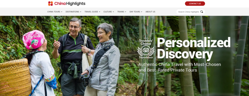
The hero section serves as the first emotional touchpoint for the visitor.
Design priorities included:
- A large lifestyle image showing real travel moments
- Clear messaging that highlights personalized travel experiences
- Strong visual hierarchy to immediately communicate value
The headline communicates exploration and discovery, reinforcing the idea that travel planning can be personalized and seamless.
Supporting design elements include:
- Minimal navigation distraction
- Strong contrast for readability
- Clear focal points guiding the eye from headline to content
This section creates the first emotional connection with the traveler.
Trust Signals and Authority
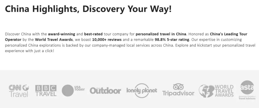
Travel decisions require a high level of trust. The page integrates several credibility elements early in the layout.
These include:
- Media mentions
- Travel awards
- Trusted travel platforms
- Industry recognition
From a design perspective, these elements are placed in a clean horizontal row, allowing visitors to quickly recognize authority without disrupting the visual flow.
Trust badges function as subtle reassurance that the brand is reputable and experienced.
Travel Information Highlights
One challenge of designing travel websites is presenting important updates and policies clearly.
For example, visa policies or travel announcements must be noticeable but not overwhelming.
The solution was a highlight information box that:
- Uses subtle borders and background contrast
- Keeps typography clean and readable
- Allows quick scanning
This ensures important travel updates remain visible without interrupting the browsing experience.
Tour Exploration Section
The Top China Tours section was designed to encourage discovery.
Each tour card contains:
- A strong destination image
- Tour duration
- Key cities included in the itinerary
- A clear “View More” action
From a design standpoint, the grid layout serves multiple purposes:
- Makes comparisons easy
- Creates visual rhythm
- Encourages browsing
The card design balances visual inspiration and practical information, helping travelers quickly identify tours that match their interests.
Social Proof and Traveler Reviews
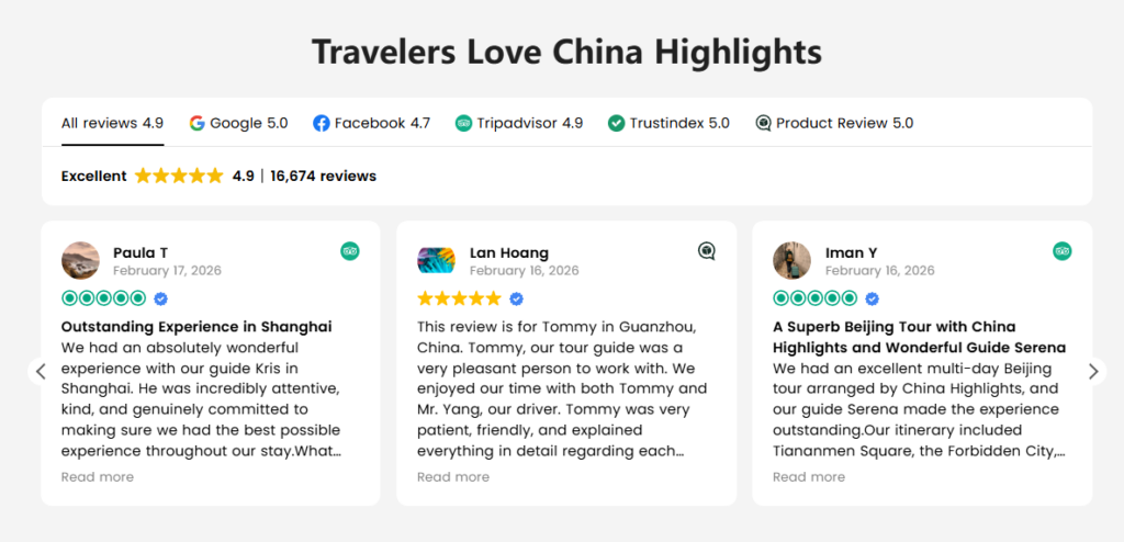
User-generated reviews are powerful persuasion tools.
The review section was designed to showcase real traveler experiences while maintaining visual cleanliness.
디자인 요소는 다음과 같습니다.
- Star ratings for immediate credibility
- Reviewer avatars for authenticity
- Short testimonial excerpts for readability
The layout uses card-based design, allowing multiple testimonials to appear without overwhelming the page.
This section strengthens trust while reinforcing the brand’s reliability.
Destination Discovery Grid
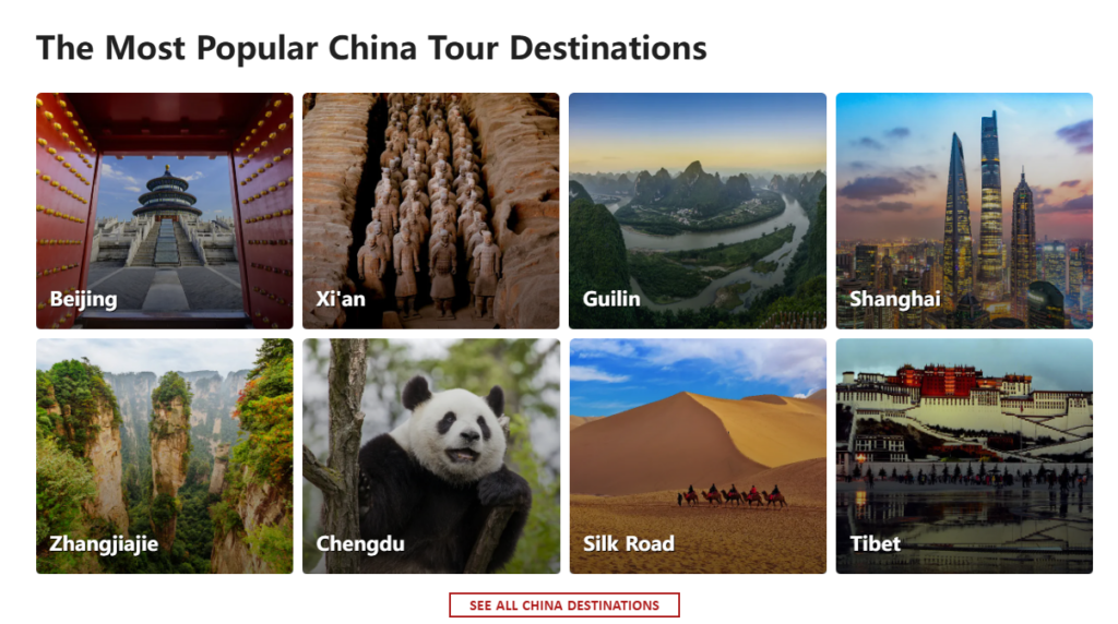
Travelers often begin planning by exploring destinations rather than tours.
The destination grid section was created to support this behavior.
Key design features include:
- High-impact destination photography
- Clear labels for each location
- Grid layouts that feel modern and scannable
Destinations such as Beijing, Shanghai, Guilin, and Tibet are displayed in a visually engaging format.
This section acts as a visual travel map, helping visitors imagine potential routes and travel experiences.
Educational Travel Content
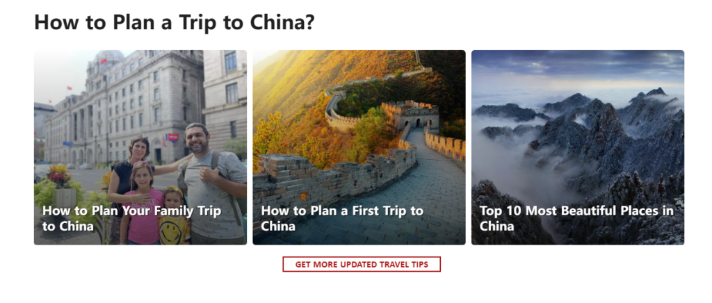
Many travelers need guidance before committing to a trip.
The design therefore includes a section dedicated to travel planning articles.
예시로는 다음과 같은 것들이 있습니다.
- Planning a first trip to China
- Family travel advice
- Scenic destination guides
From a UX perspective, this section supports content-driven discovery, allowing visitors to continue exploring without leaving the ecosystem of the website.
Conversion Section: Encouraging Action
After guiding users through inspiration, information, and exploration, the design shifts toward conversion.
A clear call-to-action invites visitors to start planning a personalized trip.
Design considerations included:
- Strong contrast button colors
- Centered layout for emphasis
- Minimal surrounding distractions
This section acts as a decision point, encouraging travelers to take the next step.
Newsletter Engagement
Travel planning often takes weeks or months.
The newsletter section was designed to capture interest from users who may not be ready to book immediately.
Key design features:
- Scenic background imagery
- Clear benefit messaging
- Simple signup interaction
This ensures the brand can continue engaging with potential travelers over time.
설계 과제 및 해결책
Challenge 1: Complex Travel Information
Train travel across China involves numerous routes and destinations.
해결책:
Organize information into clearly defined sections that prioritize readability and visual scanning.
Challenge 2: Balancing Inspiration and Practicality
Travel websites must inspire users while still providing practical guidance.
해결책:
Use a combination of:
- Lifestyle photography
- structured information cards
- educational content modules
Challenge 3: Encouraging Exploration Without Overwhelming Users
Too many options can confuse visitors.
해결책:
Implement modular layouts and curated content blocks that guide users step-by-step.
The Final Design Outcome
The redesigned page delivers several key improvements:
Clear Visual Hierarchy
Visitors can quickly understand:
- what the page offers
- how to explore tours
- where to plan their trip
Strong Travel Storytelling
Immersive imagery helps visitors imagine real travel experiences across China.
Intuitive Navigation
Each section naturally leads to the next stage of the traveler’s journey.
Improved User Engagement
Visitors can:
- browse destinations
- explore tours
- read travel advice
- start planning trips
All within a single cohesive experience.
Why Strategic Shopify Design Matters
In modern travel eCommerce, a website must function as both a content hub and a booking platform.
A thoughtful Shopify design strategy ensures:
- seamless exploration
- clear travel information
- engaging storytelling
- strong conversion pathways
When these elements work together, the website becomes more than a booking tool—it becomes part of the travel experience itself.
결론
Designing the China Trains page required a careful balance between inspiration, usability, and trust-building. Through strategic layout planning, strong visual storytelling, and conversion-focused structure, the page now provides travelers with a clear and engaging way to explore rail journeys across China.
Projects like this highlight how thoughtful Shopify design can transform complex travel information into an intuitive digital experience that encourages exploration and builds confidence in travel planning.
For businesses seeking professional 쇼피파이 design that blends storytelling, usability, and conversion strategy, the team at AIRSANG specializes in crafting high-impact eCommerce experiences tailored to global audiences.


완전한 전자상거래 시스템을 갖춘 워드프레스 웹사이트 또는 기업 사이트를 디자인하고 구축하세요.
가격 범위: $200.00~$2,500.00custom-requirements-or-special-quotations
원래 가격: $2.00.$1.00현재 가격: $1.00. 아마존 가정용 물리치료 기기 메인 이미지 디자인 설명
소개 소개: 아마존에서 홈 테라피 기기의 신뢰할 수 있는 이미지 구축 아마존에서 홈 테라피 기기의 기본 이미지를 디자인할 때 기본 ...

아마존 립스틱 전환을 위한 메인 이미지 디자인
소개: 소개: 아마존에서 판매되는 립스틱 메인 이미지 디자인하기 아마존 립스틱의 메인 이미지를 디자인할 때 우리의 책임은 그 이상입니다.

해커들이 워드프레스 관리자 이메일을 훔치는 방법(그리고 이를 막는 방법)
불편한 진실부터 말씀드리자면, 워드프레스 관리자 이메일은 생각보다 훨씬 더 많이 공개되어 있습니다. 그들은 그것을 좋아합니다. 해커에게 여러분의...

아마존 리퀴드 파운데이션 메인 이미지 변환의 특징은 무엇일까요?
서론 아마존 리퀴드 파운데이션의 메인 이미지 디자인은 단순히 제품을 아름답게 보이게 하는 것만이 아닙니다. 아마존에서 메인 이미지와...

필터 카트리지 제품을 위한 효과적인 아마존 메인 이미지 디자인하기
서론 아마존 메인 이미지 디자인은 단순히 제품을 매력적으로 보이게 하는 것만이 아닙니다. 명확성, 신뢰, 그리고 즉각적인 이해를 제공하는 것이 중요합니다. 특히...

워드프레스에 대한 리플레이 공격: 실제 위협인가, 과장된 신화인가?
먼저 한 가지를 분명히 해두죠. 리플레이 공격은 겉보기에 무섭지 않습니다. 비밀번호를 날려버리지도 않고, 초록색 해커 텍스트가 사방에 흩날리는 악성 코드를 주입하지도 않습니다. 그저 교묘하게 이루어질 뿐입니다.

WordPress 페이지를 손상 없이 복제하는 방법
솔직히 말해봅시다. 때로는 새 페이지를 만들고 싶지 않을 때가 있죠. 그냥 기존 페이지를 약간만 다르게 하고 싶을 때가 있어요. 레이아웃도, 블록도, 설정도 그대로요. 왜냐하면...

반려동물 관련 워드프레스 테마 5가지 비교
서론 반려동물 관련 워드프레스 테마를 선택하는 것은 단순한 디자인 결정 이상의 의미를 지닙니다. 사용성, 확장성, 그리고 장기적인 비즈니스 성장에 직접적인 영향을 미치기 때문입니다. 반려동물 관리 및 관련...

수영복 온라인 쇼핑몰 테마 5가지 비교
서론 수영복이나 란제리 독립 매장에 적합한 테마를 선택하는 것은 단순히 시각적인 결정에 그치는 것이 아니라, 전환율, 확장성, 그리고 장기적인 성공에 직접적인 영향을 미칩니다.

워드프레스에서 댓글 기능을 끄는 방법 (정신줄 놓지 않고)
워드프레스 댓글에 대해 이야기해 봅시다. 이론적으로 댓글은 훌륭합니다. 토론을 장려하고, 커뮤니티를 형성하며, 웹사이트에 생동감을 불어넣습니다. 하지만 현실은 어떨까요? 댓글은 종종 문제를 야기하기도 합니다...

과학 중심 브랜드를 위한 확장 가능한 워드프레스 웹사이트 구축: 아미노USA 프로젝트
서론 오늘날의 디지털 환경에서 웹사이트는 단순히 제품을 나열하는 공간 이상의 의미를 지닙니다. 규제 산업이나 연구 중심 산업에서 활동하는 과학 기반 브랜드에게 웹사이트는 더욱 중요한 역할을 합니다.

글로벌 블레이드 브랜드를 위한 확장 가능한 쇼피파이 스토어 구축: 쿨카타나 프로젝트
서론: 국경을 넘나드는 전자상거래에서 Shopify 웹사이트는 단순한 매장 이상의 의미를 지닙니다. 특정 문화권에서 사업을 운영하는 브랜드의 경우, 웹사이트는 단순한 판매 공간을 넘어 훨씬 더 많은 기능을 수행해야 합니다.

포켓몬 카드 판매를 위한 높은 전환율을 자랑하는 쇼피파이 스토어 디자인하기
서론 수집품 전자상거래, 특히 포켓몬 트레이딩 카드 게임(TCG) 시장에서 웹사이트는 단순히 제품 목록을 나열하는 것 이상의 역할을 해야 합니다.

맞춤형 오프라인 브랜드에 최적화된 전환율 높은 쇼피파이 디자인
서론 오늘날 경쟁이 치열한 전자상거래 환경, 특히 맞춤형 선물 및 수집품 분야에서 Shopify 웹사이트는 단순히 제품을 전시하는 것 이상의 역할을 해야 합니다. ...

Shopify 고객 지원팀에 문의하는 방법: 간단하고 스트레스 없는 가이드
쇼피파이 스토어 운영은 흥미진진해야지 혼란스러워서는 안 됩니다. 궁금한 점이 생기거나 문제가 발생하여 진행이 늦어질 때, 쇼피파이는 상황에 따라 다양한 지원 경로를 제공합니다.

쇼피파이 스토어 비활성화 방법: 명확하고 실용적인 가이드
쇼피파이 스토어를 비활성화하는 것은 복잡하지 않지만, 많은 판매자가 간과하는 몇 가지 결과가 따릅니다. 이 가이드에서는 비활성화 과정을 간단하고 유익하게 설명합니다.

프리미엄 꽃집 브랜드를 위한 쇼피파이 웹사이트 디자인 사례 연구
서론 오늘날 경쟁이 치열한 전자상거래 환경에서 Shopify 웹사이트는 단순히 제품을 보여주는 것 이상의 역할을 해야 합니다. 브랜드 가치를 즉시 전달하고 사용자를 안내해야 합니다...

Shopify 디자인 사례 연구: 레트로 게임 스토어
서론: 경쟁이 치열한 전자상거래 환경에서 시각적 명확성과 감정적 연결은 방문자가 고객이 될지 여부를 결정짓는 중요한 요소입니다. 특히 다음과 같은 경우에 더욱 그렇습니다...