Project overview
The client of this project is a brand that specializes in outdoor lifestyle products. It mainly sells pavilions, trellises, carports, outdoor storage sheds and courtyard supporting products. Its core market is targeted at North American home users. As the product line continues to be enriched, the customer hopes to further strengthen the brand image through the brand website and improve the online display and purchase experience of high-priced outdoor products. Therefore, he came to us and hoped to redesign a website visual and page structure with a more lifestyle sense and conversion capabilities.
The project is designed based on the Shopify platform. The core demand of customers is not only to display products, but also to enable consumers to quickly understand the purpose of the product and build purchasing confidence through real outdoor scenes, clear product classifications, reasonable homepage information levels, and trust elements such as evaluation, delivery, and after-sales. We carry out overall planning around outdoor life scenes, brand vision, category navigation and user shopping paths, so that the website takes into account brand atmosphere, product display efficiency and e-commerce conversion needs.
| サービス | Industry | プラットフォーム |
| Website design and decoration | Sports and outdoor | shopify |
| Project requirements | target market | design style |
| Improve the overall visual quality and brand recognition of the website | グローバル | Natural scenes | Modern home | Promotional e-commerce |
| project budget | Delivery content | Delivery time |
| ¥13000 | Website construction and full-site page design | 26 working days |
Project Challenges
The biggest challenge of this project is how to strike a balance between a rich outdoor product line, strong scene-based vision and e-commerce conversion. Pavilions, trellises, carports and courtyard ancillary products have high unit prices per customer, and consumers have a long decision-making cycle. If there is too much information on the homepage and unclear classification, it is easy to increase browsing pressure and weaken brand trust. In the early stage, we focused on sorting out the customer’s product structure, core categories, target markets and the purchasing habits of North American home users, and analyzed the complete path of users from the homepage to classification, product browsing and purchasing decisions. We then re-planned the homepage information level, visual classification navigation, scene map proportions and trust element layout, focusing on solving problems such as product discovery efficiency, scene substitution, page congestion and lack of purchasing confidence, so that the website would have greater clarity and conversion capabilities while maintaining the outdoor lifestyle atmosphere.
Home Page Design Strategy
Make a powerful first impression
The homepage is one of the most important pages in any Shopify store. For a brand like Erommy, the homepage needs to clearly convey the outdoor lifestyle that the brand represents as soon as users enter the website.
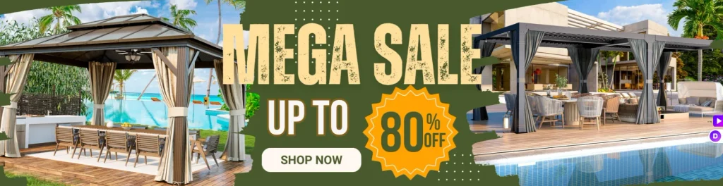
The Hero area on the first screen uses a large lifestyle scene image, showing the outdoor pavilion next to the swimming pool, allowing users to quickly enter a comfortable and relaxing outdoor living environment.
core design elements
- full width lifestyle photography
- Clear promotional information
- Simple information hierarchy
- Outstanding core product categories
Rather than using a large amount of text to stack information, the entire first-screen design emphasizes visual storytelling and directly conveys brand value through scenes.
Create a lifestyle-driven Hero above the fold
visual storytelling
Only when outdoor products are placed in real usage scenarios can it be easier to stimulate consumers’ desire to buy. Therefore, Hero Banner focuses on a spacious backyard gazebo scene and creates a comfortable outdoor atmosphere through natural light, greenery and courtyard settings.
This scene graph achieves several goals at the same time:
- Show how the product is actually used
- Communicate outdoor lifestyle
- Establish a more quality brand image
Clear promotional information
The Hero area also adds clear seasonal promotion information to help the brand quickly attract visitors’ attention during the event and drive users to further browse or purchase.
The information level of the entire first screen mainly guides users to pay attention to:
- Product usage environment
- Promotional information
- action button
This structure not only keeps the page simple, but also naturally guides users to complete the next step.
Product category navigation design
Simplify the product discovery process
Outdoor products usually have many categories. If the classification logic is not clear, it is easy for users to become confused during the browsing process.
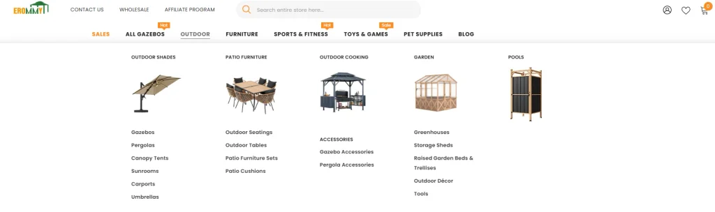
Therefore, we added a visual classification grid at the front of the homepage to focus on displaying the brand’s main product categories, including:
- Pergola Outdoor Pergola
- Gazebo outdoor gazebo
- Carport
- Shed outdoor storage shed
- Canopy awning
Each category features large lifestyle images rather than simple text links.
This design mainly improves the experience in two aspects:
First, users can quickly identify different product types through pictures.
Second, visual images can create a stronger lifestyle atmosphere, making the entire category area more like an inspiration display rather than a traditional product catalog.
Create a visual navigation system
The classification grid adopts unified design specifications:
- Unify image size
- Simplified text labels
- Clear hover interaction prompts
- Adequate and clean spacing
This design allows users who visit the website for the first time to quickly understand the page structure.
At the same time, the regular grid layout forms a stable visual rhythm and prevents the homepage from appearing crowded due to too many product categories.
Build trust through design

Trust elements and consumer confidence
For large home and outdoor products, consumers often require a higher level of trust when purchasing online.
In order to enhance brand credibility, a variety of trust elements have been added to the homepage, including:
- Free shipping information
- Customer service support
- Return and exchange policy
- Secure payment information
This information is placed in the category area, allowing users to obtain basic purchase protection information in advance before browsing the products in depth.
Reduce users’ purchasing concerns
Such a layout can reduce users’ hesitation before they officially enter the product browsing stage and build a foundation of trust for subsequent conversions.
Proof of integration into society
Social proof is also a very important part of homepage design.
Page highlights:
- Real customer reviews
- Overall rating
- Photos of real usage scenarios by customers
These contents are not only placed on the product detail page, but appear on the homepage in advance, so that users can feel the brand’s true reputation and market recognition early in the browsing process.
Product display design
Highlight key products
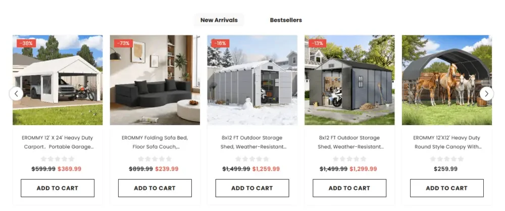
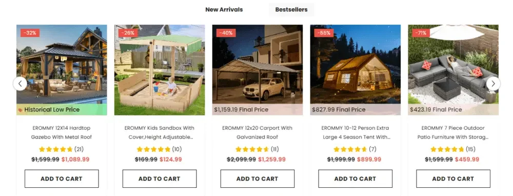
The homepage is set up with a selected product or new product area to guide consumers to quickly discover popular products.
Product cards adopt a simple and unified structure, including:
- Product pictures
- Price and discount information
- Product name
- add to cart button
Leave plenty of white space between cards to improve information recognition and prevent the page from looking overcrowded.
Design effective product cards
Great product cards are very important for conversions in your Shopify store.
Main design principles
- Use larger product images
- Reduce unnecessary text information
- Establish clear price tiers
- Highlight the buy button
All product cards maintain a unified visual specification throughout the website, allowing users to have a consistent shopping experience when browsing different pages.
Lifestyle inspiration and social content integration
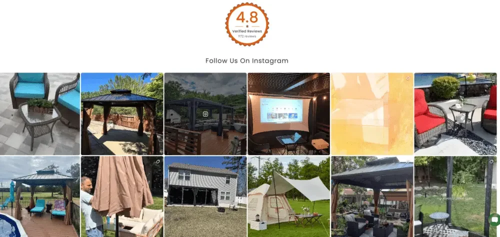
The role of lifestyle content
Outdoor products rely heavily on scene inspiration. Consumers often want to see how a product would look in a real yard or backyard setting.
Therefore, a social lifestyle image wall was added to the homepage and displayed in conjunction with user-generated content.
This part mainly plays two roles
- Demonstrate the actual installation and use effects of the product
- Build a sense of user community around the brand
By viewing these real-life scenarios, consumers can more easily imagine how the product would look installed in their own outdoor spaces.
Instagram content integration
The Instagram content area showcases real users’ photos of outdoor environments and product use.
Compared with traditional commercial product photography, this kind of content is more natural and easier to establish emotional connections with consumers.
Lifestyle content is important for driving conversion rates because it directly answers the questions consumers care about most:
“What would this product do in my backyard?”
Strengthen brand story experience
Video area creates brand atmosphere
A movie-like video area is also added to the homepage to further strengthen the brand’s outdoor life concept.
Video can enrich a brand’s story through dynamic images and highlight:
- natural landscape environment
- Comfortable and relaxing outdoor moments
- Community lifestyle scene
Such content creates a stronger emotional connection between the product itself and the consumer’s desired lifestyle.
Support brand business growth
B2B & Affiliate Marketing Programs
In addition to ordinary retail consumers, the brand also targets:
- Wholesale purchasing customers
- Affiliate Alliance Partner
A dedicated content area is set up on the homepage to showcase these cooperation opportunities.
Information design focus
Through simple and intuitive visuals and copywriting, the page mainly introduces:
- Bulk purchasing opportunities
- Commission cooperation model
This design allows the brand website to not only assume the retail sales function, but also support the brand’s more diversified business growth channels.
Content marketing integration
Blogs and educational content
Educational content plays an important role in SEO and user engagement.
A blog article preview has been added to the homepage, with the content mainly focusing on:
- Outdoor space renovation inspiration
- Pergola outdoor trellis installation case
- Patio garden design trends
These articles can help brands establish a professional image in the field of outdoor living.
At the same time, continuous output of relevant content can also increase the website’s natural exposure in search engines and bring more long-term natural traffic to the brand website.