Project overview
The client specializes in women’s fashion shoes and hopes to further enhance the overall visual quality of the store on the SHEIN platform and enhance product appeal through more scenic posters, so he approached us for store poster design. The client hopes to focus on displaying different styles of women’s shoes, such as sandals, high heels, and short boots, while taking into account product details, the effect on the model’s feet, and the fashionable outfit atmosphere. Targeting SHEIN’s young female consumer group, we focus on light luxury, elegance, holiday feeling and modern urban style, and establish a unified and varied visual system for women’s shoe stores through natural light, simple architecture, model outfits and product close-ups.
| サービス | Industry | プラットフォーム |
| shein online store design | Shoes and bags | シャイン |
| Project requirements | target market | design style |
| Improve click-through rate | グローバル | Light luxury and elegance | Mediterranean vacation | Minimalist fashion |
| project budget | Delivery content | Delivery time |
| ¥800 | 9 shein posters | 7 working days |
Project Challenges
The core challenge of this project is to maintain a unified brand vision of different styles of women’s shoes in a shopping environment where SHEIN is frequently browsed, and to present their own distinct outfit characteristics, while avoiding the problems of stacked products and cluttered images in traditional e-commerce posters. In the early stage, we first sorted out the product categories and color differences of sandals, high heels, boots, etc., analyzed the aesthetics and usage scenarios of the target female users, and unified the model style, clothing matching, architectural space, natural light and layout tone. On this basis, we plan the composition rhythm and product display methods of different posters, taking into account the on-foot effect, close-ups of single products and the overall coherence of the store.
The first picture: Use the Mediterranean summer scene to create the first impression of the store
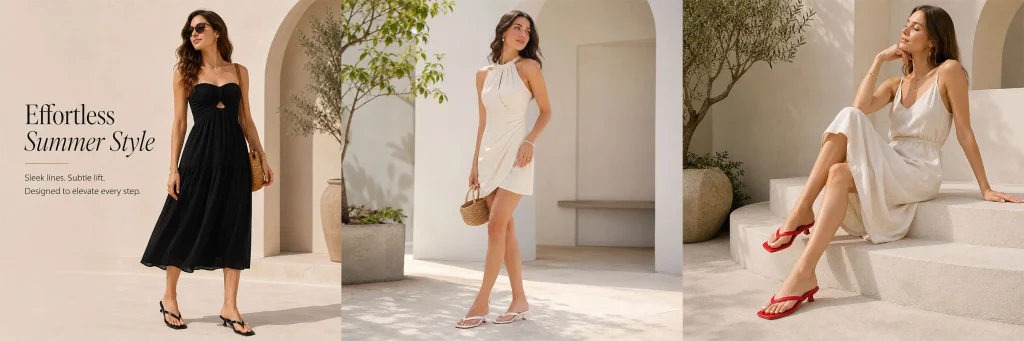
The first poster takes on a very important visual tone-setting role.
We chose off-white buildings, arches, green plants and strong but soft natural light as the main background, and used three different pictures to show the wearing status of black and white clothing with red, black and white sandals.
The “Effortless Summer Style” theme copy is added to the left area, and the model in the black long dress becomes the main visual anchor of the picture. The black clothing creates a clear contrast with the light-colored buildings, allowing the characters to be seen at the first time, while the black sandals on their feet naturally enter the consumer’s sight.
Use a white skirt and white shoes in the middle to weaken the color conflict and give the picture a sense of breathing. On the right side, a white long skirt is paired with red sandals, ending the entire picture with a distinctive red visual point.
This three-stage layout can display multiple dressing directions at the same time without appearing cluttered like ordinary product puzzles.
We hope that consumers will understand from the first poster: what is sold here is not a single style of shoes, but a series of women’s shoes that can be integrated into different summer looks.
Second picture: Highlight elegance and vacation feeling through symmetrical composition
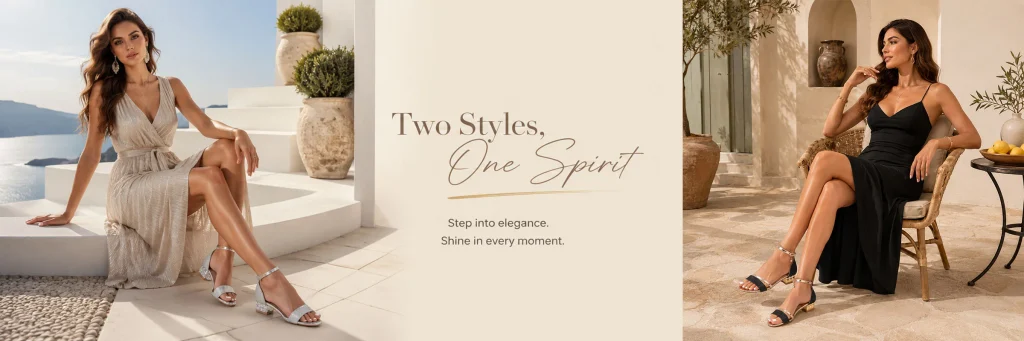
The second poster adopts a more obvious structure of “left and right characters + middle copywriting”.
The model on the left is wearing a light-colored long skirt. The seascape, white steps and large clay pots are added to the background, making the silver sandals naturally enter a high-end vacation scene. On the right side, a black long skirt is paired with black and silver sandals to create an evening or restaurant-style atmosphere through a warmer courtyard space.
We left a large area of off-white white space in the middle and used “Two Styles, One Spirit” as the visual center.
The significance of this design is to establish the concept of “same femininity, different ways of dressing”.
Consumers can intuitively see that a pair of light and delicate sandals can appear on a bright seaside holiday or be integrated into a more mature evening look.
At the same time, the contrast between left and right light and dark gives the entire poster a more obvious hierarchy. The left side is bright and transparent, the right side is warm and calm, and the white space in the middle completes the visual buffer.
Compared with directly arranging two pairs of shoes, this method makes it easier for the product to form an emotional memory.
Photo 3: Switching from summer sandals to urban boots
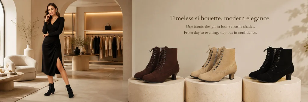
The third poster is a very important style shift in the entire series.
When the products entered the short boots category from sandals, we took the initiative to reduce the seaside and resort elements and instead used a more mature boutique interior space.
The model on the left is wearing a black long skirt and black lace-up boots. In the background, clothing displays, sofas, round tables and warm lights are added, making the overall environment closer to a modern boutique or high-end apartment.
On the right side, we directly display three types of short boots in brown, beige and black, and place each pair of shoes independently on a cylindrical display stand.
Here we deliberately increased the display ratio of the product itself.
Because short boots have more upper structures than sandals, including shoelaces, toe contours, material textures and heel shapes, relying solely on models wearing them is not enough for consumers to quickly judge product differences.
Therefore, we also use the combination of “on-feet scene + product display” to allow consumers to see the outfit effect and observe different colors.
The entire picture still maintains a warm beige space, forming visual continuity with the previous summer series.
The fourth picture: Use a double model composition to show two urban styles of short boots.
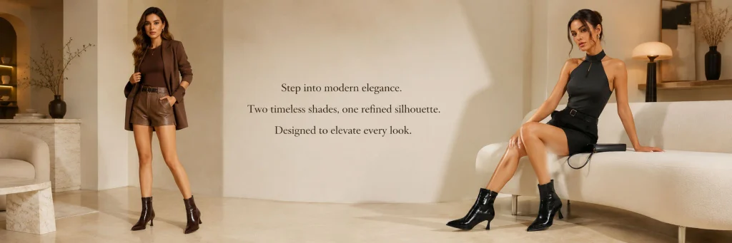
The fourth poster continues to revolve around short boots, but instead of repeating the product display method of the previous one, we use two full models.
The model on the left is wearing a brown suit, shorts and brown boots. The overall style is modern commuting and light business. The model on the right wears a black sleeveless top, short skirt and black glossy boots, which is more towards night, party and urban fashion.
The middle area remains largely blank, with only three lines of concise English copy placed.
The biggest advantage of this kind of composition is that it allows consumers to quickly compare the performance of the same type of shoes in different styles.
We did not use complicated decorations because what this poster really needs to convey is “how the shoe shape changes the entire outfit.”
At the same time, the characters on the left and right form a balance, and the white space in the middle naturally becomes a visual pause area, so that the entire store page will not appear overcrowded when browsing continuously.
Photo 5: Back to the bright and relaxing summer vacation atmosphere
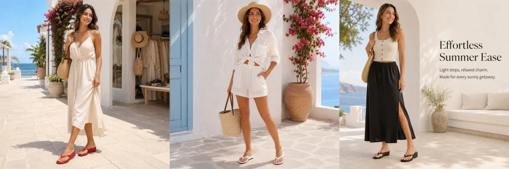
The fifth poster re-enters the summer scene.
For this one, we use three consecutive character images, and use white buildings, blue sky, seascape and rose-red flowers to enhance the sense of season.
The model on the left wears a light-colored long skirt with red sandals, the model in the middle chooses a white shirt and shorts with white shoes, and the model on the right wears a beige top and black skirt with black sandals.
The three looks actually correspond to three very typical summer dressing directions:
Resort dresses, casual shorts and light commuter skirts.
We placed the text on the far right, letting the characters and environment take up most of the space. This processing allows consumers to feel the scene first and then read the theme information of “Effortless Summer Ease”.
Visual merchandising for the women’s footwear category doesn’t necessarily require zooming in on shoes all the time.
When consumers have entered the store, establishing an imagination of “what I would look like wearing it” can also promote product exploration.
Picture 6: Add red to form a stronger visual memory point
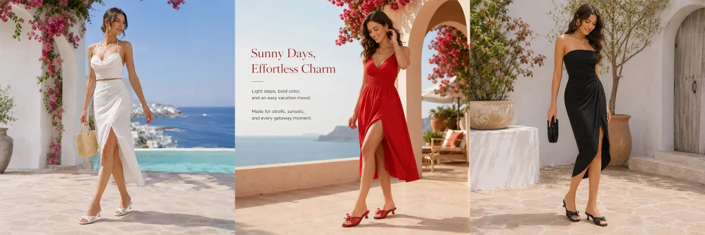
The sixth poster takes on the role of enhancing color memory throughout the series.
The previous visual was dominated by off-white, black and natural colors, so this one adds a more eye-catching red.
The model on the left is wearing a white look and white shoes; in the middle, a red dress and red sandals form a strong visual focus; on the right, a black skirt and black sandals continue to complete the balance.
We arrange the copy to the left of center and adjust the title to red.
This allows the text to echo the red shape in the middle, giving the entire picture a clearer visual center.
Red is very suitable for the key model or main color in summer shoes, because it can not only bring a holiday atmosphere, but also make the product easier to notice in SHEIN’s fast-scrolling page environment.
However, we did not use a large area of red background, but only used it for shoes, dresses and titles. This not only retains the sense of high-end, but also prevents the picture from turning into a promotional poster.
Picture 7: Put the characters’ outfits and product close-ups in the same scene
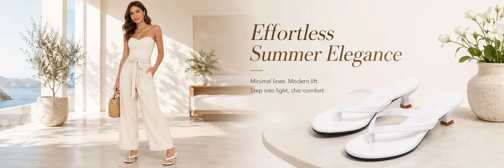
The seventh poster begins to further strengthen the product itself.
On the left is a model wearing an off-white tube top and wide-leg pants, with white sandals on her feet. On the right side, the same white shoes are directly enlarged, allowing the product to occupy a more obvious visual position.
We placed the products on light-colored stone countertops, while adding clay pots, white flowers and natural light.
This allows the close-up of the product to still belong to the entire lifestyle scene without suddenly switching to a pure white background of the product image.
Use “Effortless Summer Elegance” as the theme in the middle and leave enough white space.
The focus of this one is to solve two needs:
Consumers not only want to know whether the shoes are coordinated, but also want to see the shape of the shoes.
Therefore, “model + amplification product” has become a very effective combination.
For SHEIN store posters, this structure is particularly suitable as a key promotional image because it is more direct than a pure scene image and more fashionable than a traditional detailed image.
Photo 8: Use red sandals to create the main summer style vision
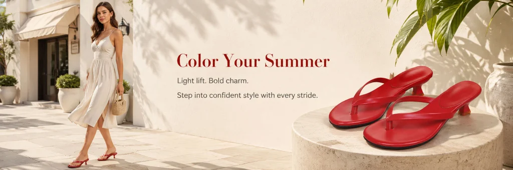
The eighth picture continues the logic of “character + product close-up” of the previous picture, but replaces the white shoes with red ones.
The model on the left still chooses a light-colored long skirt, so the red sandals on her feet naturally become the most eye-catching part of the look.
On the right side, we have significantly enlarged the red shoes and placed them on the round stone countertop.
The background is kept light off-white, and leaf shadows are added to give the picture a realistic feeling of natural sunlight.
The title “Color Your Summer” is in red, creating a direct connection with the product.
We didn’t add complicated graphics or color blocks here, because the red shoes themselves already have enough visual appeal.
If a large number of decorations are added, the dominant position of the product will be weakened.
This picture is closer to a “key product advertisement” and can serve as the entrance to new products, featured colors, or summer series on the store homepage.
Picture 9: Use a deeper urban space to enhance the texture of the black model
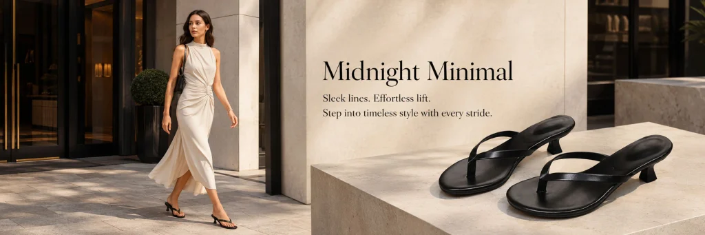
The final poster takes the series from a bright holiday scene into a more mature urban space.
The model on the left is wearing a light-colored long skirt and black sandals, walking past the entrance of a dark building. The background uses a lot of black, gray and stone colors, so that the black texture of the shoes naturally blends with the entire environment.
On the right, two black sandals are enlarged and placed on a simple stone platform.
Instead of continuing with seascapes, flowers or bright blue skies, we created an urban feel through architectural shadows and harder lines.
The title “Midnight Minimal” is also consistent with this scenario.
The function of this picture is not only to show the black shoes, but also to help consumers understand the difference in style between them and white and red shoes.
White is more light, red is more eye-catching, and black is more suitable for simple, urban and evening looks.
Expressing color personality through different contexts can influence consumer choice more effectively than simply displaying color options.