


 Japanese
導入
Designing a main image set for a wire stripper on オゾン is not about making the tool look “cool.”
It is about making every function instantly understandable, even to a buyer who does not read specifications carefully.
This project focuses on a multifunction wire stripper, and the goal of the main image design was very clear:
to translate complexity into clarity, while maintaining strong visual impact in Ozon’s highly competitive tools category.
From the first hero image to the final application scenes, every image was designed to answer one silent buyer question:
“Can this tool really do everything I need, and can I trust it?”
Below, we break down each image and explain the design logic behind it.
| 配達時間 | カテゴリ | アプリケーションプラットフォーム |
| 7日間 | wire stripper | オゾン |
| 関与するデザイナー | 料金 | 効果 |
| リン・チャン | $110 | Sales📈296% |
Image 1: Hero Main Image – Multifunction at First Glance
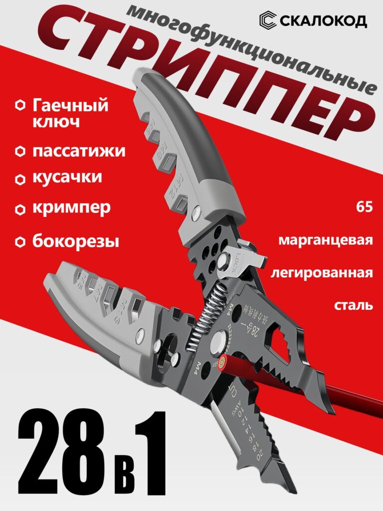
The first image serves as the primary Ozon main image, and its job is to stop scrolling.
Design Intent
Ozon buyers often decide within seconds whether to click a product.
For this reason, we placed the wire stripper diagonally, fully opened, revealing its internal structure and multiple working areas.
This pose immediately communicates:
- It is not a basic wire stripper
- It integrates multiple tools in one body
- It looks solid, professional, and industrial-grade
Visual Hierarchy
The red-and-white background creates strong contrast, helping the black metal body stand out clearly.
Large typography emphasizes:
- “Multifunction”
- “28 in 1”
- Core tool categories (cutting, crimping, stripping)
This layout ensures that even on a small mobile screen, buyers instantly understand:
this is a high-value, all-in-one tool, not a single-function product.
Image 2: Functional Breakdown – Explaining Complexity Visually
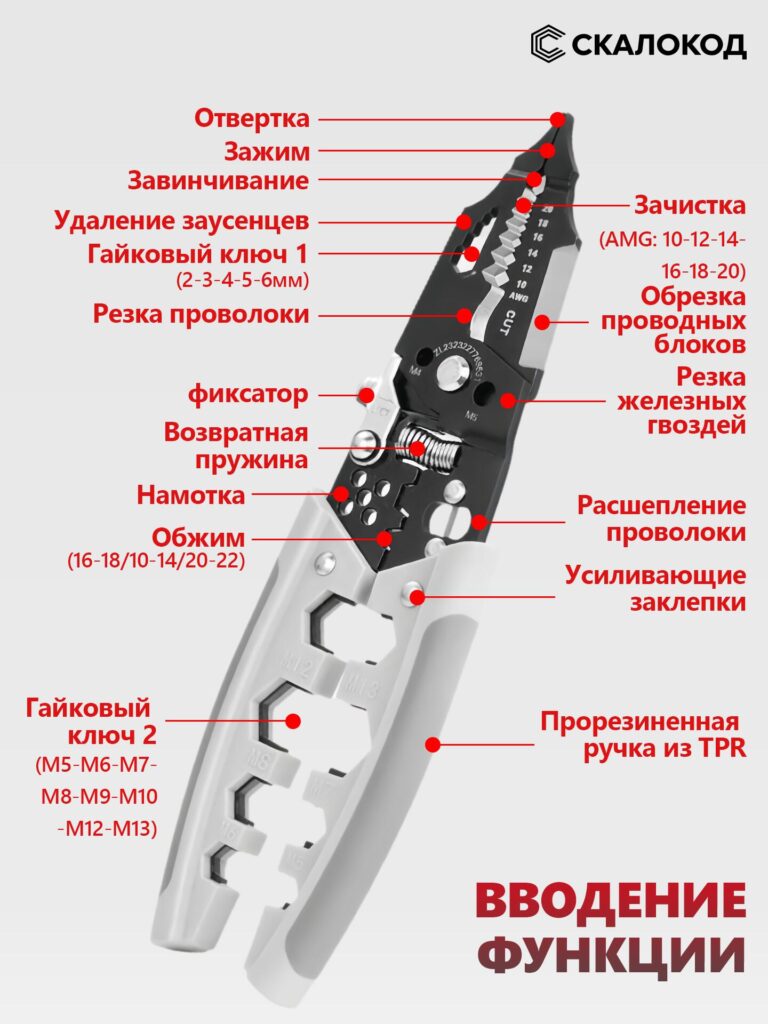
This image is the technical explanation image.
Why This Image Matters
Multifunction tools often fail on Ozon because buyers feel overwhelmed.
To avoid this, we clearly labeled each functional zone with callouts and red indicator points.
The image explains:
- Wire stripping ranges (AWG sizes)
- Crimping sections
- Cutting edges
- Lock mechanism
- Return spring
- Nut wrench areas
Design Choice
Instead of long paragraphs of text, we used:
- Short, precise labels
- Clear directional lines
- High contrast red markers
This approach mirrors industrial instruction diagrams, which builds trust and reduces hesitation.
The buyer no longer guesses how the tool works — they see it.
Image 3: Material Focus – 65 Manganese Alloy Steel
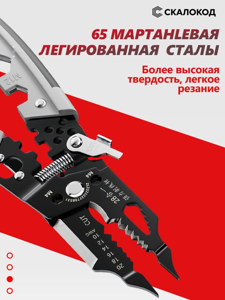
This image focuses entirely on material credibility.
Why Material Needs Its Own Image
On Ozon, tools are often compared on:
- Durability
- Cutting performance
- Lifespan
We highlighted 65 manganese alloy steel with a close-up angle that shows:
- Sharp cutting edges
- Solid thickness
- Reinforced pivot points
Visual Messaging
The typography emphasizes:
- Higher hardness
- Easier cutting
- Professional-grade metal
By isolating material quality into a single image, we ensure buyers clearly understand:
this tool is not made from cheap steel.
Image 4: Waterproof & Anti-Corrosion Performance
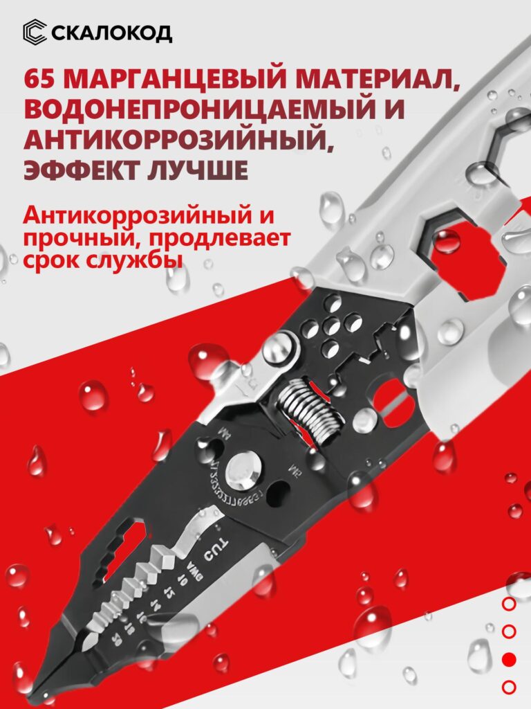
This image introduces environmental resistance.
Design Purpose
Electricians and DIY users often work in:
- Humid environments
- Outdoor spaces
- Construction sites
To visually communicate durability, we added water droplets across the tool surface.
Why Visual Effects Matter
Instead of simply saying “anti-corrosion,” the image shows it.
The droplets reinforce:
- Waterproof coating
- Rust resistance
- Long-term usability
This image reassures buyers that the tool will not degrade quickly, even under tough conditions.
Image 5: Ergonomic TPR Handle – Comfort and Control
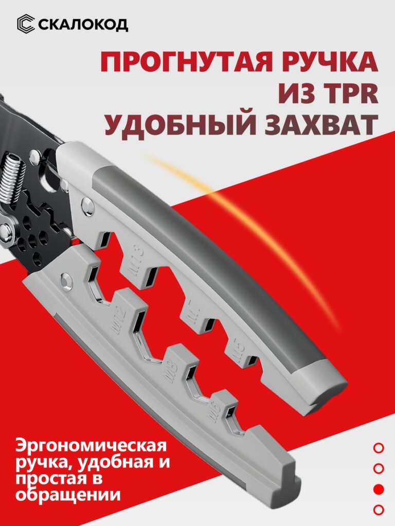
This image focuses on user comfort.
Design Insight
Many Ozon tool listings ignore ergonomics, but hand tools are used for long periods.
Fatigue is a real concern.
The curved TPR handle is shown in close-up to highlight:
- Non-slip grip
- Soft-touch material
- Ergonomic contour
Emotional Impact
This image speaks to comfort, not power.
It tells the buyer:
“You can use this tool longer, with less strain.”
That emotional reassurance is often the difference between saving a product and purchasing it.
Image 6: Application Scenarios – Real-World Use
This is a multi-scene application image, divided into four functional scenarios.
Why Scenarios Convert Better
Buyers trust products more when they see real use cases instead of isolated product shots.
Each quadrant shows:
- Wire cutting
- Wire stripping
- Wire twisting
- Screwdriver function
Design Strategy
使用したのは:
- Clean indoor environments
- Real wires and sockets
- Natural tool angles
This avoids looking staged or unrealistic.
The buyer can imagine using the tool immediately — a key conversion trigger.
Overall Visual Strategy for Ozon
Across all images, we followed three core principles:
1. Clarity Over Decoration
No unnecessary effects. Every visual element explains something functional.
2. Strong Contrast for Mobile Viewing
Red, white, and black ensure readability on small screens.
3. Trust Through Detail
Close-ups, material emphasis, and labeled functions reduce uncertainty.
Why This Main Image Set Works on Ozon
This design approach aligns perfectly with Ozon’s buyer behavior:
- Buyers skim fast
- Buyers compare aggressively
- Buyers distrust vague listings
By structuring the image set as a visual story, we guide the buyer step by step:
from curiosity → understanding → confidence → purchase.
最後に
A wire stripper may look like a simple tool, but selling it successfully on オゾン requires strategic visual communication.
This main image set does not rely on exaggerated claims.
Instead, it proves value visually, function by function, image by image.
That is the core philosophy behind this design.
If you are building a cross-border product listing, especially in competitive tool categories, image strategy is not optional — it is decisive.
This is exactly the type of visual system we specialize in at エアサン, helping brands translate complex products into clear, conversion-focused listings for global marketplaces.


WordPressのウェブサイトや、完全なeコマースシステムを備えたコーポレートサイトをデザイン・構築します。.
価格帯$200.00~$2,500.00カスタム要件または特別見積もり
元価格は$2.00。.$1.00現在の価格は$1.00。. Amazonホーム理学療法機器のメイン画像デザイン解説
はじめにAmazonで家庭用治療器の信頼できるイメージを構築する Amazonで家庭用治療器のメインイメージをデザインする際、私たちが最も重視するのは...

Amazon リップスティックコンバージョンのメイン画像デザイン
はじめにアマゾンで売れる口紅のメイン画像をデザインする アマゾンの口紅のメイン画像をデザインするとき、私たちの責任は...

Amazonのリキッドファンデーションのメイン画像がコンバージョンにつながる理由
はじめに Amazonリキッドファンデーションのメイン画像デザインは、単に商品を美しく見せるだけではありません。Amazonでは、メイン画像と….

フィルターカートリッジの効果的なAmazonメインイメージのデザイン
はじめに Amazonのメイン画像をデザインする上で、商品を魅力的に見せることは決して重要ではありません。明確さ、信頼性、そして瞬時に理解できることが何よりも重要です。特に….

ペット向けWordPressテーマ5選を比較
はじめに ペット関連のWordPressテーマを適切に選ぶことは、単なるデザイン上の決定ではありません。使いやすさ、拡張性、そして長期的なビジネスの成長に直接影響します。ペットケアとペット...

科学主導のブランドのためのスケーラブルなWordPressウェブサイトの構築:AminoUSAプロジェクト
はじめに 今日のデジタル環境において、ウェブサイトは単なる製品リストを掲載する場所ではありません。規制の厳しい業界や研究重視の業界で事業を展開する科学主導のブランドにとって、ウェブサイトは….

グローバルブレードブランドのためのスケーラブルなShopifyストアの構築:CoolKatanaプロジェクト
はじめに 越境電子商取引において、Shopify の Web サイトは単なる店舗ではありません。ニッチで文化主導のカテゴリーで活動するブランドにとって、Web サイトは単なる店舗以上のものを実現する必要があります...

ポケモンカード向け高コンバージョンShopifyストアの設計
はじめに 収集可能な電子商取引の世界、特にポケモン トレーディング カード ゲーム (TCG) 市場では、Web サイトは単に製品をリストするだけでは不十分です。...

カスタムレンガブランドのための高コンバージョンShopifyデザイン
はじめに 今日の競争の激しいeコマース市場、特にパーソナライズされたギフトやコレクターズアイテムの分野では、Shopifyのウェブサイトは商品を展示する以上の機能を提供する必要があります。それは….

高級花卉ブランド向けShopifyウェブサイトデザイン事例
はじめに 今日の競争の激しいeコマース市場において、Shopifyのウェブサイトは商品を表示する以上の機能を提供する必要があります。ブランド価値を瞬時に伝え、ユーザーを誘導する必要があります….

Shopifyデザインケーススタディ:レトロゲームストア
はじめに 競争の激しいeコマース環境では、視覚的な明瞭さと感情的な繋がりが、訪問者が顧客になるかどうかを左右することがよくあります。これは特に….

Shopifyデザインケーススタディ:タクティカルレスキューブランド
はじめに 優れたShopifyウェブサイトは、商品を展示するだけではありません。ウェブサイトの目的を伝え、信頼を築き、ユーザーが自信を持って購入を決定できるよう導きます。これは特に….

電動自転車ブランド向けShopifyウェブサイトデザイン事例
はじめに 今日の競争の激しい電動自転車市場では、Shopify の Web サイトは製品を表示するだけでなく、ストーリーを伝え、信頼を構築し、ユーザーを誘導する必要があります...

クリエイティブブランドのためのスケーラブルなShopify Eコマース
はじめに クリエイティブなブランドが成長すると、ウェブサイトの維持に苦労することがよくあります。製品ラインの拡大、コンテンツの増加、トラフィックの増加に伴い、多くのビジュアル重視のブランドは….

ホームデコレーションブランド向けShopifyウェブサイトデザイン事例
はじめに 競争の激しいホームデコレーション市場において、ビジュアル・アイデンティティはもはや単なる美観ではなく、信頼、閲覧行動、そして購入決定に直接影響を与えます。例えば….

スケーラブルなWordPressサブスクリプションウェブサイトの構築事例
はじめに 現代のeコマースブランドにとって、ウェブサイトはもはや単なるデジタル店舗ではありません。サブスクリプション、コンテンツストーリーテリング、信頼構築などをサポートするエンジンなのです。.

アダルトブランド向けの高コンバージョンWordPressデザイン
はじめに 競争の激しいeコマース市場では、魅力的なビジュアルだけでは十分ではありません。成功するWordPressウェブサイトは、訪問者を明確かつ意図的なジャーニーへと導く必要があります。.

スケーラブルなWordPressセックスドールEコマースウェブサイト
はじめに 高性能な越境電子商取引 Web サイトを立ち上げるということは、製品をオンラインに掲載するだけでは十分ではありません。競争が激しく、視覚的に重視される市場で事業を展開しているブランドにとって、Web サイトは...