


カートに商品がありません。.

 Japanese
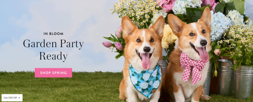
Pet brands do not win on product alone. They win when the website makes shoppers feel an emotional connection before they ever click into a collection page. That is exactly why The Foggy Dog is such a strong Shopify reference point. Its homepage blends lifestyle storytelling, seasonal merchandising, personalization, gifting, social proof, and cause-driven branding into one polished customer journey. The site highlights clear top-level paths such as New, Walk, Wear, Sleep, Play, Bundle + Save, Personalization, Collections, and Sale, while also pushing seasonal campaigns like Easter and Spring from the first screen.
For a project like this, our role as a design partner is not to copy what already exists. Our job is to study why the experience works, identify the brand mechanics behind the visuals, and translate those insights into a tailored Shopify design system that fits the client’s own products, audience, and commercial goals. In this kind of engagement, we focus on structure, visual hierarchy, brand storytelling, merchandising presentation, and conversion-focused page design rather than development-heavy implementation details.
| 配達時間 | カテゴリ | アプリケーションプラットフォーム |
| 10days | pet | shopify |
| 関与するデザイナー | 料金 | 効果 |
| ナンシー | $300 | flow📈217% |
The Foggy Dog homepage works because it understands its customer immediately. It does not present itself as a discount pet store. It presents itself as a polished lifestyle brand for pet parents who care about aesthetics, gifting, quality, and emotional value. That positioning shows up in the way the homepage uses soft seasonal colors, premium pet photography, editorial-style product grouping, and clean navigation architecture. The homepage also layers in trust signals, including a giving-back message, a review section labeled “Making Tails Wag,” and user-generated social content under “Foggy Dog in The Wild.”
That combination matters in Shopify design. A good Shopify storefront is not just a product catalog with banners. It is a guided visual journey. On this site, the journey starts with a seasonal hero, moves into curated shopping edits, introduces category pathways, surfaces personalized products, reinforces the mission of the brand, and closes with social proof and community. From a design perspective, that is a very complete funnel.
If we were hired to design a Shopify website in this style, our first goal would be to create a storefront that feels premium and emotionally warm from the first second. The objective would not simply be to “make the homepage look nice.” The true goal would be to help the client communicate a distinct pet lifestyle brand through layout, image direction, typography balance, category organization, and collection storytelling.
A homepage like this needs to do five things well. It needs to introduce the brand mood. It needs to make shopping easy. It needs to help customers discover product categories. It needs to increase average order value through bundles and product sets. And it needs to build confidence through reviews, community imagery, and mission-driven messaging. The Foggy Dog already demonstrates many of these principles through its category structure, bundled offers, personalization path, review section, and charitable message about feeding shelter dogs.
Every strong Shopify design begins with positioning. Before we design sections, we define the feeling the site should create. For a pet lifestyle brand, that usually sits somewhere between playful and polished. The Foggy Dog leans into a cheerful, giftable, editorial direction rather than a mass-market pet supply look, and that distinction changes every design decision that follows.
In our process, we would build a visual strategy around questions like these:
What kind of pet parent is the brand speaking to?
Is the brand more boutique, more premium, more playful, or more practical?
Should the site feel seasonal, timeless, or trend-led?
How much of the homepage should be lifestyle versus product-led?
For a project inspired by this type of reference, we would likely recommend a warm pastel palette, soft neutral support colors, elevated serif-meets-clean-sans typography, and photography that makes the products feel collectible rather than purely functional.
We do not stop at a Pinterest-style inspiration board. We turn the brand direction into a usable design system. That includes color roles, spacing rhythm, section behaviors, image crop logic, CTA styles, collection card rules, icon style guidance, and headline hierarchy. This is especially important in Shopify because the homepage often grows over time with seasonal edits, new launches, and campaign blocks. A design system keeps the storefront cohesive even when content changes.
One of the strongest parts of The Foggy Dog experience is its clear top navigation. The category labels are easy to understand, and they mirror how customers actually browse: by product type, need state, or seasonal collection. We would use that same principle when designing for a client. A homepage should reduce decision fatigue, not increase it.
For a Shopify pet brand, we would plan the homepage around a sequence like this:
Hero Banner
A lifestyle-first hero that communicates the season, collection, or campaign.
Quick Collection Entry Points
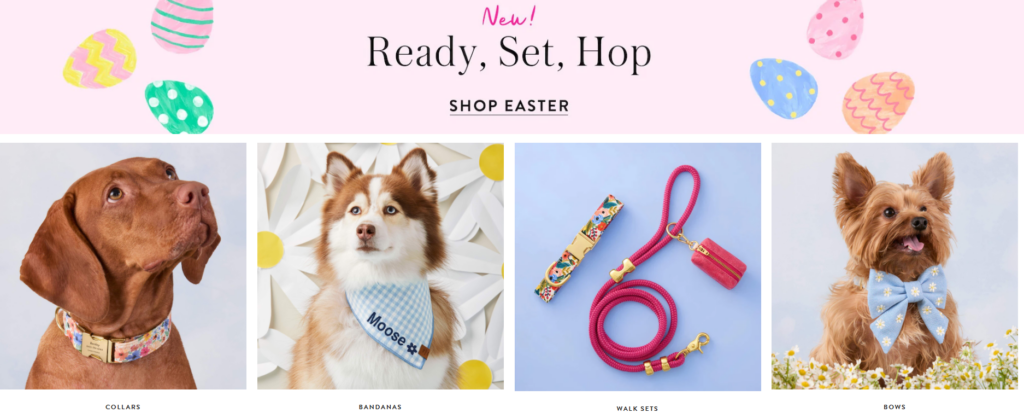
Visual cards that let shoppers jump to top categories such as collars, bandanas, leashes, beds, or toys.
Curated Merchandising Rows
Collection edits organized by theme rather than by randomness. Examples could include spring florals, wedding pets, gifting essentials, or best sellers.
Personalization Feature
A dedicated block that highlights custom products, which helps increase perceived value and gifting appeal.
Trust and Community
Reviews, social imagery, and mission messaging that reinforce quality and emotional credibility.
This structure is effective because it follows how modern ecommerce customers scan. They want inspiration first, then fast entry into relevant products, then reassurance before buying.
Many Shopify homepages waste the hero area on generic brand photography. We take a different approach. The hero should combine beauty with direction. The Foggy Dog hero uses strong lifestyle imagery and seasonal campaign language, then supports it with a direct call to shop the featured collection. That is exactly how a hero should work. It should set tone and drive action at the same time.
When we design a hero for a client, we focus on four visual priorities:
the subject must read clearly on desktop and mobile,
the offer or theme must be understood in seconds,
the CTA must be easy to find,
and the photography must reflect the brand’s price point.
A common challenge in Shopify design is that brands want a premium editorial look, but they still need the page to sell products. We solve this by controlling visual rhythm. Instead of making every section equally loud, we alternate between large emotional images and tighter product-focused grids. The Foggy Dog homepage does this well by mixing full-width brand moments with smaller shopping modules, collection edits, and product rows.
That rhythm keeps the page from feeling like either a sterile catalog or an overly artistic campaign page. It creates a better balance between discovery and conversion.
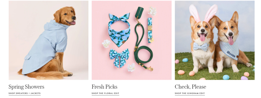
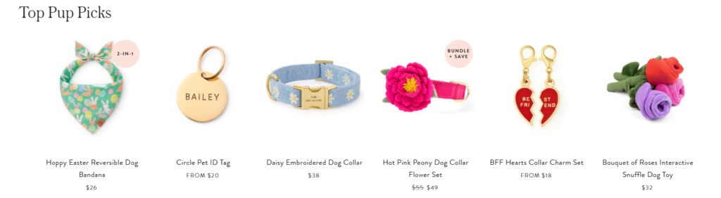
One of the smartest design choices on The Foggy Dog homepage is how products are presented as coordinated edits rather than isolated listings. Seasonal collections, collar-and-bow combinations, walk sets, and themed product groupings all help customers imagine a complete look instead of a single SKU. The navigation and featured categories also reinforce those shopping patterns through sections like Walk Sets, Collar + Bow Sets, Charms + ID Tags, and Personalization.
This is where thoughtful Shopify design directly supports revenue. When the page shows products in a styled ecosystem, the customer is more likely to build a matching purchase. Our design method would lean heavily into that by creating:
Styled Collection Cards
Category blocks with consistent imagery, short emotional copy, and strong CTA labels.
Coordinated Product Rows
Merchandising bands that present matching products together by palette, season, or use case.
Cross-Sell Storytelling
Visual logic that naturally moves shoppers from collars to charms, bandanas, leashes, beds, or gifts.
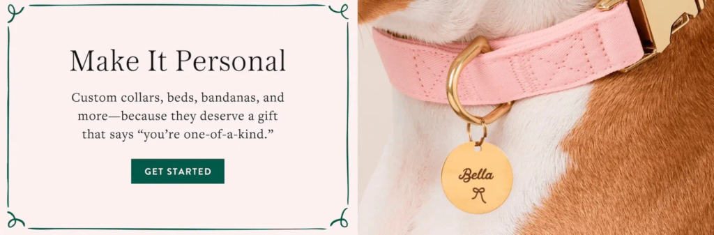
Personalized products are not just another category. They are a value multiplier. The homepage screenshot clearly gives personalization a featured promotional block, which is a smart design decision because customization increases sentiment, gifting appeal, and perceived uniqueness.
In our design work, we would treat personalization as a visual feature story, not a small link buried in navigation. That means clearer before-and-after product styling, emotional headline copy, and a section layout that frames customization as a signature service of the brand.
Pet brands often have too many adorable visuals competing at once. That can make the homepage look chaotic. A site like The Foggy Dog avoids that by maintaining a consistent color mood, clean spacing, and disciplined image selection even when the products are playful.
Our solution would be to set tighter rules for color balance, section density, and image crop consistency. Cute should never mean crowded.
Accessories like charms, collars, and bows can feel fragmented if the layout is too transactional. The answer is design framing. We would use larger visual storytelling blocks, coordinated set photography, and more intentional whitespace so even smaller-ticket products feel collectible and gift-worthy. The Foggy Dog’s grouped presentation of collars, bandanas, bows, ID tags, and walk sets shows how much stronger accessories look when they are merchandised as a family.
Trust is essential in ecommerce, but generic badge-heavy layouts can damage brand warmth. The Foggy Dog solves this by embedding trust into brand storytelling. Its review area highlights more than 10,000 five-star reviews, and its giving-back message explains that every order feeds a shelter dog. Those are persuasive trust signals, but they are presented in a friendly, brand-consistent way.
Our approach would follow the same principle. Instead of dumping trust elements into one crowded strip, we would integrate them into beautifully designed sections that feel native to the brand.
We would design the homepage so each section has one job. The hero would inspire. The category grid would direct. The merchandising blocks would sell. The personalization section would deepen value. The reviews would reassure. The social section would create community. This kind of role-based structure improves both usability and visual clarity.
We would recommend photography that feels natural, bright, and editorial, with careful emphasis on fabric textures, color coordination, and pet expression. The goal would be to make every product look emotionally desirable, not merely functional. This is especially important for brands selling style-led pet accessories.
We do not rely on loud discount graphics to drive performance. Instead, we use better hierarchy, stronger content grouping, more compelling collection imagery, and better CTA placement. The Foggy Dog demonstrates that a Shopify store can feel calm, premium, and conversion-aware at the same time.
A homepage designed this way should deliver stronger first impressions, clearer product discovery, better category engagement, and higher perceived brand value. It should also support improved average order value by presenting coordinated sets and gifting paths more effectively. Just as important, it should help the brand feel memorable.
The Foggy Dog experience suggests why this works. The site creates multiple reasons to buy beyond basic utility: seasonal freshness, personalized gifting, styled product combinations, social proof, and emotional mission. Those are design-led merchandising advantages, not just product advantages.
設計する Shopify website like this is about more than arranging sections on a page. It is about shaping how a customer feels, what they notice first, how easily they shop, and why they trust the brand enough to buy. The strongest lesson from The Foggy Dog is that thoughtful Shopify design can turn a pet product catalog into a fully developed lifestyle experience. Its navigation, seasonal storytelling, curated bundles, personalization focus, charitable messaging, review content, and social community features all contribute to a storefront that feels polished and intentional.
That is the kind of work we aim to deliver: strategic, visually refined, conversion-aware Shopify design that helps brands look more valuable and sell more confidently. At エアサン, we focus on exactly this kind of ecommerce page design—brand-led storefronts that combine aesthetics, structure, and shopping clarity into a stronger independent online presence.


