


 Japanese
導入
Building a successful eCommerce website for a niche outdoor brand requires more than clean visuals—it demands a deep understanding of user intent, product storytelling, and conversion-focused structure. When working on the website for YakAttack, a premium kayak fishing accessories brand powered by BigCommerce, our primary focus was to elevate the design experience while preserving the rugged authenticity of the brand.
This project centered on creating a seamless, intuitive, and visually compelling journey that aligns with how real fishing enthusiasts explore, evaluate, and purchase gear online. Rather than simply redesigning a homepage, we approached the entire site as a connected system—where every page contributes to trust, clarity, and conversion.
| 配達時間 | カテゴリ | アプリケーションプラットフォーム |
| 24日間 | Outdoor fishing gear | ビッグコマース |
| 関与するデザイナー | 料金 | 効果 |
| リン・チャン | $2100 | flow📈342% |
ブランドとそのオーディエンスを理解する
Who Are We Designing For?
YakAttack serves a very specific audience: passionate kayak anglers who value durability, modular gear systems, and real-world performance. These users are:
- Highly product-aware
- Detail-oriented in their purchasing decisions
- Motivated by functionality over aesthetics—but influenced by strong visuals
Design Objective
Our goal was to bridge two worlds:
- The raw, outdoor identity of fishing culture
- The clean, structured clarity of modern eCommerce design
We needed to ensure the site felt both authentic and premium, without overwhelming users with technical complexity.
ホームページデザイン戦略
強い第一印象を与える
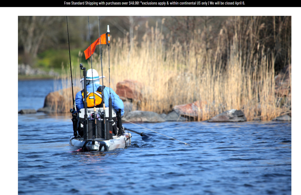
The homepage acts as the entry point into the brand’s ecosystem. We designed it to immediately communicate three key ideas:
- Lifestyle immersion (kayak fishing in action)
- Product ecosystem clarity (modular gear categories)
- Brand authority and trust
Hero Section Approach
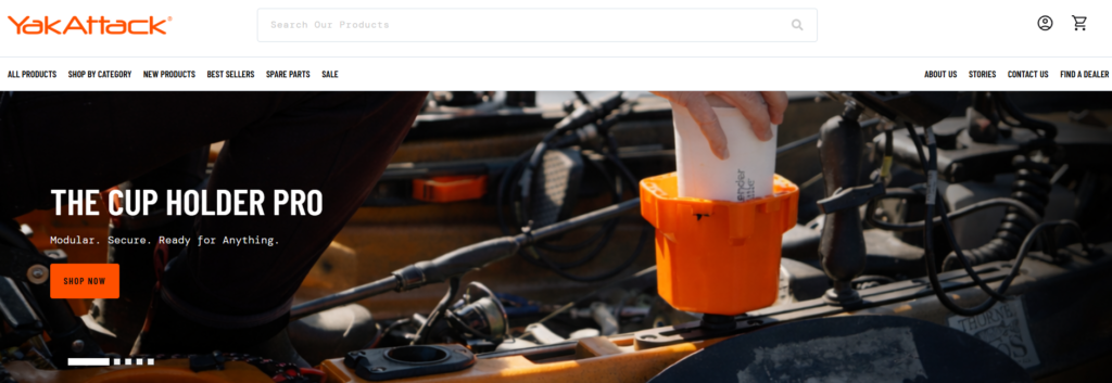
- Full-width lifestyle imagery showcasing real fishing scenarios
- Minimal but impactful headline messaging
- Clear primary CTA guiding users into product exploration
This approach avoids clutter and instead pulls users into an emotional context—helping them visualize themselves using the gear.
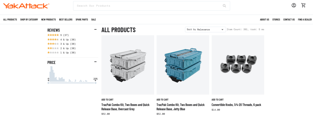
Structuring Product Discovery
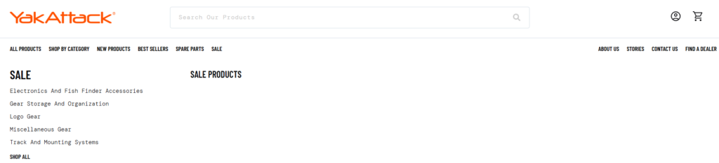
One of the biggest challenges in fishing gear websites is complexity. There are multiple product types, compatibility concerns, and technical variations.
We addressed this through structured category navigation:
Category Blocks
- Rod holders
- Mounting systems
- Storage solutions
- アクセサリー
Each category is visually represented with:
- Clean product imagery
- Short, benefit-driven descriptions
- Clear navigation hierarchy
This reduces cognitive load and allows users to quickly find what they need.
Balancing Visual Impact with Clarity
Outdoor brands often rely heavily on imagery, but too much visual noise can hurt usability.
私たちの設計ソリューション:
- Controlled use of high-quality visuals
- Strong spacing and grid alignment
- Consistent typography hierarchy
This ensures the site feels premium without sacrificing readability.
Product Page Design Optimization
Designing for Decision-Making
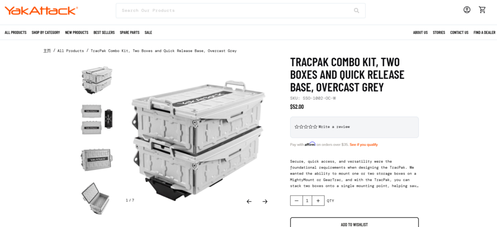
Product pages are where conversions happen. Instead of overwhelming users with technical data, we structured content to guide decision-making naturally.
Key Design Elements
- Above-the-fold clarity
- Product name, key benefits, and pricing visible immediately
- Visual storytelling
- Lifestyle images + close-up product details
- Structured information hierarchy
- Features → Benefits → Use cases
- Clear CTA positioning
- Prominent and always accessible
Simplifying Complex Product Systems
YakAttack products often work as part of a modular system. This can confuse users if not clearly explained.
We introduced:
- Visual compatibility cues
- Related product groupings
- Simple explanatory sections
This transforms complexity into clarity—helping users understand how products work together.
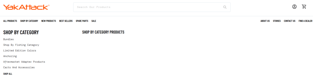
Collection Page Experience
Improving Browsing Efficiency
Collection pages were designed to support both:
- Quick scanning
- Deeper exploration
Design Enhancements
- Clean grid layout with consistent spacing
- Multi-line product titles with controlled truncation
- Subtle hover interactions for engagement
We avoided excessive filters or distractions, focusing instead on clarity and speed.
Visual Consistency Across Listings
Consistency builds trust. We ensured:
- Uniform product image ratios
- Balanced spacing between elements
- Predictable layout behavior
This makes the browsing experience feel stable and professional.
Supporting Pages and Brand Storytelling
About and Brand Pages
Rather than treating these as secondary pages, we designed them as trust-building assets.
Key Focus Areas
- Brand origin and mission
- Real-world product usage
- Community-driven identity
The layout emphasizes:
- Storytelling sections
- Lifestyle imagery
- Clean typography
Content and Educational Sections
Fishing enthusiasts often research before buying. We supported this behavior by structuring content areas that:
- Educate users on gear usage
- Showcase real applications
- Reinforce expertise
This approach positions the brand as both a product provider and a knowledge source.
私たちのデザインプロセス
Step 1: Research and Analysis
We began by analyzing:
- Competitor websites
- User behavior patterns in outdoor niches
- Existing site structure and pain points
This helped us identify gaps in clarity, navigation, and visual hierarchy.
Step 2: Information Architecture
We restructured the site to:
- Simplify navigation paths
- Group related products logically
- Reduce unnecessary friction
The goal was to make every click feel intentional.
Step 3: Visual System Design
We established a consistent design language:
- タイポグラフィの階層
- Color usage aligned with outdoor branding
- Spacing and layout grids
This ensures visual coherence across all pages.
Step 4: Conversion-Focused Layouts
Every section was designed with a purpose:
- Guide users
- 混乱を減らす
- Encourage action
We focused on clarity over decoration.
直面した課題
1. Complex Product Relationships
YakAttack’s modular system can be difficult to explain visually.
私たちの解決策:
We simplified communication through layout structure and visual grouping instead of technical explanations.
2. Balancing Rugged Branding with Modern UX
Outdoor brands often lean heavily into rugged aesthetics, which can conflict with clean UX design.
私たちの解決策:
We retained authentic imagery while applying modern layout principles to maintain usability.
3. Avoiding Information Overload
Too much product detail can overwhelm users.
私たちの解決策:
We prioritized key selling points and structured additional details progressively.
Our Design Approach and Philosophy
Customer-First Experience
We design for how users think—not how brands want to present information.
これはつまり:
- 明確なナビゲーション
- 論理的なコンテンツフロー
- Reduced decision friction
Visual Clarity Over Complexity
Instead of adding more elements, we focus on:
- Better spacing
- Strong hierarchy
- Intentional design choices
Scalable Design Systems
We build designs that:
- Work across multiple pages
- Maintain consistency
- Adapt as the product catalog grows
結果と影響
ユーザーエクスペリエンスの向上
- Easier navigation across categories
- Faster product discovery
- Clearer understanding of product systems
Stronger Brand Perception
- More premium visual identity
- Increased trust through consistency
- Better storytelling across pages
Enhanced Conversion Potential
- Clear CTAs
- Reduced confusion
- More confident purchasing decisions
結論
Designing an eCommerce website for a specialized outdoor brand like YakAttack requires more than aesthetics—it requires strategic thinking, user empathy, and a deep understanding of how design drives behavior.
By focusing on clarity, structure, and storytelling, we transformed the site into a cohesive digital experience that supports both exploration and conversion. Every page—from homepage to product detail—was designed to guide users naturally while reinforcing the brand’s identity.
At the end of the day, great eCommerce design is not about making things look better—it’s about making them work better.
で エアサン, we specialize in crafting high-converting, design-driven independent websites for global brands. If you’re looking to elevate your eCommerce experience through strategic design, our team is ready to help you build a site that not only looks premium—but performs.


WordPressのウェブサイトや、完全なeコマースシステムを備えたコーポレートサイトをデザイン・構築します。.
価格帯$200.00~$2,500.00カスタム要件または特別見積もり
元価格は$2.00。.$1.00現在の価格は$1.00。. Amazonホーム理学療法機器のメイン画像デザイン解説
はじめにAmazonで家庭用治療器の信頼できるイメージを構築する Amazonで家庭用治療器のメインイメージをデザインする際、私たちが最も重視するのは...

Amazon リップスティックコンバージョンのメイン画像デザイン
はじめにアマゾンで売れる口紅のメイン画像をデザインする アマゾンの口紅のメイン画像をデザインするとき、私たちの責任は...

ハッカーがWordPress管理者のメールアドレスを盗む方法(そしてそれを阻止する方法)
WordPressの管理者メールアドレスは、あなたが思っている以上に公開されているのです。ハッカーはそれが大好きです。彼らにとって、あなたの...

Amazonのリキッドファンデーションのメイン画像がコンバージョンにつながる理由
はじめに Amazonリキッドファンデーションのメイン画像デザインは、単に商品を美しく見せるだけではありません。Amazonでは、メイン画像と….

フィルターカートリッジの効果的なAmazonメインイメージのデザイン
はじめに Amazonのメイン画像をデザインする上で、商品を魅力的に見せることは決して重要ではありません。明確さ、信頼性、そして瞬時に理解できることが何よりも重要です。特に….

WordPress へのリプレイ攻撃: 本当の脅威か、それとも誇張された神話か?
まず最初に明確にしておきましょう。リプレイ攻撃は見た目には怖くありません。パスワードを破壊したり、緑色のハッカーテキストが飛び交うような悪質なコードを挿入したりもしません。彼らは狡猾なのです…。.

WordPressページを何も壊さずに複製する方法
正直に言って、新しいページを作りたくない時もあるでしょう。同じページを少しだけ変えたいだけなのに。レイアウトもブロックも設定も全部同じ。なぜなら….

ペット向けWordPressテーマ5選を比較
はじめに ペット関連のWordPressテーマを適切に選ぶことは、単なるデザイン上の決定ではありません。使いやすさ、拡張性、そして長期的なビジネスの成長に直接影響します。ペットケアとペット...

5つの水着eコマーステーマを比較
はじめに 水着やランジェリーの独立ストアに適切なテーマを選択することは、見た目だけの問題ではなく、コンバージョン率、拡張性、長期的な効果に直接影響します...

WordPressでコメント機能をオフにする方法(気が狂わずに)
WordPressのコメントについてお話しましょう。理論上は、コメントは素晴らしいものです。議論を促し、コミュニティを築き、ウェブサイトに「活気」を与えてくれます。しかし実際にはどうでしょうか?コメントはしばしば人を惹きつけ….

科学主導のブランドのためのスケーラブルなWordPressウェブサイトの構築:AminoUSAプロジェクト
はじめに 今日のデジタル環境において、ウェブサイトは単なる製品リストを掲載する場所ではありません。規制の厳しい業界や研究重視の業界で事業を展開する科学主導のブランドにとって、ウェブサイトは….

グローバルブレードブランドのためのスケーラブルなShopifyストアの構築:CoolKatanaプロジェクト
はじめに 越境電子商取引において、Shopify の Web サイトは単なる店舗ではありません。ニッチで文化主導のカテゴリーで活動するブランドにとって、Web サイトは単なる店舗以上のものを実現する必要があります...

ポケモンカード向け高コンバージョンShopifyストアの設計
はじめに 収集可能な電子商取引の世界、特にポケモン トレーディング カード ゲーム (TCG) 市場では、Web サイトは単に製品をリストするだけでは不十分です。...

カスタムレンガブランドのための高コンバージョンShopifyデザイン
はじめに 今日の競争の激しいeコマース市場、特にパーソナライズされたギフトやコレクターズアイテムの分野では、Shopifyのウェブサイトは商品を展示する以上の機能を提供する必要があります。それは….

Shopifyサポートへの問い合わせ方法:シンプルでストレスフリーなガイド
Shopifyストアの運営は、混乱するのではなく、ワクワクするものであるべきです。疑問が生じたり、問題が発生して作業が滞ったりした場合でも、Shopifyは状況に応じて複数のサポートパスをご用意しています。.

Shopifyストアを非アクティブ化する方法:分かりやすく実践的なガイド
Shopifyストアの無効化はそれほど複雑ではありませんが、多くのマーチャントが見落としている影響があります。このガイドでは、そのプロセスを分かりやすく解説します。.

高級花卉ブランド向けShopifyウェブサイトデザイン事例
はじめに 今日の競争の激しいeコマース市場において、Shopifyのウェブサイトは商品を表示する以上の機能を提供する必要があります。ブランド価値を瞬時に伝え、ユーザーを誘導する必要があります….

Shopifyデザインケーススタディ:レトロゲームストア
はじめに 競争の激しいeコマース環境では、視覚的な明瞭さと感情的な繋がりが、訪問者が顧客になるかどうかを左右することがよくあります。これは特に….