Focusing on the clustered false eyelash set, we organize the style comparison and makeup effect display into a set of English product pictures. The entire set of works adopts the visual language of pink and white makeup, detailed titles, and close-ups of eyes. Through the division of labor in different pictures, the product appearance, local information, and usage scenarios are gradually presented.
| サービス | Industry | プラットフォーム |
|---|---|---|
| Amazon primary and secondary product images design | Beauty and personal care | Amazon |
| Project requirements | target market | design style |
| Style comparison and makeup effect display | English content display | Pink and white makeup, thin title, close-up of eyes |
| Project quotation | Delivery content | Delivery time |
| ¥500 | 7 product primary and secondary product images | 4 days |
Design Challenge: Let different information have its place
The set includes eyelashes of different densities and lengths, as well as clamps and glue accessories. If all the information is piled into one picture, tools and styles will easily compete for attention. We broke down the unboxing contents, selection basis and character makeup, and asked each picture to answer a specific question.
Our design strategy
Use light pink and a large area of white to inherit the beauty atmosphere, making the black eyelashes the clearest visual subject.
Make eye contrast, length arrangement and suit tiling into separate pictures, and unify thin line annotations and margins.
Overview of the set: first take a look at the combination inside the box
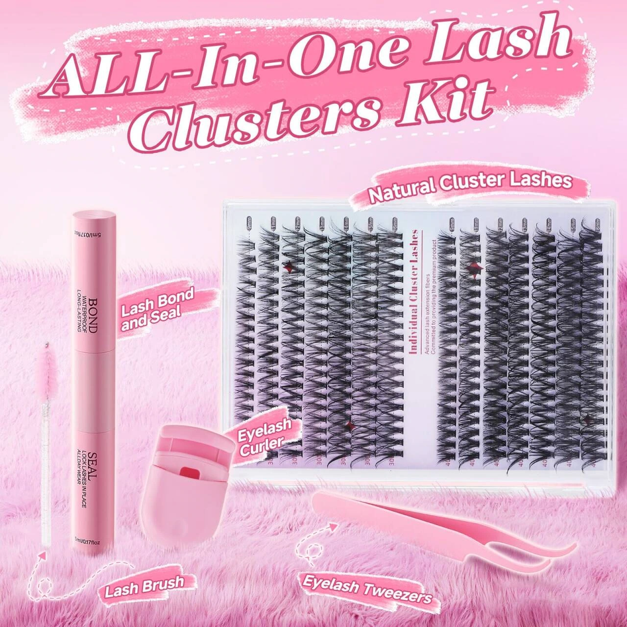
We laid out eyelash trays, clamps, brushes and bottle accessories on a white background, and used pink areas to collect titles and small labels. There are gaps between the items, and the slender tools are arranged along the edges of the picture. Readers can first identify the complete combination and then look for accessories one by one.
Style selection: put density in the same scale
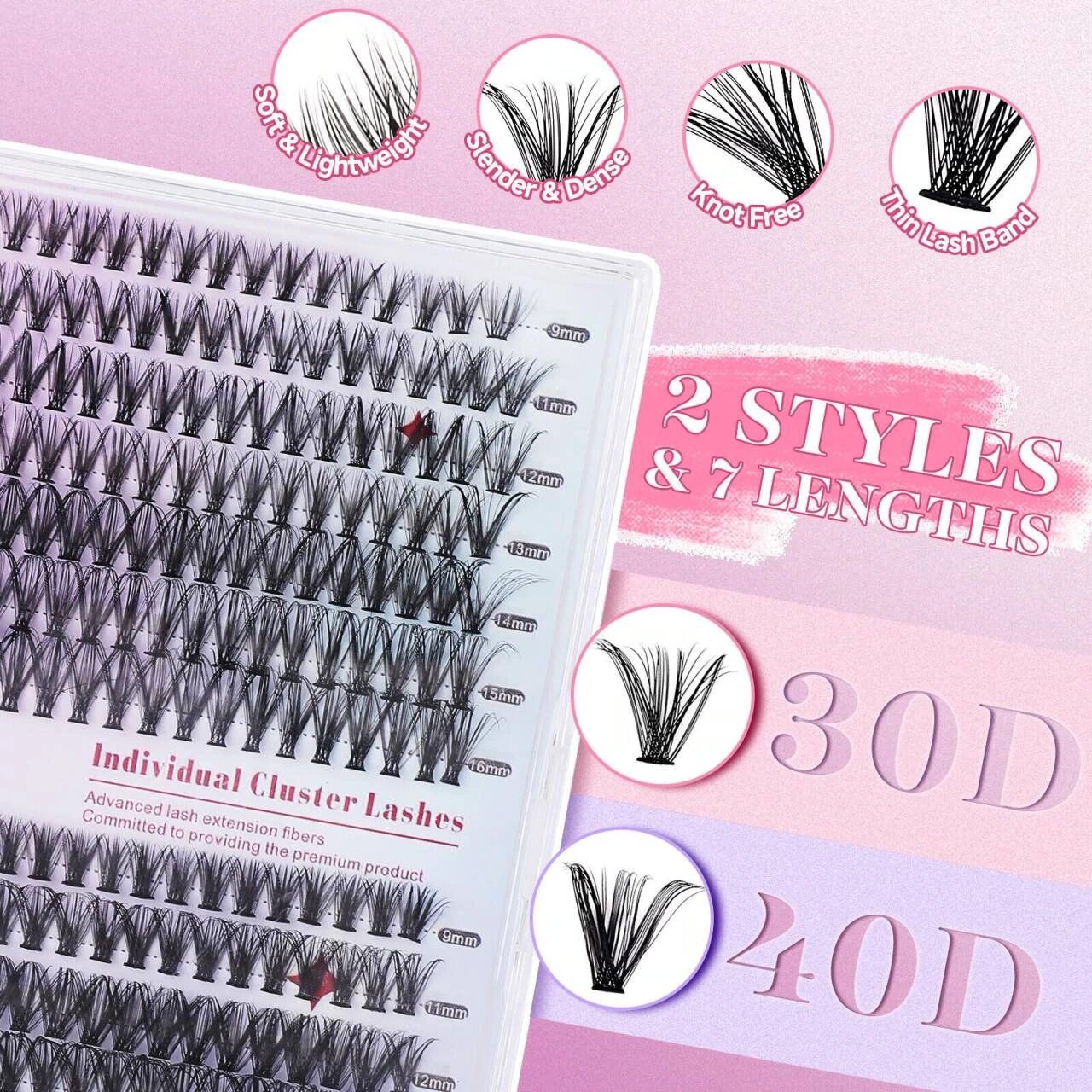
We place two eyelash trays side by side, with a circular enlargement above to complement the texture of the hair bundles. The title and style numbers should be kept in larger font sizes, and detailed descriptions should be relegated to the next level to avoid dense small fonts from overshadowing the actual differences between the two styles.
Eye Contrast: Uniform cropping helps observation
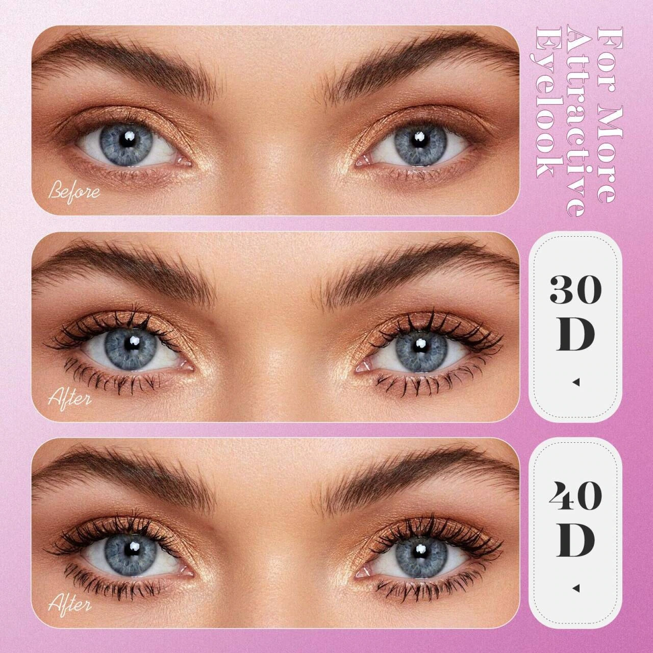
We divided the eye close-up into three horizontal frames, maintaining similar viewing angles and cropping ranges, and then used short labels to distinguish the original state from the two styles. The light-colored dividing strip makes the comparison sequence clearer, focusing on the visual changes in eye contour and eyelash arrangement.
People and products: connecting the look back to the suit
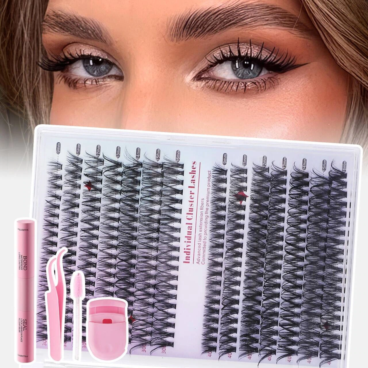
We let the character’s eyes occupy the upper half, leaving the eyelash tray and tools below to form a vertical reading path from makeup to products. The pink and white background color continues the style of the entire set, and there are no excessive decorations in the product area, making it easy to identify the contents of the set.
Quantity information: arranged around the slanted lash tray
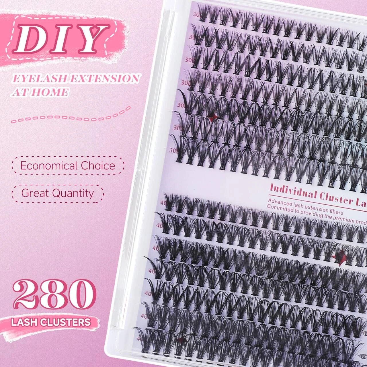
We let the eyelash tray occupy the main body at a diagonal angle, using light pink dotted lines and short labels to guide the quantity information around. The tilted composition brings changes, but the text is still arranged according to the horizontal baseline, keeping reading stable.
Length arrangement: allows specifications to be searched column by column
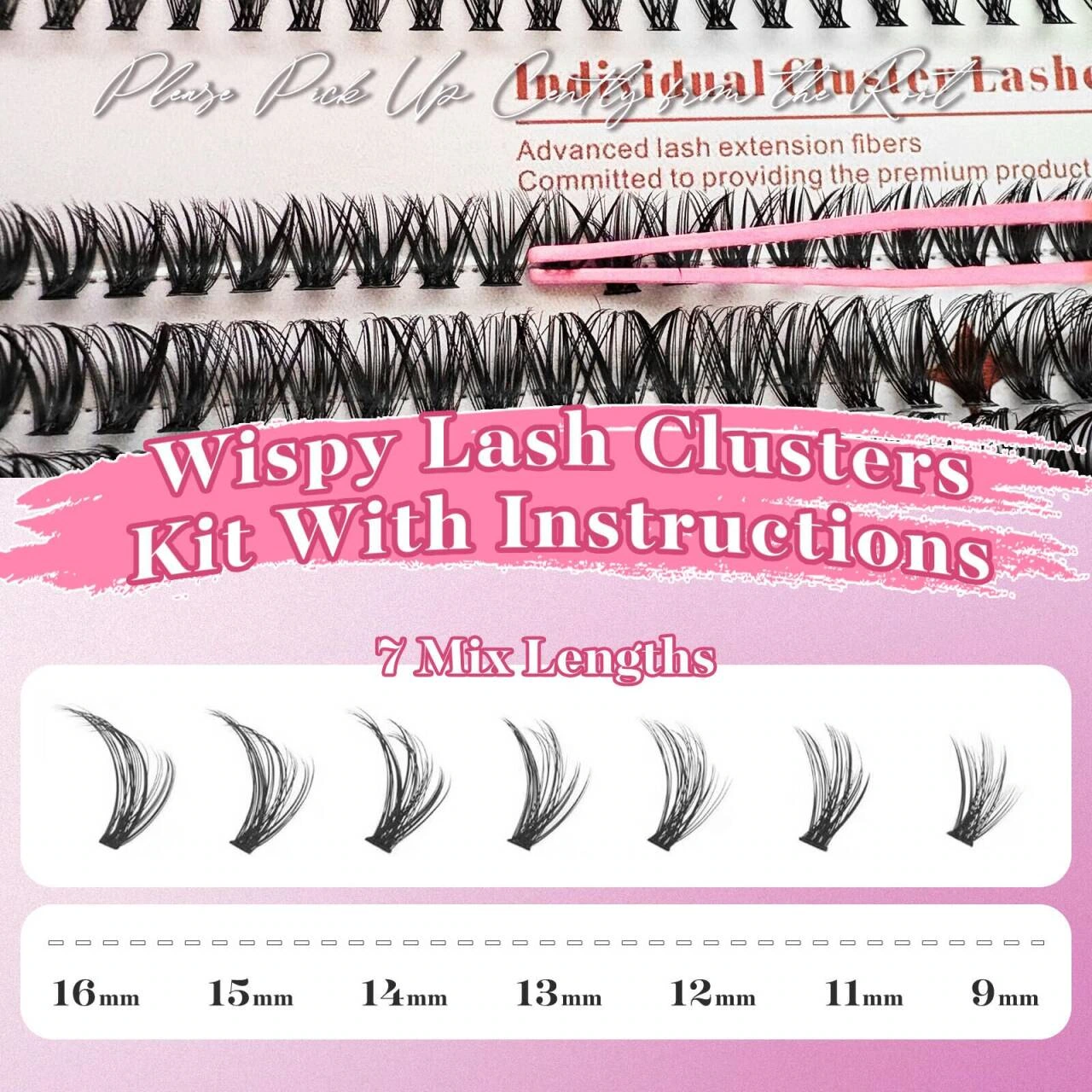
We arrange them horizontally according to the length of the hair bundles, with the numbers falling directly on the corresponding positions, and using pink and white information blocks to distinguish the titles and parameters. The spacing between lengths remains consistent, allowing dense formats to establish a defined rhythm.
Portrait finishing: retain branded beauty tone
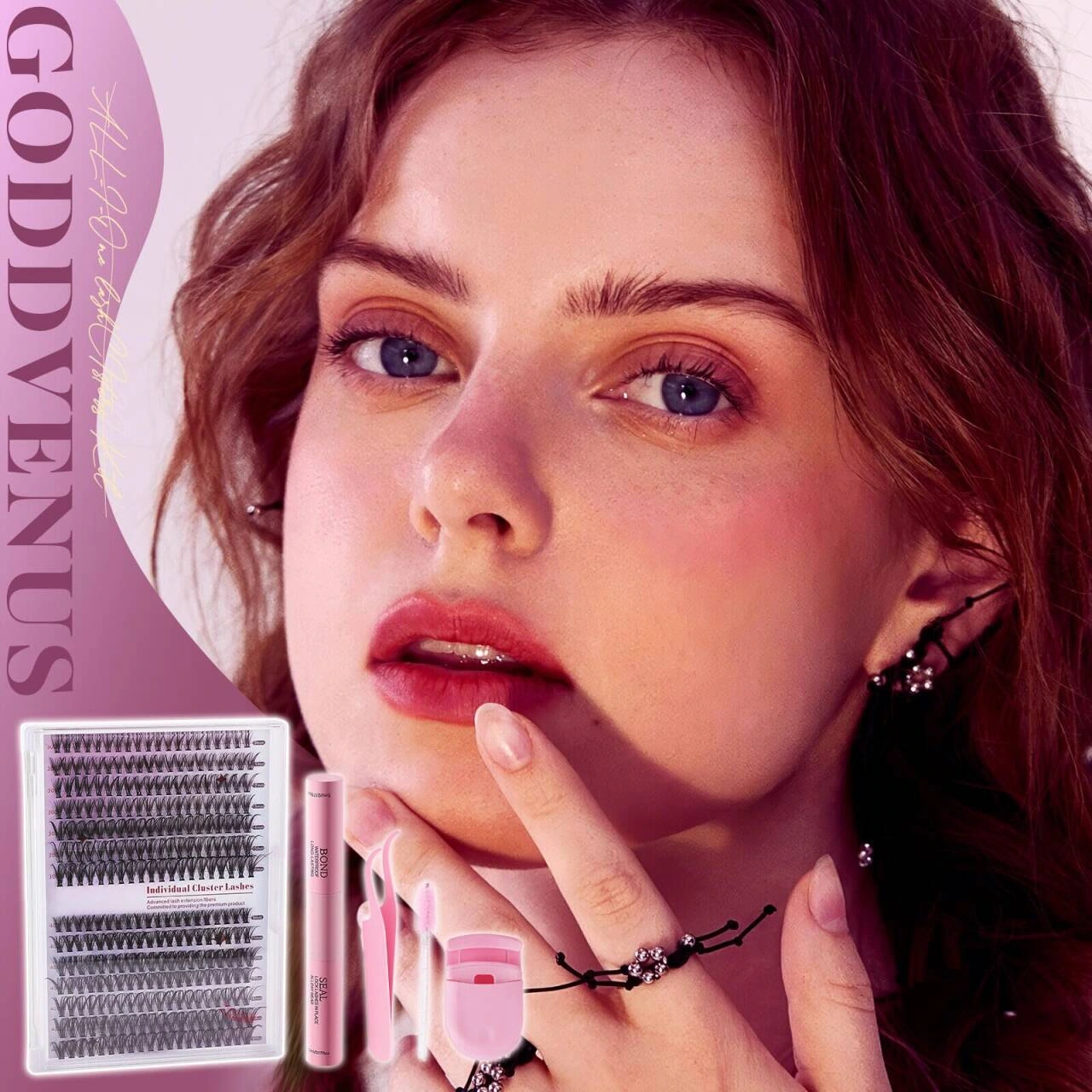
We wrap up the group with complete character portraits, and place the set on the lower left as a product anchor. The vertical fonts and large white space continue the light beauty style, and characters, titles and products each occupy clear areas.
Deliver and design value
This set of works contains a total of 7 product pictures. We arranged the responsibilities of different pictures around style comparison and makeup effect display, and maintained the visual consistency of the entire set with pink and white makeup, detailed titles, and eye close-ups. From overall identification to partial explanation, the pictures complement each other, allowing readers to find information based on their own concerns.
Develop a clear visual expression for your products
You can provide us with existing product information, physical photos and key points to be displayed. We will combine the product structure, style differences and usage scenarios to plan image content and layout suitable for Amazon product display.