


 Japanese
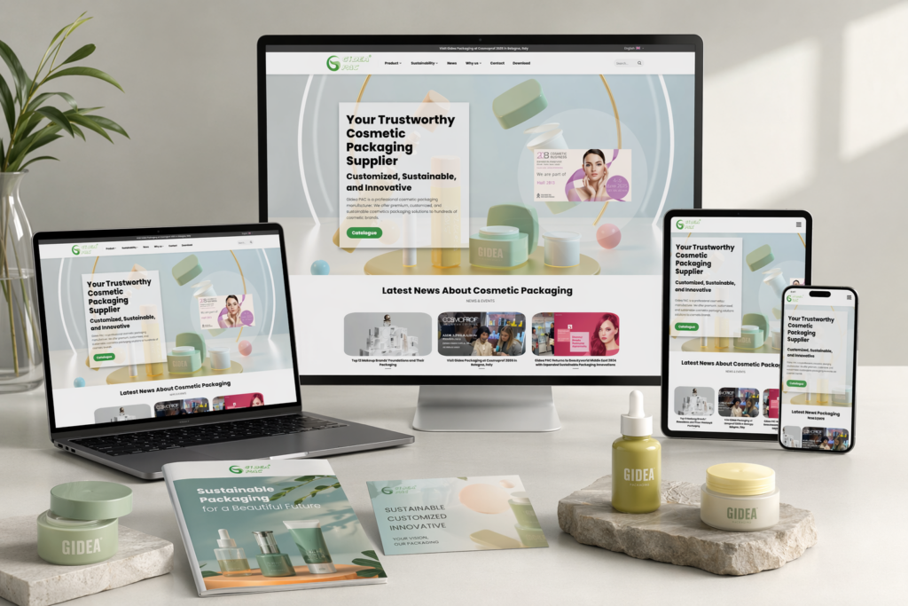
導入
In today’s competitive global market, a website is no longer just a digital brochure—it is a core business asset that shapes how customers perceive a brand, interact with its products, and ultimately make purchasing decisions. For manufacturers and suppliers in industries like cosmetic packaging, the challenge is even greater: how do you present technical products in a way that feels premium, trustworthy, and easy to understand?
This was exactly the challenge behind the creation of the ワードプレス ウェブサイト Gidea PAC. The goal was not only to establish a strong online presence, but to build a structured, scalable, and conversion-oriented website that could support long-term global growth.
In this case study, we’ll walk through how we helped the client build their WordPress website from the ground up, how we approached page structure and design, and how a strategic combination of website construction and visual presentation can elevate a brand in a highly competitive B2B industry.
| 配達時間 | カテゴリ | アプリケーションプラットフォーム |
| 23日間 | Cosmetic Packaging | ワードプレス |
| 関与するデザイナー | 料金 | 効果 |
| リン・チャン | $2600 | Pageviews📈314% |
プロジェクトの目標と戦略的方向性
Before starting the build, we aligned closely with the client to define clear objectives. These goals guided every decision throughout the project.
Key Objectives
- Establish a professional and trustworthy global brand image
- Clearly present complex product categories and customization capabilities
- Improve user navigation and content clarity
- Build a flexible structure for future expansion
- Support lead generation and business inquiries
Unlike many projects that focus purely on aesthetics, this project required a strong foundation. The website needed to function as both a product showcase and a business conversion tool.
Our Approach to WordPress Website Construction
Rather than jumping straight into visual design, we began with the core of the website: its structure and build logic.
Structured Page Architecture
We designed a clear and scalable sitemap that organizes content in a way that is intuitive for global users:
- Homepage (brand positioning and overview)
- Product categories (organized by packaging type)
- Customization solutions
- About the company
- Contact and inquiry pages
This structure ensures that users can quickly understand what the company offers without confusion.
Modular Build Strategy
To ensure flexibility, we built the site using a modular approach. Each section of the page functions as an independent content block, allowing:
- Easy updates and replacements
- Consistent layout across pages
- Faster future expansion
This approach mirrors the logic of modern eCommerce platforms, bringing similar flexibility into WordPress without relying on complex development.
Performance-Oriented Setup
We prioritized speed and usability from the beginning:
- Clean layouts with minimal unnecessary elements
- System font usage for faster loading
- Optimized image placement and sizing
- Mobile-first layout considerations
The result is a smooth browsing experience across both desktop and mobile devices.
Homepage Design and Layout Strategy
The homepage plays a critical role as the first impression of the brand. Our focus was to combine strong visual storytelling with clear information hierarchy.
Hero Section: Immediate Brand Impact
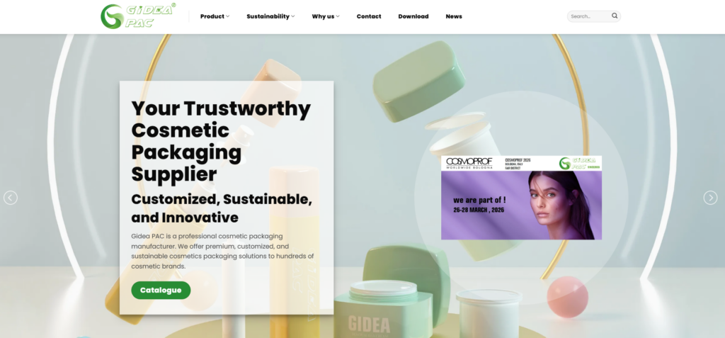
We used a clean, high-quality hero section to communicate:
- The brand’s positioning in cosmetic packaging
- Core strengths such as sustainability and customization
- A clear call-to-action for inquiries
This section sets the tone for the entire website.
Product Showcase: Organized and Visual
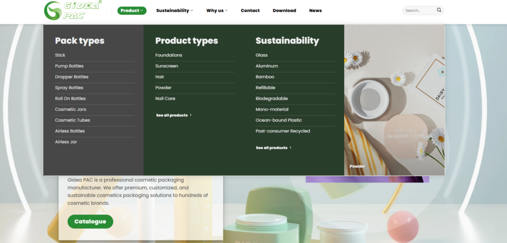
Instead of overwhelming users with too many options, we structured product categories into visually distinct sections:
- Bottles
- Jars
- Tubes
- Custom packaging
Each category includes clean imagery and concise descriptions, helping users quickly identify relevant products.
Trust-Building Elements
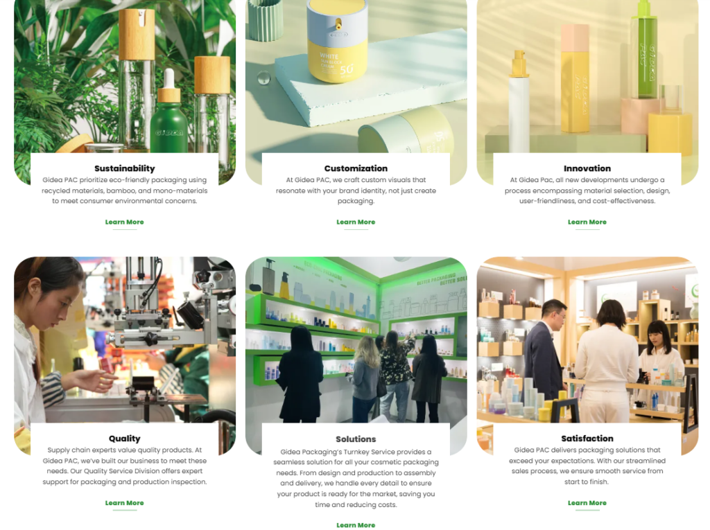
To strengthen credibility, we integrated:
- Client references or use-case scenarios
- Highlights of manufacturing capabilities
- Emphasis on eco-friendly materials
These elements are essential for B2B decision-making.
Clear Navigation Flow
Every section on the homepage is designed to guide users deeper into the site:
- From overview → product categories
- From products → customization
- From interest → contact
This structured flow increases engagement and conversion potential.
Extending Beyond the Homepage
While the homepage is the entry point, the real strength of the website lies in its supporting pages.
Product Detail Pages
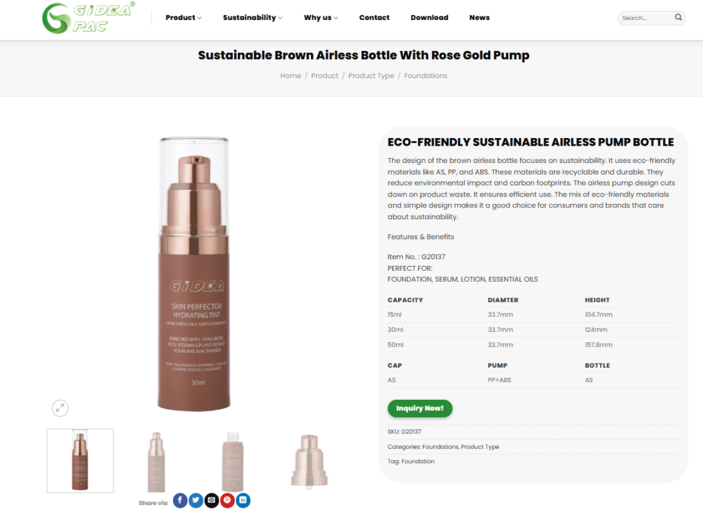
Each product page is structured to balance clarity and depth:
- High-quality product visuals
- Key specifications presented in a simple format
- Customization options clearly highlighted
We avoided overwhelming technical details and focused instead on usability and presentation.
Customization and Solutions Pages
These pages communicate the brand’s core advantage: flexibility.
We structured them to:
- Explain the customization process step-by-step
- Showcase possible variations
- Reinforce the brand’s expertise
This helps transform a standard product catalog into a solution-oriented experience.
About Page: Building Brand Identity
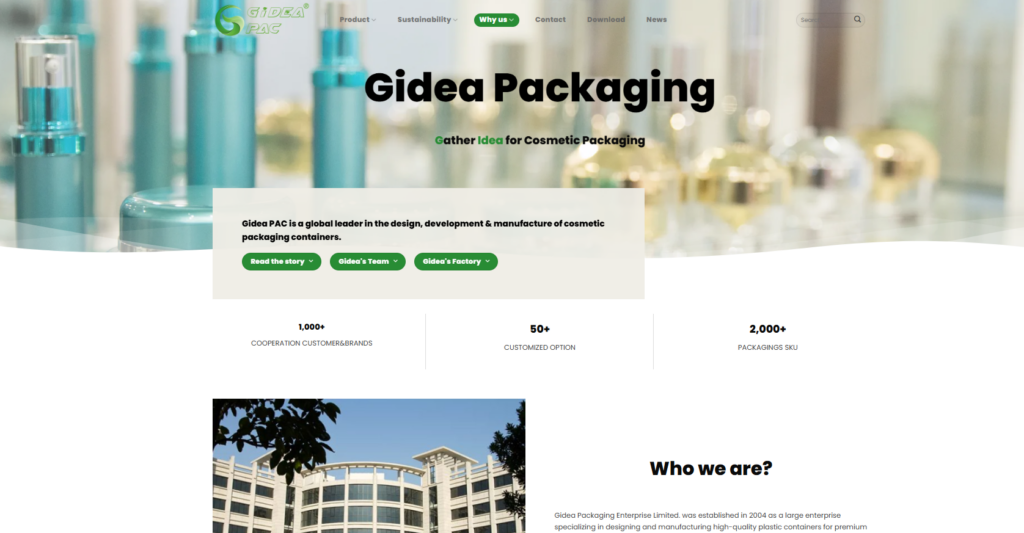
The About page focuses on storytelling:
- Company background
- Mission and values
- Industry positioning
This humanizes the brand and builds trust with international clients.
Contact and Inquiry System
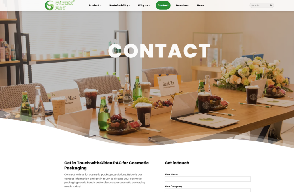
We simplified the contact process to reduce friction:
- Clear call-to-action sections
- Easy-to-fill inquiry forms
- Strategic placement across multiple pages
This ensures users can reach out at any stage of their journey.
直面した課題
Every project comes with its own set of challenges. For this website, the main difficulties included:
Presenting Technical Products Clearly
Cosmetic packaging products can be complex and highly customizable. The challenge was to present them in a way that is easy to understand without losing professionalism.
Balancing Design and Information
Too much design can distract, while too much information can overwhelm. Finding the right balance was critical.
Building for Global Users
The website needed to cater to an international audience with different browsing habits and expectations.
当社のソリューション
To overcome these challenges, we applied a series of strategic solutions.
Simplified Content Presentation
We broke down complex information into:
- Short descriptions
- Visual highlights
- Structured sections
This improves readability and user experience.
Clean and Minimal Design Language
We adopted a modern, minimal design approach:
- Generous white space
- Consistent typography
- Neutral color palette
This keeps the focus on the products.
コンバージョン重視のレイアウト
Every page is designed with a clear goal:
- Guide users through a logical journey
- Encourage interaction
- Lead to inquiries
This ensures the website is not just informative, but effective.
結果と影響
After completing the website build and design, the client achieved several key improvements:
Stronger Brand Image
The new website presents the company as a professional, reliable global supplier.
ユーザーエクスペリエンスの向上
Visitors can now easily navigate the site, understand products, and find relevant information.
Higher Engagement
The structured layout encourages users to explore multiple pages.
Better Conversion Potential
Clear calls-to-action and simplified inquiry processes increase the likelihood of generating leads.
Our Methodology: Design Meets Structure
One of the key takeaways from this project is the importance of aligning website construction with design thinking.
Our process always follows a clear sequence:
- Define goals and user needs
- Build a logical structure
- Design for clarity and engagement
- Optimize for usability and performance
This approach ensures that every website we build is not only visually appealing, but also strategically effective.
結論
成功する ワードプレス website is not about adding more features—it’s about creating a structured, user-focused experience that aligns with business goals.
For the Gidea PAC project, the combination of strong website construction and thoughtful design resulted in a platform that supports both brand growth and customer engagement. By focusing on clarity, usability, and scalability, we helped transform a traditional product showcase into a powerful digital tool.
で エアサン, we specialize in building and designing WordPress and Shopify websites for global businesses. Our approach combines strategic structure with conversion-focused design, helping brands present themselves professionally and grow in competitive international markets.


WordPressのウェブサイトや、完全なeコマースシステムを備えたコーポレートサイトをデザイン・構築します。.
価格帯$200.00~$2,500.00custom-requirements-or-special-quotations
元価格は$2.00。.$1.00現在の価格は$1.00。. Amazonホーム理学療法機器のメイン画像デザイン解説
はじめにAmazonで家庭用治療器の信頼できるイメージを構築する Amazonで家庭用治療器のメインイメージをデザインする際、私たちが最も重視するのは...

Amazon リップスティックコンバージョンのメイン画像デザイン
はじめにアマゾンで売れる口紅のメイン画像をデザインする アマゾンの口紅のメイン画像をデザインするとき、私たちの責任は...

ハッカーがWordPress管理者のメールアドレスを盗む方法(そしてそれを阻止する方法)
WordPressの管理者メールアドレスは、あなたが思っている以上に公開されているのです。ハッカーはそれが大好きです。彼らにとって、あなたの...

Amazonのリキッドファンデーションのメイン画像がコンバージョンにつながる理由
はじめに Amazonリキッドファンデーションのメイン画像デザインは、単に商品を美しく見せるだけではありません。Amazonでは、メイン画像と….

フィルターカートリッジの効果的なAmazonメインイメージのデザイン
はじめに Amazonのメイン画像をデザインする上で、商品を魅力的に見せることは決して重要ではありません。明確さ、信頼性、そして瞬時に理解できることが何よりも重要です。特に….

WordPress へのリプレイ攻撃: 本当の脅威か、それとも誇張された神話か?
まず最初に明確にしておきましょう。リプレイ攻撃は見た目には怖くありません。パスワードを破壊したり、緑色のハッカーテキストが飛び交うような悪質なコードを挿入したりもしません。彼らは狡猾なのです…。.

WordPressページを何も壊さずに複製する方法
正直に言って、新しいページを作りたくない時もあるでしょう。同じページを少しだけ変えたいだけなのに。レイアウトもブロックも設定も全部同じ。なぜなら….

ペット向けWordPressテーマ5選を比較
はじめに ペット関連のWordPressテーマを適切に選ぶことは、単なるデザイン上の決定ではありません。使いやすさ、拡張性、そして長期的なビジネスの成長に直接影響します。ペットケアとペット...

5つの水着eコマーステーマを比較
はじめに 水着やランジェリーの独立ストアに適切なテーマを選択することは、見た目だけの問題ではなく、コンバージョン率、拡張性、長期的な効果に直接影響します...

WordPressでコメント機能をオフにする方法(気が狂わずに)
WordPressのコメントについてお話しましょう。理論上は、コメントは素晴らしいものです。議論を促し、コミュニティを築き、ウェブサイトに「活気」を与えてくれます。しかし実際にはどうでしょうか?コメントはしばしば人を惹きつけ….

科学主導のブランドのためのスケーラブルなWordPressウェブサイトの構築:AminoUSAプロジェクト
はじめに 今日のデジタル環境において、ウェブサイトは単なる製品リストを掲載する場所ではありません。規制の厳しい業界や研究重視の業界で事業を展開する科学主導のブランドにとって、ウェブサイトは….

グローバルブレードブランドのためのスケーラブルなShopifyストアの構築:CoolKatanaプロジェクト
はじめに 越境電子商取引において、Shopify の Web サイトは単なる店舗ではありません。ニッチで文化主導のカテゴリーで活動するブランドにとって、Web サイトは単なる店舗以上のものを実現する必要があります...

ポケモンカード向け高コンバージョンShopifyストアの設計
はじめに 収集可能な電子商取引の世界、特にポケモン トレーディング カード ゲーム (TCG) 市場では、Web サイトは単に製品をリストするだけでは不十分です。...

カスタムレンガブランドのための高コンバージョンShopifyデザイン
はじめに 今日の競争の激しいeコマース市場、特にパーソナライズされたギフトやコレクターズアイテムの分野では、Shopifyのウェブサイトは商品を展示する以上の機能を提供する必要があります。それは….

Shopifyサポートへの問い合わせ方法:シンプルでストレスフリーなガイド
Shopifyストアの運営は、混乱するのではなく、ワクワクするものであるべきです。疑問が生じたり、問題が発生して作業が滞ったりした場合でも、Shopifyは状況に応じて複数のサポートパスをご用意しています。.

Shopifyストアを非アクティブ化する方法:分かりやすく実践的なガイド
Shopifyストアの無効化はそれほど複雑ではありませんが、多くのマーチャントが見落としている影響があります。このガイドでは、そのプロセスを分かりやすく解説します。.

高級花卉ブランド向けShopifyウェブサイトデザイン事例
はじめに 今日の競争の激しいeコマース市場において、Shopifyのウェブサイトは商品を表示する以上の機能を提供する必要があります。ブランド価値を瞬時に伝え、ユーザーを誘導する必要があります….

Shopifyデザインケーススタディ:レトロゲームストア
はじめに 競争の激しいeコマース環境では、視覚的な明瞭さと感情的な繋がりが、訪問者が顧客になるかどうかを左右することがよくあります。これは特に….