


 Japanese
導入
In the competitive world of mobile accessories, a website must do more than simply display products—it must communicate brand identity, highlight product value, and create a seamless shopping experience. For brands selling premium items such as carbon fiber phone cases, design plays a crucial role in conveying quality, durability, and innovation.
その Shopify store for カーボンケース was designed with these goals in mind. The objective was to create a visually striking storefront that reflects the sleek, high-performance nature of carbon fiber products while maintaining a clean and intuitive user journey.
In this project, our role focused entirely on Shopify website design—structuring the layout, creating visual hierarchy, organizing product presentation, and crafting an interface that encourages exploration and conversion. By aligning design decisions with brand positioning and user behavior, we helped transform the site into a modern, high-impact ecommerce experience.
This article explains the design strategy behind the カーボンケース Shopify website, including the design process, the challenges we faced, the solutions we implemented, and the final results.
| 配達時間 | カテゴリ | アプリケーションプラットフォーム |
| 11days | Carbon Fiber Cases | shopify |
| 関与するデザイナー | 料金 | 効果 |
| リン・チャン | $310 | Store Entry Rate📈247% |
Understanding the Brand and Project Goals
Before starting the design process, it was essential to understand the brand’s identity and the audience it targets.
カーボンケース sells premium carbon fiber phone cases and accessories. Carbon fiber is commonly associated with performance, engineering, durability, and luxury, often seen in industries such as automotive, aerospace, and high-end technology products. The website design needed to visually communicate these qualities from the moment a visitor lands on the homepage.
Key Goals of the Project
The project focused on several core objectives:
- Establish a premium brand image
- Showcase the unique carbon fiber aesthetic
- Create a clear product browsing structure
- Build strong visual trust signals
- Improve the overall shopping experience
- Ensure the site feels modern and professional
From a design perspective, the challenge was to balance visual impact and usability. A visually heavy design could distract from product discovery, while a minimal layout might fail to express the premium nature of the products.
Our task was to find the right balance.
Shopifyのデザインアプローチ
Designing a successful ecommerce site requires more than arranging sections on a page. It involves understanding how users browse products, what builds trust, and how visual hierarchy influences purchasing decisions.
Our Shopify design approach focused on four principles:
1. Visual Hierarchy
A well-structured hierarchy helps visitors quickly understand:
- what the brand sells
- what products are available
- where to go next
We carefully structured the homepage so that users naturally move from brand introduction → product categories → featured products → trust elements → social proof.
2. Product-Focused Layout
Since the product itself is visually distinctive, the design prioritizes large product visuals and clean backgrounds. This ensures the carbon fiber textures and patterns stand out.
3. Minimal Distractions
Premium products benefit from clean layouts and controlled color palettes. We avoided unnecessary elements and focused attention on the products.
4. Brand Consistency
Every visual element—from colors to spacing—was designed to reinforce the brand’s identity.
The Design Process
Research and Inspiration
The first step involved studying:
- premium phone accessory brands
- luxury tech ecommerce sites
- modern Shopify storefront design trends
We analyzed how leading brands use:
- high-contrast product photography
- minimal color palettes
- bold hero sections
- strong visual storytelling
This research helped establish a design direction that would align with the カーボンケース brand.
Creating the Homepage Structure
The homepage plays the most critical role in an ecommerce website. It must immediately communicate the brand value and guide visitors toward products.
We structured the homepage into several strategic sections.
ヒーローセクションのデザイン

The hero section introduces the brand with a bold visual statement.
主な設計上の選択肢は次のとおりです。
- large product imagery
- dark, high-contrast background
- minimal text overlay
- clear navigation access
The carbon fiber textures and colorful forged patterns immediately capture attention. This approach helps communicate the premium material quality without requiring lengthy descriptions.
Category Navigation

After the hero section, visitors are guided into product categories.
We designed a visual category grid that allows users to explore products based on their device type:
- Apple
- Samsung
- アクセサリー
This layout serves two important purposes:
- It simplifies product discovery.
- It visually showcases the product range.
Instead of overwhelming users with too many options, the design encourages intuitive browsing.
おすすめ商品レイアウト
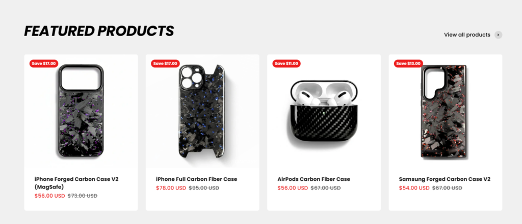
The featured products section highlights best-selling items.
From a design standpoint, we focused on:
- clean product cards
- clear product imagery
- visible pricing
- simple discount indicators
Spacing and alignment were carefully optimized to create a balanced product grid that feels organized and professional.
This section helps customers quickly identify popular items and encourages engagement.
Trust-Building Section

Trust elements are critical in ecommerce design.
We included a section that highlights key selling points such as:
- brand popularity
- fast shipping
- responsive customer support
Visually, this section uses simple icons and short descriptions, which makes the information easy to scan.
The goal is to reassure customers and reduce purchase hesitation.
Customer Review Showcase
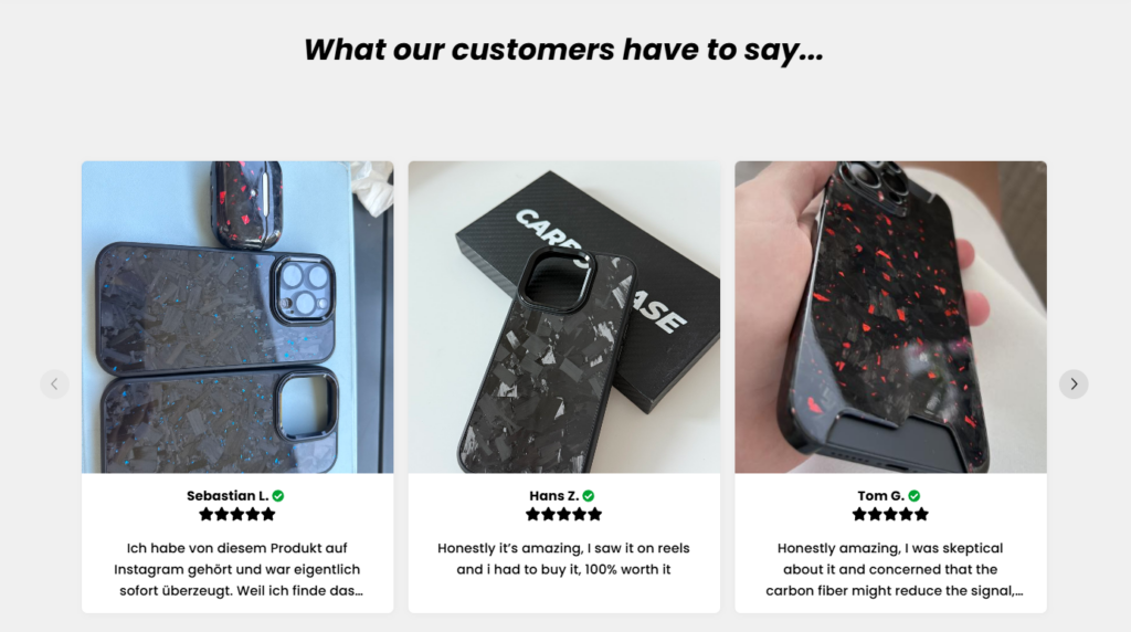
User-generated content is one of the strongest forms of social proof.
To reinforce product credibility, we created a customer review carousel that displays:
- real product images
- customer names
- short testimonials
This section adds authenticity to the website and visually demonstrates how the products look in real-world usage.
FAQ Section
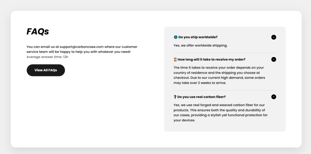
The FAQ section addresses common questions customers may have, such as:
- shipping availability
- delivery timelines
- product materials
From a design perspective, the accordion layout keeps the page clean while still making information accessible.
This reduces friction during the buying process.
Design Challenges We Faced
Even a well-defined project presents challenges. In this case, several design considerations required careful attention.
Balancing Visual Impact and Simplicity
Carbon fiber patterns are visually rich. If used excessively, they could make the page feel cluttered.
We solved this by:
- using neutral backgrounds
- limiting textures to product imagery
- maintaining generous white space
This allowed the products to remain the focal point.
Maintaining Brand Consistency
カーボンケース features multiple color variations of forged carbon patterns.
To maintain visual consistency across the site, we used a neutral color palette for the interface:
- black
- dark gray
- white
This ensures that colorful product textures stand out without overwhelming the design.
Ensuring Clear Navigation
Visitors should be able to reach products within seconds.
To achieve this, we:
- simplified the navigation structure
- emphasized category entry points
- used clear visual grouping
The result is a browsing experience that feels intuitive.
当社のデザインソリューション
To address the challenges above, we implemented several design solutions.
A Strong Visual Identity
The design emphasizes bold imagery and minimal text. This reflects the premium nature of the products and aligns with the expectations of modern ecommerce shoppers.
Product-Centered Design
Instead of overloading the homepage with marketing text, we allowed product visuals to tell the story.
This approach:
- improves product appeal
- shortens decision time
- increases browsing engagement
Clean and Modern Layout
The design prioritizes spacing, alignment, and simplicity.
This makes the site feel:
- modern
- trustworthy
- easy to navigate
These qualities are essential for high-end ecommerce brands.
The Results of the Design
After implementing the final Shopify design structure, the website achieved several key outcomes.
A Clear Brand Identity
The site now visually communicates the strength and sophistication associated with carbon fiber products.
Improved Product Presentation
Products are displayed in a way that highlights their textures, finishes, and craftsmanship.
This enhances perceived product value.
A Streamlined User Journey
Visitors can easily move through the site:
Homepage → Category → Product → Purchase
Reducing friction improves overall usability.
Stronger Customer Trust
With trust badges, customer reviews, and clear structure, the website feels more credible and professional.
Why Design Matters in Shopify Ecommerce
A successful Shopify store depends heavily on design.
Strong design can:
- improve brand perception
- guide user behavior
- highlight product quality
- increase customer confidence
For premium products especially, the website often serves as the first impression of the brand. A thoughtful design strategy ensures that impression is positive.
結論
Designing the カーボンケース Shopify website required a balance of aesthetics, usability, and brand storytelling. By focusing on clear visual hierarchy, product-centered layouts, and trust-building elements, we created a modern storefront that effectively showcases carbon fiber phone cases and accessories.
The project demonstrates how strategic Shopify design can elevate an ecommerce brand and improve the overall shopping experience.
で エアサン, we specialize in Shopify website design for ecommerce brands, helping businesses create visually compelling storefronts that highlight their products and strengthen brand identity. Our focus is on thoughtful design, clear user journeys, and modern ecommerce presentation that supports long-term brand growth.


WordPressのウェブサイトや、完全なeコマースシステムを備えたコーポレートサイトをデザイン・構築します。.
価格帯$200.00~$2,500.00custom-requirements-or-special-quotations
元価格は$2.00。.$1.00現在の価格は$1.00。. Amazonホーム理学療法機器のメイン画像デザイン解説
はじめにAmazonで家庭用治療器の信頼できるイメージを構築する Amazonで家庭用治療器のメインイメージをデザインする際、私たちが最も重視するのは...

Amazon リップスティックコンバージョンのメイン画像デザイン
はじめにアマゾンで売れる口紅のメイン画像をデザインする アマゾンの口紅のメイン画像をデザインするとき、私たちの責任は...

ハッカーがWordPress管理者のメールアドレスを盗む方法(そしてそれを阻止する方法)
WordPressの管理者メールアドレスは、あなたが思っている以上に公開されているのです。ハッカーはそれが大好きです。彼らにとって、あなたの...

Amazonのリキッドファンデーションのメイン画像がコンバージョンにつながる理由
はじめに Amazonリキッドファンデーションのメイン画像デザインは、単に商品を美しく見せるだけではありません。Amazonでは、メイン画像と….

フィルターカートリッジの効果的なAmazonメインイメージのデザイン
はじめに Amazonのメイン画像をデザインする上で、商品を魅力的に見せることは決して重要ではありません。明確さ、信頼性、そして瞬時に理解できることが何よりも重要です。特に….

WordPress へのリプレイ攻撃: 本当の脅威か、それとも誇張された神話か?
まず最初に明確にしておきましょう。リプレイ攻撃は見た目には怖くありません。パスワードを破壊したり、緑色のハッカーテキストが飛び交うような悪質なコードを挿入したりもしません。彼らは狡猾なのです…。.

WordPressページを何も壊さずに複製する方法
正直に言って、新しいページを作りたくない時もあるでしょう。同じページを少しだけ変えたいだけなのに。レイアウトもブロックも設定も全部同じ。なぜなら….

ペット向けWordPressテーマ5選を比較
はじめに ペット関連のWordPressテーマを適切に選ぶことは、単なるデザイン上の決定ではありません。使いやすさ、拡張性、そして長期的なビジネスの成長に直接影響します。ペットケアとペット...

5つの水着eコマーステーマを比較
はじめに 水着やランジェリーの独立ストアに適切なテーマを選択することは、見た目だけの問題ではなく、コンバージョン率、拡張性、長期的な効果に直接影響します...

WordPressでコメント機能をオフにする方法(気が狂わずに)
WordPressのコメントについてお話しましょう。理論上は、コメントは素晴らしいものです。議論を促し、コミュニティを築き、ウェブサイトに「活気」を与えてくれます。しかし実際にはどうでしょうか?コメントはしばしば人を惹きつけ….

科学主導のブランドのためのスケーラブルなWordPressウェブサイトの構築:AminoUSAプロジェクト
はじめに 今日のデジタル環境において、ウェブサイトは単なる製品リストを掲載する場所ではありません。規制の厳しい業界や研究重視の業界で事業を展開する科学主導のブランドにとって、ウェブサイトは….

グローバルブレードブランドのためのスケーラブルなShopifyストアの構築:CoolKatanaプロジェクト
はじめに 越境電子商取引において、Shopify の Web サイトは単なる店舗ではありません。ニッチで文化主導のカテゴリーで活動するブランドにとって、Web サイトは単なる店舗以上のものを実現する必要があります...

ポケモンカード向け高コンバージョンShopifyストアの設計
はじめに 収集可能な電子商取引の世界、特にポケモン トレーディング カード ゲーム (TCG) 市場では、Web サイトは単に製品をリストするだけでは不十分です。...

カスタムレンガブランドのための高コンバージョンShopifyデザイン
はじめに 今日の競争の激しいeコマース市場、特にパーソナライズされたギフトやコレクターズアイテムの分野では、Shopifyのウェブサイトは商品を展示する以上の機能を提供する必要があります。それは….

Shopifyサポートへの問い合わせ方法:シンプルでストレスフリーなガイド
Shopifyストアの運営は、混乱するのではなく、ワクワクするものであるべきです。疑問が生じたり、問題が発生して作業が滞ったりした場合でも、Shopifyは状況に応じて複数のサポートパスをご用意しています。.

Shopifyストアを非アクティブ化する方法:分かりやすく実践的なガイド
Shopifyストアの無効化はそれほど複雑ではありませんが、多くのマーチャントが見落としている影響があります。このガイドでは、そのプロセスを分かりやすく解説します。.

高級花卉ブランド向けShopifyウェブサイトデザイン事例
はじめに 今日の競争の激しいeコマース市場において、Shopifyのウェブサイトは商品を表示する以上の機能を提供する必要があります。ブランド価値を瞬時に伝え、ユーザーを誘導する必要があります….

Shopifyデザインケーススタディ:レトロゲームストア
はじめに 競争の激しいeコマース環境では、視覚的な明瞭さと感情的な繋がりが、訪問者が顧客になるかどうかを左右することがよくあります。これは特に….